Minimalist Splendor — The Best Of Elegant Simplicity From H. Moser, Cartier, Hublot, And More

I love the simple fact that a watch can do so much to my everyday fit and mood, and I couldn’t care less about the dress rules. If a big 42mm sports watch with a 44mm bezel looks great under a linen-mix shirt and fits under the cuff, then I’ll wear it if it looks right on the day. Contrasts are just as powerful as a smooth match of styles, like a diver with a sports jacket and shirt. And the same goes for the simple elegance of spare dials with no dates or indices. They might not give you the exact minute past the hour at a glance, but does it matter? They look great with everything. so bring on the minimalist splendor.
Well, except for a worn-out fleece only fit for walking the dog, I do have limits (and hate fleece). But if there is something I am missing in my collection, it is a smooth-talking no-index watch. There is something about a spare dial design that makes you notice the other important details, such as the smooth curvature of a Cartier Tank case flank or the scalloped sides and balanced proportions of an Endeavour from Eduoard Meylan and his dial artists at H. Moser. I would also like to underline my love for the retro-futurist look of the jump-hour watch, where the purity of digits within a window takes time-telling down to its essence. Minimal design for maximum impact is a thing, and it’s big.
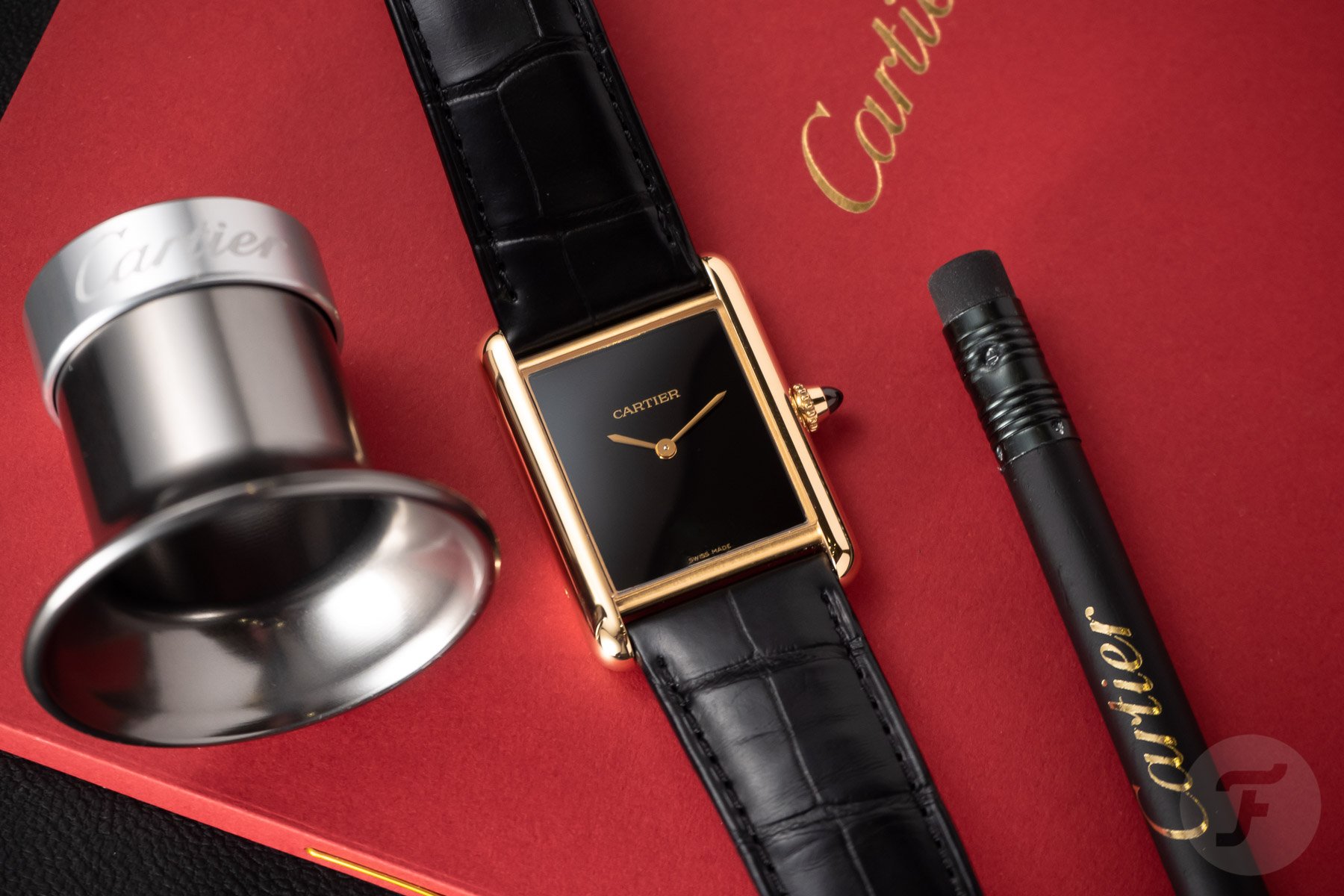
Cartier Tank Louis Cartier
It seems almost pointless talking about the Cartier Tank since the brand is hot enough these days to scorch your wrist. This Tank LC is the minimalist Cartier essence in 18K yellow gold with a sexy abyss of a dial. The Tank will make you love slim rectangularity, even if your style is bulletproof tool watches. Just check out Nacho’s story here, and you’ll get a whiff of its tempting French perfume. With this ref. WGTA0160, the Tank takes on a different persona. Gold makes for an easily overplayed strong statement, and über bling is not for me. But with the sleek Tank, there’s no need to worry; you simply can’t go wrong with this hand-wound delight.
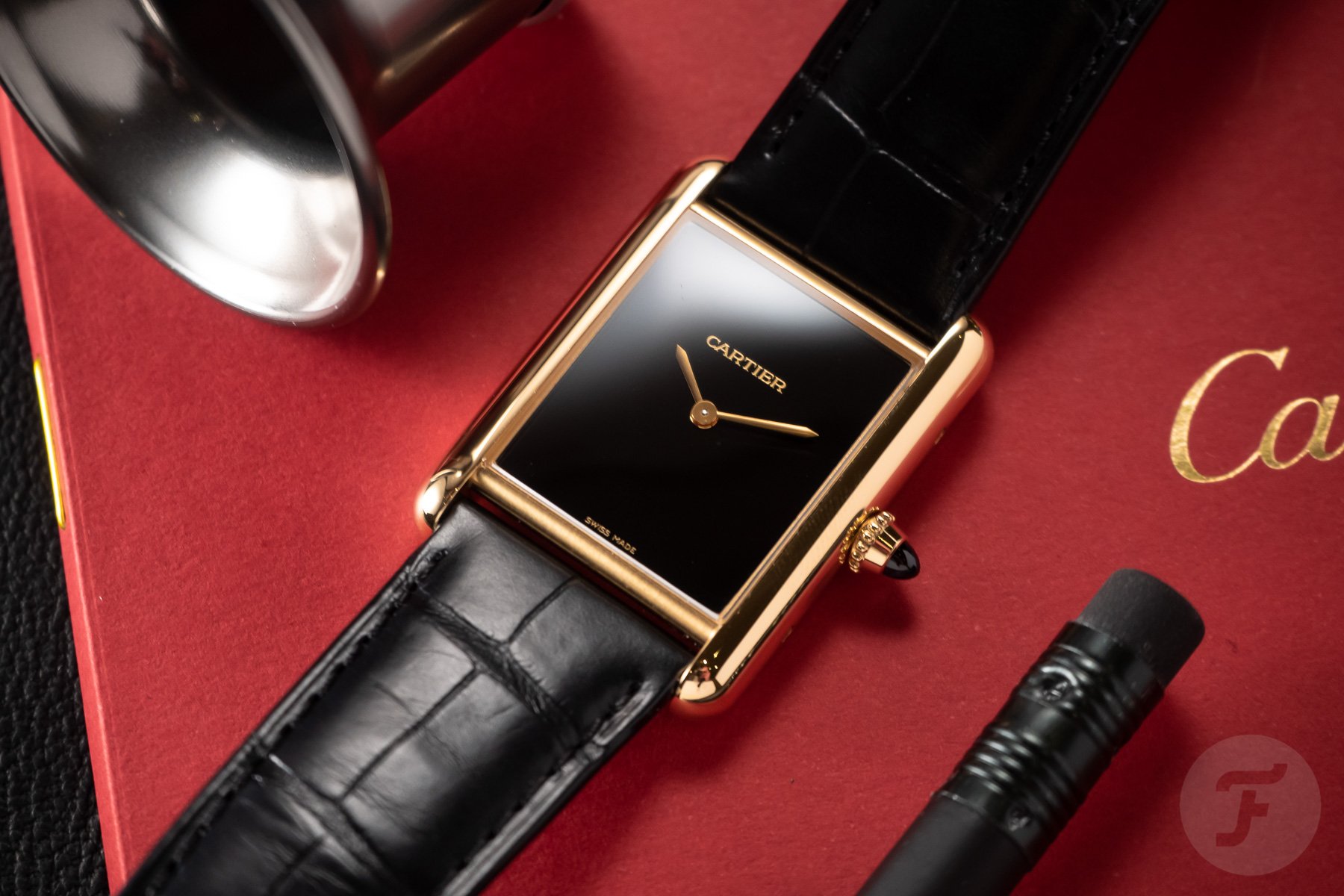
With a svelte 6.6mm thickness with perfect 33.7mm × 25.5mm proportions, rich yellow gold frames the glossy black dial. The latter is spare, delicately graced with a straight Cartier logo and those perfectly sized sword hands. It doesn’t matter if it’s three or four minutes past two. With this Tank, you will not notice stress anymore, even at €14,000.
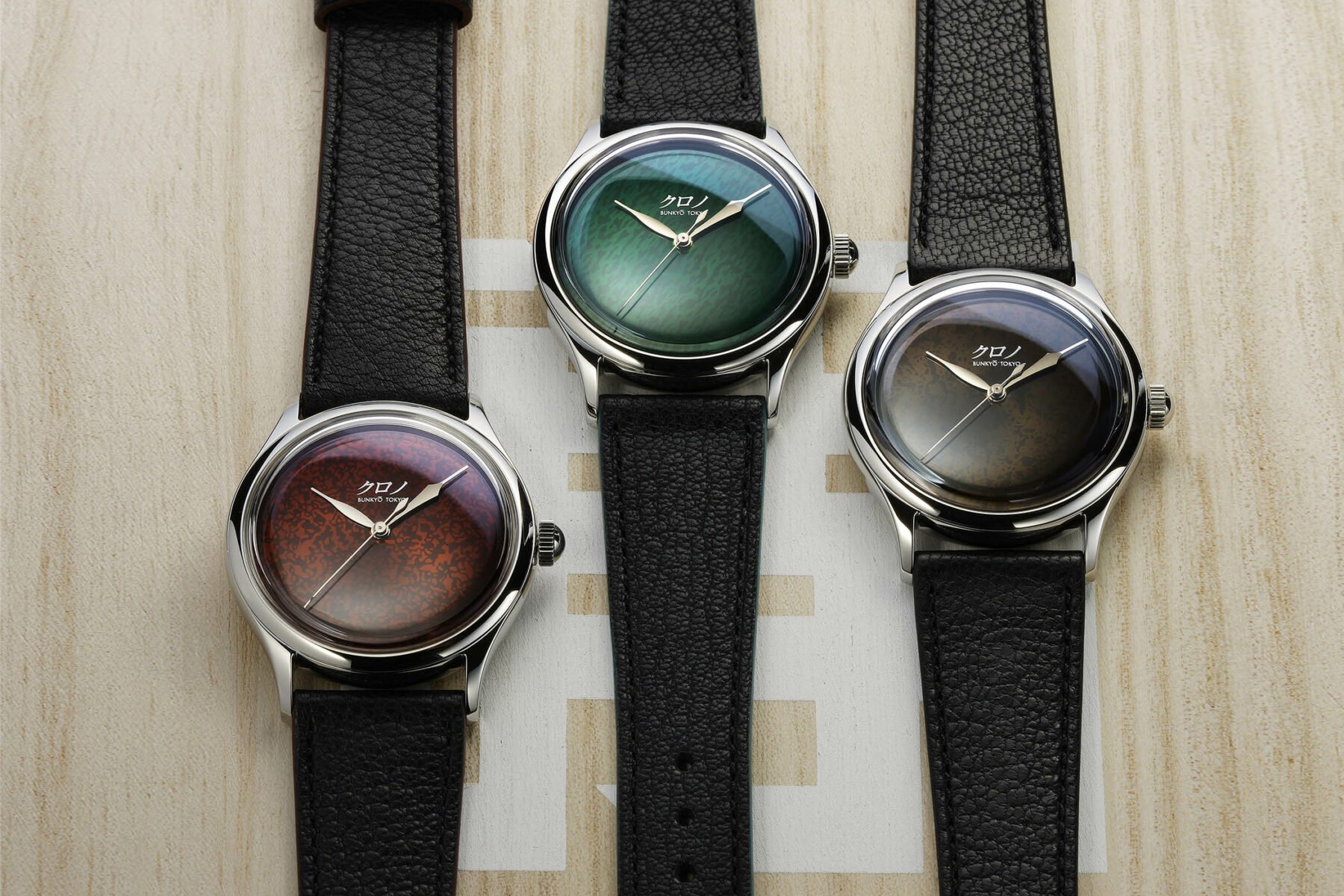
Kurono Tokyo Grand Urushi Aoyama
Just like Grand Seiko, the sub-brand of Sensei Hajime Asaoka makes use of the traditional Japanese wonders of multi-layered urushi (lacquer). These three are variations on Asaoka-san’s theme of well-known 38mm prowess, but this time sans indices, chronograph registers, or the calendar sub-dials found in my Calendrier. Through centuries-old Japanese craftsmanship, the brush-applied layering of the urushi makes the polished, folded hands hover elegantly under the crystal. I do appreciate the sharp, angular contrasts of a Grand Seiko case, but the smoothly polished Kurono Tokyo case speaks with a quieter voice, letting the dials dominate the conversation. These are only available for order and pick-up at the Kurono Tokyo showroom in Aoyama, so if you’re going to Tokyo, let me know, eh? Each sells for ¥358,500 (approximately €2,415) excluding VAT.
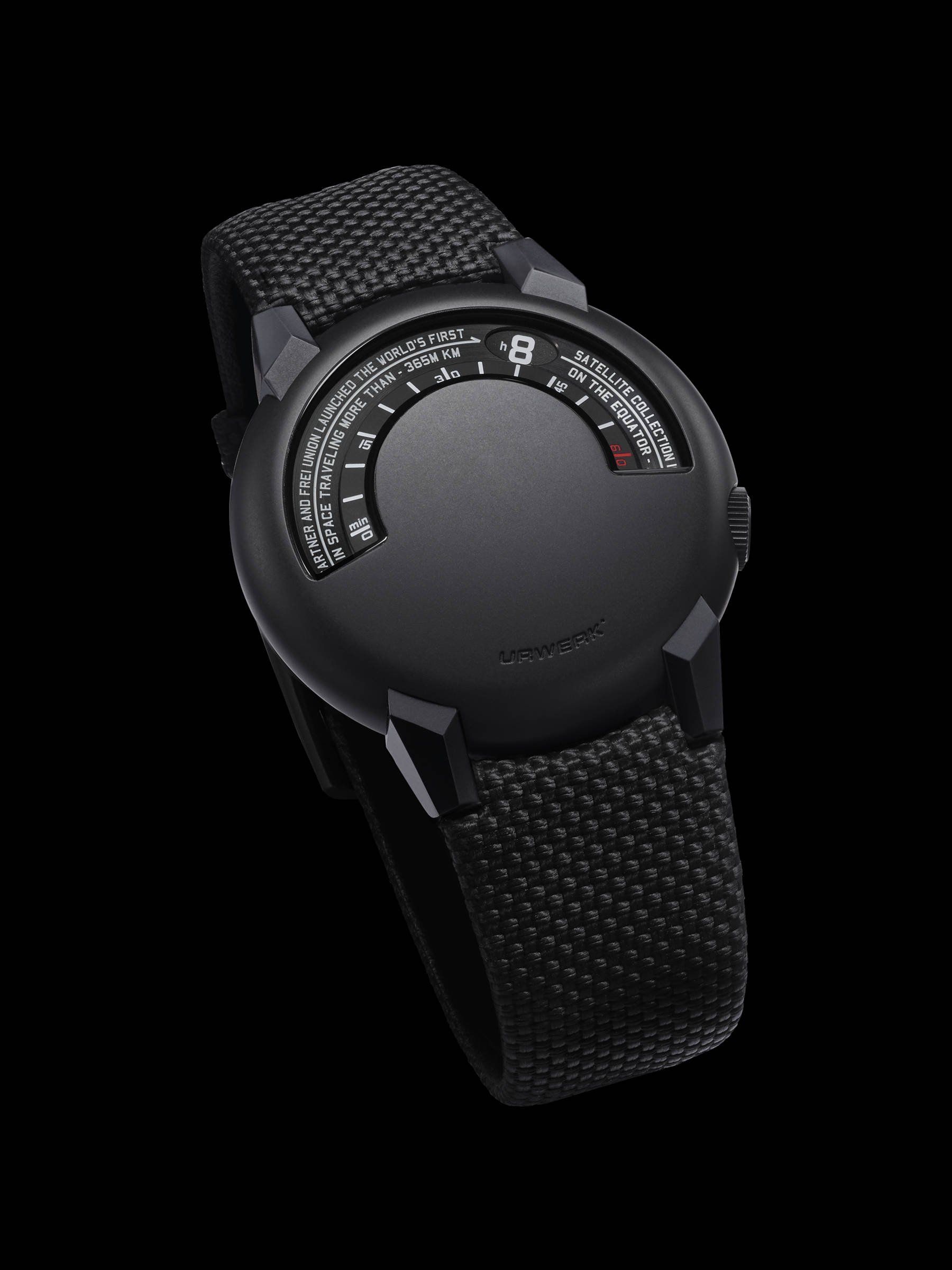
Urwerk UR-102 Reloaded
This is not a brand you would expect to see in this article, I’m sure. I’m a big fan of Urwerk’s fascinating world of spacecraft for the wrist and steampunk musings in metal. But minimalism is not the brand’s forte; brutal micro-mechanical architecture is the name of the game. As Dave succinctly put it in his story, this is a UR-102 revisited rather than reissued, and it’s a modern interpretation of an already future-proof watch. The ever-avant-garde work of Felix Baumgartner and Martin Frei is shown here in perhaps its most elegant form, a suave version of their powerful mechanics for the wrist.
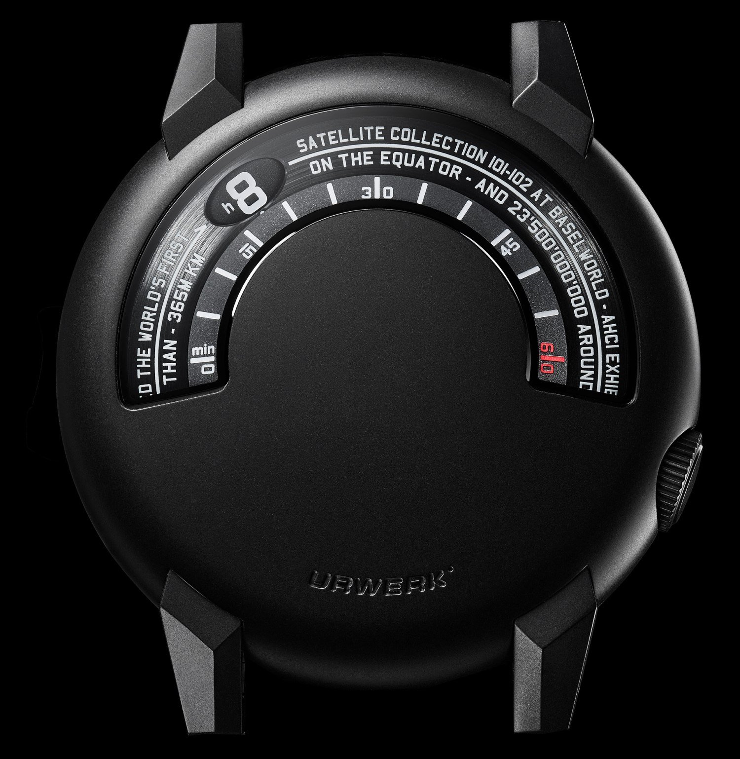
Like a smooth black pebble, it displays its easy-when-used-to-it display in a crescent at 12, not unlike a vintage speedometer, and the entire thing gels. My favorite detail is the way the severely angular lugs seem to grab hold of the smooth case, each underlining the other’s design through contrast. Juxtapositions make for a strong wrist presence, but no Urwerk creation is for the wrist-shy. And that is exactly why I have plenty of love for the cheeky brand. The UR-102 Reloaded models were released as a set of two at CHF 56,000 excluding tax, but if we wait a while, I’m sure this dark grail will appear solo.
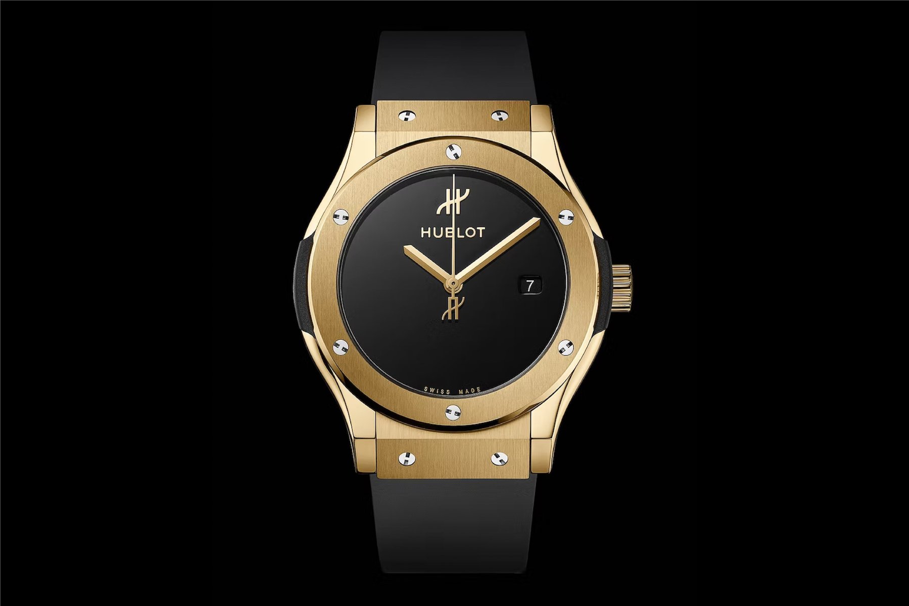
Hublot Classic Fusion original
Hublot is an oft-debated brand within the Fratello team, and its signature Big Bang models are divisive. I’ll be frank and admit to a few Hublot glitz tools being on my list of guilty pleasures, but this was a surprise. During LVMH Watch Week, Hublot launched the Classic Fusion Original, a limited (for now) take on the brand’s OG watch. The gold version in a near-perfect 38mm size got to me in a way that no other Hubbie has ever done.
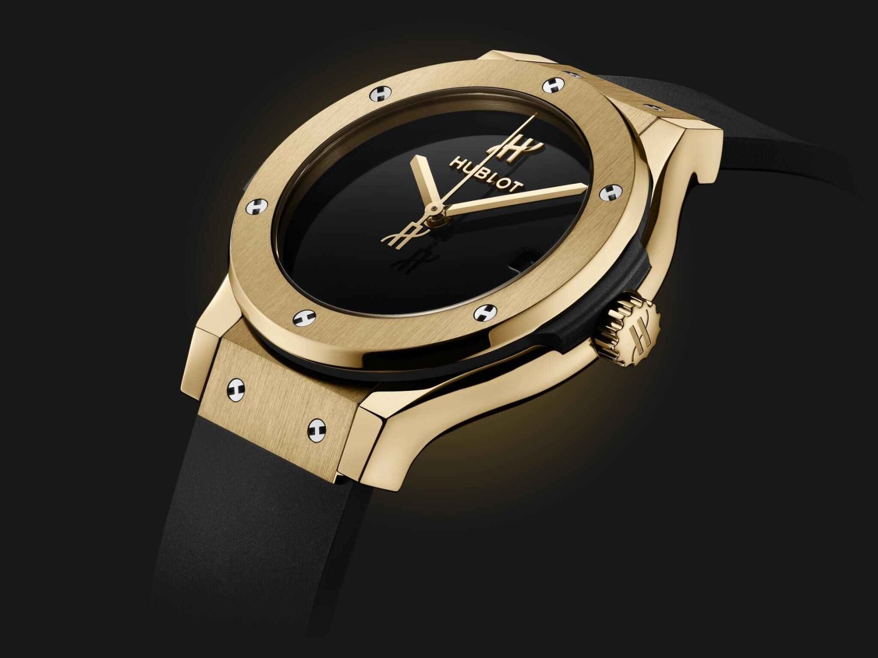
The case is a balanced blend of angular brushing with polished tweaks, but those bolt heads? My obsessive inner voice says “no,” but I do enjoy their cheeky, industrial twist. The same goes for the rubber strap, which looks normal on gold these days, but let’s not forget that Hublot was the originator. Yes, this is a Hublot watch that I wouldn’t mind wearing, with gloss black countered by angular gold. For €21,400 at launch, it’s no surprise that this great salute to the Carlo Crocco OG sold out.
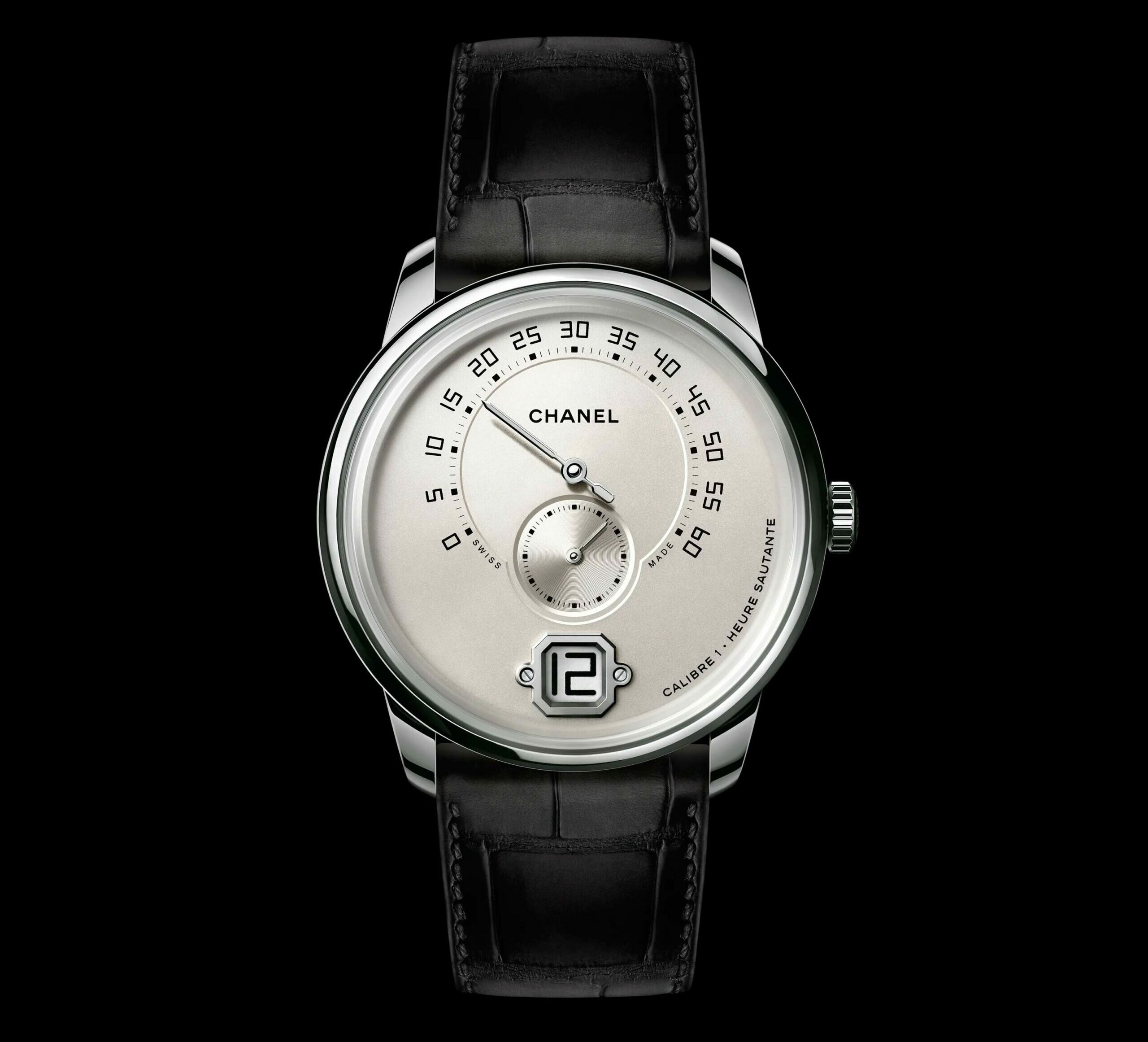
Monsieur de Chanel
Some of you might find this watch too complex for this story or still balk at the brand name, but I insist. While Chanel isn’t the name that first jumps to mind when envisioning Haute Horlogerie, ever since Watches and Wonders this year, I’ve had brand-snob remorse. The Monsieur de Chanel series is nothing but symmetrical perfection (at a price), and it’s still going strong after seven years. There’s no steel version anymore, and the least (relatively speaking) expensive reference is this clean-cut white gold one at €43,500. All Monsieurs are endowed with a clean dial within a case that is pure, classically polished, and merely serves as a frame. But what it frames has the overlapping excellence of top-tier Glashütte Original or Lange. A central axis of graphic design guides the placement of a recessed 240-degree retrograde minute register at 12, with deep-set small seconds just below the dial center.
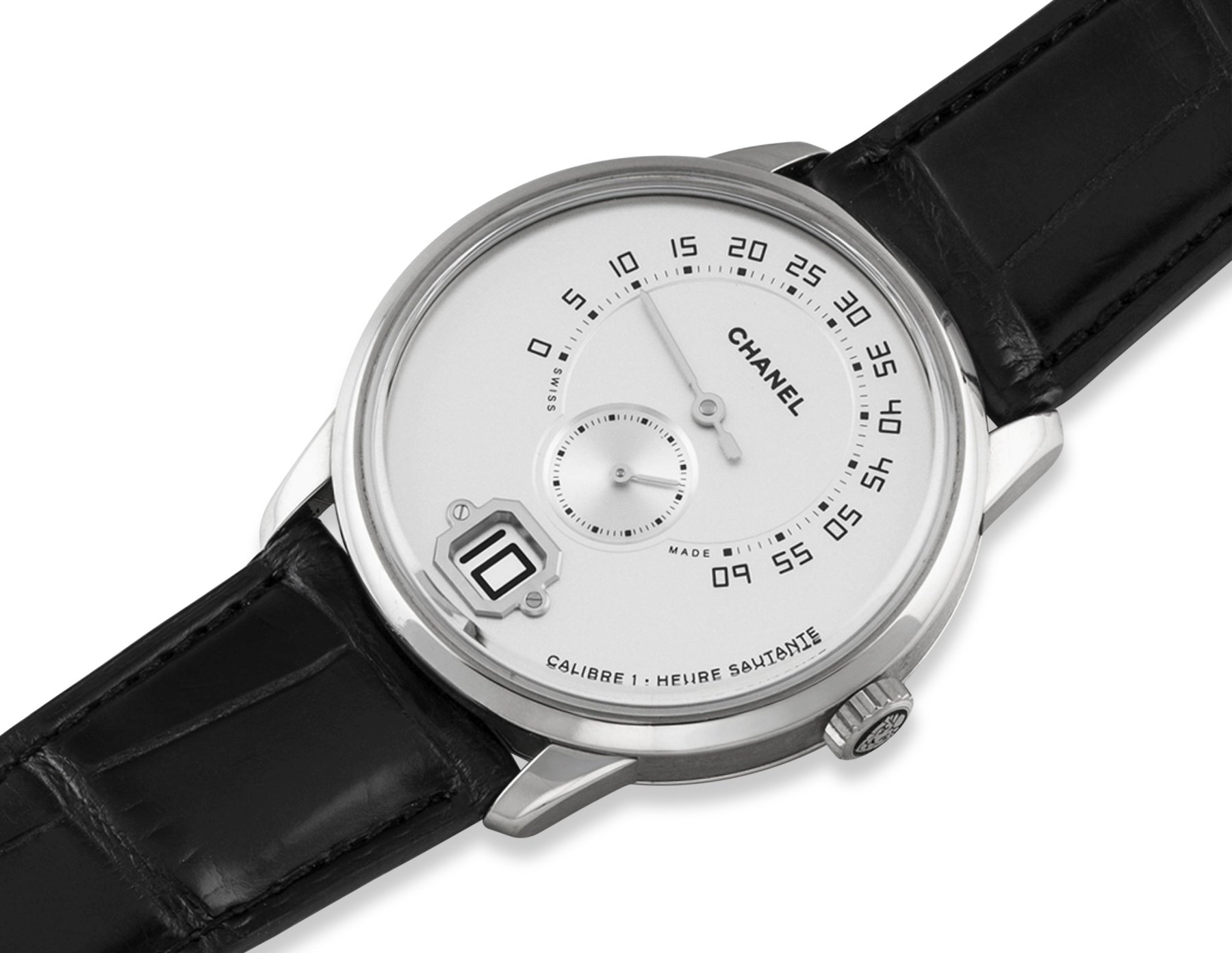
Image: Christie’s
This is contrasted to the smooth opaline dial by a sunray finish. But the pièce de résistance is the gold octagonal frame at 6 o’clock for the jumping hours. With the overall smoothness of the design, the screwed-in frame of the jump-hour display feels oddly industrial. But with each angle and screw head perfectly finished, it makes for a charming boldness. The same goes for the almost sci-fi angularity of the font, making Chanel’s first foray into men’s complications still cool after its 2016 debut.
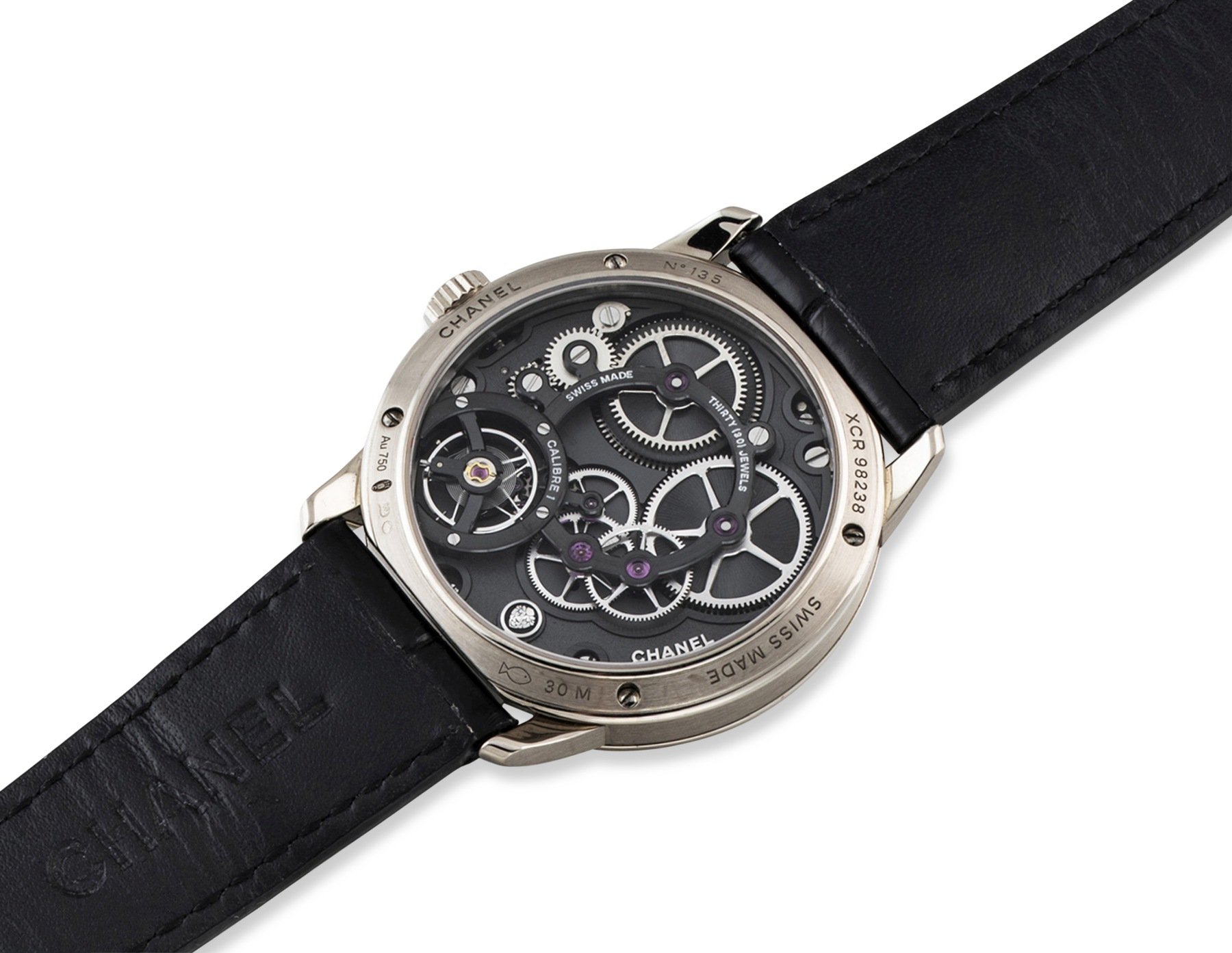
Image: Christie’s
Around the back is the three-day Calibre 1 produced by Romain Gauthier to Chanel specs. This exclusive movement shows a micro-feast of dark anthracite in a marked juxtaposition to the smooth overall vibe.
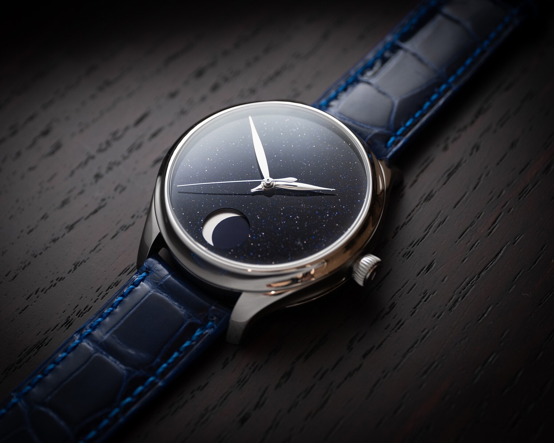
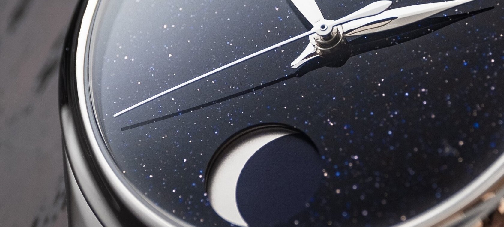
H. Moser & Cie. Endeavour Perpetual Moon
This version of the Endeavour is classic Moser-minimal while also being the joker in the brand’s horological pack. We are used to being impressed by the infinite depths of H. Moser’s fume dials, but this time, it’s made from aventurine glass. Most non-watch (or non-jewelry) lovers think that the glittering sky of dark blue is a natural stone. But no, in Italian, per avventura means “by chance.” One origin story goes that a Murano glassworker accidentally dropped copper filings into a molten glass mix. This resulted in what the Italians call avventurina.
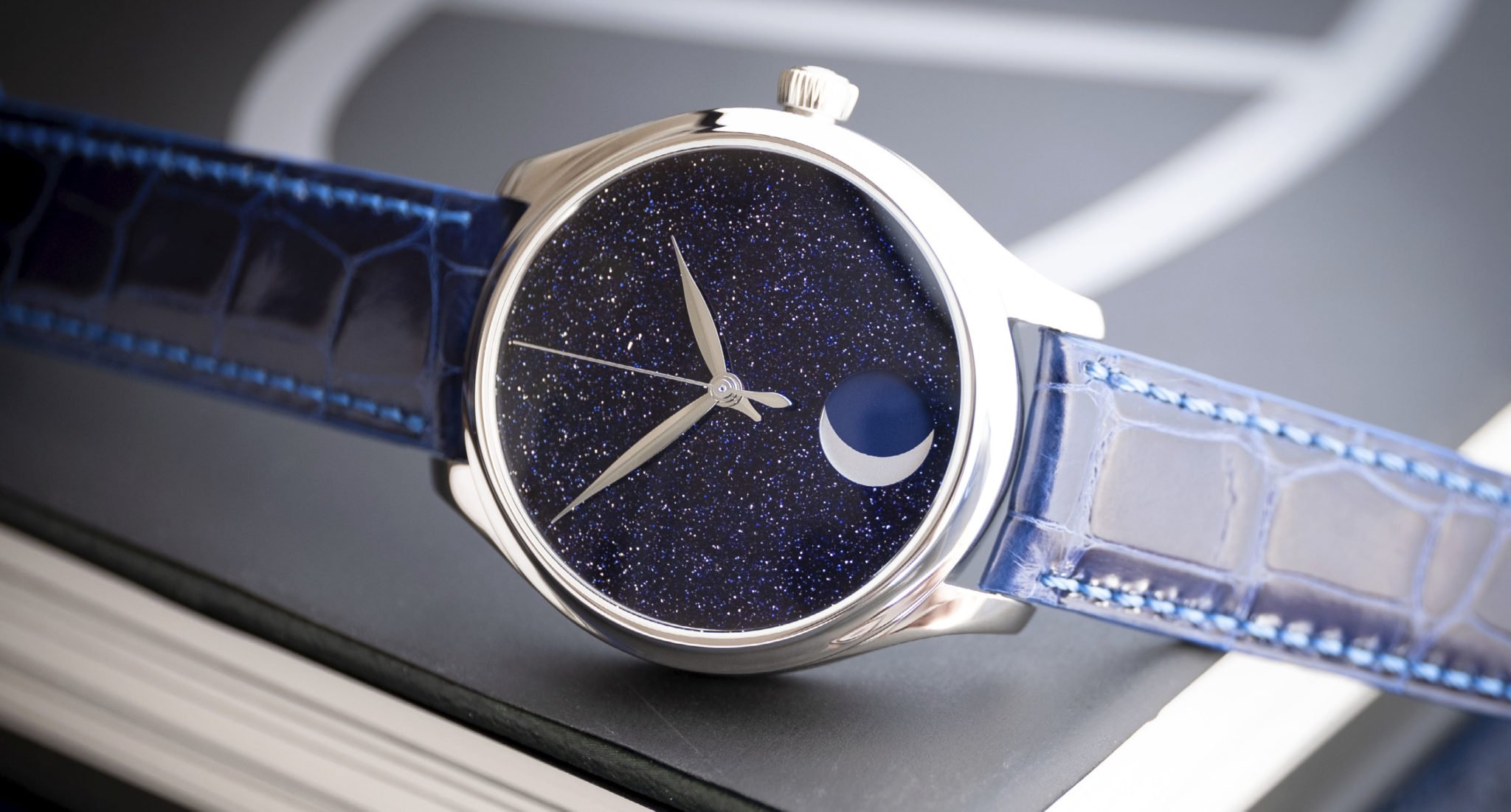
Its glittering depths fit perfectly with the moonphase display at 6 o’clock, but that’s not all. The HMC 801 in-house caliber is traditionally crafted and is a complex foil to the simplicity of the dial. It has a power reserve of seven full days, and the moonphase mechanism deviates by only one day in 1,027 years. Furthermore, the small pointer underneath the hour and minute hands is a day/night indicator, using the right half of the dial for AM and the left for PM. So once again, Moser’s minimalist charm hides a complex nature. One of the 50 examples in steel can be found for CHF 35,000 from H. Moser & Cie.
Fratelli, I’m thinking we don’t need detailed dials for everything. Do you agree with me on the beauty of simplicity to underline a stunning case or juxtapose the mechanical architecture within? Let me know in the comments.
Find me and follow me: @thorsvaboe