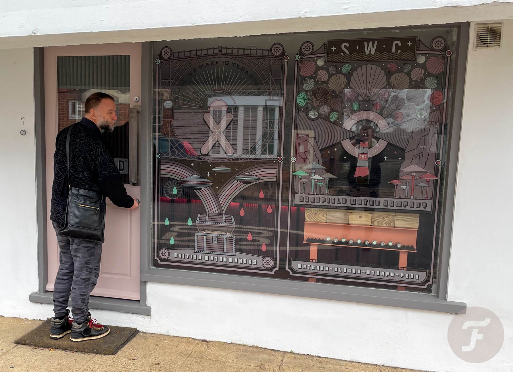
Schofield Watch Company: Rob Visits The Riverside Store In Upper Beeding

I remember saying to someone recently that I wasn’t really one for the unboxing experience. I even said it in an article on Fratello (maybe more than once). Well, I might have changed my mind. Or maybe I should say this: I am a fan of boxing — excellent boxing. I am a fan of turning a marvelously created object over in my hands. I like to enjoy every considered angle, every purposeful facet, and every joyful flourish. Recently, I made my way down to Upper Beeding, just ten miles north of Shoreham-by-Sea, to visit my old friend Giles Ellis of Schofield Watch Company. While there, I collected my very own Schofield B4 that I reviewed on these pages upon its release in summer.
I’ve waited almost ten years for this moment. I’ve followed Giles and his endeavors since watchmaking school. I always told myself I’d own a Schofield one day. One day, I was sure, I would have gone far enough into my career to have enough surplus income to treat myself to an exemplary expression of Giles’s vision. For me, the Japan-inspired Beater B4 was the one that brought together all my favorite elements in one perfect package.
Heavyweight boxing
But before I even got to the watch I’d been waiting so long to strap on, I had to stop and study the box. Giles has always been passionate about his packaging, and I’ve always been impressed by it. I will say this, though. After all these years of experience, he’s still getting better at it. Instantly, my eye is drawn by the cold-enameled badge on the front of the box that features the Schofield rotor logo and a shade of dusty blush pink that echoes the predominant color of the Riverside Store.
I told Giles it looked like a tasty slice of watermelon. He looked at me like I’d been dropped on my head one too many times as a baby (it’s not the first time someone has looked at me that way).
“It’s a rotor, mate.”
“Yeah, a tasty rotor!”
“No, I’m serious: the dot is the bearing point, you twit.”
Form and function in perfect harmony
Okay, he didn’t call me a twit with words (he’s always able to say something in between the words he actually uses). Luckily, we found my watermelon incident mutually amusing and it did nothing but add to the happiness of that moment. And I really was happy. Every element of that box (which is thoroughly explained in the below video), is thought out. We hear it said a lot, but this is really what it looks like when form and function meet in perfect harmony.
The cedar block upon which the watch sits and the way in which the box can be repurposed for straps, tools, or equally precious curios adds value to the whole experience. The deeply engraved “X” atop the box’s lid marks the spot beneath which true treasure can be found. As Schofield’s current tagline currently states, these certainly are pioneering watches for a new era.
View this post on Instagram
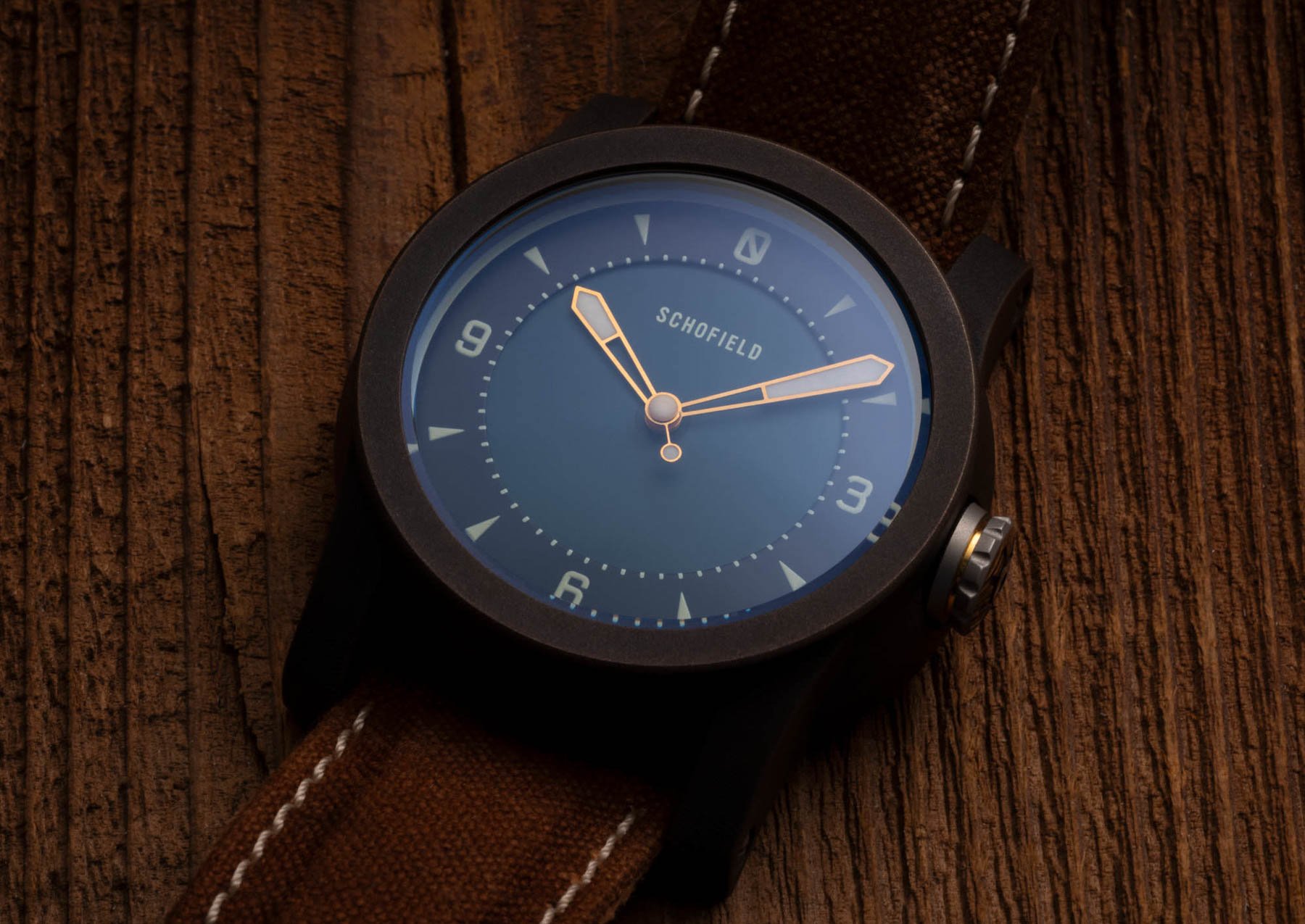
A little about the watch
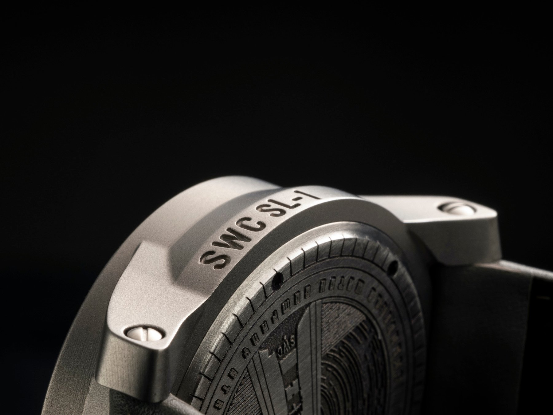
I’m going to do a long-term review of the watch I bought in a couple of months so I won’t go overboard right now. But allow me to gush for a moment at the genuine shock I experienced that I was not in any way disappointed when I took the watch in hand for the first time. I’ve seen many of Schofield’s watches over the years, but the one I committed to buy, I committed to blindly. Everything about it was as I hoped, but I hadn’t anticipated a couple of things. Firstly, I hadn’t expected how much I would love the “bloom” of the patina on the case. Giles had spoken to me frequently about this and while I was able to understand and identify it from photos, it looks really different in real life.

From the images I’d seen, I wondered if it might prove distracting in person. I was mildly concerned it would appear and, perhaps more importantly, feel like a defect. However, the opposite is true. The swelling changes of color that emanate from the bloom’s epicenter imbue the watch with warmth, a dynamic realness, and an almost living character. Each watch is unique. Every case is force-patinated by Giles’s own hand in his outhouse at home. It is perhaps this personal attention to detail that has seen the raw bronze respond so gracefully to its maker’s touch.
I’m getting emotional…
Don’t worry: I haven’t been dropped on my head (again). I’m not suggesting the material is actually emotionally connected to Giles. I am, however, suggesting it seems like there is definitely something more to the way these watches are patinated than just pure science. It will be interesting to see how this heavy coating wears over time. Giles estimates that after one year, the force-patinated Beaters and the raw bronze Beaters will be indistinguishable. By that point, the raw bronze should have “caught up” with their darker brethren. Meanwhile, the forced patina of mine will likely have worn away on the edges so as to return portions of the watch to their original luster.
View this post on Instagram
A little about the strap
I love straps. Giles loves straps. Our dear, departed mate, Simon Cudd (whose name still features on the very special Schofield & Cudd straps the boys made together) loved straps. As such, choosing the right one to mod this watch so it was truly mine was important. I love the Mudcloth strap upon which it comes, but I wanted something altogether darker and moodier. I had in mind the dark brown Clayton Leather strap, but while I was rifling through the store’s reserves I came across the very last smooth Tiger Loaf strap (with hot pink lining), which I’d thought lost to the past.

In truth, it now is a thing of the past, seeing as the machine used to make it has been “condemned”. Yes, regrettably, that is not a joke. Consequently, I’d better take darn good care of it so I can wear it for as long as possible.
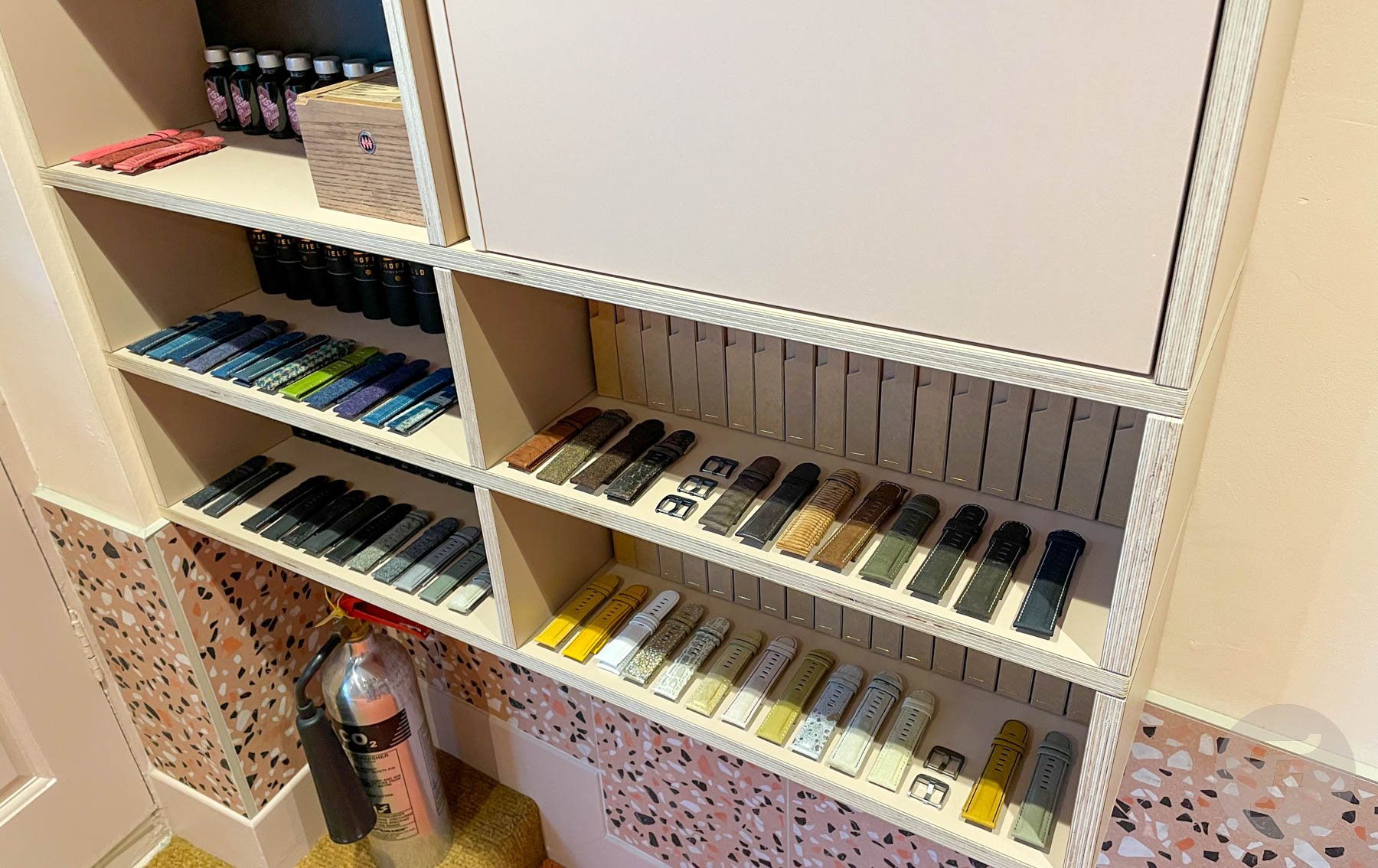
I decided to swap out the standard steel buckle for one of the ceramic-coated beauties that Giles offers as purchasable extras in the store (online and real). I had planned on a blue one to create a very homogenous look on the front and the back of the watch. Then, however, I spied a bright, almost fluorescent orange one sitting all alone on a shelf.
“How about the orange?”
“That’s a bold look!”
“It’s a Fratello thing, mate. I’ll take it.”
And so, my latent Dutchness won out again. I have ended up with a totally unique watch with a totally unique set-up after a very personal journey toward its ownership. In a nutshell, I couldn’t be happier.
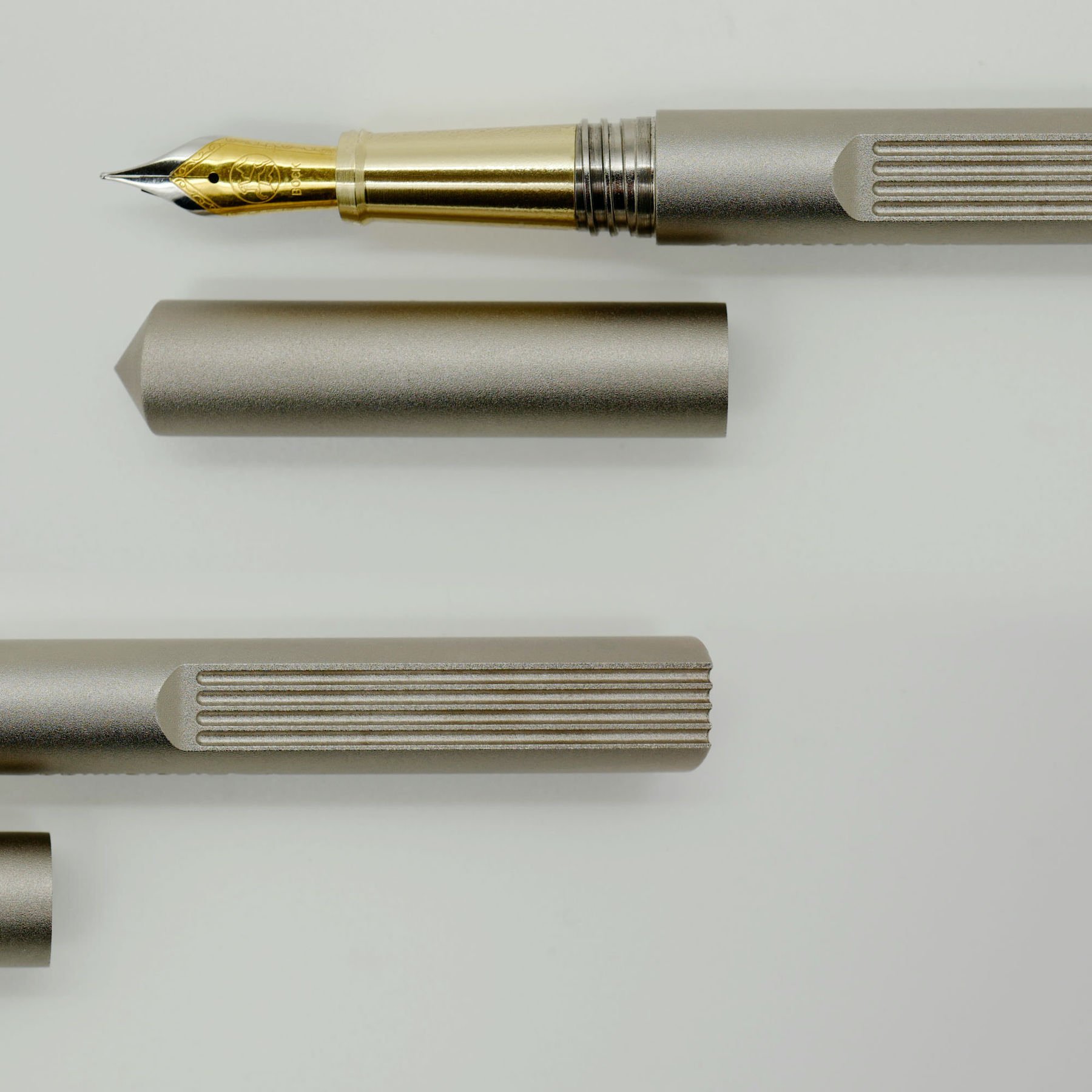
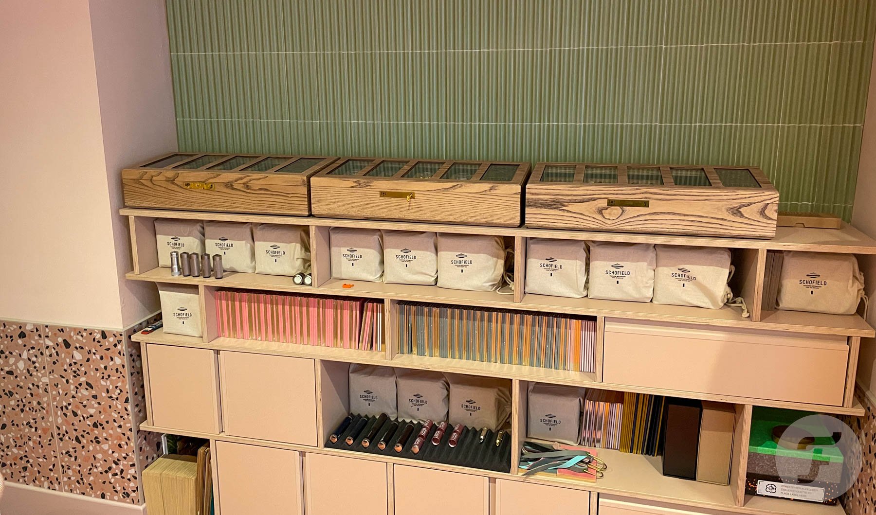
The pens
If you’re a fan of the things Giles makes under the Schofield banner, you simply have to watch the above video. In it, he explains the new ballpoint mod-kit available for the current range of Schofield fountain pens (or as the standard set-up when you buy the pen in the first place).
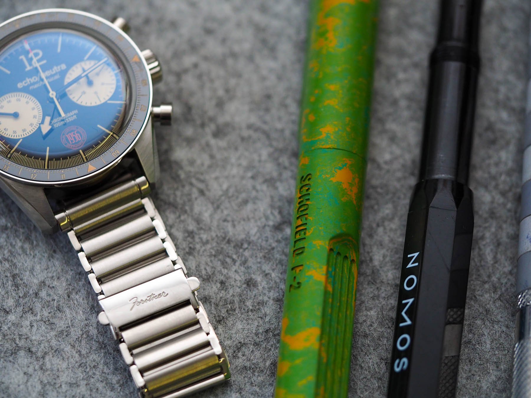
Right there in the middle, sandwiched between an echo/neutra 1956 Cortina on a Forstner Klip bracelet and a NOMOS Glashütte fountain pen…
I own a green and yellow P2 fountain pen, but I write by hand very infrequently. As such, I am considering adding the ballpoint kit to my pencil case very soon. If I were buying again, however, I would buy the aluminum pen Giles shows in the video. The weight and balance of that thing are absolutely phenomenal. I’m actually not a big pen collector, but I might have to become one if he keeps this up.
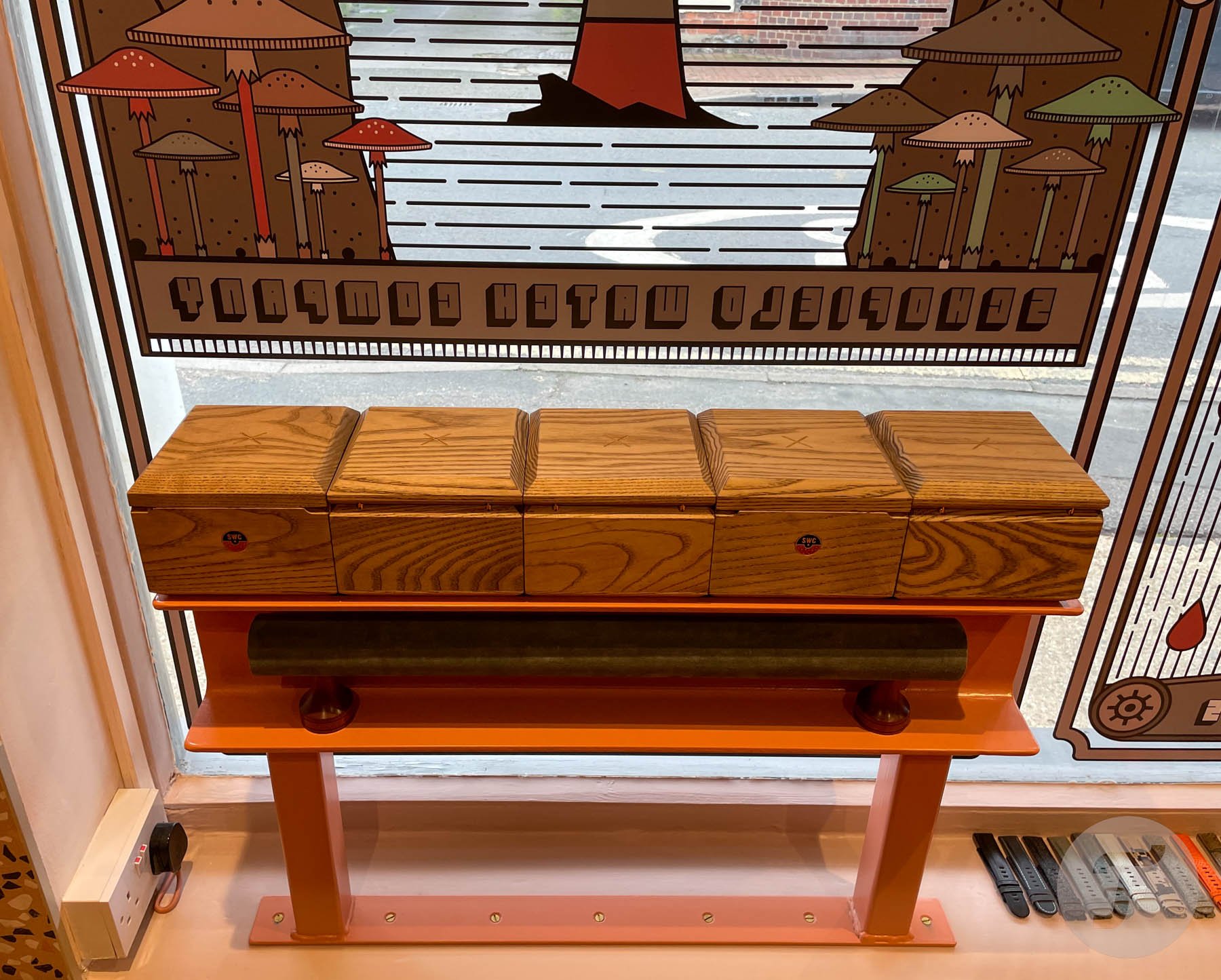
The clock
Despite having some limited experience with fixing clocks, I don’t own any particularly good ones. To be frank, there aren’t that many on the market these days. I am very keen on the soon-to-be-released Junghans kitchen clock in baby blue, but beyond that, decent analog options are limited.
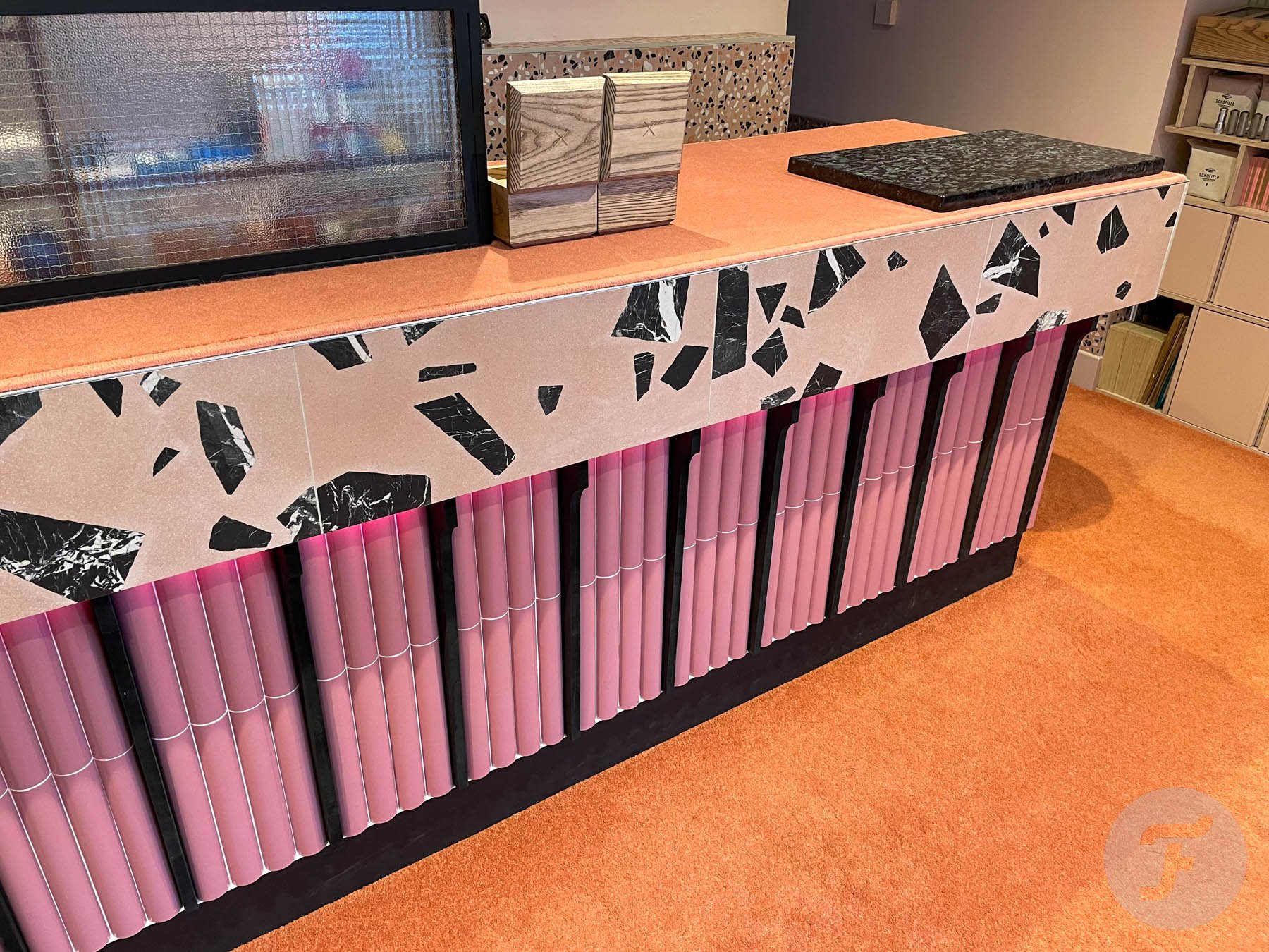
All the details in the Riverside Store, Upper Beeding, England, add up to create a unique and inimitable shopping experience…
Giles has created something very, very special with the Schofield Watch Company Small Wall Clock (the SWC SWC). It is machined from a solid billet of aluminum before being nickel-plated, and it weighs a ton. The dial, with its red SWC logo at 6 o’clock, is printed by a watch dial printer as opposed to a clock face printer. This ensures better design fidelity and sharpness. It has a luminous sign o’ life seconds hand and legible stick hands for the hours and the minutes. The coolest bayonet closure on the back encloses a high-frequency Seiko-made quartz movement. Its batteries should last about a year and take about ten seconds to change.

Best of all, Giles spent so much on getting the design just right, he’s likely to make less money on each of these than he does on a single strap. If that isn’t a labor of love, I don’t know what is. The clock will be available in three colors (watch the video to find out what they are). It will be priced around £1,000. Hopefully, it will hit the shelves (and subsequently walls) this month. There will also be the option of purchasing either a desk-top stand or a railway-clock bracket so the clock can be mounted to protrude from the wall (and even have a second clock mounted facing the opposite direction). Not bad at all, eh?
What would you like to see?
I hope you enjoyed these short video chats shot on location in Schofield Watch Company’s Riverside Store in Upper Beeding, England. If you’d like to see more of this kind of content, let me know in the comments below. And, while you’re at it, let us know what you’d like to see from Schofield next. Would you like to see new models? How about new movements or new products? Maybe, you’d just like to see more color options. Whatever it is, I’d love to hear it. Learn more about Schofield Watch Company here.