Speedy Tuesday – Differences in Speedmaster Bezels

Collectors of vintage watches will probably agree with me that it is all about the details. Although the most frequently asked question about collecting Omega Speedmasters are about the dial and hands, the bezel seems to get some attention as well. Through the years, the bezel of the Speedmaster (pre-)Professional changed quite a bit, which makes it difficult to give straight answers most of the time.
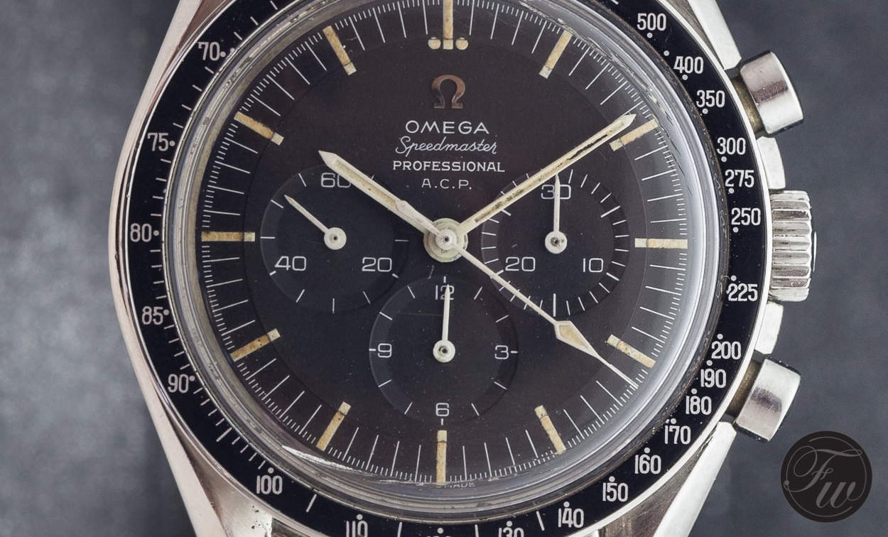
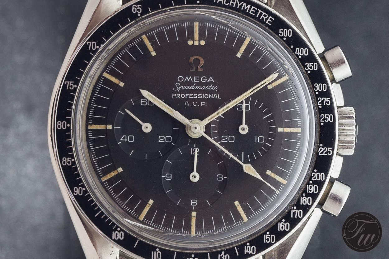 For example, the above Speedmaster Professional ACP (which we discussed here) from approx. 1965 has a bezel that seems time correct, but you could also identify this as a bezel from the 1970s. But what gives it away? How to identify the correct bezel for a particular Speedmaster?
How to identify the correct bezel?
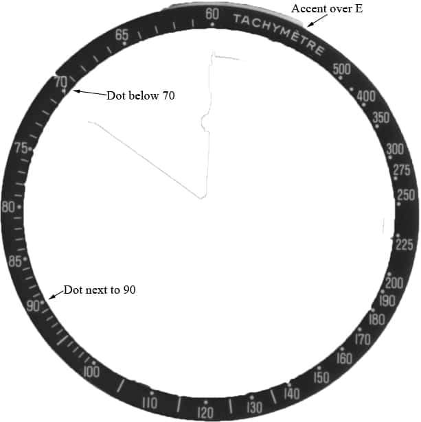
To be honest, it isn’t that easy. Some collector pay attention to the printing, used fonts and whether the ‘Tachymetre’ has an accent on the E or not. Another important identifier is the scale and the dots. The dots positioned next, below or under the number can also help you to identify whether the bezel is correct for the watch.
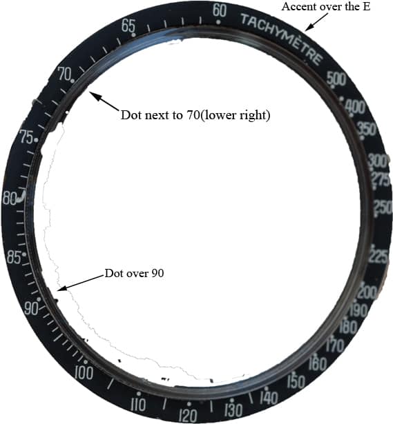
 Looking at the picture above (Ashley Budgen’s Speedmaster Professional with caliber 321 movement), you will see that the Tachymetre is spelled with an accent over the E. Next, you’ll see the dot over 90 and the dot next to the 70, positioned at its lower right.
Personally, I like to use the following ‘chart’ that – friend of the show – RichardEW (see his Speedy Tuesday contribution here) created for his fellow Speedmaster collectors. Basically, it divides the bezels into three categories.
Pre-1970 Speedmaster bezel
1970 – approx mid 1990s Speedmaster bezel
Mid-1990s – modern Speedmaster bezel
That seems to be easy, right? Well, wrong. There are still quite some variations on this topic. For example, some of the limited edition Speedmaster watches seem to have different printing and use of the dots. Also, for the regular Speedmaster watches, there are still some differences in the printing of the words and numerals which make it possible to identify them a bit more ‘spot-on’.
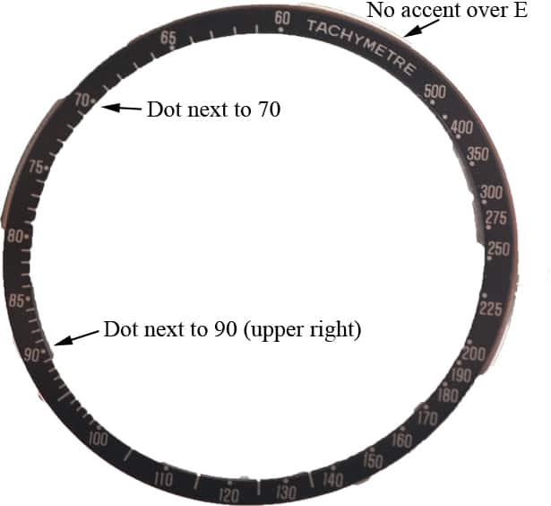
Eptaz, moderator of the Omega Forums over at WatchUseek is of the opinion that it helps to have a closer look at the use if the accent over E and the style of the printing. In short:
– Tall Tachy text with no accent over E – started to appear in late ’60s, at least through ’80s
– Tall thicker Tachy text with no accent over E – less common, seen in early ’90s
– Squat Tachy text with accent over E – started to appear in ’90s, currently still in use
– Squat Tachy text with no accent over E – less common, seen in mid-90s (possibly only on Special/LE models?)
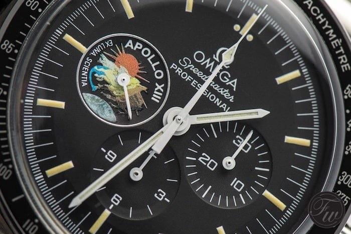
However, looking at some of the Speedmaster watches in my own collection it might still be different. The NOS Speedmaster Professional Apollo XIII I have for example, is a mid-1990s limited edition (999 pieces) which definitely has the accent over the E, but with a squat Tachy text.
Then, there are also some cases of misprint and totally different scales (telemeter, pulsations etc). You might be lucky when you have one with different scales, as Omega documented their production and deliveries quite well. An extract of the archive might mention the special tachymeter scale. In the case of the misprint, for example the printing of ‘220’ on the bezel, you will be just lucky to find one. These are quite rare.
I am confused! Now what?!
Do not worry! Let’s start with the good news: Unlike collecting vintage Rolex sports watches like Submariner and GMT-Master models, incorrect details on the Omega Speedmaster watches do not have a huge impact on their value. Unless you are talking the really early Speedmaster watches from the late 1950s, early 1960s. You are (still) quite safe if you are looking at the reference 105.012 Speedmaster watches and later models. I am happy to tell you that Speedmaster enthusiasts & collectors are a bit more down to Earth than, let’s say, their Rolex counterparts.
In the case of misprints, you might pay an addition premium for that particular reference. The same goes for Speedmaster watches of which has been identified to be delivered with an original red/orange hand.
Now for the bad news, since there are quite a few variations of the Speedmaster bezel, it is really difficult to identify whether a bezel was delivered from factory on your watch. In my opinion, you should at least try to have a time-correct bezel, but I would refrain to get into the nitty-gritty details as you will find yourself paying too much money and effort in finding the grail bezel for your watch. In the end, Omega didn’t seem to pay that much attention as well (hence the misprinted bezel that was in an early 1970s batch). This also resulted in having a few transitional models, of which the 1968 model with the caliber 861 movement but with dial that has the applied Omega logo is the best example. “Empty your stock before you start taking the new stuff” must have been the assignment in those days. It has its charms of course.
More on this topic can be found here, here and here. I also suggest to take a look at Alberto Isnardi’s book on the Speedmaster.
Happy Speedy Tuesday!