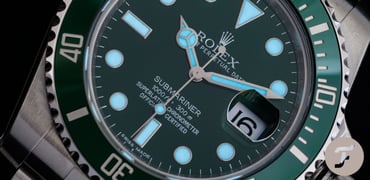
Sunday Morning Showdown: Omega Seamaster 300M 2531.80.00 Vs. Seamaster 300M Co-Axial Master Chronometer 210.30.42.20.03.001

We seem to be on a dive-watch kick lately on Sunday Morning Showdown. Last week, it was a battle of the Rolex household (more on that shortly), but this week, we head over to Biel with our time machine and put old versus new on the battlefield. As you know from the title, this week’s battle will be Seamaster versus Seamaster. Less than fifteen years stand between this week’s contenders, and though the Seamaster DNA is strong, these two could not be more different. So today, it will be Nacho and Jorg that clash, each on the side of one of these two modern icons, to see which of the two takes the crown home. But, as always, that’s up to you and your vote. So make sure you read through until the end and cast your ballot for who you think should emerge victorious.
In a dozen years, between the discontinuation of the Omega Seamaster Professional 300M 2531.80.00 in 2006 and the introduction of the Seamaster Diver 300M Co-Axial Master Chronometer 210.30.42.20.03.001 at Baselworld 2018, a lot changed. Yes, reference numbers got a lot longer and much harder to memorize. But this classic blue Seamaster, introduced 30 years ago in 1993 in its classic quartz incarnation (2531.80.00), changed in almost every way imaginable. Only its overall silhouette with the distinct scalloped bezel, signature twisted lugs, and the ever-present helium escape valve remains. But is it a case of innovation and improvement? Or was the original inimitable in its perfection? Will ’90s nostalgia and visions of Brosnan’s Bond prevail? Or has ceramic conquered the hearts of watch enthusiasts and collectors? Personal preference will always play a role, but ultimately, the vote is yours, so choose wisely; only one can emerge victorious.
The crown holds on to its throne
About last week… What a showdown, indeed! The Fratelli flocked in to cast their votes like never before, and heated discussion brews in the comments even one week on. Ultimately, Rolex kept the crown and won the showdown with 56% of the vote. Is it an exaggeration to label this a close call? I don’t think so. It seems that there’s a new generation of watch enthusiasts for whom Rolex has become unobtanium and, therefore, has lost some of its appeal. Tudor remains a brand that offers decent value for money, and availability is rarely a problem. You could certainly argue that this detracts from the image somewhat since a certain difficulty in obtaining something adds a lot of satisfaction when it’s finally in your hands. But does the thrill of finally getting the call from your AD outweigh the frustration of waiting?
Ultimately, it comes down to personal opinion and how willing you are to compromise. That, coupled with your income and savings, will certainly make quite a difference. Regardless, with 150 comments on that article you all had a lot to say. Today’s duel may be slightly more straightforward, but we are keen to see what you think. It’s a debate that pops up from time to time here at Fratello HQ. Will today’s result settle it? I can’t imagine it will, but one thing is certain: we’ll be wiser about what you, our readers, prefer. So, will you be on Nacho’s side, rooting for aluminum bezel inserts, small-wave dials, and the 41mm × 12mm sweet spot? Or will you side with Jorg and his brand-new ceramic, laser-etched dial, 42mm modern Seamaster 300M? Read on, and as always, leave your vote below!
Nacho and the Omega Seamaster Professional 300M ref. 2531.80.00
It feels good to kick things off this week! Chronological order of release is on my side as I look to sway you all in favor of my pick, the old but gold Seamaster Professional 300M 2531.80.00. I hope you’re ready, Jorg, because I’m feeling confident in my choice, and I know that our audience has a soft spot for the watches of that early 2000s sweet spot. I’m not pulling any punches, though, as it’s clear that in some technical aspects, you have the upper hand. But for me, it’s all about materials that age and develop character. Like a pair of good leather boots, it’s nice when they’re brand new, but so much better once they’ve broken in and developed a unique patina. But that’s not all, my friend. I have one other heavyweight factor on my side that I think could make all the difference.
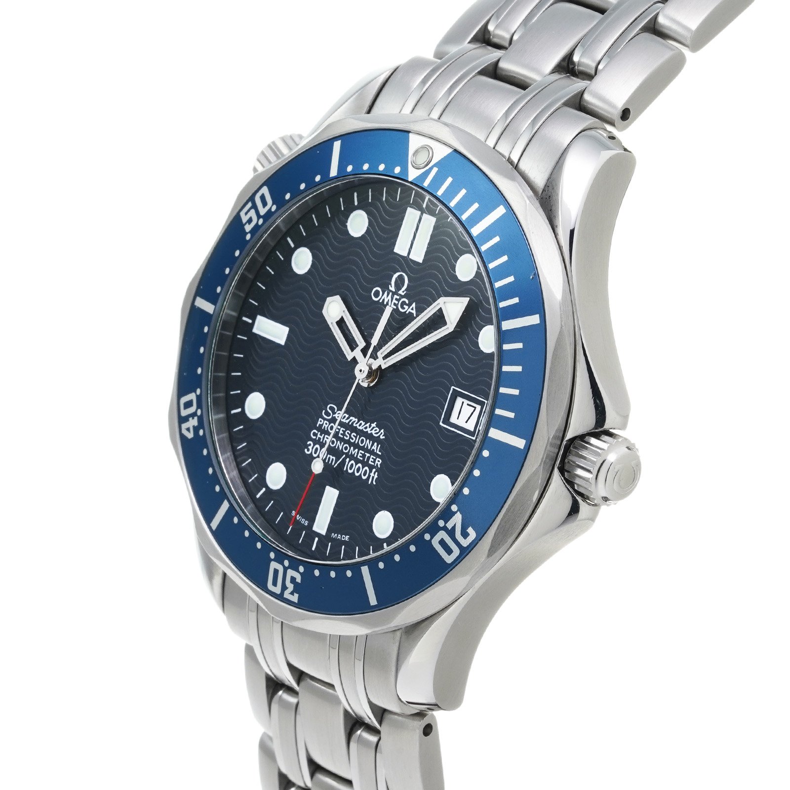
Image: Watchnian
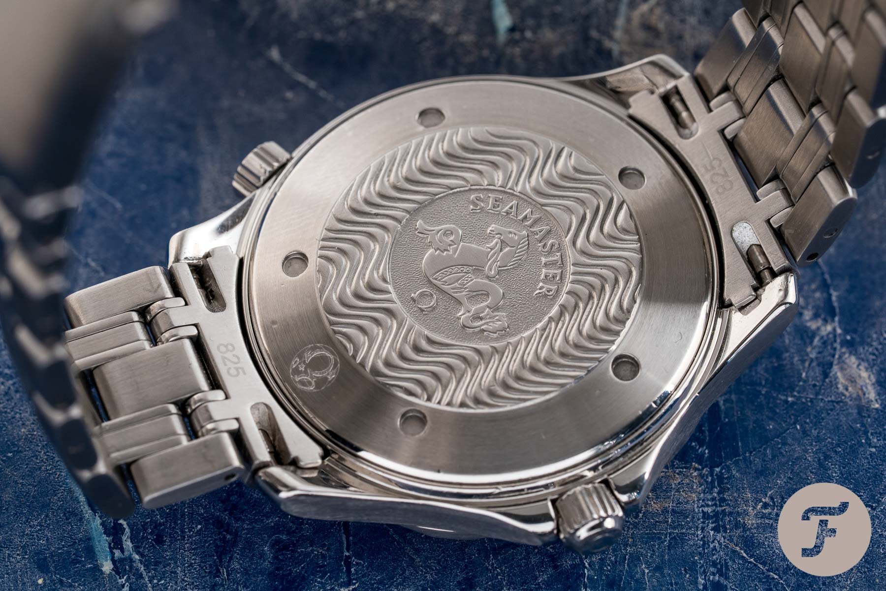
There are two things to note before I kick things off. The first is that we will pretend that the awkward mid-2010s reference 212.30.41.20.03.001 doesn’t exist. Don’t get me wrong, it’s not a bad watch per se — if you have one and you absolutely love it, please go on loving it — but in a battle of old Seamaster versus new, it’s definitely the worst of both worlds (and then some). The second is that I recently picked up a Seamaster 2254.50.00 from 2006. This is the black version with sword hands (my favorite Seamaster diver ever made), but it sat in the collection alongside its blue counterpart. So, in a way, I’ve put my money where my mouth is. I wholeheartedly stand with the aluminum-bezel beauties of the late ’90s and early 2000s. That said, let’s jump into it!
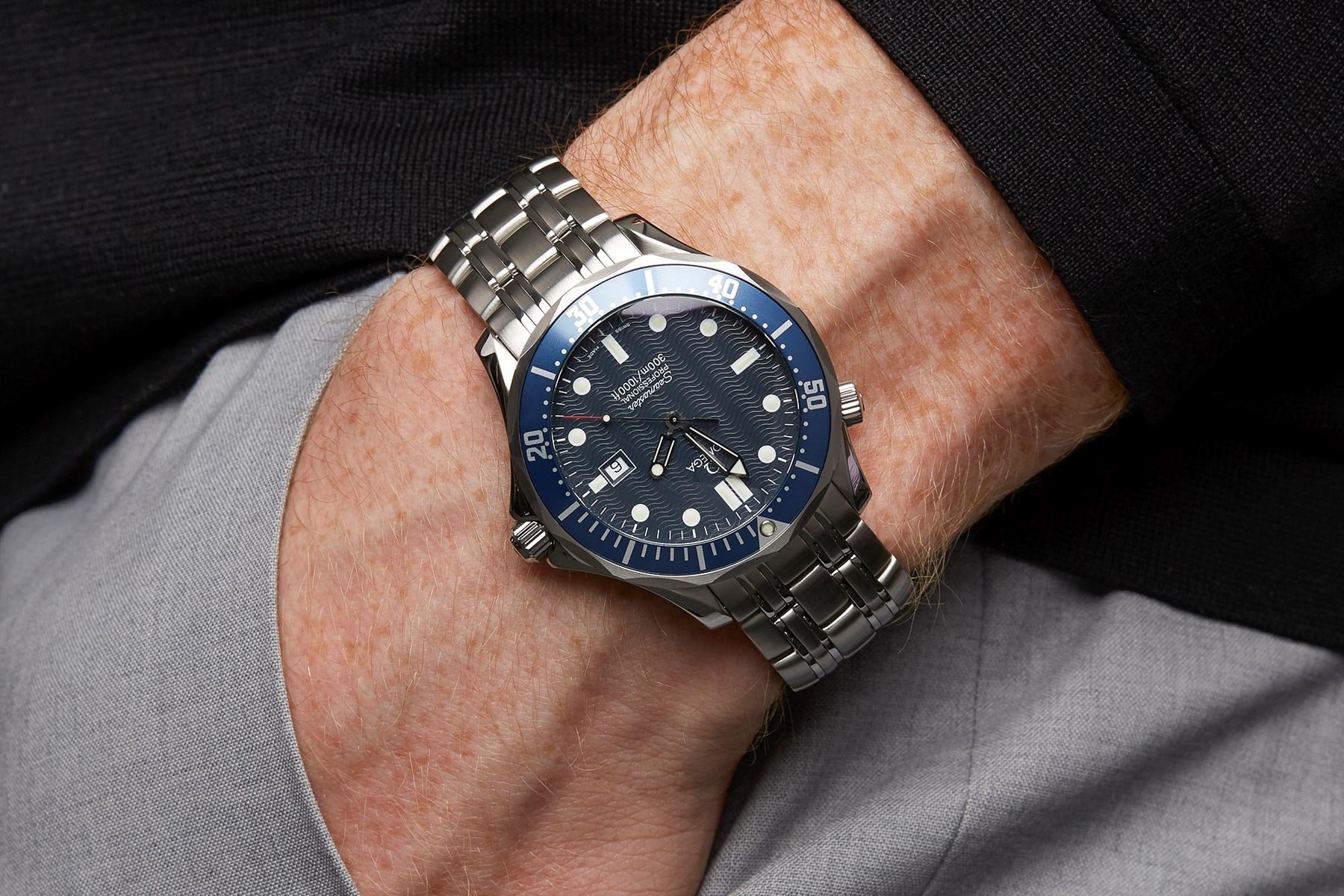
Image: Xupes
Making waves, not ripples
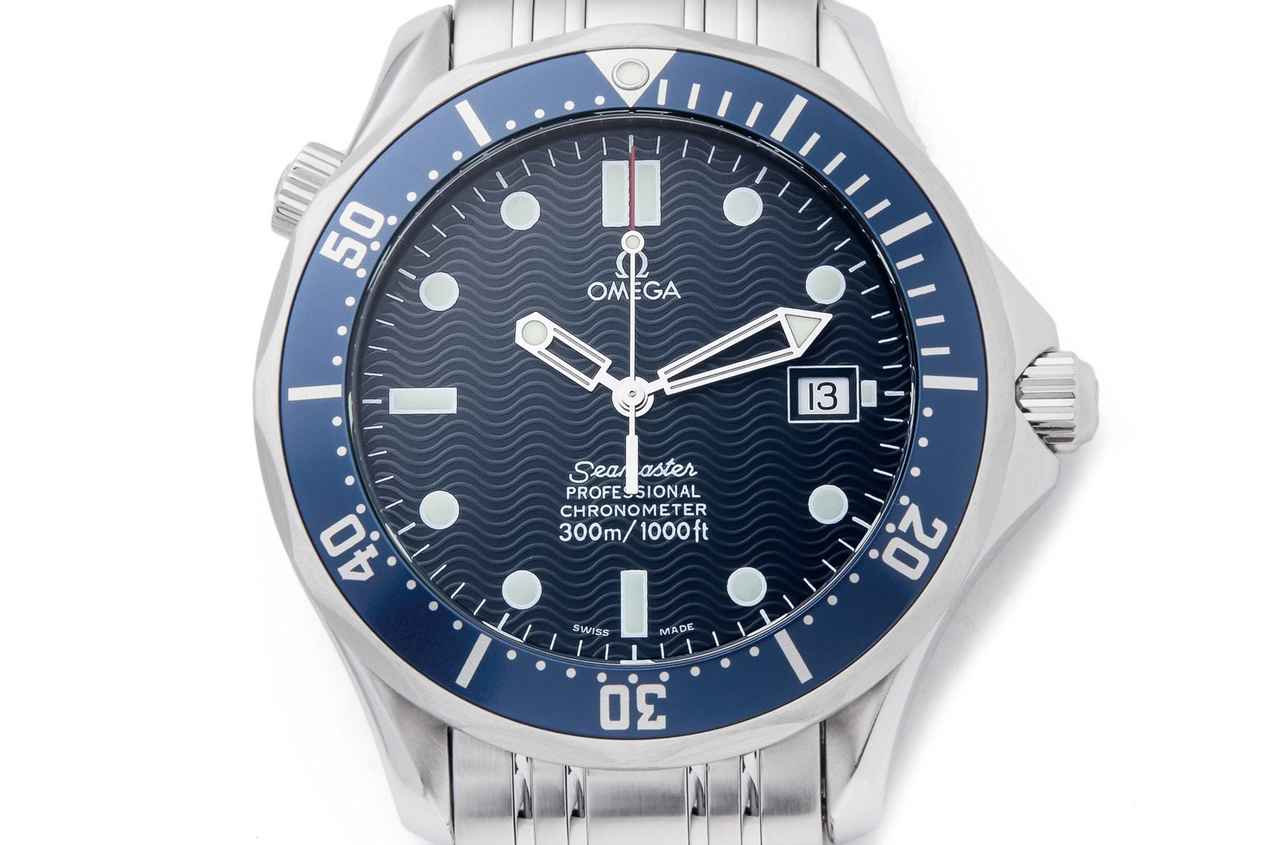
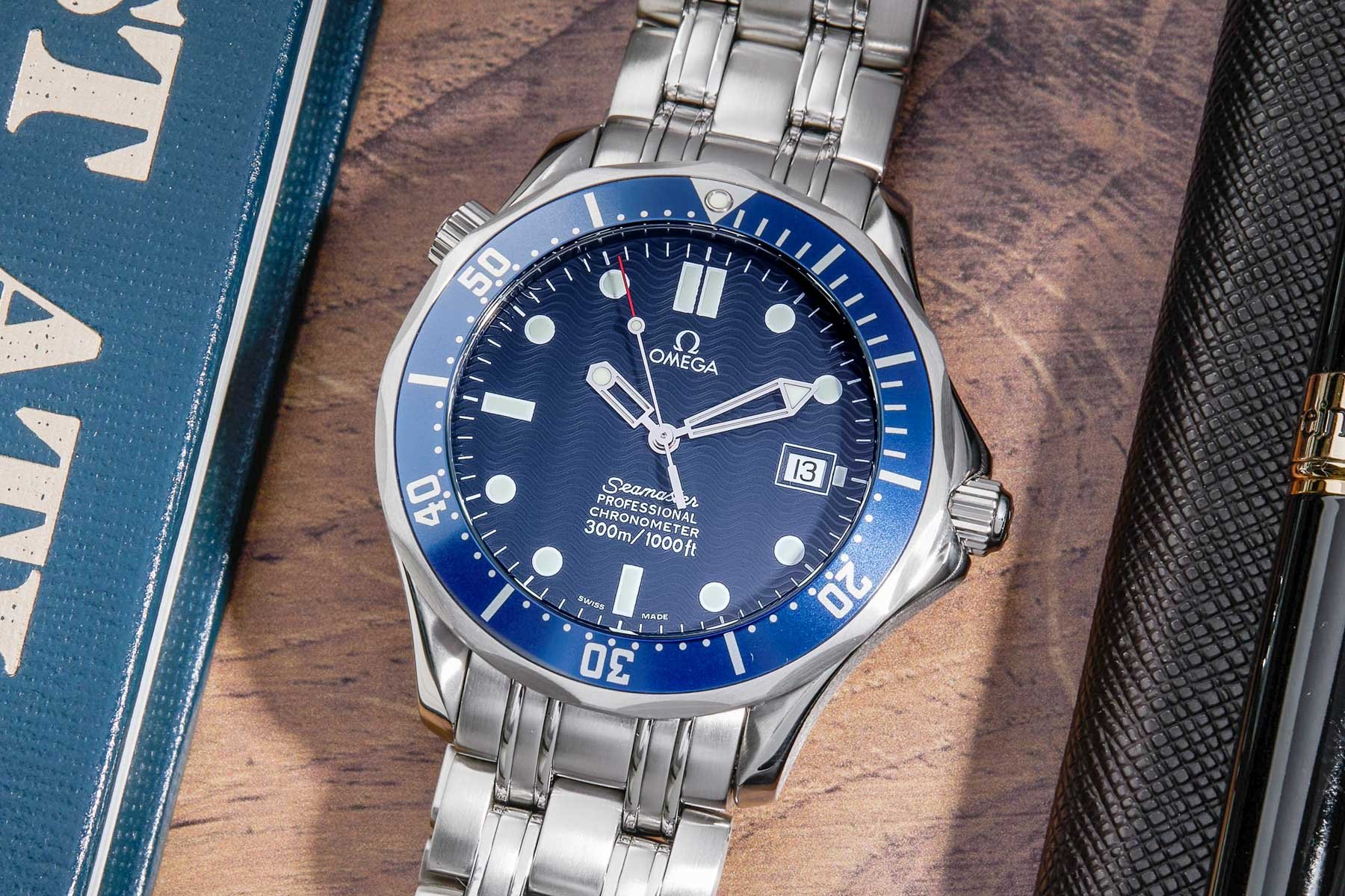
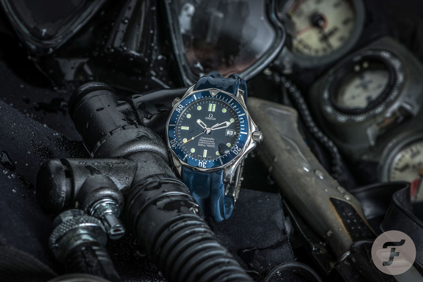
Now, one of the first key differences you’ll notice when looking at these watches can be found in their dials. The Seamaster 2531.80.00 has the classic wave dial that everyone has come to know and love. This guilloché-like texture is present throughout the full dial, including the outer minute track. It plays with the light in a unique way, disappearing and appearing, the waves shifting from dark blue to white as they reflect light. If you haven’t seen one of these in person, you’re missing out. It truly is a beautiful thing. However, the main thing lost in the new models is the dial’s subtlety. The older dials are completely matte with no applied elements whatsoever. Only the hands catch the light with their unique gleam (another distinctive element also not found in later models).
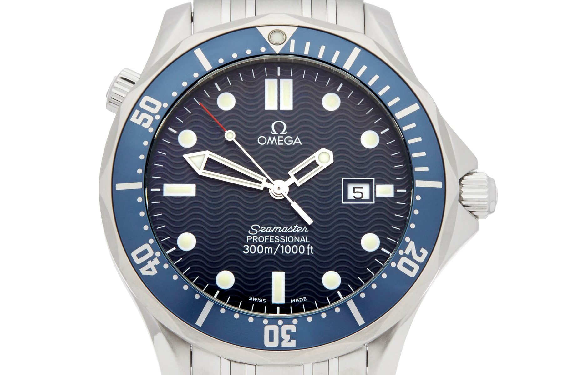
Image: Xupes
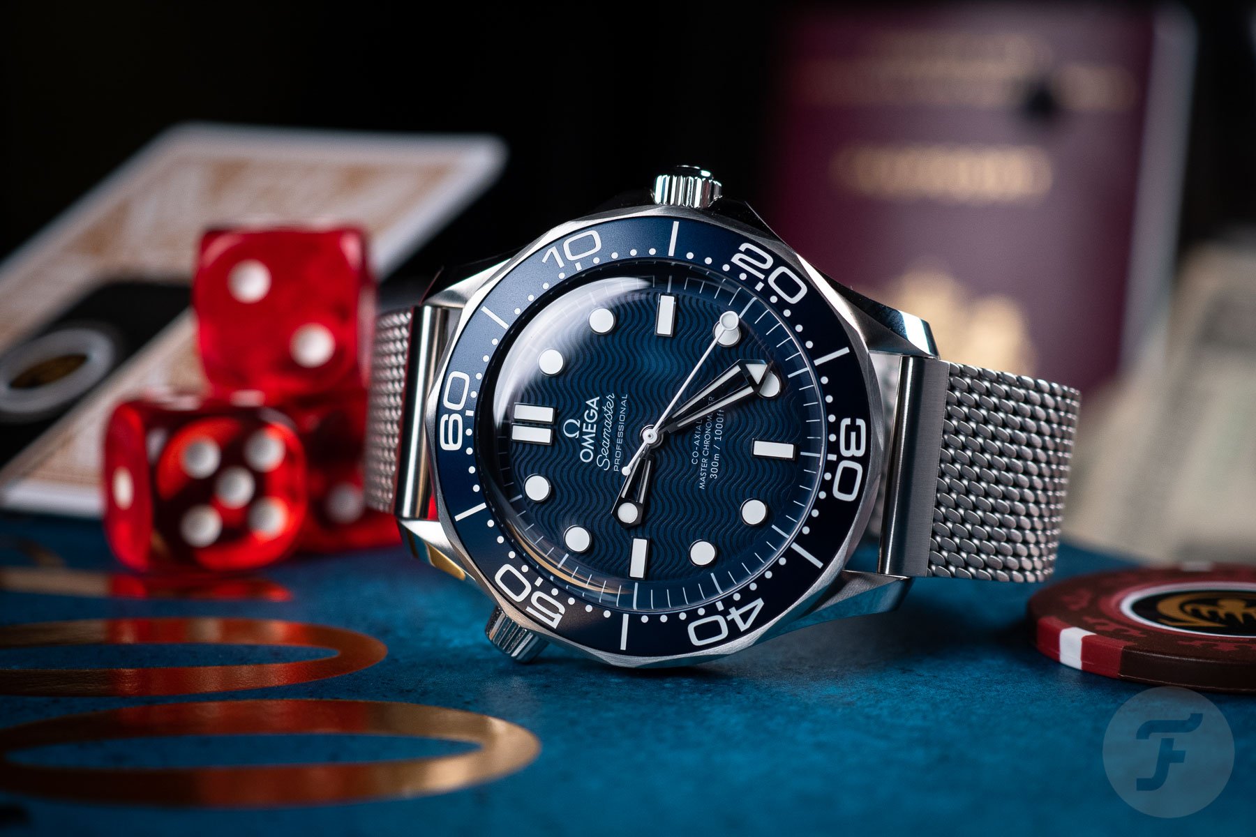
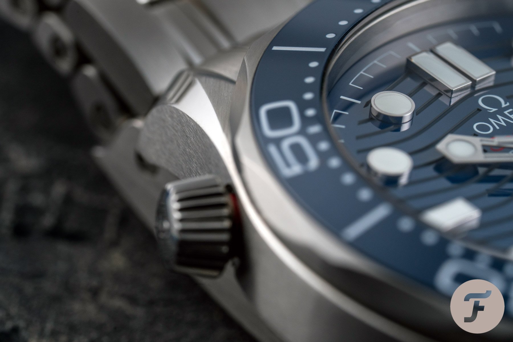
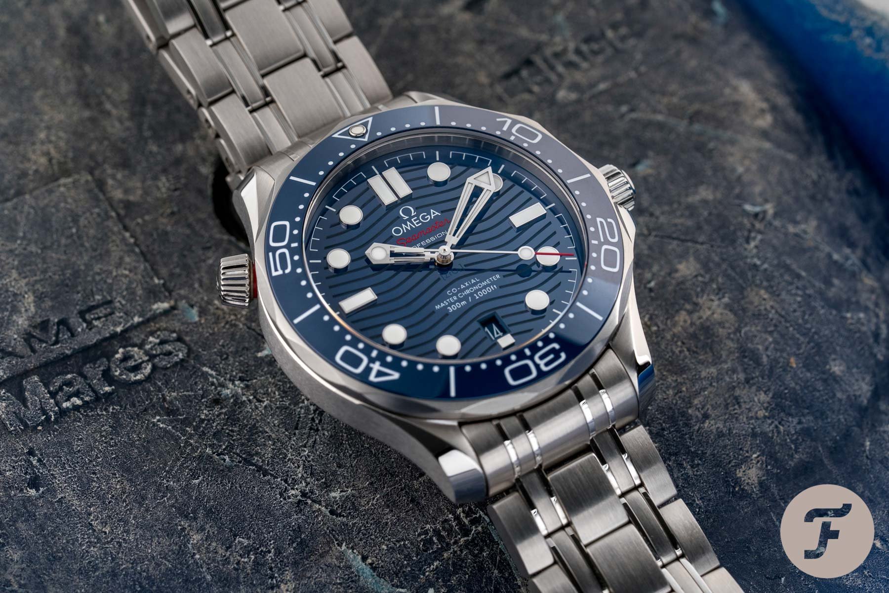
The white text and luminescent markers contrast beautifully and crisply against the subtly textured backdrop. There’s a certain understated elegance that one can only appreciate after staring at one of these dials up close in the light. By contrast, the new Seamaster’s dial is equipped with deeply laser-etched… ripples? You can’t call them waves, especially not compared to those on the classic 2531 dial. There are fewer of them (19, to be exact), and the wave’s amplitude is severely reduced. The fact that the dial’s surface is glossy (even the lume markers look glossy) betrays this diver’s tool-watch roots. The bezel is equally shiny and abandons the classic SMP numerals in favor of a more Planet Ocean-like look. But this is not the only point where the new watch loses some of the original’s charm and character.
Dumbing it down
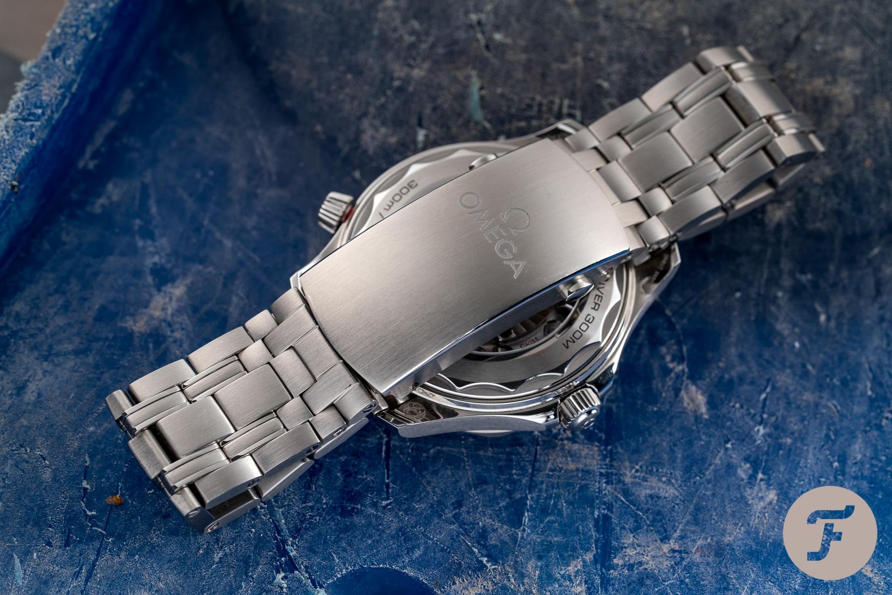
That’s right; in some way, the subtle intricacies of the original are watered down or even ironed out in the new Seamaster 300M. I find that removing some of the organic curves from the bracelet is a big loss. It removes character and dumbs the watch down. On top of that, the helium escape valve’s crown on the new model looks like the bottom of a cupcake — surely, a tapering crown is more prone to slipping through the user’s fingers? Then there’s the text distribution on the dial. The old model puts the brand and its logo up at 12 o’clock, with the rest of the information below the hands at the 6 o’clock position. The date is placed at 3 o’clock in the most traditional manner. Is there too much text on the 2531? Maybe. There will always be differing opinions on this, but I, for one, enjoy it.


But what’s worse than four lines of text at 6 o’clock? That’s right, three at 12 o’clock and three at 6 o’clock (and that’s not counting the completely unnecessary stamp of the elemental formula of ceramic under the central pinion). The entirety of the 6 o’clock area in the modern Seamaster 300M is a mess. The dial text is too high, the date window is also, and the stubby marker looks silly, leaving too much space for the minute track and “Swiss Made” print. Do I love “Swiss Made” printed on either side of the full marker on the 2531? Not really, but at least the dial is far more balanced. It’s also devoid of color, which adds to its understated look, whereas on the new model, the color leaks from the seconds hand (where it serves as a visual aid) to the “Seamaster” wording (which is distracting and tacky).
What could have been…
Now, don’t get me wrong. Contrary to what you might have gathered, I don’t hate the modern Seamaster 300M. I seriously considered buying it as my first “real” watch back in 2020. Instead, I went for a Speedmaster and never looked back, but it’s not a watch that I wouldn’t happily wear. I just find it a shame when we look at what could have been. This is something that we would have had to use our imaginations for until late last year. But then Omega introduced the reference 210.30.42.20.03.002. For those who don’t speak calculator, that’s the Seamaster Diver 300M James Bond 60th Anniversary. And what a watch it is! The wave dial returns, aluminum is back, and almost all of the elements make sense again. Many of the points I critiqued remain, but I find it the most appealing Seamaster in the collection today.


Well, I would if it were a standard production model without the Bond animation on the case back. It shows us what could have been — where Omega could have taken the Seamaster Professional, staying true to the original while modernizing it. Sure, you could use matte ceramic instead of aluminum (though nothing beats how aluminum catches the light and how it ages and fades over time). I also get that watches grew at some point. Hell, even Rolex models gained a millimeter or two. And though the change in diameter doesn’t bother me much, it’s the thickness that I can’t stand. The new Seamaster 300M is 13.6mm thick, whereas the 2531 is a slim 11.7mm. It may not seem like much, but it certainly feels like night and day on the wrist. That’s the last major point I have before moving on to some quick bullet points and handing it off to Jorg.
Lightning round
For this final section (and yes, I promise it’s the last one), I just wanted to list a few points that I prefer on the 2253.80.00 that the 210.30.42.20.03.001 simply cannot match. The first one is simple, and it’s a matter of price. The 2531 had a retail price of €1,700. Today, pre-owned examples trade at an average price of €2,350. As of this month, the current Seamaster 300M has a new retail price of €6,300. That’s quite a bit more to start with, and somehow, sadly, the average price for a pre-owned example is about €3,750. Ouch. These are all facts and figures from WatchCharts, which reveal that perhaps there was more value to be had from the old Seamaster than the new. Sure, you have a new (more difficult and expensive to service) Co-Axial Master Chronometer movement. But for a tool watch, isn’t the humble ETA-based caliber 1120 good enough?
I can only speak from my own experience, but my 2254 (with the same movement inside) has not been set in about a month now, and it’s only 2–3 seconds off from when I set it on the first day I got it. So not only is it a reliable timekeeper, but it also retains the tool-watch charm. It’s not overly shiny and flashy. It’s not an object of luxury. It even found its home on James Bond’s wrist, only to be replaced by the Planet Ocean, and now a tailor-made watch that does away with some of the shiny luxuries of the modern SMP. Sometimes, if something isn’t broken, it’s best not to fix it. And I think that’s what we see when we look back at the Omega Seamaster Professional 300M 2531.80.00. With that, I hand you over to Jorg, representing the most modern (and shiniest) of Seamaster divers.
Jorg: Omega Seamaster Diver 300M Co-Axial Master Chronometer ref. 210.30.42.20.03.001
You definitely had plenty to say about the two Seamasters, Nacho! My history with the Seamaster 300M actually starts with the watch that you so passionately defended. Back in the early 2000s, when Robert-Jan and I became friends, he used to own a Seamaster Professional 300M 2531.80.00. I got to wear his long-term on several occasions. And back then, as you explained, these watches were very affordable. It’s also why RJ suggested on numerous occasions that I buy one. It would have been the perfect first mechanical luxury watch after starting my first job. While I would have absolutely adored owning one because I love the brand and the Bond connection that it comes with, the design came with certain flaws or aspects that you could call “an acquired taste.”
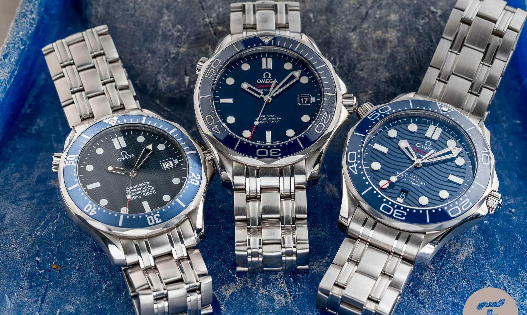
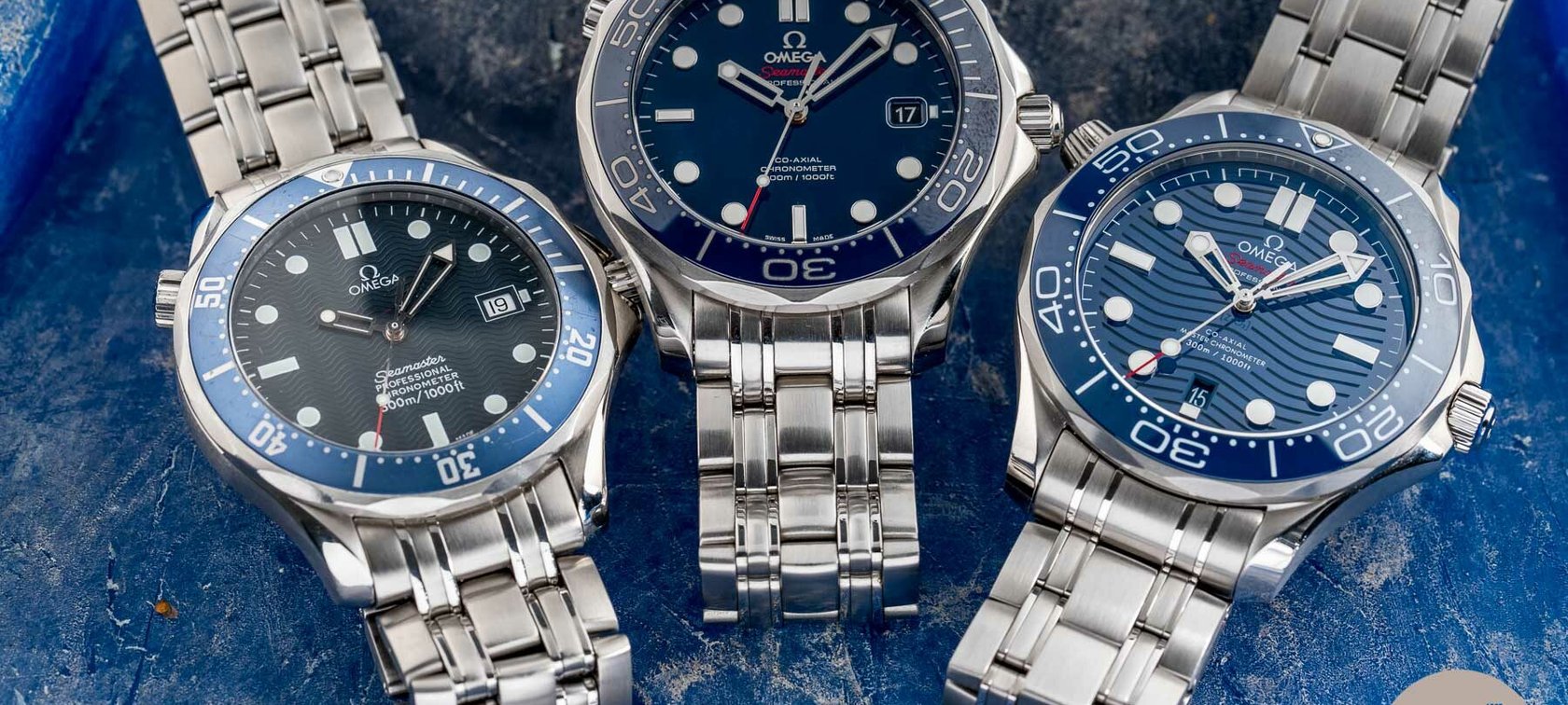
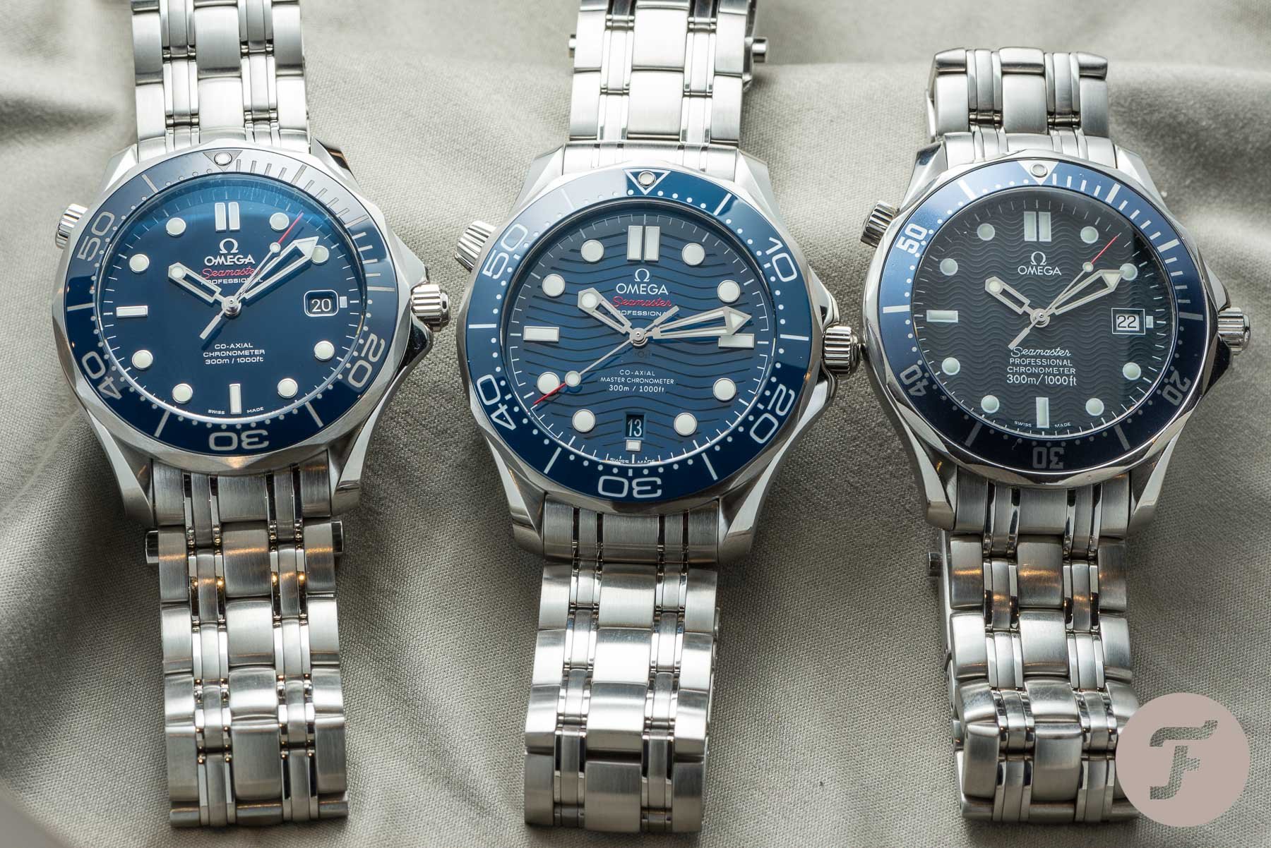
Three generations of Seamaster 300M watches
The old Seamaster Professional 300M is a lot to take in
It starts with the overall feel that the watch gave me back then and still does over two decades later — there is too much going on. With all its angles and facets, the case design of the watch has never been my favorite. While it’s a great design for many people and a fantastic piece of engineering, my heart never really embraced it. With an intricate design like that, one thing that could help is a nice, toned-down bracelet. But Omega decided to go the opposite route and create a bracelet that was even busier than the case design with all its intricacies.
And I do realize that the combination of the case and the bracelet makes the Seamaster Professional 300M so recognizable in the first place. Over time, the sentiment for this recognizable style has grown tremendously. Add the connection to James Bond and it’s easy to see why so many people love the watch. And in all honesty, I share that sentiment. I love it for all it represents. I love how it feels on the wrist, and that’s why I could see myself wearing it again with great joy.
The devil is in the obvious details
But seeing the pictures also reminded me of several other details that I didn’t like about the watch. Let me start with the dial. I agree with you, Nacho; the dial of the old SMP is better than the current one. I remember that back in 2018, Omega made a big deal of the dials and their laser-engraved wave pattern. But the truth is, the old dial has more charm. It is more intricate and feels less industrial. But Omega did hit it out of the park by updating other details that I don’t like about your preferred version. First, the hour markers of the old Seamaster feel too small in relation to the overall size of the watch and the dial in particular.
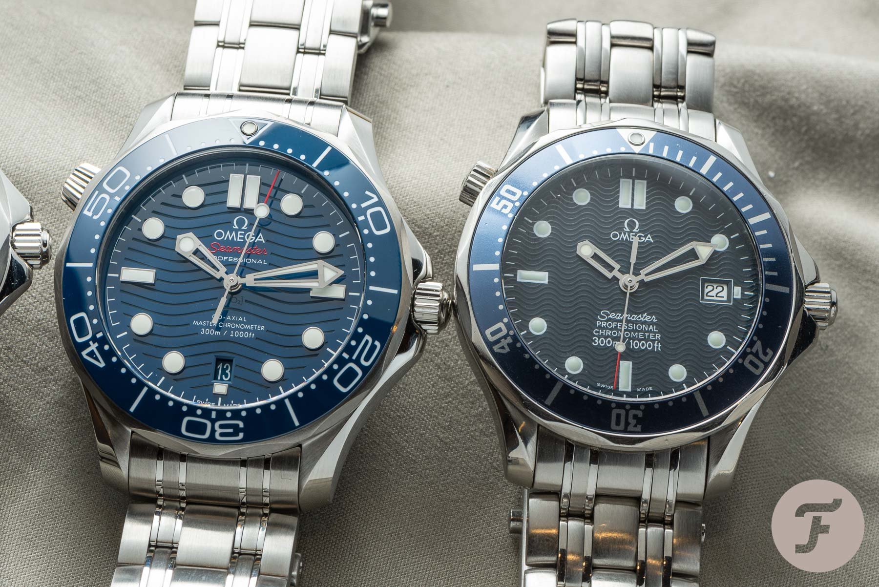
Secondly, the hour hand is way too small and looks almost comical in combination with the minute hand. While I am with you in the preference for an aluminum bezel, again, it’s about the design. The numerals that Omega used for the diving scale on the old version are painfully nondescript. They lack character and size, making them an element that blends in rather than stands out. Lastly, the branding is also poor. With just the Omega logo on the upper half, the designers could have made it bigger, helping to balance out the huge amount of text on the lower portion of the dial. That said, I firmly believe that the “Seamaster Professional” text should accompany the logo. The result of these shortcomings was a watch that I wanted to love so badly but just didn’t.
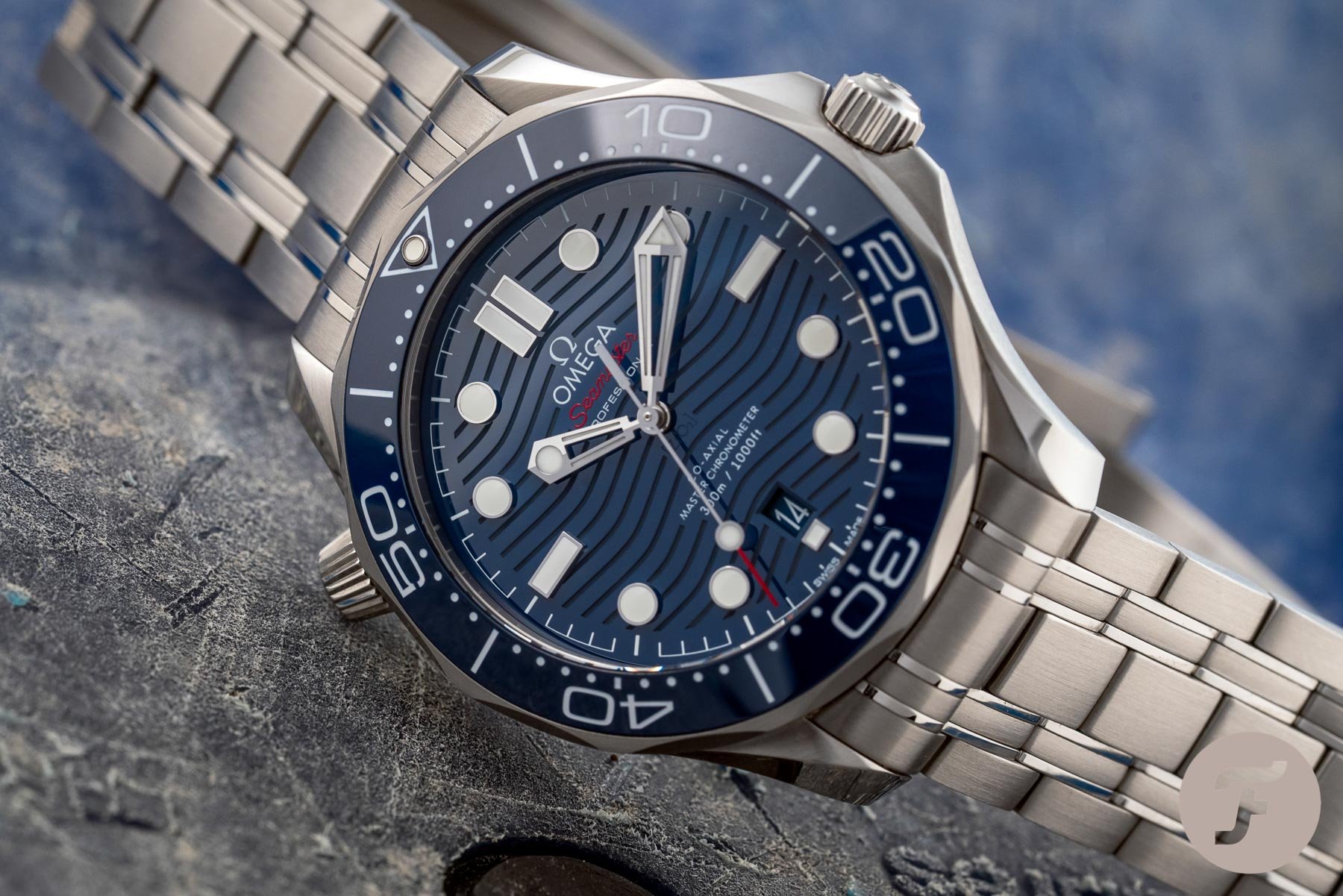
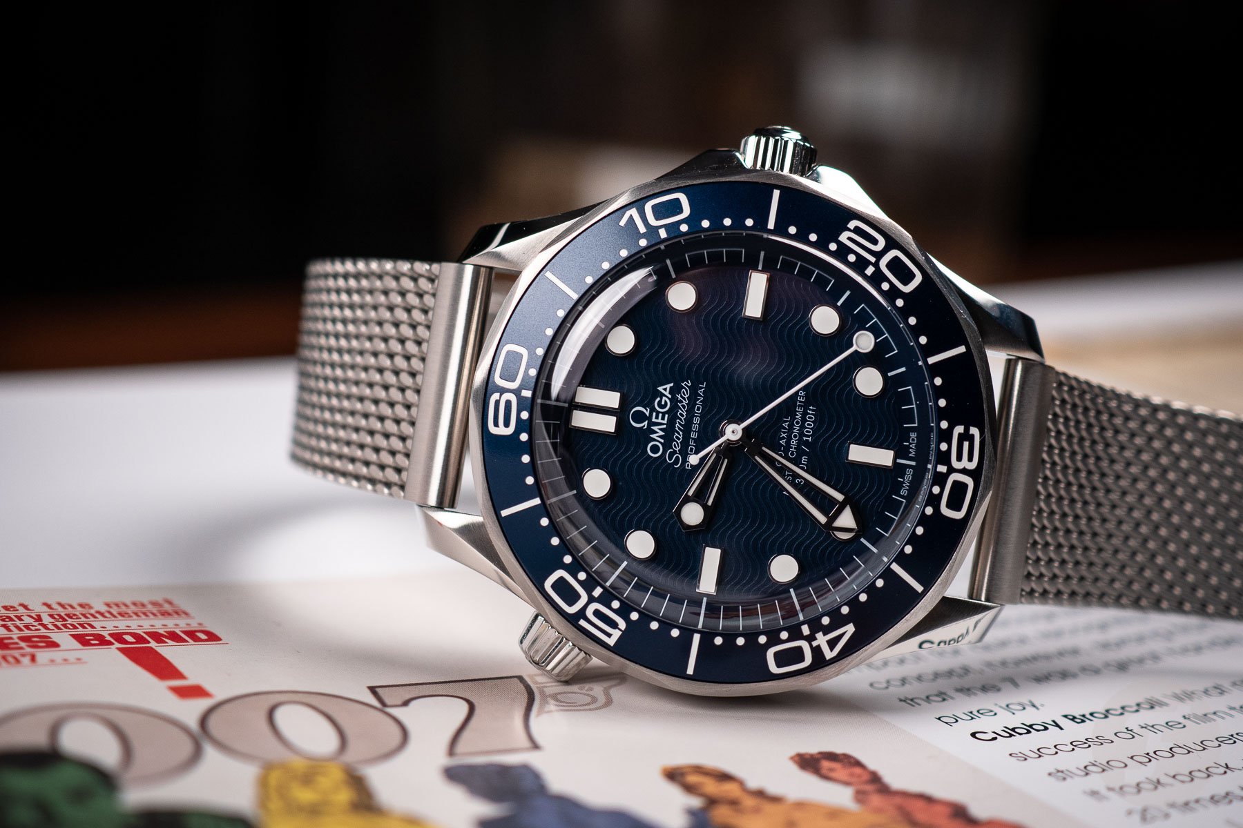
Moving on to the current Seamaster Diver 300M
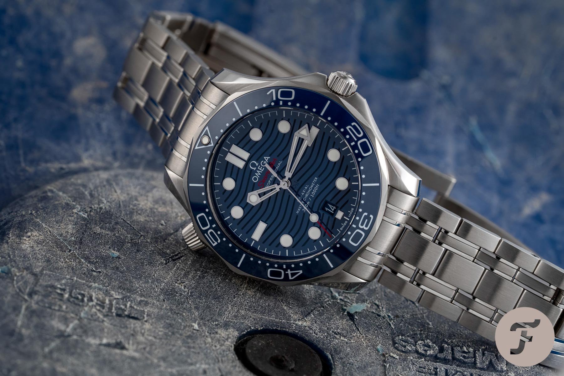
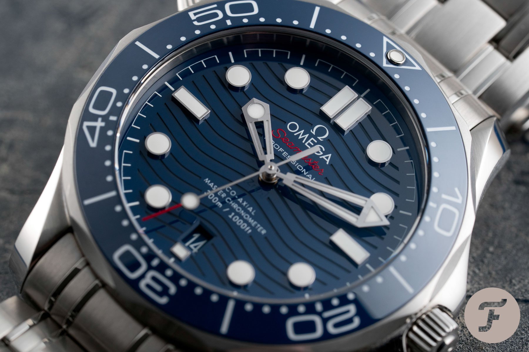
This brings me to the current Seamaster Diver 300M ref. 210.30.42.20.03.001. When it was introduced in 2018, I was incredibly happy to see that Omega gave the Seamaster 300M a visual balance that made sense. All the design flaws that the Seamaster Professional 300M 2531.80.00 had were solved perfectly. The applied hour markers look great, and their size and placement suit the dial to a tee.
The designers also fixed the issues with the hour hand perfectly. Not only did they make it bigger, but the shape was also adjusted to match the minute hand. As a result, the current Seamaster Diver 300M has one of the most recognizable and greatest handsets out there, in my opinion. Moving on to the bezel typography, it is an evolution of the font on the ref. 212.30.41.20.03.001, which was between the two references we discuss in this article. Though we both like to forget that model, the font type does add character and balance and gives the watch its modern presence.
The helium escape valve is a quirky detail I love
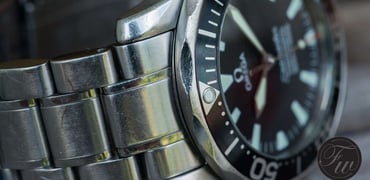
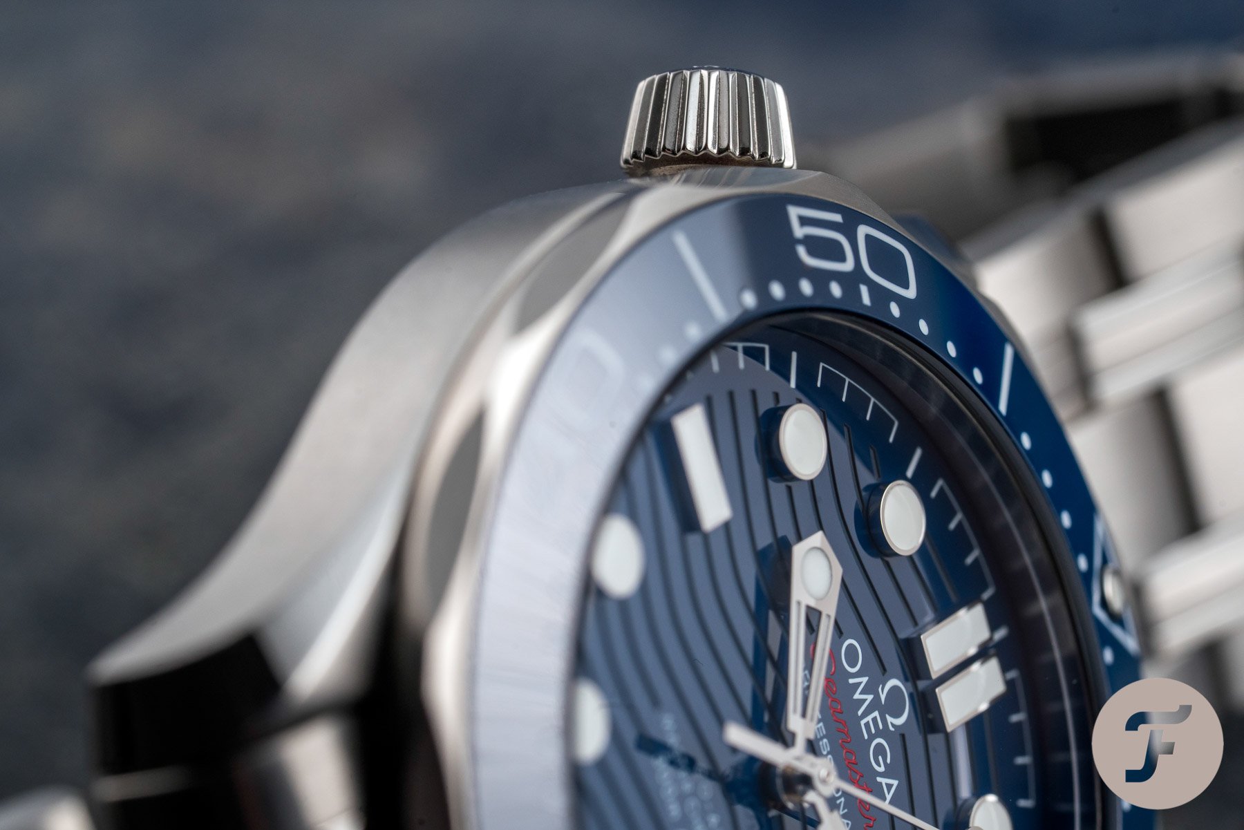
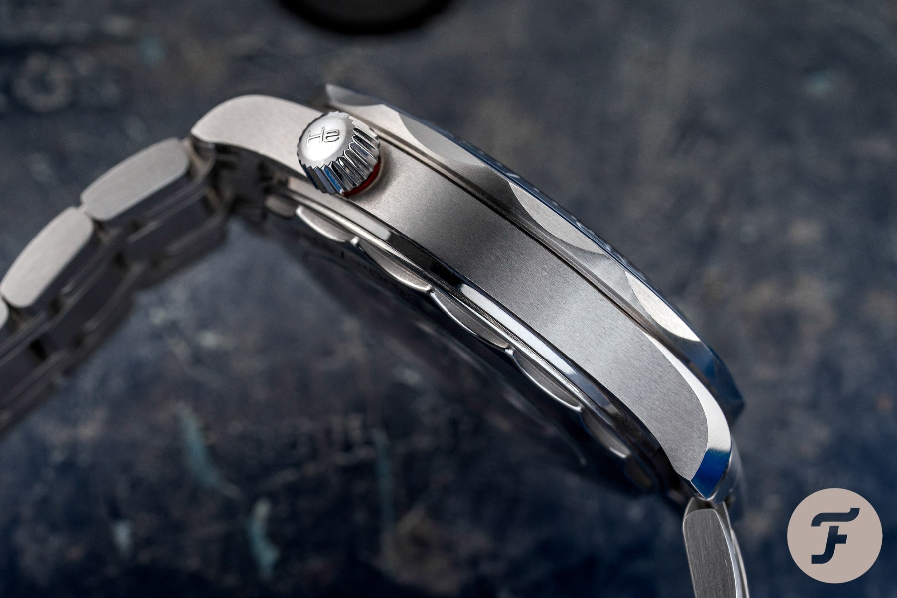
This brings me to the case of that “pesky” helium escape valve (HEV). It’s a detail that so many people hate. In my book, this function-forward feature adds a lot of character to the updated case, which, although thicker, is still very comfortable on the wrist. Combined with the new bezel and design of the bezel insert, it feels more harmonious instead of a jumble of elements. For many people, the conical HEV is too big and draws too much attention. While I won’t deny that it does stand out, I have grown to love it as a quirky design element that adds character to the case. Would I ever use it? Of course not. But I have come to appreciate it for its visual presence.
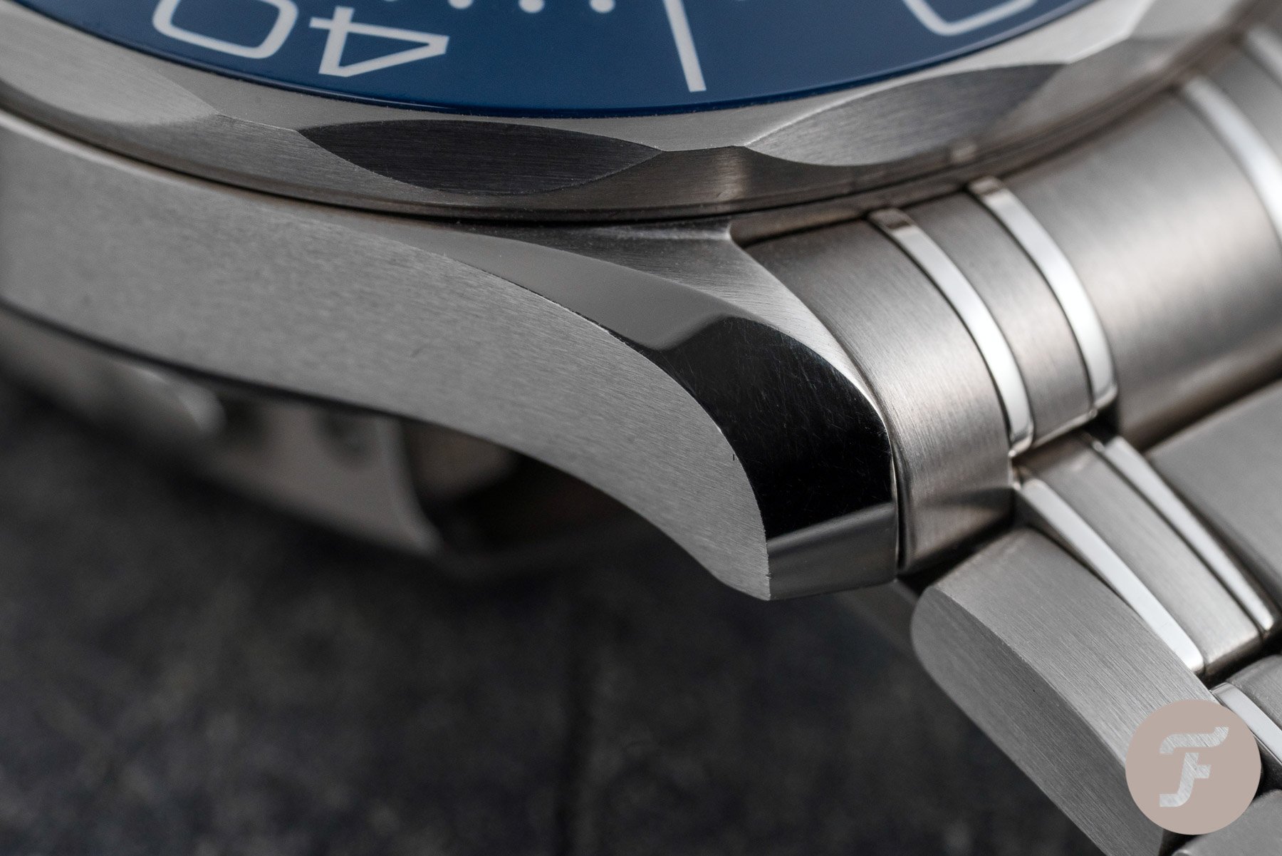
Is everything better on the current Seamaster Diver 300M? Well, some elements are debatable. The first is the case thickness. The older model is an absolute joy to wear. The diameter and slim profile make the case brilliant on the wrist. The new model is bulkier, and when combined with its 42mm diameter, it is far from a humble watch. Another element is the date window. I usually like a date window at the trusted 3 o’clock position. Omega did a great job of matching the date disc color with the dial color and the shape and size are perfectly in line with the rectangular markers at 3 and 9 o’clock. But in all honesty, I’m still on the fence about the placement.
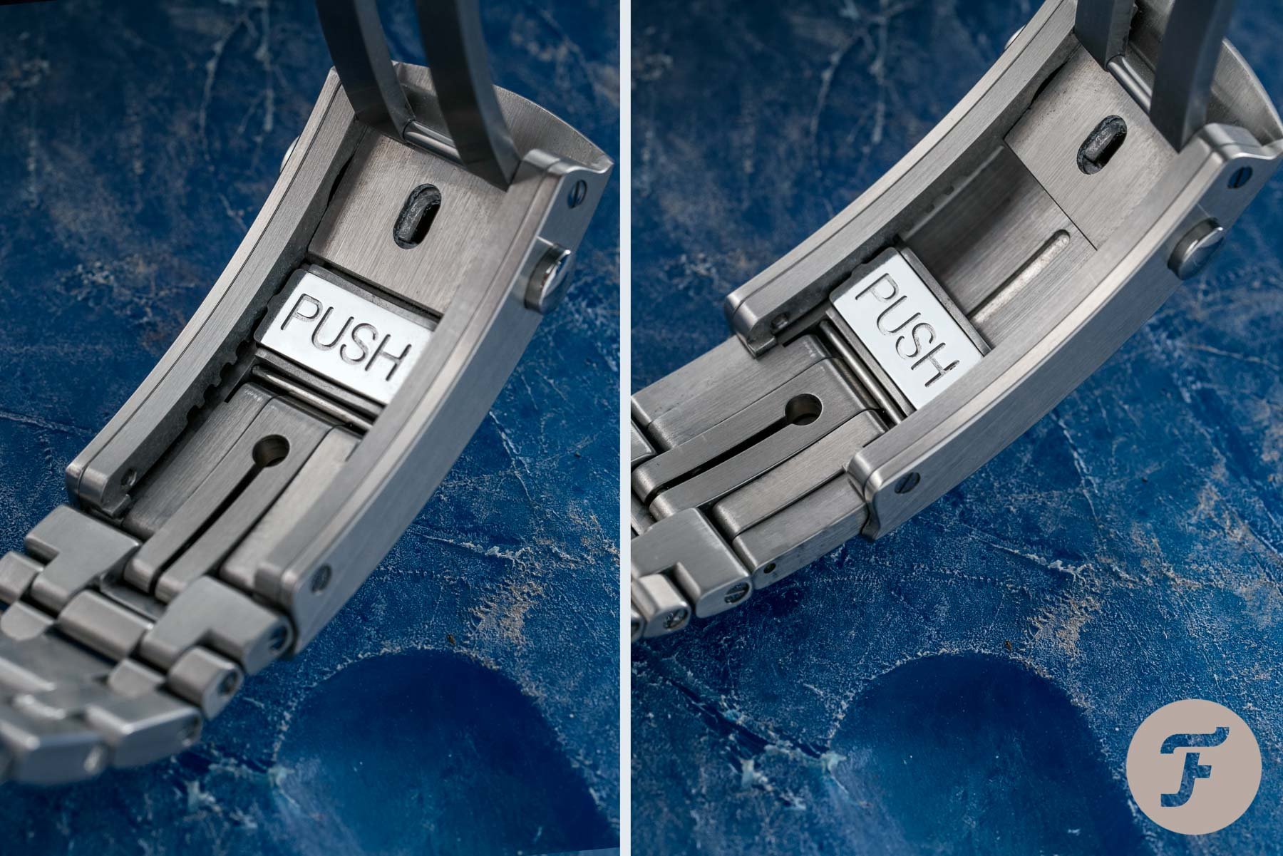
The bracelet is always a topic of discussion
Lastly, the bracelet is still not my favorite. The weird thing is that I have grown to love the old bracelet because it is part of that old aesthetic conceived in the ’90s that makes the Seamaster an icon of that era. Once again, the sentiment is great. But Omega updated the design to make it a great modern version of the old bracelet. While it will never be my favorite design, it wears brilliantly and offers all the functionality you want from a diving bracelet. Plus, the build quality is undoubtedly better in comparison to the old version.
The modern Omega caliber 8800
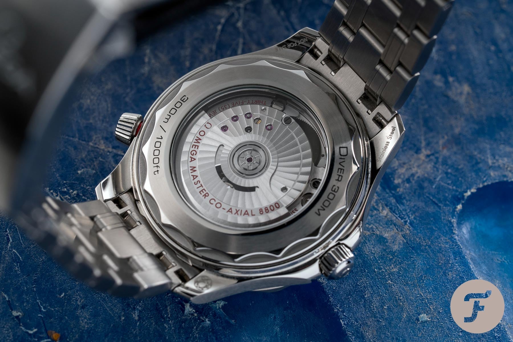
This brings me to the movement. You ask whether the ETA-based caliber 1120 isn’t good enough, but you and I both know it’s not simply about being good enough in the competitive luxury industry. While I do not debate the reliability of the old movement, it is about way more than that. The in-house-developed Master Chronometer caliber 8800 offers way more than the old caliber 1120.
This modern movement is a joy to witness through the sapphire display case back. This Co-Axial movement, in architecture, specs, and execution, is a huge step up from the caliber 1120 of decades past. It offers a 55-hour power reserve, has a METAS-certified accuracy of -0 to +5 seconds a day, and is antimagnetic to at least 15,000 gauss. It is a big reason why this watch is more expensive than its predecessors and is priced the way it is, disregarding the steep price increases we have recently seen.
Which is the better Omega Seamaster 300M?
While there is a case to make for your Seamaster Professional 300M ref. 2531.80.00, Nacho, it simply is no match for the current ref. 210.30.42.20.03.001. The combination of the design, the materials, the finishing, and the movement turns the current Seamaster Diver 300M into one of the best dive watches on the market today. Add its legacy on top of that, and it’s simply hard to beat. Your Seamaster Professional has one thing going for it — sentiment. And while sentiment gets you a long way, it doesn’t make it a better watch.
Having said that, we both agree on what could have been. Indeed, the recently released James Bond 60th Anniversary Seamaster is the perfect combination of sentiment and modern-day execution. It incorporates the old wave pattern and aluminum bezel, loses the date, and introduces a great bracelet alternative. But then again, I could do without the gimmicky case back and the extraordinarily high price. That is also why we didn’t make it part of this matchup. This showdown is about the standard production models, and when it comes to those, I would pick the current Seamaster Diver 300M every single time.
Final thoughts
But it’s not up to us to decide which one of these watches will emerge victorious. We pass that responsibility to you, our faithful Sunday Morning Showdown readers. We hope you enjoyed seeing these two birds of a feather (or feathers of the same bird) go toe to toe for the SMS crown. It’s certainly no simple choice, but I hope you’ll find that we’ve informed you well enough to make it. Without further ado, the time has come to vote for your champion. May the better Omega Seamaster 300M win! Make sure to vote for your choice below, and also let us know why you picked it in the comments. See you next week for another Sunday Morning Showdown!