#TBT A Rainbow Mood With Tian Harlan’s Chromachron Color-Time Watch

However colorful or eclectic my collection is, the Chromachron color-time watch by Tian Harlan has never been on my wishlist. Sure, I know I have my fair share of weirdo watches, but who would have thought that one with no hands and, seemingly, no way to tell time would get a feature in #TBT? Well, here we are…
Michal Pastier, a former colleague and now a friend of mine, is also one of the most creative minds I know. He is the founder of the competing advertising agency Zaraguza and a branding agency called GoBigname. What I didn’t know about him until recently was that he also fell under the spell of vintage watches. Our paths crossed again, and I helped to source a Chromachron color-time watch for him recently. When I wanted to bring it to him upon its arrival, he simply said, “Why don’t you photograph it first?”
Meeting the Chromachron color-time watch
Until he said that, it had never crossed my mind that I would review it for you in my #TBT column. Looking back now, I don’t exactly know what I thought about it, but I think I even didn’t consider it to be a “real watch”. It was sort of a toy for me, almost like Black Pac-Man rotating over a dozen colorful pizza slices. I was simply ignorant. And without Michal prompting me to look at it, that wouldn’t have changed.
Mechanical Chromachron
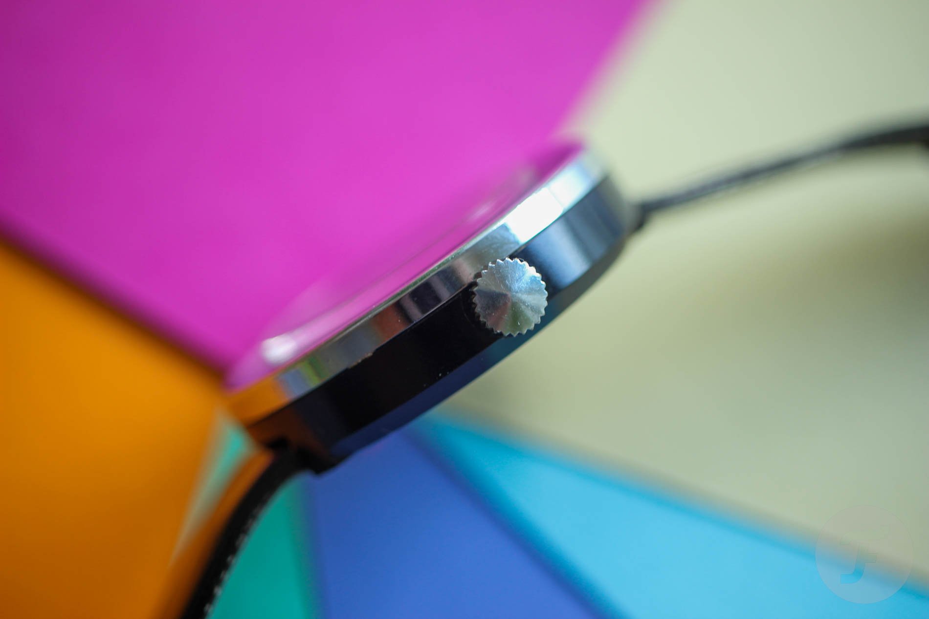
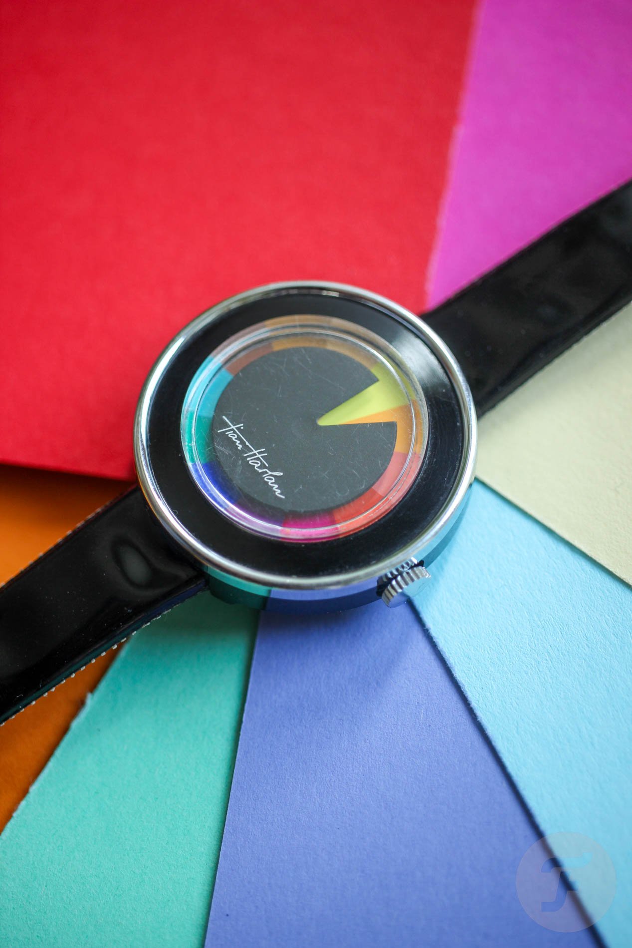
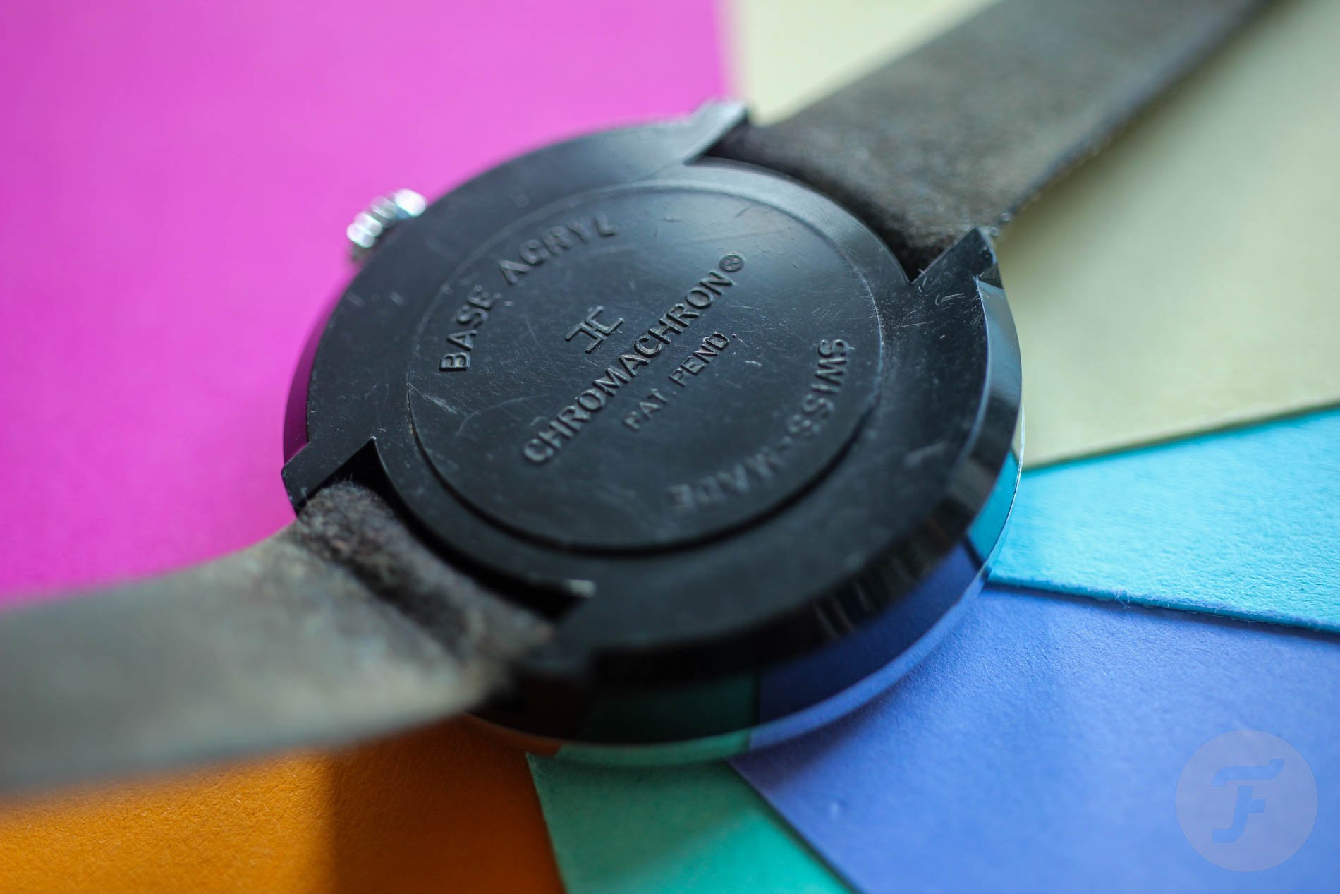
When Michal said I could keep it for a few weeks, I freed it from the bubble wrap. It came on an original shiny plastic strap that looks like a pair of cheap vinyl pants. I rolled the Chromachron in my fingers and, more or less intuitively, touched the crown and tried to wind it. To my greatest surprise, Michal had gotten one of the earliest models with a mechanical movement.
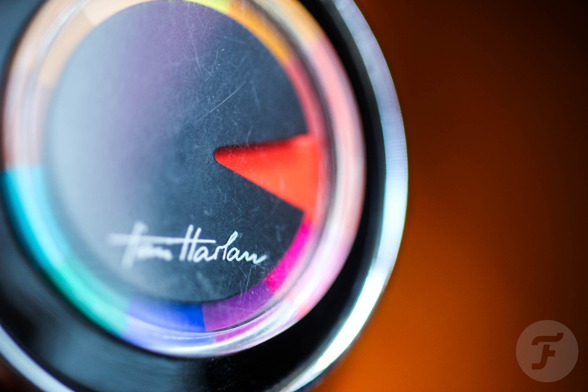
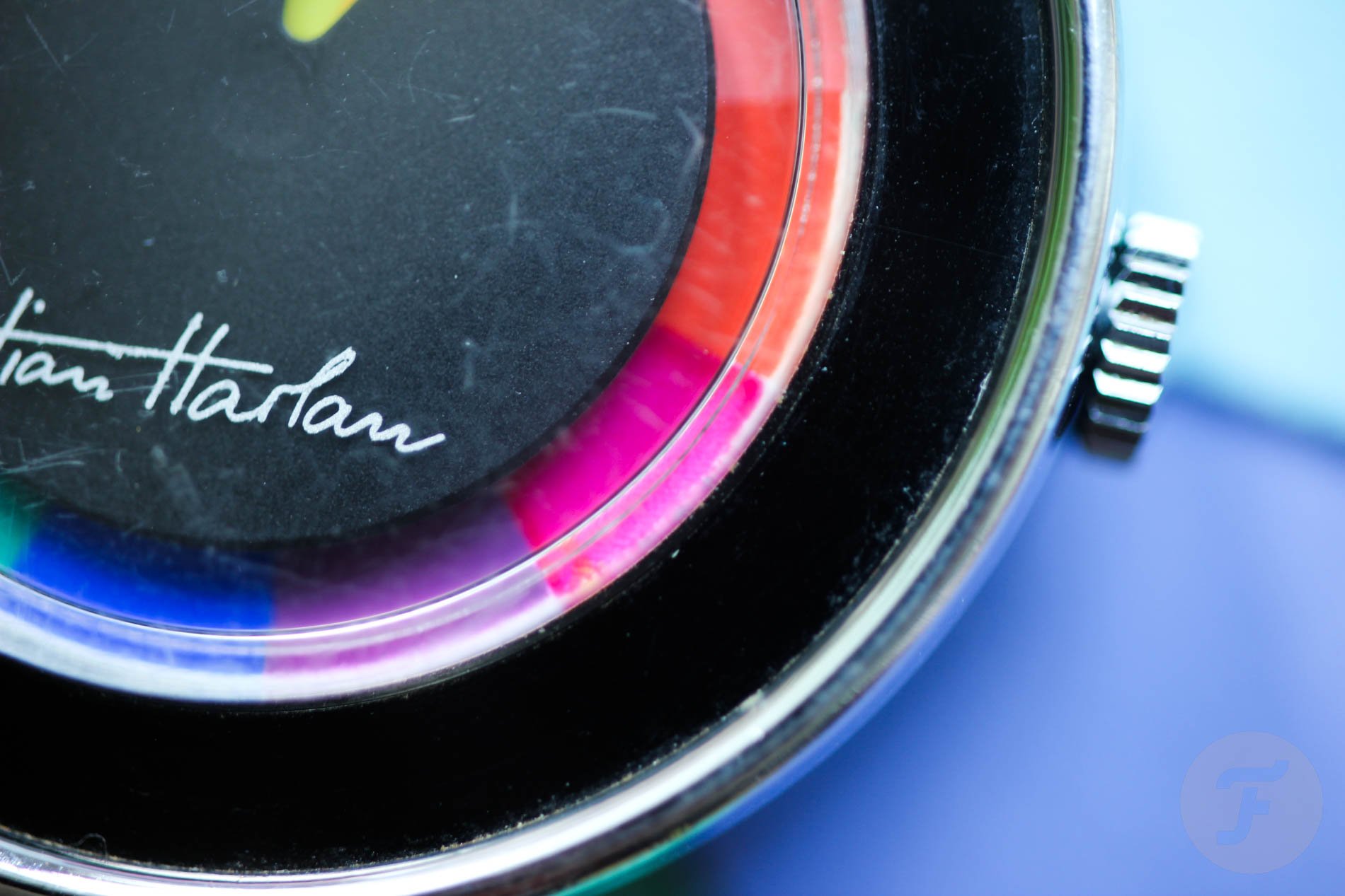
A not-so-useless dial
The imprecise time display of Tian Harlan’s Chromachron watch is one of its strongest and weakest points. Free-spirited folks loved Harlan’s rebellion against the “dictatorship of the exact time” and his watch creation, which gave an approximate idea of the time. In its defense, I have to say that I don’t find it harder to read than, let’s say, a Rolex onyx dial.
How does it work?
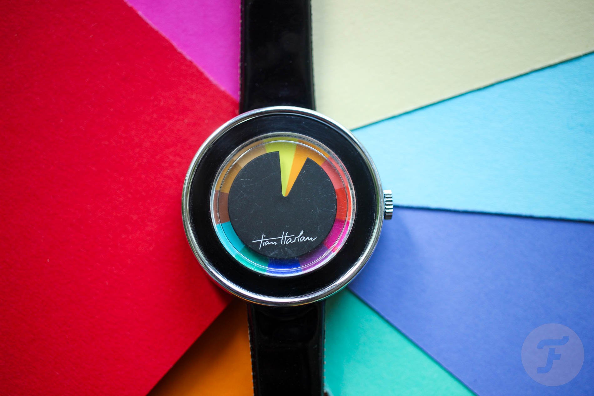
Well, it doesn’t have a minute track. Instead of hour indexes, it has a dial background divided into 12 triangles, each representing one hour. On top of it, there is a “negative” cut-out of a singular triangle into a black disc. This way, you get a shape like Pac-Man’s mouth rotating against the background at a speed of “1tph” — one triangle per hour. When the triangles fully overlap, you get a full hour.
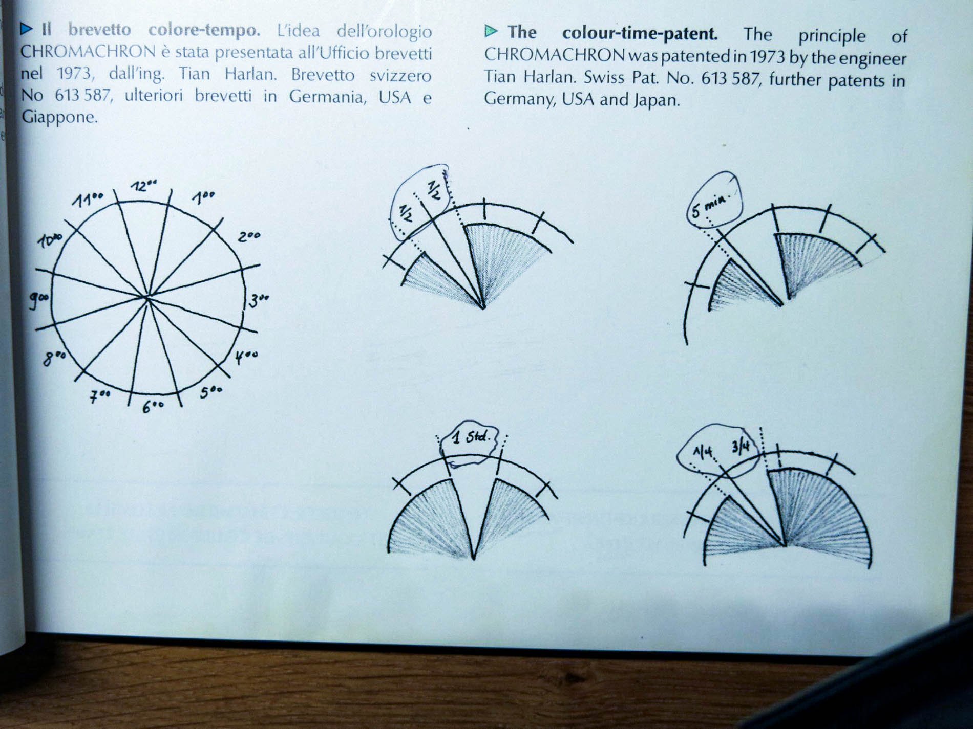
Image: ricardo.ch
The designer’s doodles
After a few hours, my eyes were fully aligned, and could read the time easily. And I dare say that after a day, I was able to read the time more precisely and faster than I was able to do on a super clean Rolex onyx dial with no markers. When browsing through the internet, I found some sketches that seem to be scans of Harlan’s drawings in the watch’s original booklet. I have to say, they got me right in the heart. That feeling of connection with the designer and his ideas cast a magic spell on me and instantly created a strong emotional connection. It was like diving into Harlan’s mind.
Who is Tian Harlan?
If you’re wondering what nationality a guy named Tian could be, I will spare you the thinking. Tian Harlan was born in Berlin, Germany, and “Tian” is short for Kristian. His fascination and experimentation with color-coded time displays got some recognition at the Color-Time sculpture exhibited in Munich during the 1972 Olympic Games. Just about a year later, Harlan introduced a set of mechanical watches, and the one we’re looking at today is from precisely that era.
Pieter Doensen writes in his book History Of The Modern Wrist Watch that Harlan penned about 100 watch designs. The Chromachron color-time watch was available in transparent plastic, round, oval, or square cases. Customers could get plated, steel, or chrome cases too. Doensen says that even Max Bill, Charles Aznavour, or Ringo Star wore Harlan’s Chromachron color-time watch.
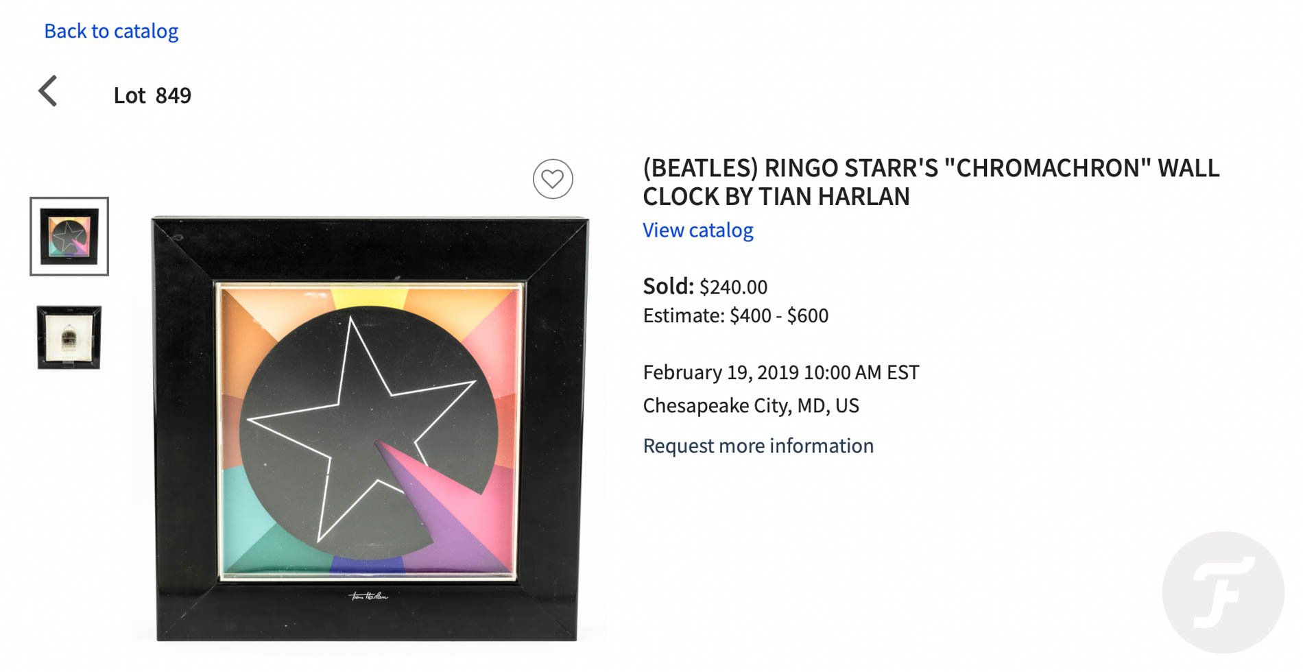
A star-catch Chromachron
Just a few years ago, someone scored a great deal at one of Alexander’s Historical Auctions. For as little as $240, the bidder won what seems to be Ringo Star’s Chromachron wall clock. The lot came with a 2011 signed letter of provenance from Nancy Lee Andrews, a former model, photographer, and Ringo Starr’s finacée of six years in the 1970s. In the letter, she says that the clock “…was purchased by Ringo Starr with the intention of possibly using it for gifts. Ringo had the star painted on the clock.” What a catch!
Are the colors random?
I like to imagine Harlan sitting at his desk and cutting tiny triangles out of colored paper. He glues them around a test dial and makes his initial prototype. I am no expert on colors, but color assembly creates playful harmony. In his story, Louis Westphalen from Hodinkee writes, “Each color was matched to the hour for which it stands, both in terms of illumination and energy. This explains the shining yellow for noon, while the afternoon gets increasingly darker colors as the sun fades away.”
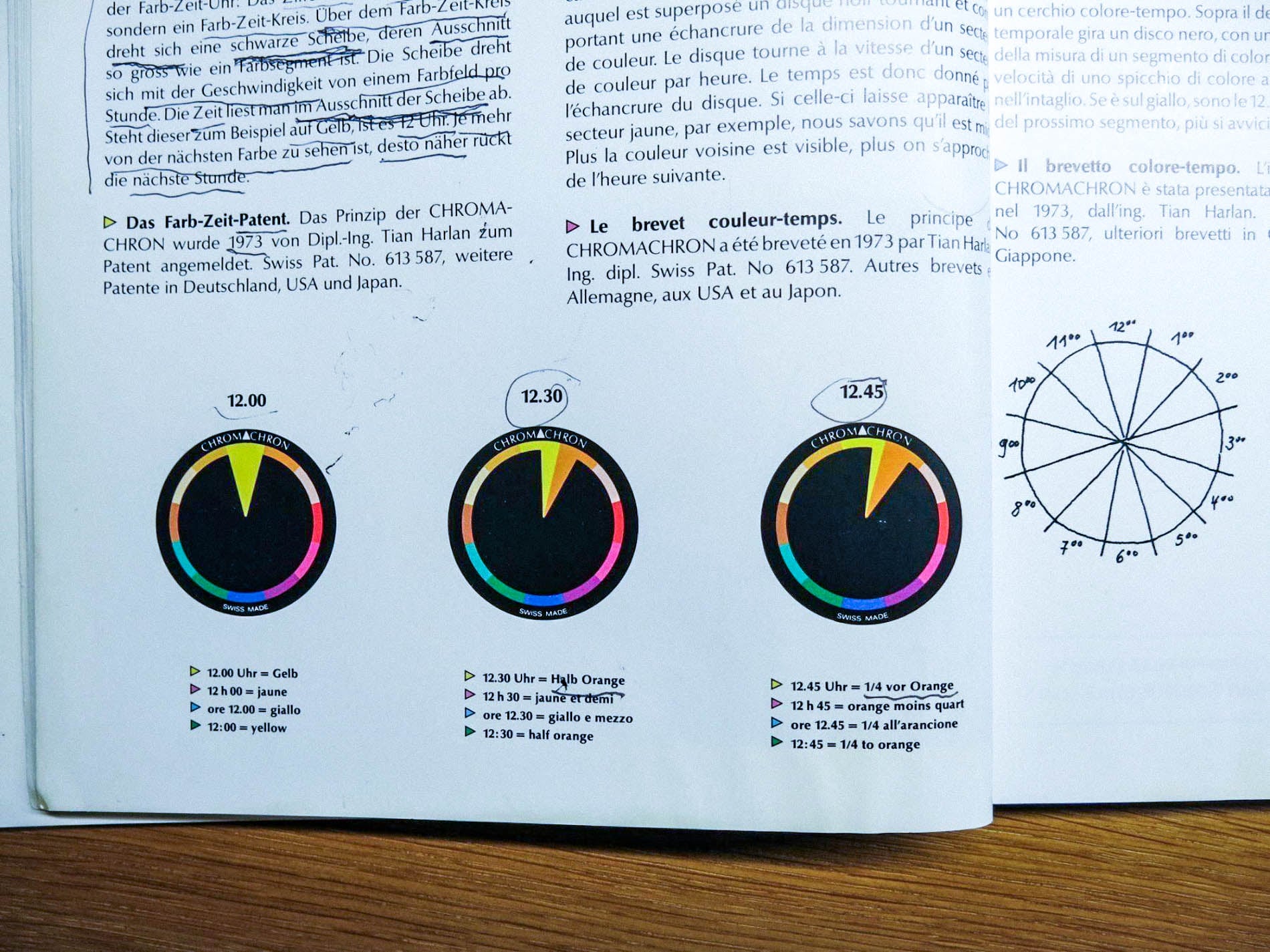
Image: ricardo.ch
Last thoughts on the Chromachron color-time watch
I know some of you may hate it, but I cannot stop comparing Tian Harlan’s Chromachron to the Breitling Superocean ’57 Limited Edition II or the Rolex Oyster Perpetual with a turquoise “celebration motif” dial. I didn’t like them the day they were introduced, and I don’t like them today. Colors “violated” over standard index schemes or downgraded into purposeless objects may be interesting, but they’re not natural or original in use. Both miss the point; they miss the idea.
Tian Harlan’s Chromachron doesn’t use color as an additional element or attribute to create emotion. Harlan made these colors become the time. Each has a respective hour of the day, and it doesn’t need any other element to break it down into minutes. Harlan created something simple but quite powerful and overwhelming. Until I tried it for myself, though, I could not give it the recognition it deserved. The moral of the story is this: stay open to new concepts. Happy hunting!