The Importance Of Graphic Design In Watches: How Typography And Fonts Can Make Or Break A Watch

Does the subject sound a bit dry, or are you already aware of this conundrum? It shouldn’t even be a question we need to ask as cohesive graphics can be everything on a dial. If you’ve never noticed it, perhaps you’re sticking to an Apple Watch. Its studied design language and non-clashing fonts are pitch-perfect, but what about the dials in your analog collection? I posit that the importance of graphic design in watches is still underrated and too often seems like an afterthought.
I happen to find this hugely important. Legibility (well, we read typography) is just as important as a lovely bracelet and fit. Everything might sit perfectly balanced on the dial, the brand logo matching a diver’s meter spec, but then… ouch! The date window is mismatched in color and has numerals in a completely different style. Am I being overly picky, or is this a big deal?

NOMOS leads by example
Having worked at Miele for almost a decade, I know everything about German perfection, and any watch from NOMOS is a pillar of it. The brand’s designers take their time tweaking already beautifully functional fonts, setting a Bauhaus example for others to follow. The Tangente, in my favorite 38mm case size here, is a textbook example of cohesive design. Its Bauhaus-inspired logo has wide letter spacing and a quirky stretch of the “M” in the center. The “Glashütte” sub-logo and special-edition text at the dial base is the same typography, while the numerals are tall and sculptural Art Deco in their minimalism. Not only that, but the thickness of the hands speaks the same architect-cool language, while the red 12 is a welcome dab of color.
When too much information is just too much
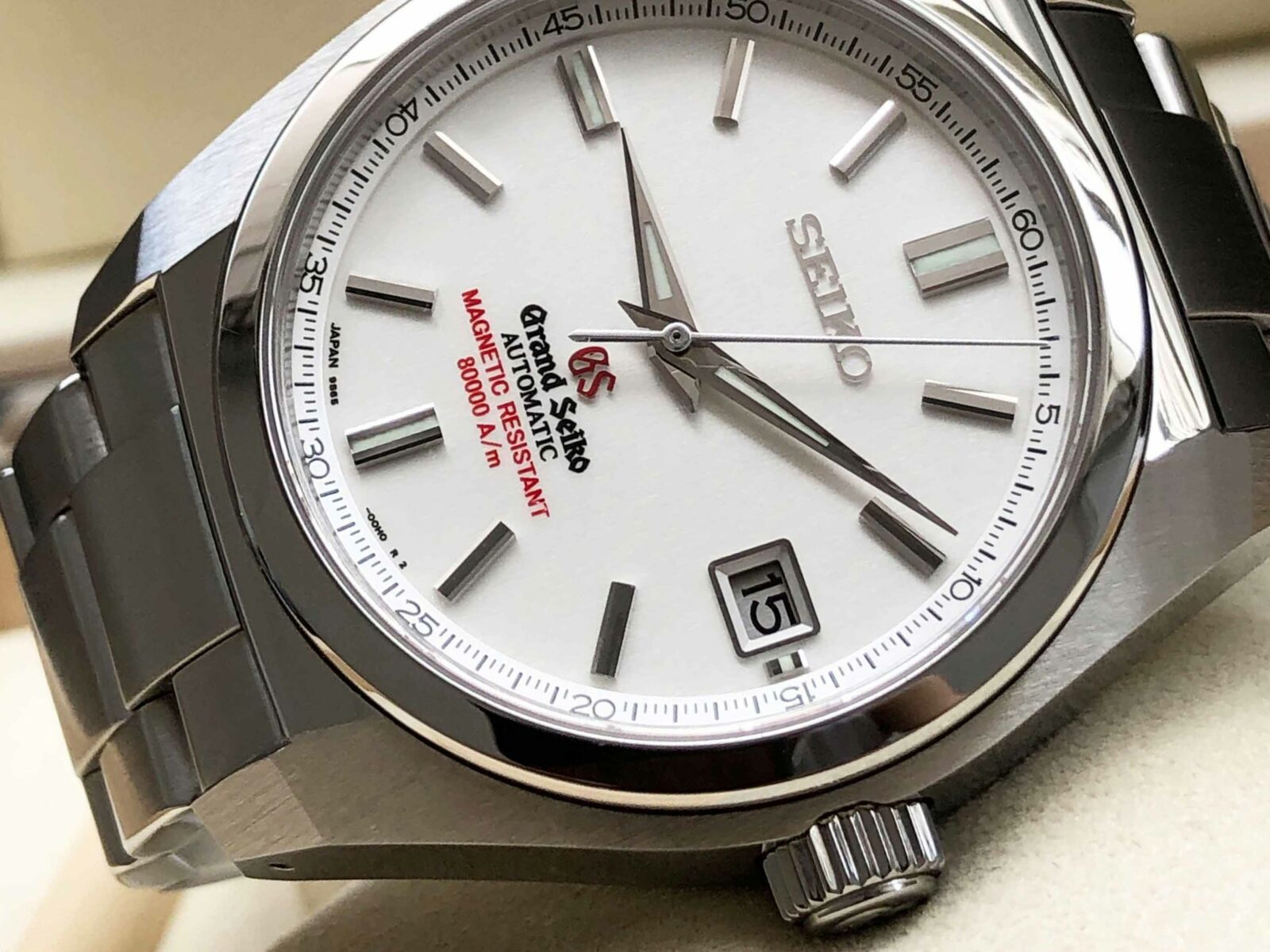
The Grand Seiko SBGR077 is a superb alternative to the Rolex Milgauss, the quirky professional reference. And while its 80,000 A/m (1,000 gauss) magnetic resistance is a cool feature, some more time could have been spent on the typography, people. Yes, the razor-sharp details of the arctic-white dial are as beautiful as we have come to expect in a watch that was released in 2015 before the GS-only logo at 12. Still, the mind boggles as to how the designers could have chosen no fewer than four seemingly random typefaces. The area above 6 o’clock is more packed than a Tokyo subway carriage at rush hour, with the GS logo even looking to be a slightly darker tone of red. Sometimes less is indeed more.
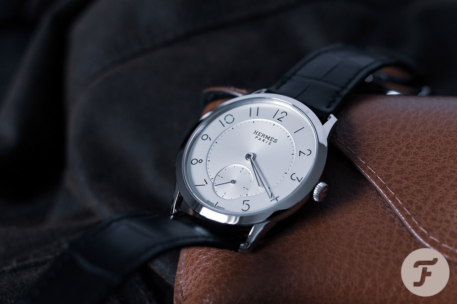
Classic excellence by Hermès
The French know the importance of a complete and chic picture. Hermès is a brand that, with its “fashion” stigma, is still struggling to win over the #watchfam. But the tides are slowly turning, and the sartorial connection makes for dial magic in the Slim d’Hermès. This was designed from the ground up, including the font, with a lack of fuss across the case and dial and a focus on thin elegance. With its minimalist chic, it is a lot more modern than the Arceau, and it features a specifically designed font. The work of graphic designer Philippe Apeloig makes numerals from charmingly disconnected lines and circles. But reading the dial, it all gels, with a simple design making for a refined, legible, and svelte look.

Honey, they chopped one off!
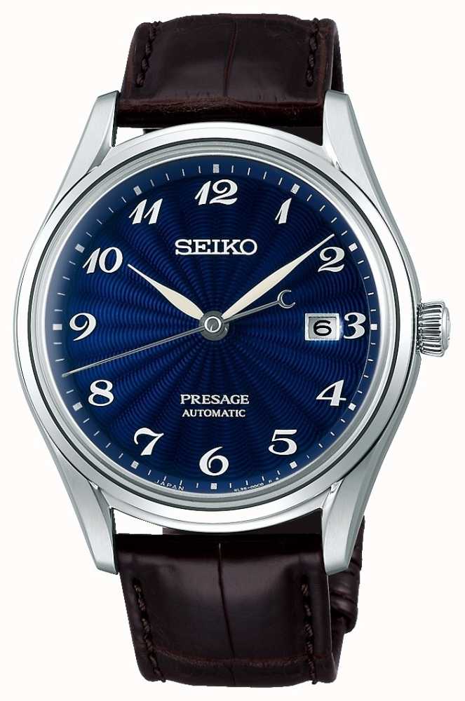
The Seiko Presage series is known for its “baby Grand Seiko” value and dazzling dials. But sometimes Seiko slips up, even if the guilloché depths of the blue dial are captivating. The extravagant, Breguet-ish white lacquer numerals are way more sweeping in their lines than the Seiko logo. Still, they work perfectly with the white and blue colorway and feuille hands. The date window, however, looks almost Photoshopped in, cutting off a section of the Arabic numeral at 3 o’clock. It seems the designers tried sliding it left, making it unbalanced in its bright squareness. The font also clashes with its standard, modern functionality. We know the date is a useful function as we’re heading into the holidays and forget what day it is. But move it to the right and drop the number 3! Heck, you could even keep the modern font if only it were matched in blue.
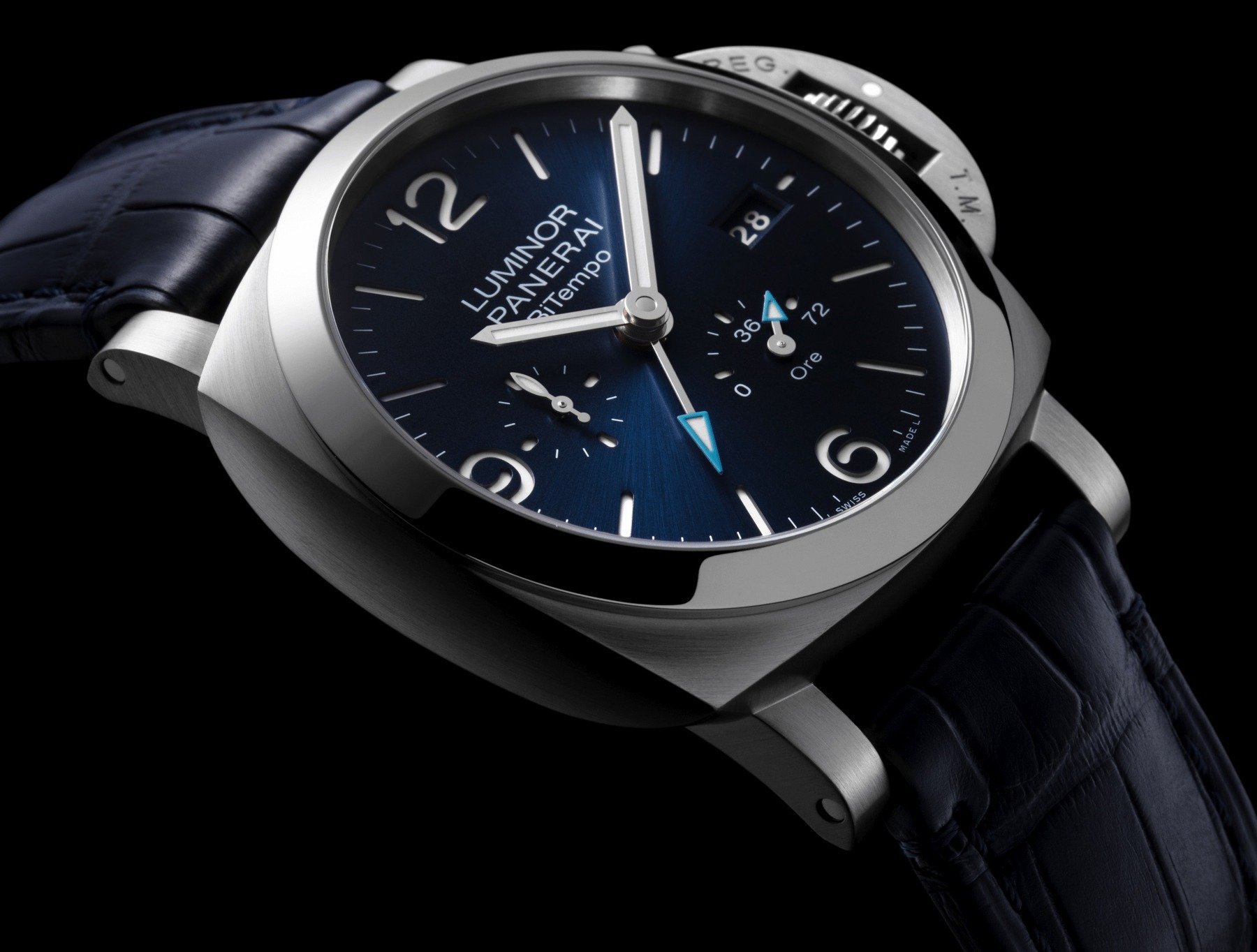
Panerai perfect
I don’t know if it’s because Italians have a better sense of aesthetics than most, but the delight of one font and style does wonders for the Panerai Luminor BiTempo. With both Luminor and Panerai having the same number of letters, the two lines get their balance for free. Panerai has also sensibly kept the same wide, squat font for the rest of the details. Even the fun twist of “BiTempo” with its faulty capital “T” works a charm, as do the power-reserve indicator and date. For the brand, the classic sandwich-dial 6, 9, and 12 have transcended mere numerals, becoming part of the dial design rather than physical numbers. Now, I’ll get back to waiting for Panerai’s first normal, round-cased, non-Luminor/Radiomir watch. Surely, it will happen one day?
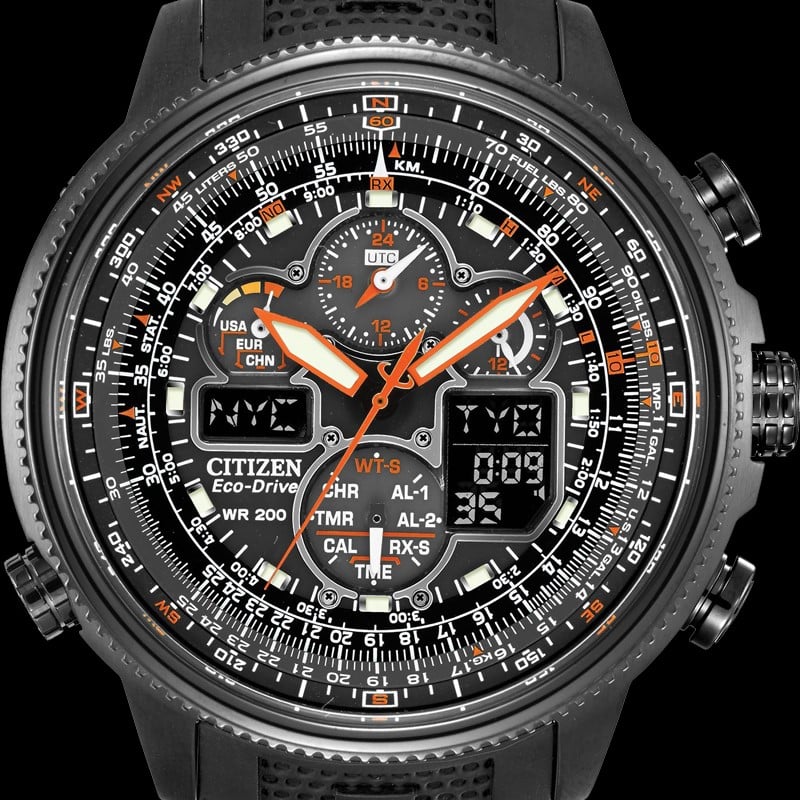
The “pilot’s” tool watch
Yes, the word “pilot’s” is in scare quotes for a reason. The Citizen JY803504E Promaster Navihawk A-T might evoke Tomcat battle missions by its name alone, and it is a massive 48mm in diameter. But that won’t help you decipher it. With mind-boggling sub-dials and two tiny LCD screens, you’ll have your work cut out for you by reading almost 20 titles and abbreviations. To that, add four scales with minuscule fonts and no less than seven hands to keep track of! To be honest, no professional pilot would use this €600 sports watch as a navigational tool. And if he did, I would be worried for the passengers because trying to keep track of the madness on this dial is a full-time job in itself. Consider it a daydream tool for young budding pilots and it’ll make sense, just like the charming Breitling Navitimer, but in a different league.
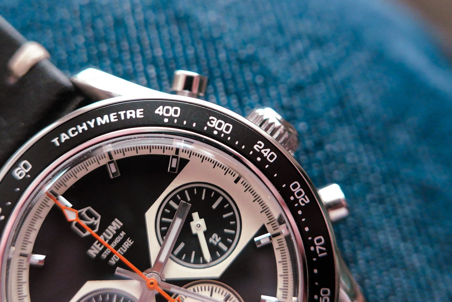
Small-brand excellence from Stockholm
Nezumi Studios in Stockholm is run by David Campo, a vintage-Porsche enthusiast with a perfectionist’s eye for graphic details. When it comes to microbrands and small independents, the lower costs are quite often inverse to the thoughts and time spent on a design. The logo of the Nezumi Voiture is quirky-cool, and the cohesive text is rendered in a crisp off-white modernist font. But what about the tachymeter bezel? David drew up the tachy scale by hand, scanned it in low resolution, vectorized it, and added it to the technical drawings to recreate a vintage screen-printed look. If you check the bezel with a loupe, no two numbers are the same, and it is mid-century perfect.
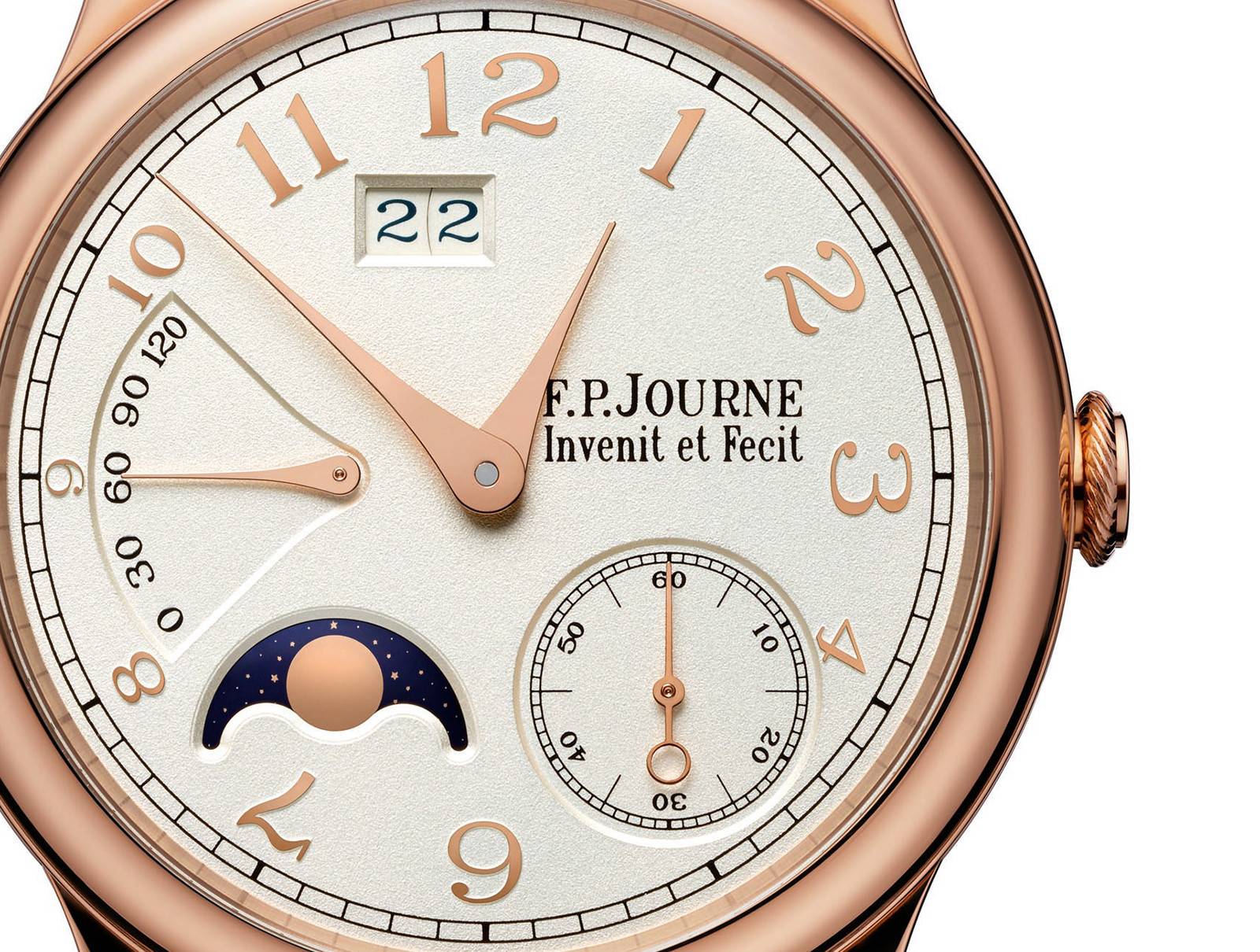
F.P.Journe’s shrinking perfection
The stellar rise of F.P.Journe on the auction scene has proven that independent horology has become more than a niche interest. Here, with Breguet-ish numerals, even an asymmetric dial with a lot of action feels like a study in dial typography. Notice that all numerals are in one single typeface, without which the dial would be far more difficult to read. My favorite touch is how Journe shrinks the numerals to avoid cutting them off. Just look at the 8, the 9, and especially the 10, of which the 1 is shorter than the 0. The creative mastery makes the hint of chop on the 4 completely forgivable, and the grainy texture on the off-white dial is a busy feast for the eyes. Only imagining this dial with two or more typefaces makes you understand the importance of this singular graphic vision.
So, dear Fratelli, have I made you study your dials for typefaces and spacing errors, or am I an obsessive perfectionist? Actually, don’t answer that last question, but do let me know your thoughts in the comments.
Find me and follow me: @thorsvaboe