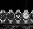
Watch Features I Appreciate — Details More Brands Should Get Right

Once you have experienced your fair share of watches, you develop a taste for certain specific watch features. Call them the opposite of your pet peeves. They are the details that make a good watch great for you. Some may be objectively better features, while others are completely personal preferences.
In this article, I will share some of mine. These are the watch features I thoroughly appreciate and wish more watch brands would get right. Let’s get stuck in!
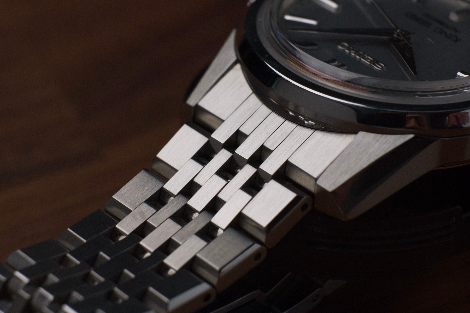
Interestingly, the small jump between the lug and end link works here
Watch features I appreciate: properly integrated end links
You may have heard me rant about end links before. The humble end link is a dead giveaway of the level of attention and consideration that went into a design. So often, the end link is an afterthought that literally and figuratively bridges the gap between a case design and some generic bracelet. And even on non-generic bracelets, good end links are still rare. It is almost as if many designers don’t consider them worth their time.
But before I go off on a rant about bad end links, let me focus on the good ones instead. A watch feature I appreciate deeply is an end link that looks just like the bracelet links. In other words, it is either made up of discrete parts or milled to a level of precision that makes it look like separate parts. I just cannot stand an end link that is quite obviously a single piece made to look like separate links.
It should also integrate with both the case and the bracelet design. If it cannot stylistically bridge that gap seamlessly, the bracelet and case are poorly paired. An end link that looks like it is made up of separate parts and that integrates with the overall aesthetic is pure bliss for me. If, additionally, it is of the female style and allows for greater articulation, you can carry me away.
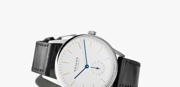
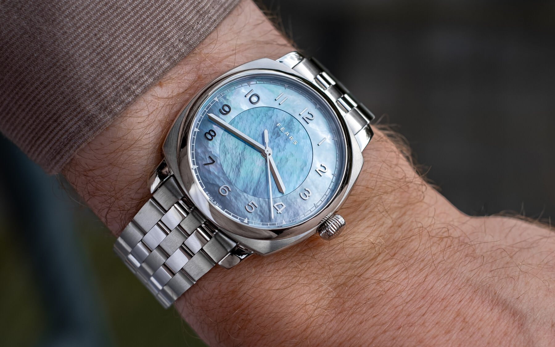
Matte surfaces
I made my way into the watch world through the sub-universe of vintage watches. I was trained and mentored as a vintage watch dealer. As I moved from vintage to modern, two things stood out. First, watches got a lot bigger. Second, watches got a lot shinier. Dials, bezels, bracelets…the shinier, the “better”. Among the watch features I deeply appreciate, however, are matte surfaces.
I like my Oyster-style bracelets fully brushed. I prefer my dials matte. And bezel inserts? Matte, please! I think my liking of these dull surfaces goes a little deeper than just taste. If you are going to design the ultimate highly legible time-telling tool, do you make it reflective? Of course not.
Today, it seems like every other dial is fumé, sunburst, and glossy. Call me boring, but I prefer matte, plain colors. Generally speaking, I also tend to prefer brushed surfaces on cases and bracelets. Polished surfaces are fine as accents, but make the bulk brushed for me! It saves me the constant wiping of fingerprints too.
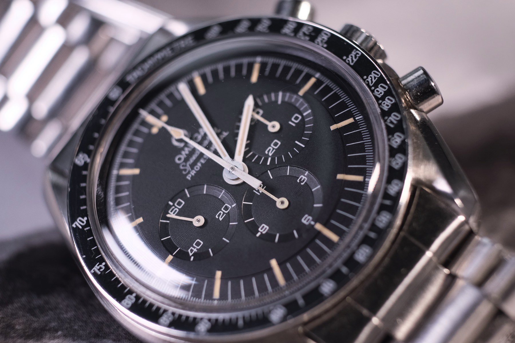
Watch features I appreciate: brushing I can feel
Speaking of matte surfaces, I truly appreciate very pronounced, deep brushing. You know, the kind of brushing you can feel. Most brushed surfaces on watches feel very soft and smooth. I prefer brushing that feels sticky when you run your finger perpendicular to the brushing direction. This means the lines are sharp and deep. And in my humble opinion, that looks so much nicer.
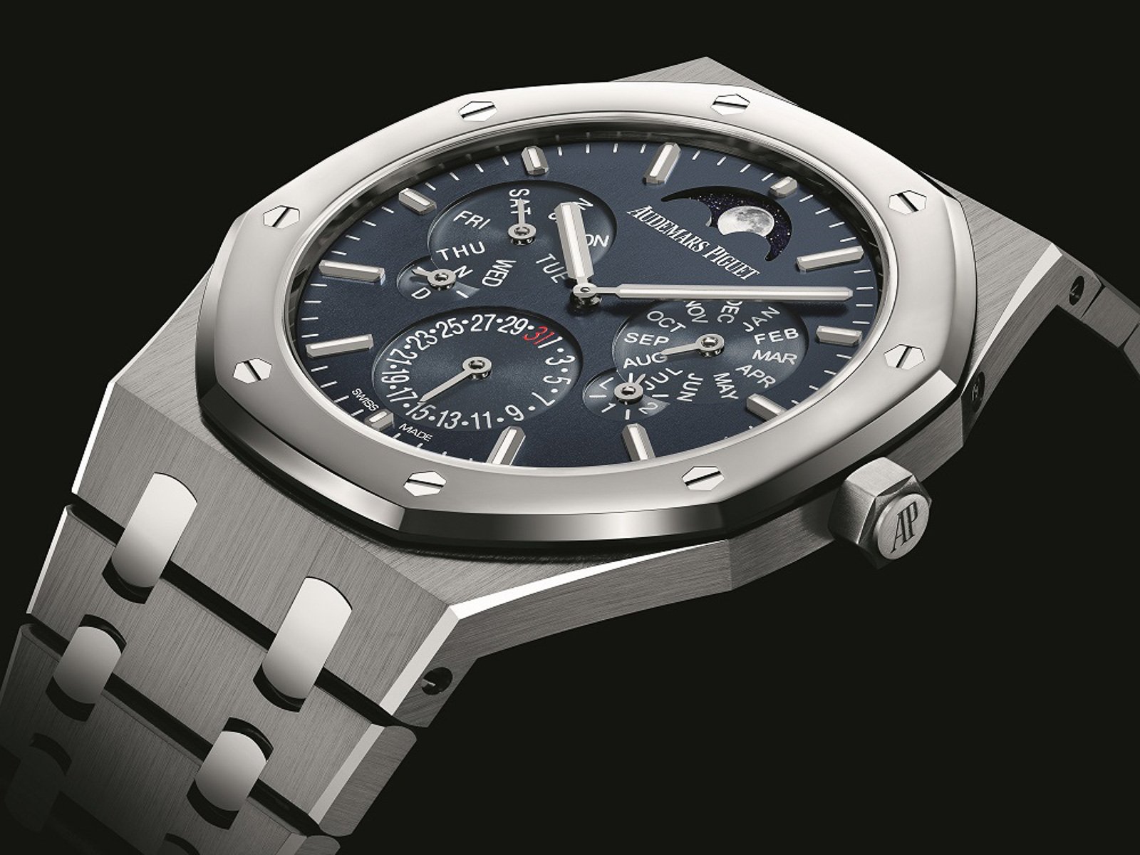
Generally, you have to spend quite a lot of money to get such brushing. I recently wrote about watches that punch above their weight, and my list included the Longines Spirit. It is one of the few watch lines that offer the tactile brushing I like at a sub-€5K price level. In an ideal world, however, I would have an AP Royal Oak to stroke perpendicularly to its hairline finish all day. That sticky sensation would probably lower my blood pressure. The above somehow sounds dirty… I swear I am just talking about watches here.
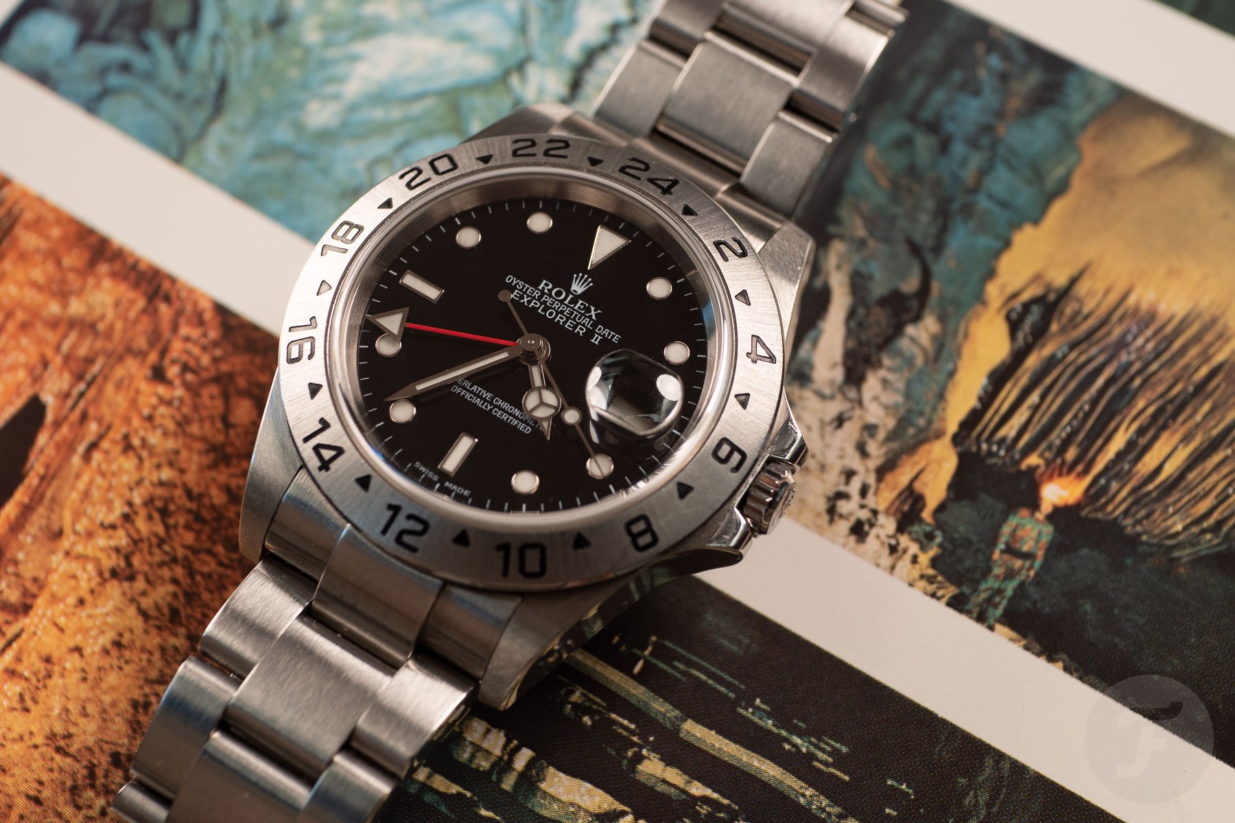
Thinness goes a long way. I love the ergonomics of a five-digit Rolex sports watch.
An ergonomic stance on the wrist
Another watch feature I deeply appreciate is an ergonomic stance on the wrist. This one sounds obvious, but you would be surprised at how few watches truly get this right. Generally speaking, it is achieved by thinness and curvature. But it is down to the ratios between the dimensions too.
Absolute thinness, interestingly, matters less than a squat stance. The center of gravity should be low. If, for some reason, a watch cannot be made nice and thin, there are ways to hide it. It helps to make the watch bigger, for instance. The Omega Planet Ocean is a prime example. I find the 39.5mm version too tubby. The old 42mm models are just as thick or thicker (depending on the generation), but they wear more ergonomically, even on my relatively small wrist. A wider lug spacing can help too, as can a radical curve around the wrist.
Closing thoughts
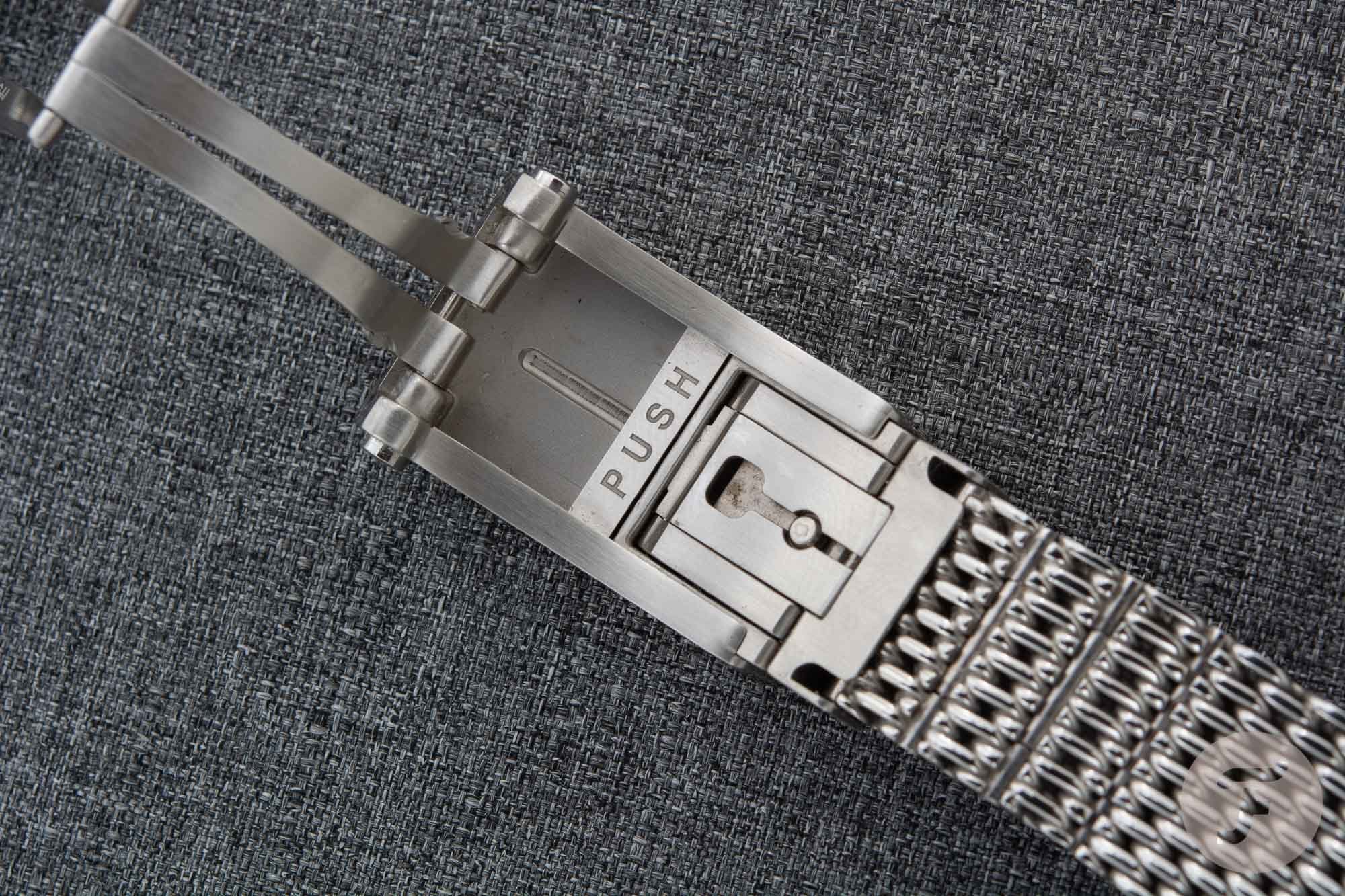
Honestly, I could go on. I like steel/solid case backs on watches with “workhorse” movements. I like date windows at 6 o’clock, although I prefer no-date watches. Dials with minimal text can often count on my approval. I enjoy screw-down crowns. Toolless micro-adjustment, quick-release straps, AR coating on the underside of the crystal only…count me in.
I am sure you disagree with some of my preferred watch features. That is fine! I am, however, more curious to hear which features push all the right buttons for you. What do you like to see in a watch design or the spec sheet? What gives you “the fizz,” as James May would put it? Let us know in the comments below!