Introducing: The Rado True Round × Les Couleurs Le Corbusier Special Editions

Rado has a long-standing collaborative relationship with Les Couleurs Suisse. Until now, this has led to 12 releases that used Le Corbusier’s 63-shade color system, which he described in his book Polychromie Architecturale. For its latest collaborative effort, Rado took it a step beyond just using the Swiss-French architect’s color system. While these watches each include four shades from it, they also pay homage to some of Le Corbusier’s most important architectural works. That makes this new trio of Rado True Round × Les Couleurs Le Corbusier Special Editions so much more than just an exploration of colors. They are a celebration of the work of a man who many consider the master of modern architecture.
This week is a fun one for me, as I get to write about two watches directly linked to two of the world’s most famous architects. Yesterday’s review of the Lebond Attraction was a step into the world of Antoni Gaudí. Today, we explore the world of Le Corbusier. Writing both articles has led me to brush up on my knowledge of these men. For this new trio of True Round models, Rado channeled inspiration from three of Le Corbusier’s historical works. The brand’s team used several shades from Le Corbusier’s color system and added the texture of the material used for the three buildings. Let’s go over the three new Rado True Round models to find out more about their respective stories.
The Rado True Round × Les Couleurs Le Corbusier Special Editions
As you would expect, all three models are made of ceramic. In the past, Rado has used Le Corbusier’s colors to create a great series of monochromatic True Round models, each using a single shade from the 63 available. But this new trio takes it a step further. They all feature a 40mm case with a 10.4mm thickness, a 47.3mm lug-to-lug, and a 50m water resistance rating. Inside the three watches lies Rado’s caliber R763. This automatic movement is a variation of the Swatch Group’s Powermatic 80 caliber and operates at 21,600 vibrations per hour while offering an 80-hour power reserve.
We kick things off with the first model, which pays tribute to La Cité Radieuse. It’s a huge concrete apartment building in Marseille, France. It was the first of five residential buildings that Le Corbusier designed for France and Germany. The building was completed in 1952 and reimagined urban living. The first of the three watches takes the building’s rough-cast, board-formed concrete, known as béton brut, as inspiration for the dial.
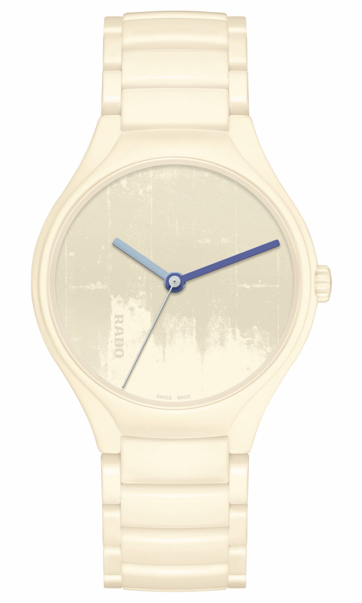
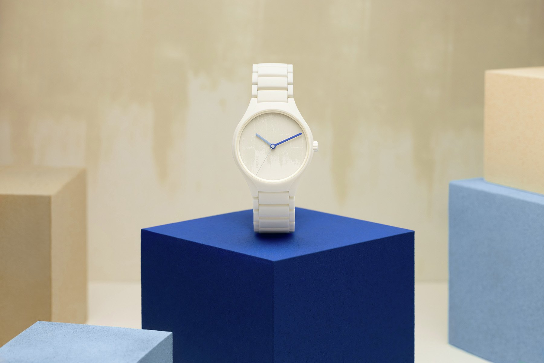
The first Rado watch in ivory-white ceramic
It all starts with the high-tech ceramic case, bracelet, and crown executed in matte Ivory White (4320B). This marks the first time that Rado has created a watch in this color, which apparently took years to achieve. The case matches a ceramic dial in the same color. But for extra depth, the texture of béton brut is laser-engraved into the ceramic dial. It adds texture and color that immediately evoke the material used for Le Corbusier’s creation.
The dial is matched with three hands in three shades of blue from Le Corbusier’s color system. The hour hand is Lucent Sky Blue (32021), while the minute hand is Luminous Ultramarine Blue (32020). Lastly, the thin seconds hand is Light Ultramarine Blue (32023). Thanks to the contrast between these colors and the dial, the time is easy to read. But most of all, the four colors create a really nice soft-toned watch.
Exploring the world through Le Corbusier’s creations
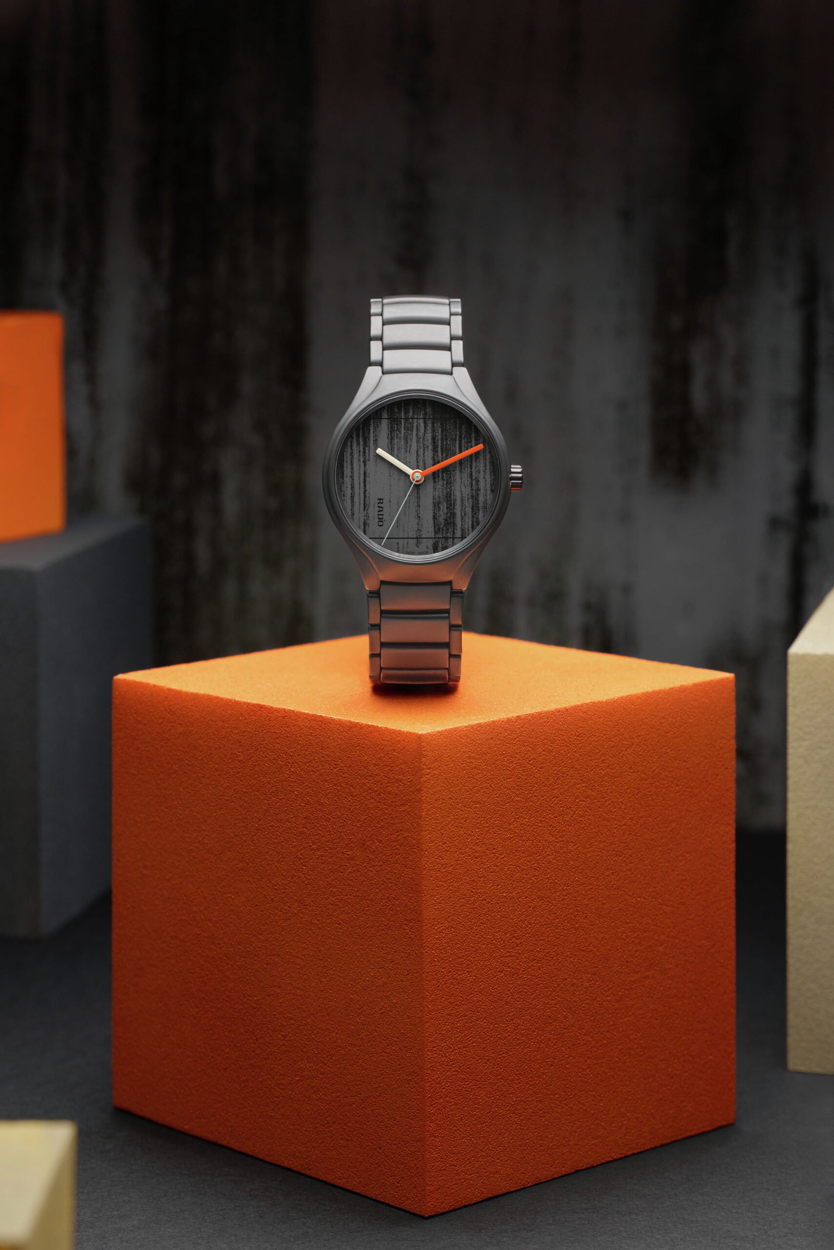
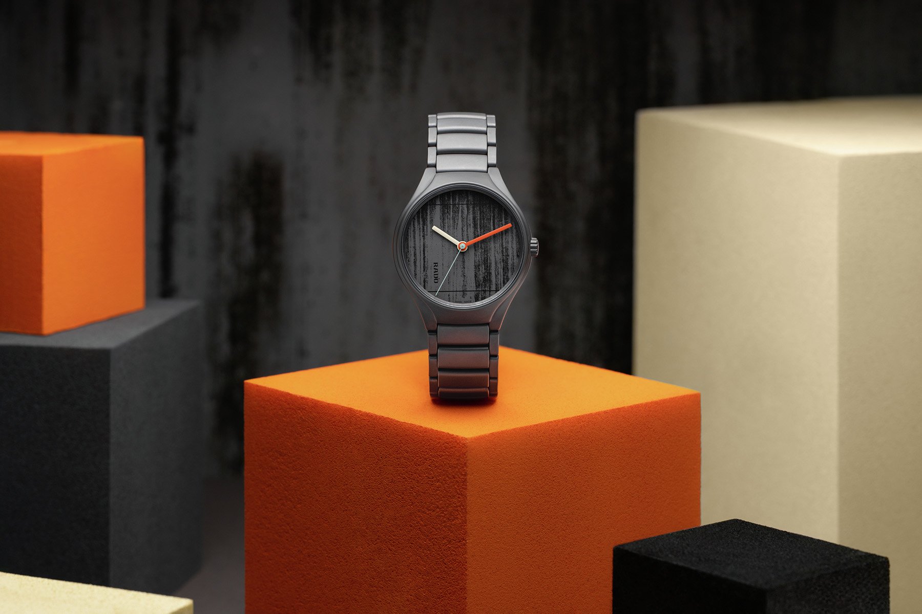
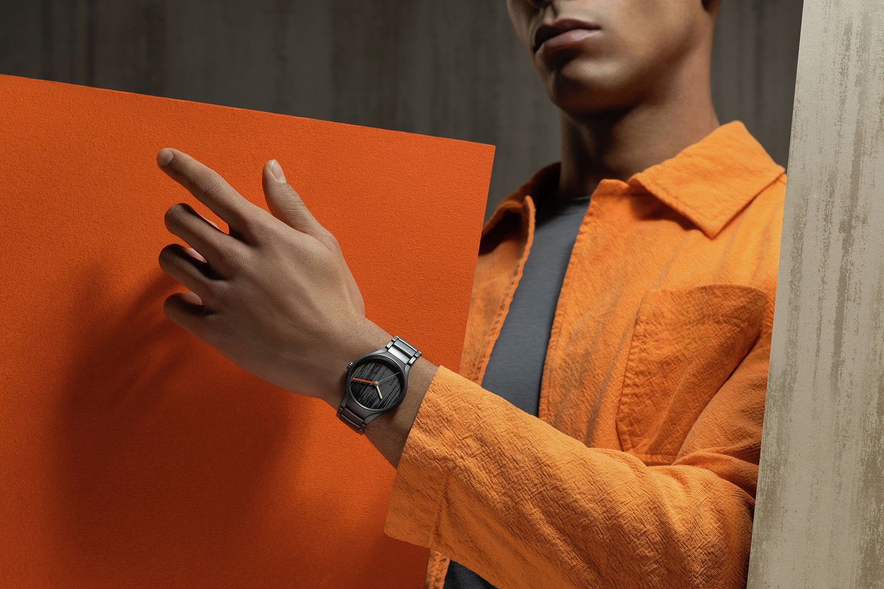
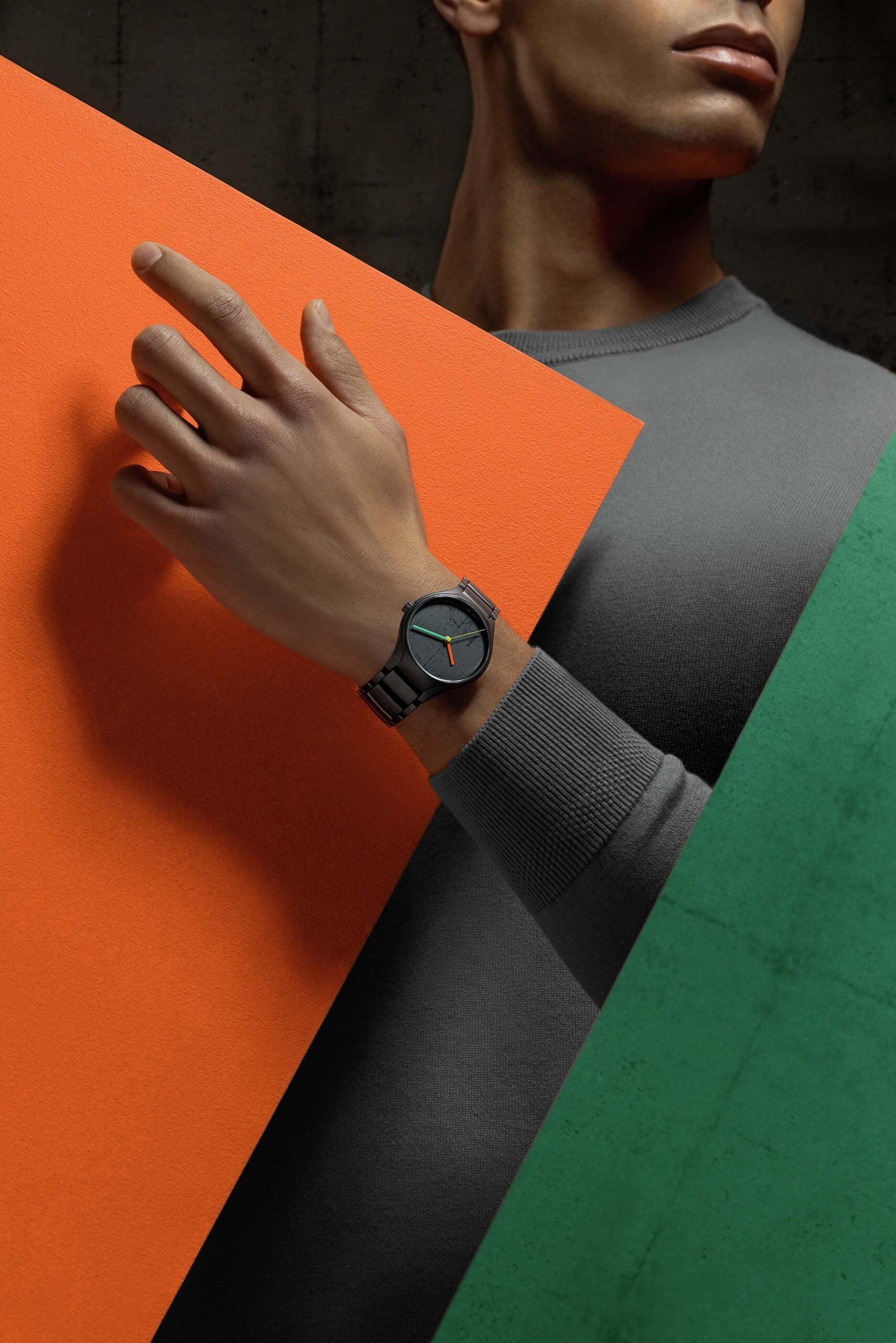
The second of three models takes inspiration from the Carpenter Center for the Visual Arts, which is part of the world-famous Harvard University. Completed in 1963, this building has an angular, raw-concrete aesthetic that is a stark contrast to the leafy squares and Georgian architecture of Harvard University. It is the only building that Le Corbusier designed in North America. The Carpenter Center for the Visual Arts was also one of Le Corbusier’s last works and is part of the United States’ cultural heritage.
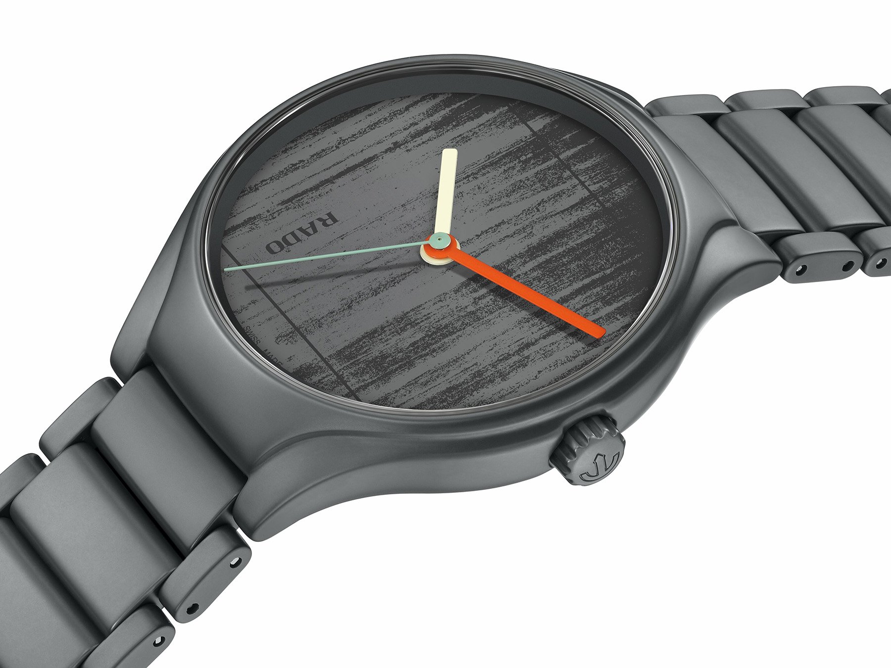
The ceramic case, bracelet, and crown for this second model are Iron Grey, reference 32010 in the Polychromie Architecturale system. The ceramic dial is made in the same color and features the laser-engraved molded concrete texture of the building’s facade. Hovering over the unique dial are three contrasting lacquered hands. The hour hand is Cream White (32001), the minute hand is Powerful Orange (4320S), and the seconds hand is Slightly Greyed English Green (32041).
All in all, this creates a completely different look compared to the first model. But it’s more than just the contrast between light and dark. I love the look of this dark gray watch because it still has that soft matte presence. As a result, I feel it’s closer to the white variant than the third model.
Le Corbusier’s grandiose work in India
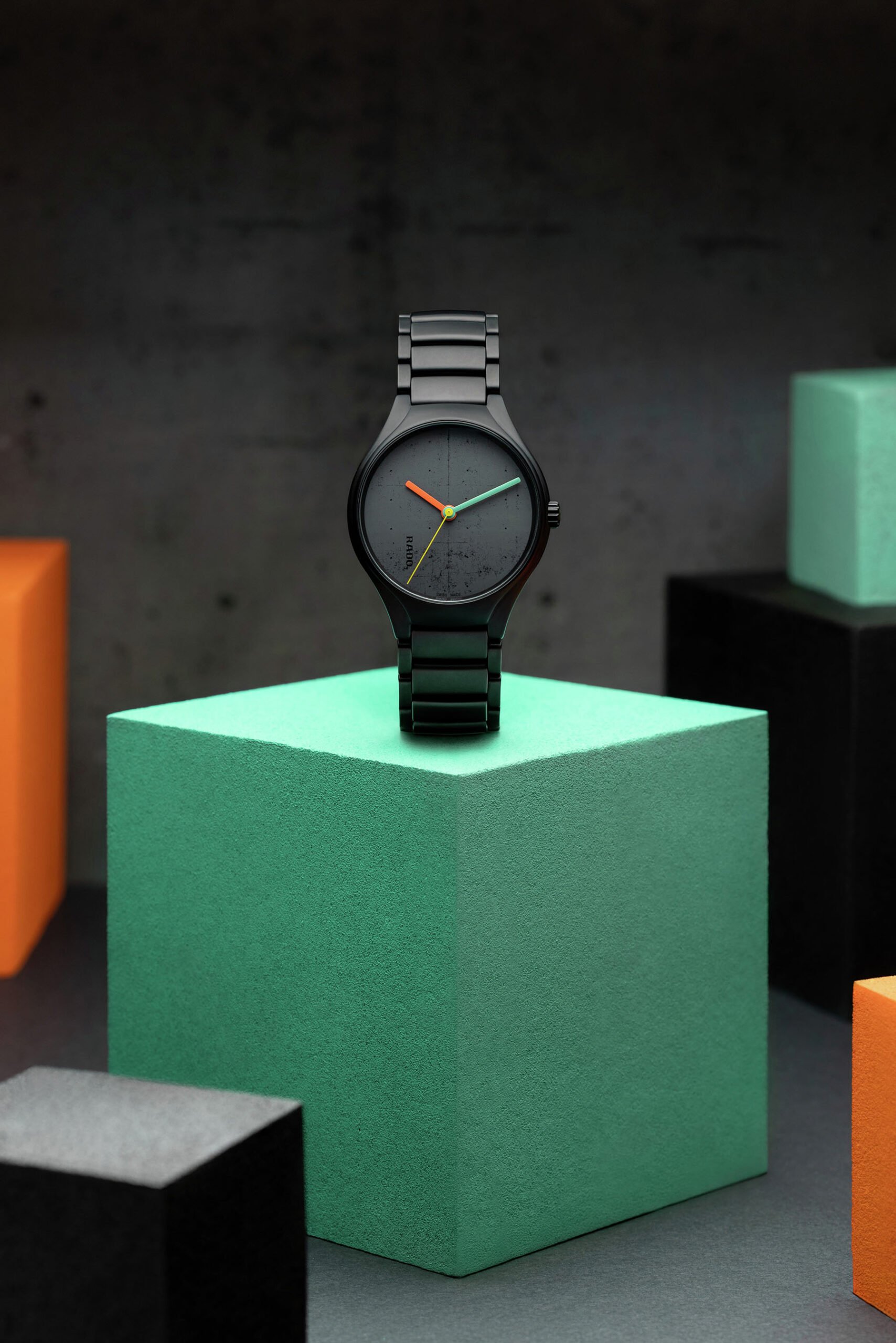
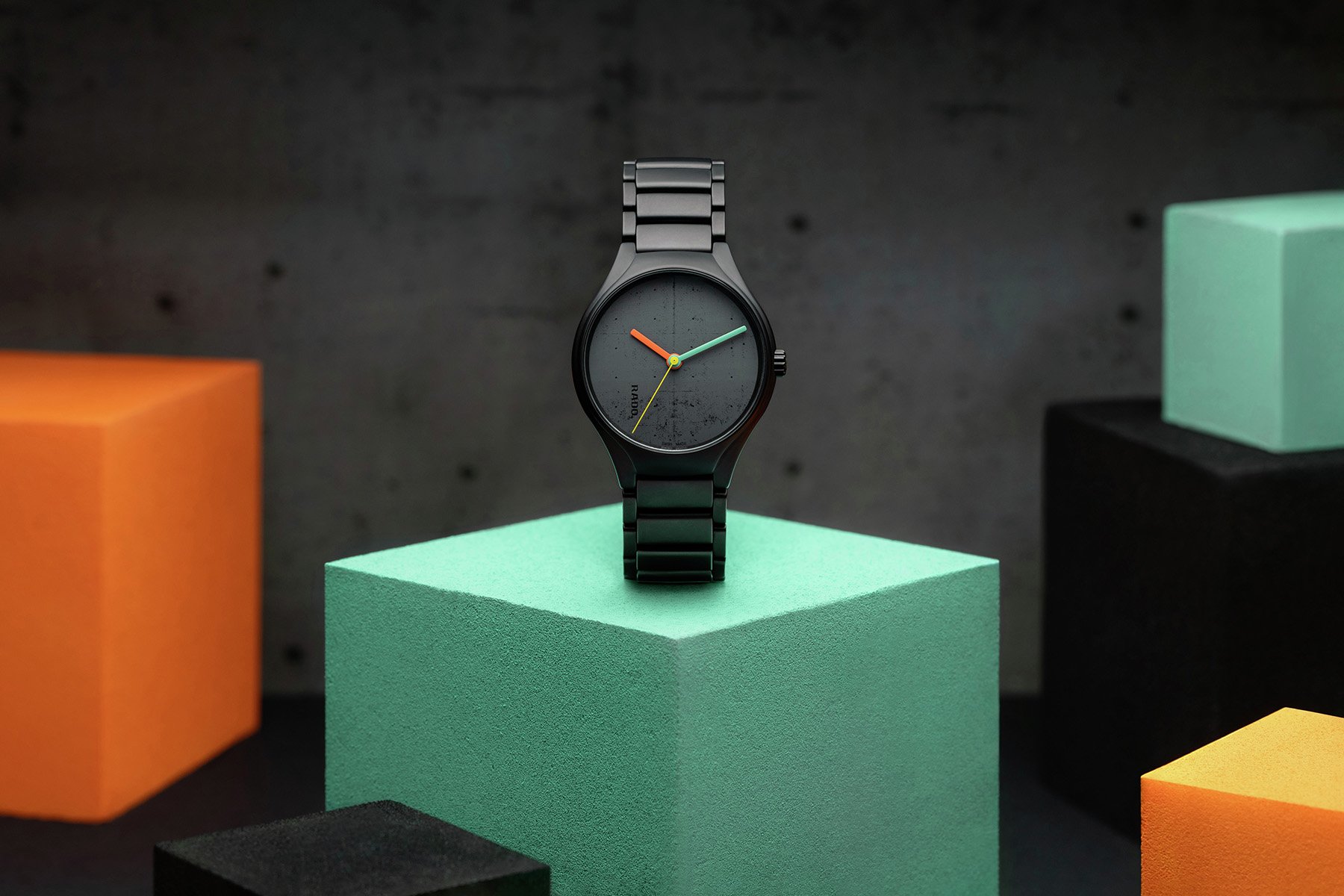
This third model was inspired by Le Corbusier’s urban-planning vision for Chandigarh, India. The watch takes direct cues from the city’s Palace of Assembly. Completed in 1962, this is one of three public buildings known as the Capitol Complex. Even more importantly, though, they are part of a larger conceptual idea that Le Corbusier had for the new capital of Punjab. The architect imagined a more rational, efficient city with a geometric “grid” layout. Additionally, the Capitol Complex carefully blended architectural principles and nature. It laid the groundwork for how we still look at the basic principles of urban planning today.
The Palace of Assembly is the most famous of the buildings and inspired the Rado designers to create a special dial for this watch. First, the case, bracelet, and crown are made of Ivory Black, reference 4320E in the Polychromie Architecturale system. The matching dial features a laser-engraved pattern depicting the facade of the Palace of Assembly in Chandigarh. Hovering over the dial are three lacquered, contrasting hands. The hour hand is Powerful Orange (4320S), the minute hand is Emerald Green (4320G), and the seconds hand is Olive Green (4320F). This stealthy model completes a trio of unique timepieces.
Final thoughts on the Rado True Round × Les Couleurs Le Corbusier Special Editions
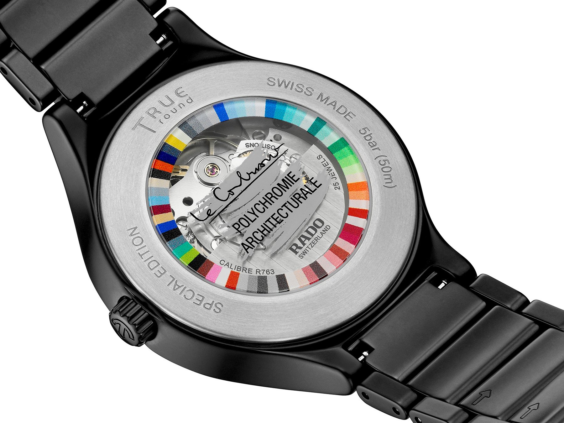
But that is not where it ends. If you turn the watches around, you will see a special case back. It features all 63 shades of Le Corbusier’s color spectrum digitally printed on the sapphire display. The colorful ring encircles the automatic caliber. But as you can see, at the center of the sapphire crystal, you will find Le Corbusier’s logo and the reference to the Polychromie Architecturale. As a former design professional, I am a fan of color systems, and it is great to see Le Corbusier’s full range of colors integrated into the design.

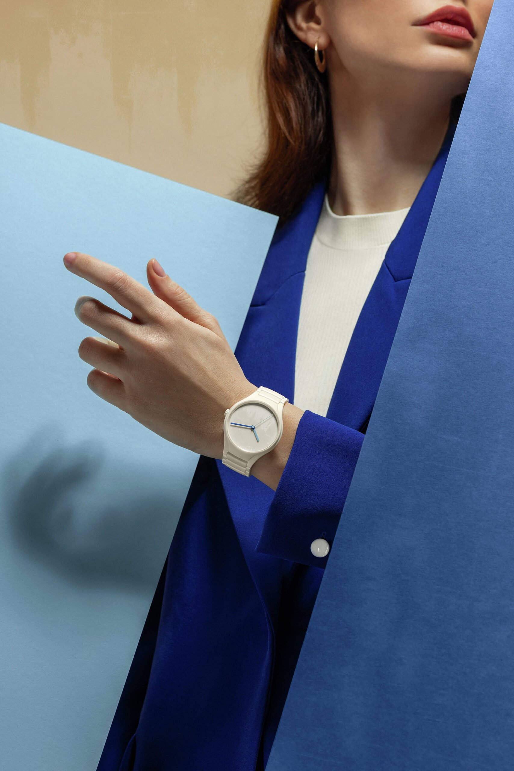
The colors also return in the special commemorative boxes these watches come in. Each of the three models is available now for €2,750. This sum will buy you a watch that looks deceivingly minimal at first glance. But once you read the story behind these three models and see them up close, you will quickly understand there is a lot more to them. I love the soft look of this trio of watches. The specific finish of the ceramic material looks super nice.
It also looks very comfortable to wear. We all know that ceramic is lightweight, but the soft, matte overall presence adds a lot to the magic. On top of that, this trio tells a great architectural story that puts the spotlight on Le Corbusier. Knowing that he was born in La Chaux-de-Fonds, the heart of Swiss watchmaking, makes these watches even more interesting. This trio of Rado True Round models is a testament to the role of watches as powerful storytellers.