Sunday Morning Showdown: Tudor Ranger (39mm) Vs. Longines Spirit Pilot

Good morning, and welcome to another Sunday Morning Showdown. Last year, Tudor added a new 36mm size and a beige-dial option to its entry-level Ranger lineup. In November, we put it up against the Christopher Ward C65 Dune, and the Tudor won by quite a big margin. You could say it was an unfair match, though, as the Ranger costs three times as much as the C65 Dune. So we decided to find the Tudor Ranger a more suitable challenger. That’s how we ended up with the Longines Spirit Pilot.
While the 39mm Tudor Ranger sells for €3,630, the Longines Spirit Pilot can be yours for €2,950. That’s if you’d like to get these watches on their matching three-row bracelets. On a nylon strap, the Ranger is €400 less expensive, while the Spirit Pilot costs €250 less on leather or €350 less on rubber. Let’s see if the Spirit Pilot can put up a fair fight with the Ranger. But first, we’ll take a look at what happened during last week’s showdown.
Previously, on Sunday Morning Showdown…
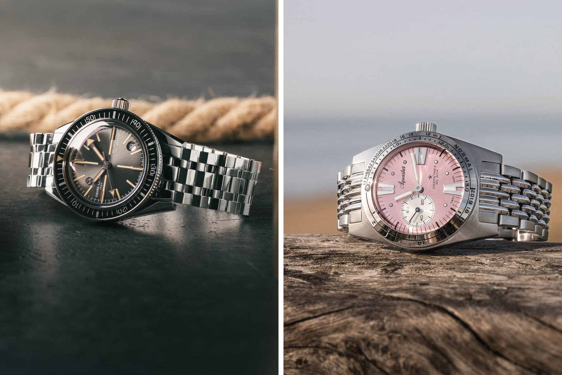
Last week, the Favre Leuba Deep Raider Revival took on the Aquastar Deepstar II. People mainly criticized the Deep Raider Revival’s 4:30 date window, and some thought the Deepstar II’s dial was cleaner. You also thought the latter has a more authentic connection to the brand’s history. Ultimately, though, both watches received equal love, which is why the showdown ended in a tie. Let’s see if this week’s battle will be just as close!
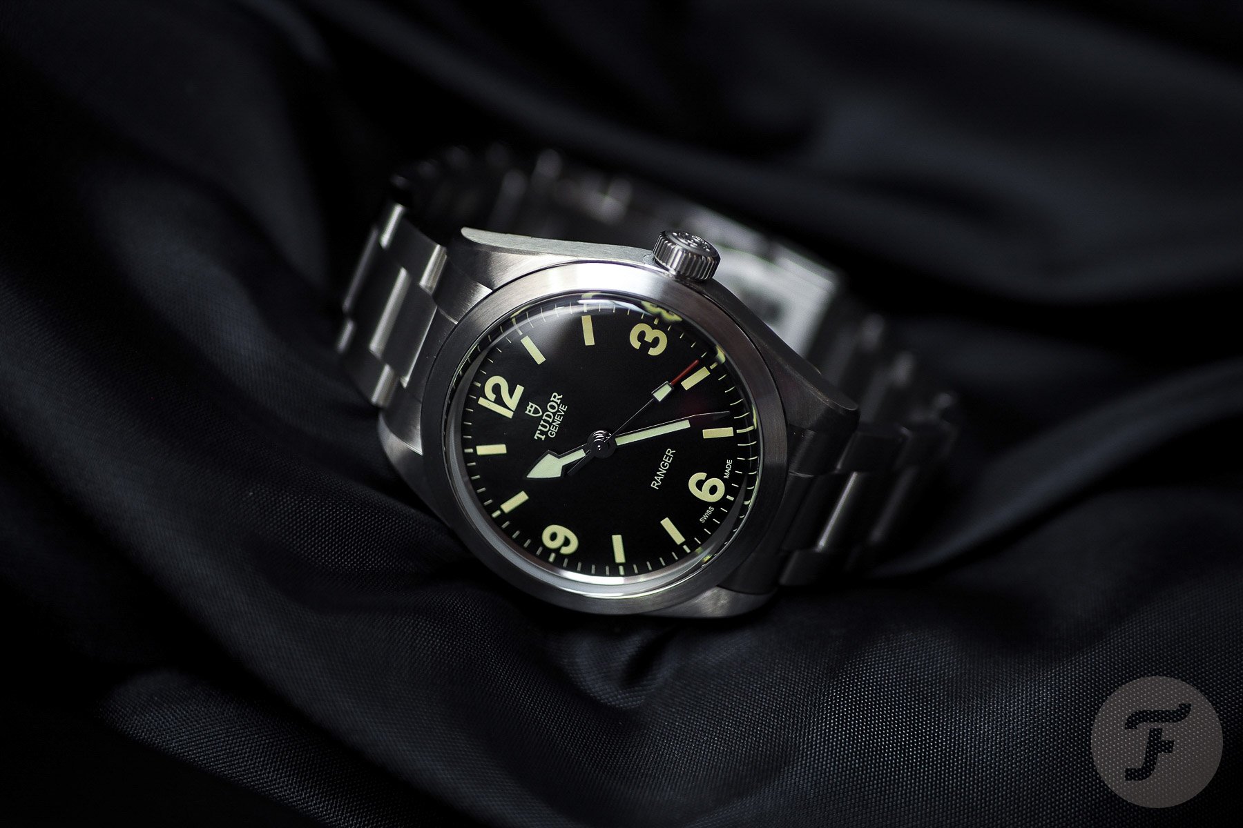
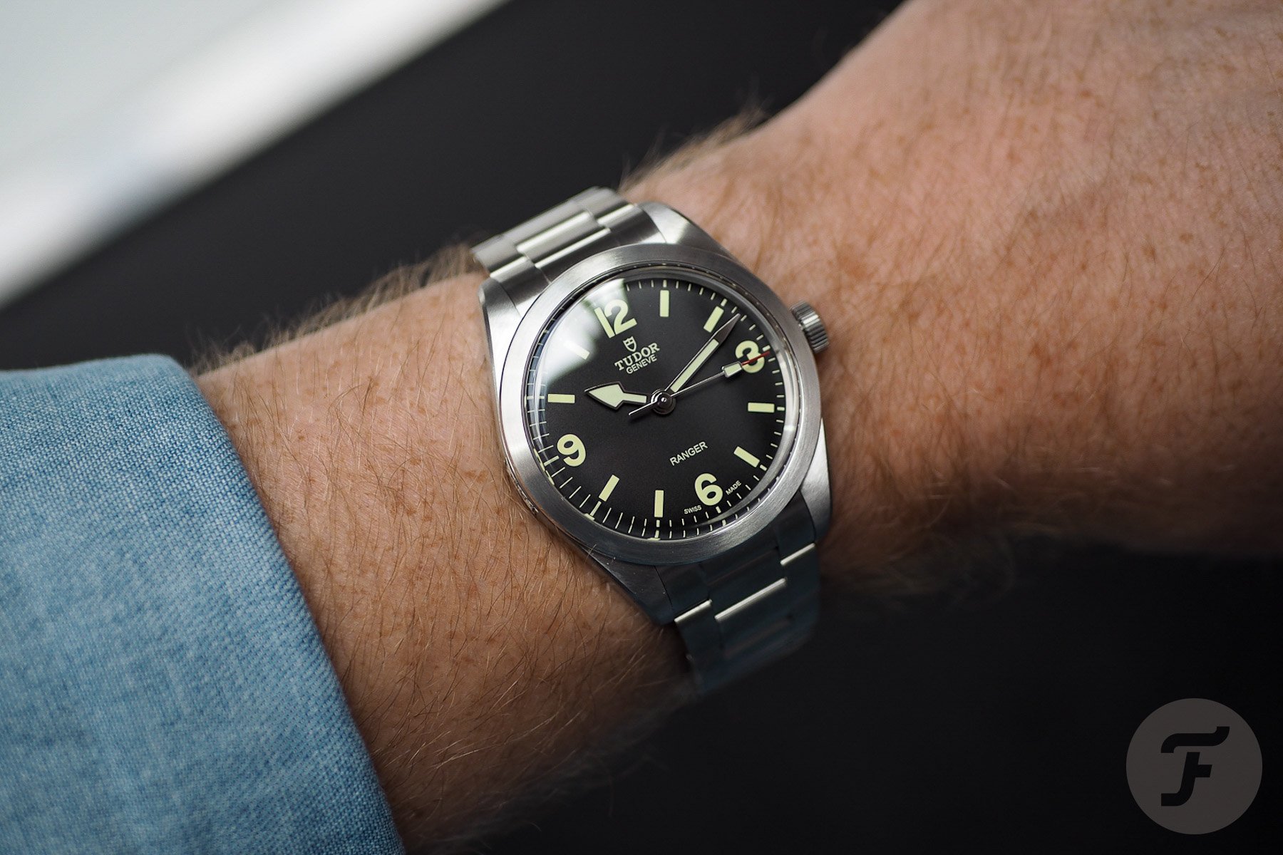
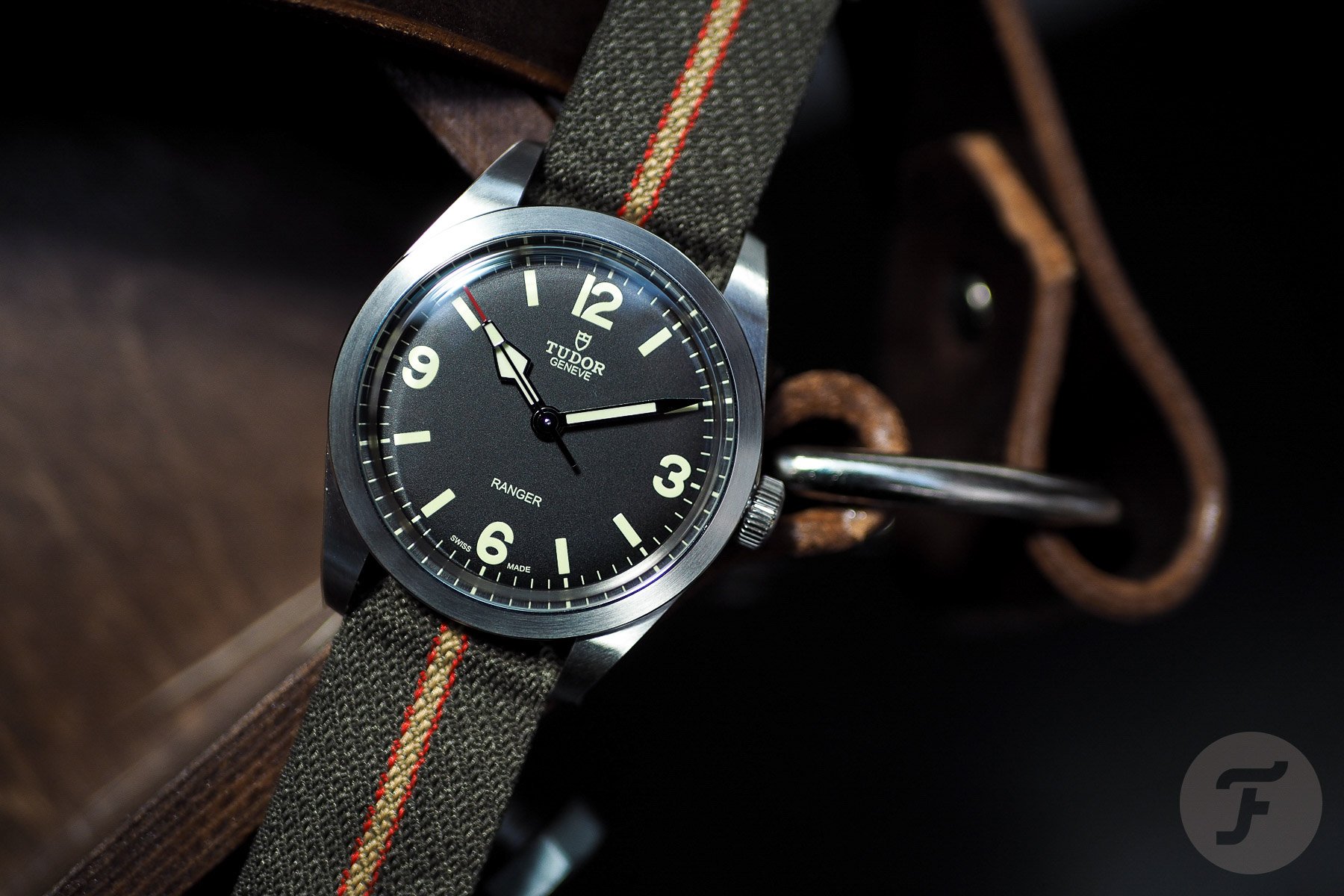
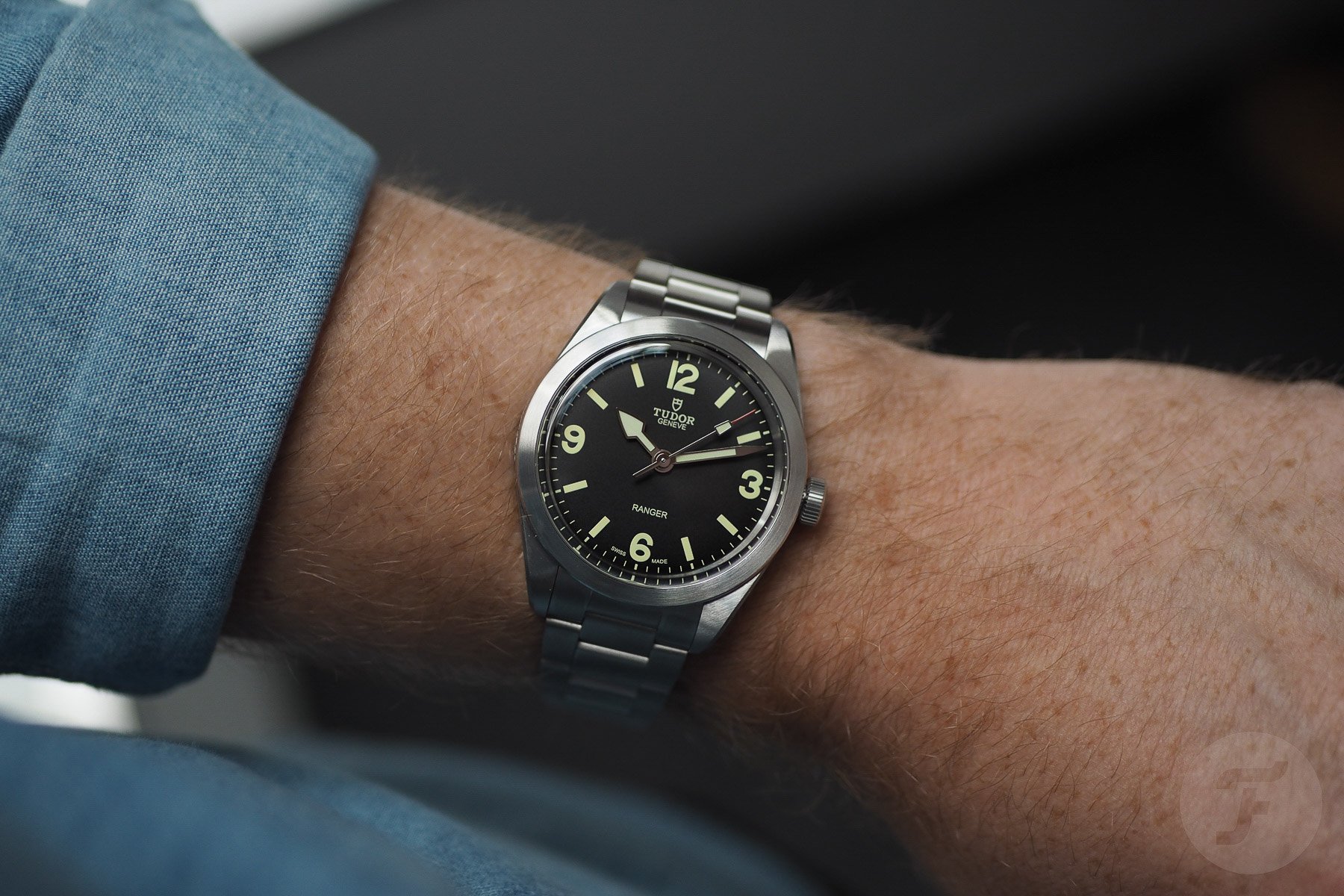
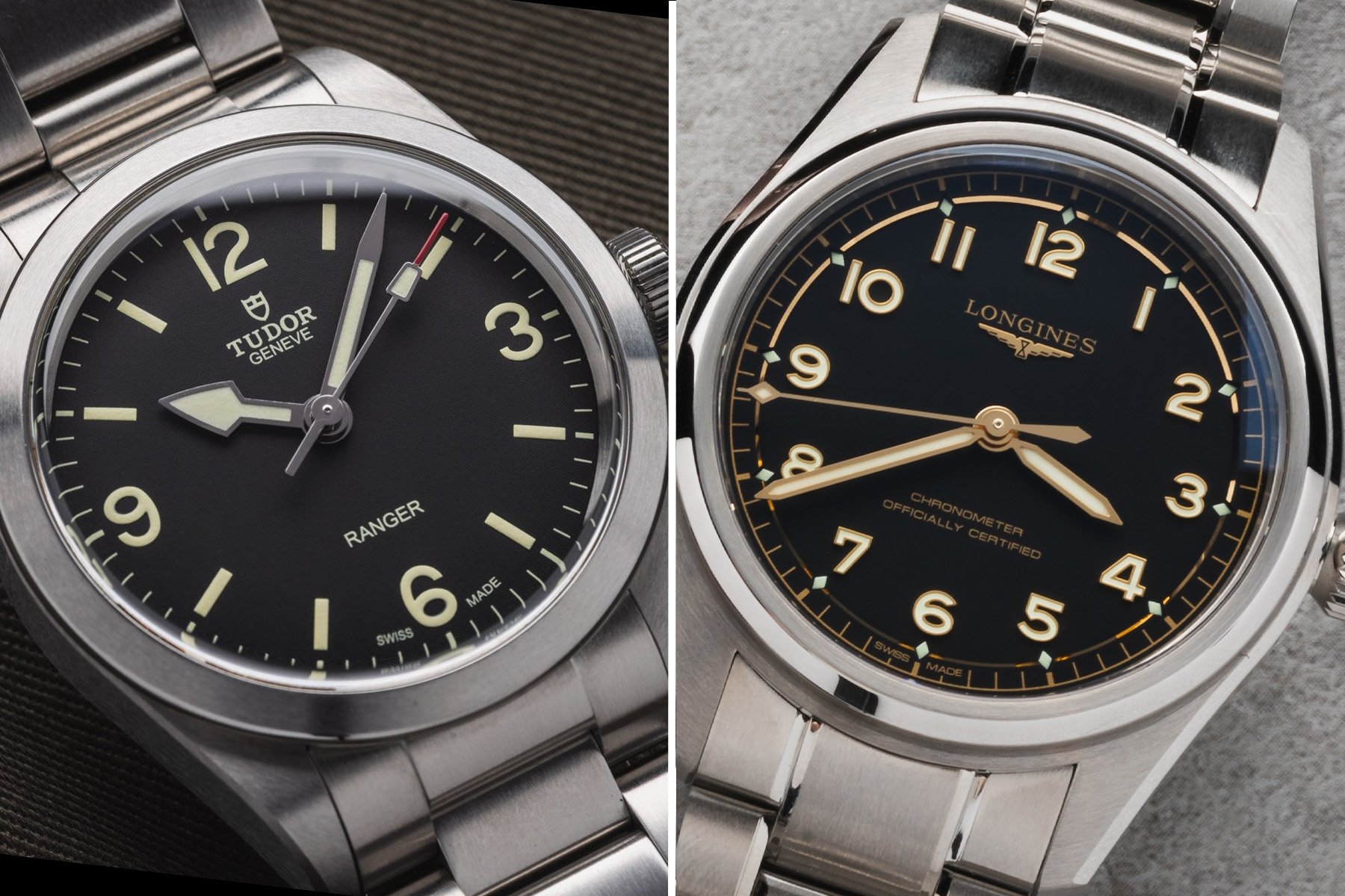
Daan: Tudor Ranger 39
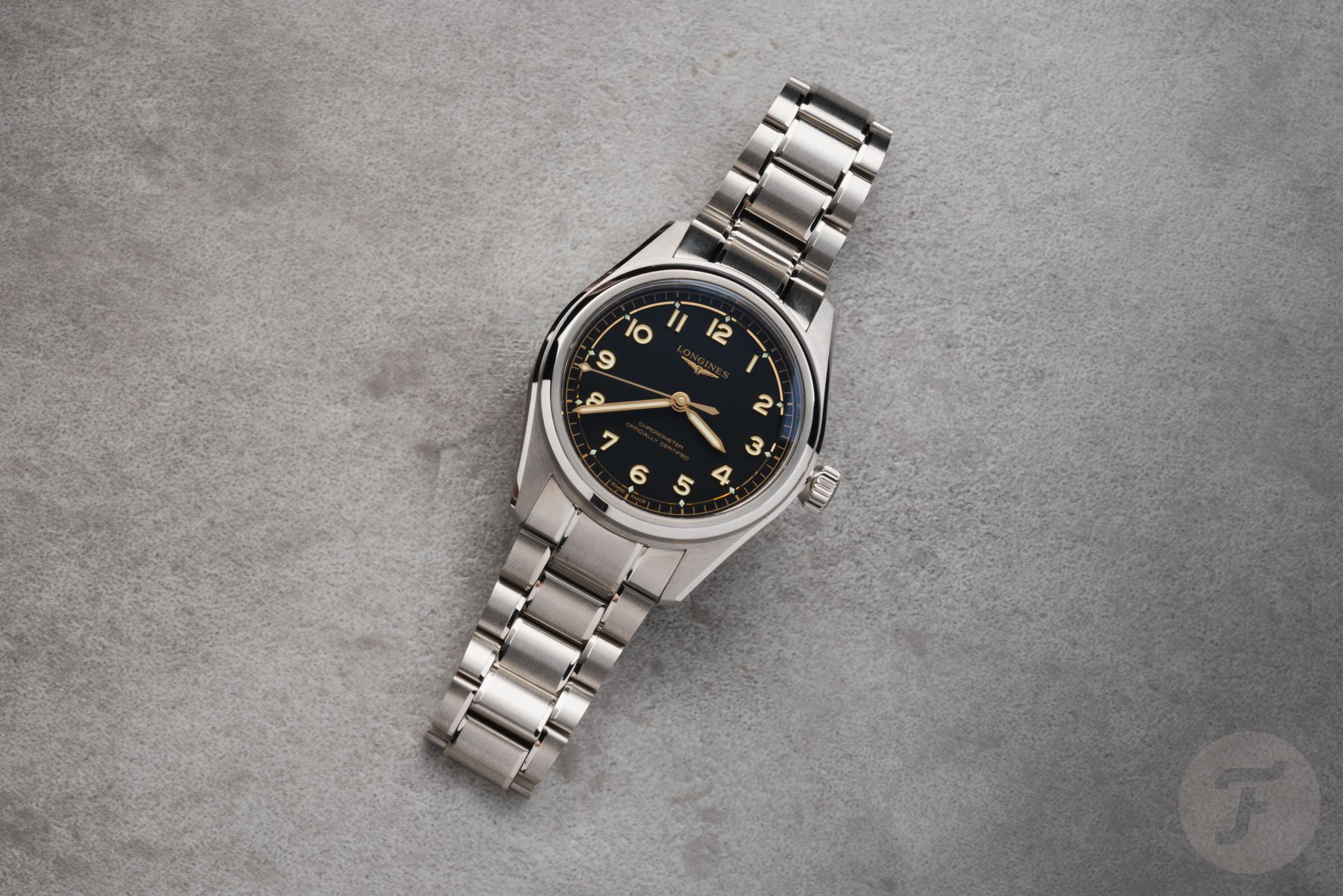
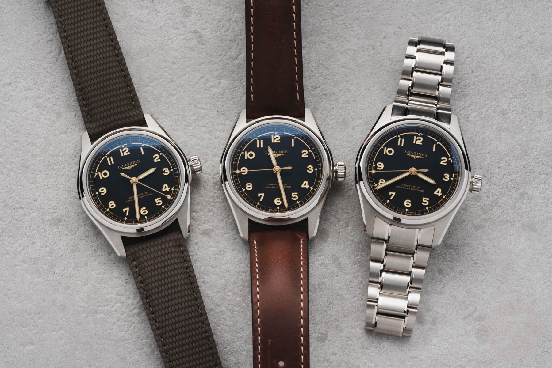
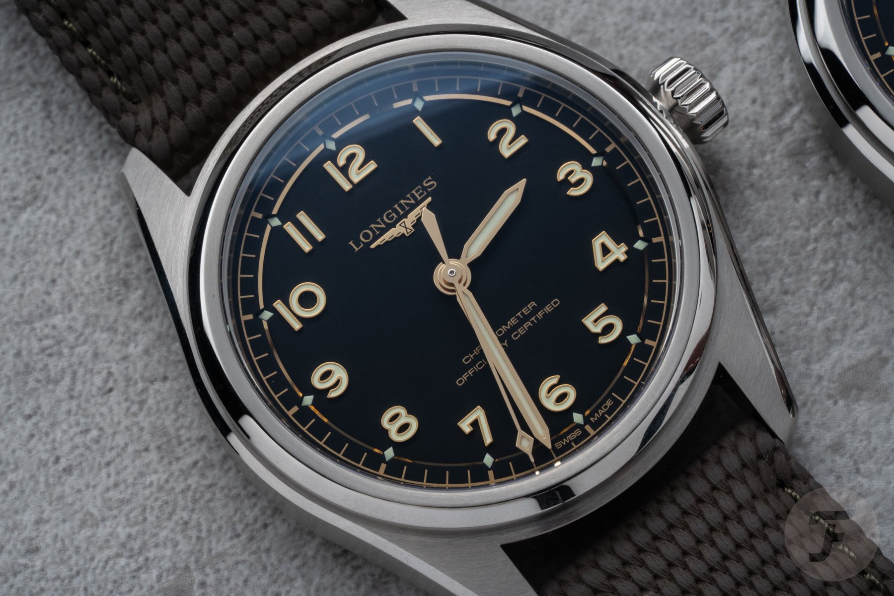
Both of this week’s contenders may indeed share a similar vibe with their Arabic numerals and time-only dials. However, the Longines Spirit Pilot has an aviation theme, while the Tudor Ranger is more of a general expedition watch. I’m usually not a huge fan of pilot’s watches, but the Spirit Pilot’s 39mm case isn’t too big, so that’s not something I can use against it today.
I also quite like the layout with the full set of applied numerals and the diamond-shaped hour markers that overlap with the stepped minute track. The thing that does bother me about the Longines, though, is the matte black dial with all the gilt on top. I know it refers to its past, and vintage-inspired watches are still a trend these days. Still, every time I look at the Spirit Pilot’s dial, I wonder what it would have looked like without all the gold-tone elements.
A divisive dial
In your hands-on article, Thomas, you mentioned that you’re not a big fan of the Tudor Ranger’s dial. That’s not even because of the shovel-shaped hour hand that most people find a bit awkward. No, it’s because the printing on the dial ignores the standard typographer’s rule book. The 3 feels unbalanced, the 6 and 9 are almost egg-shaped, and the 12 is out of proportion.
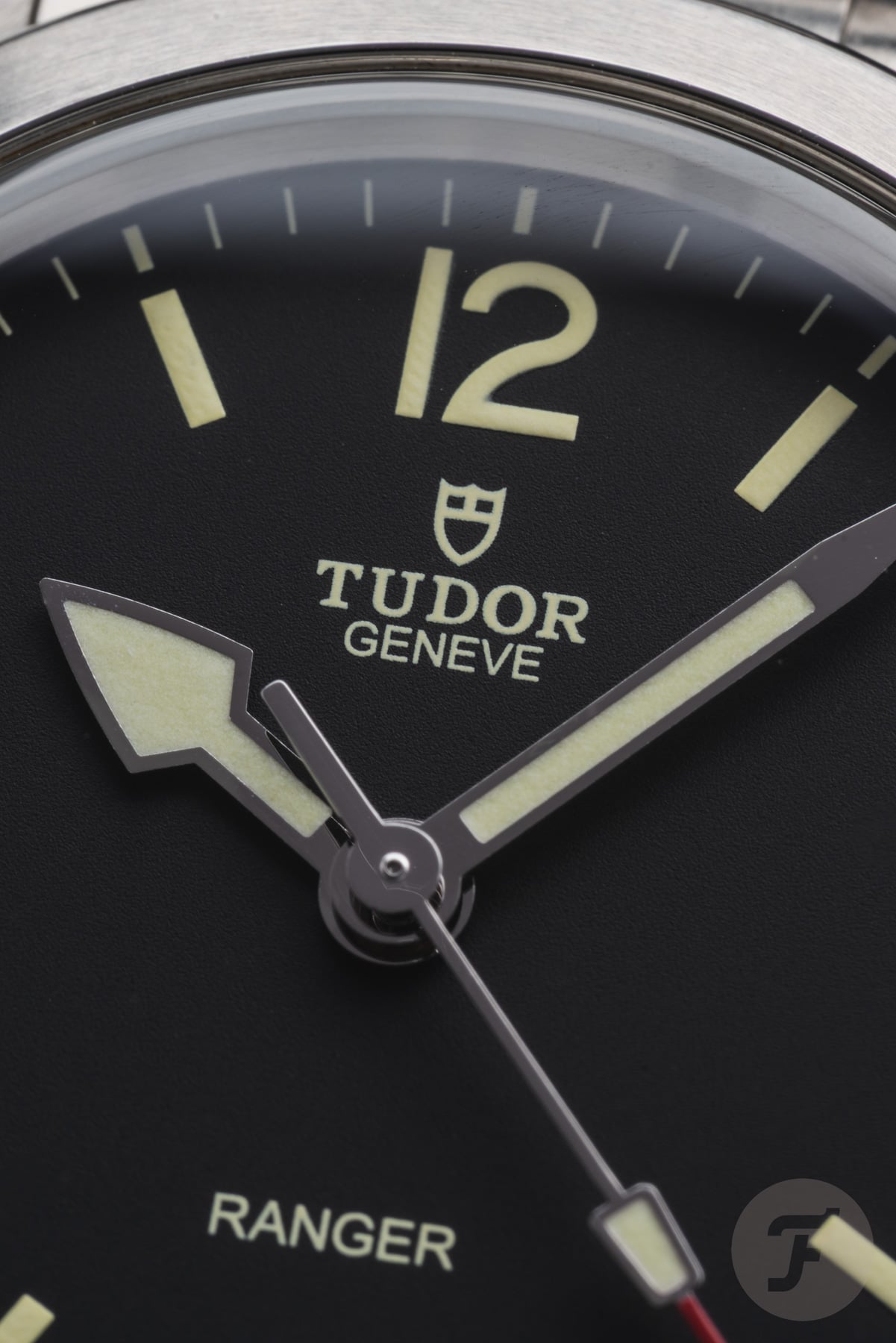
Honestly, I also noticed something was off, but the overall look doesn’t bother me. I simply thought the printing was inspired by yesteryear, and I think it adds to the Ranger’s vintage-inspired style. If you’re not a typography nerd like Thomas, I think the Tudor’s dial is totally fine. It might be a bit flat, especially compared to the one in the Longines, but that’s simply because it replicates its ancestor’s look. Would lume blocks have been cool, like on a Vertex, for example? Sure, but they would’ve ruined the Ranger’s no-nonsense look.
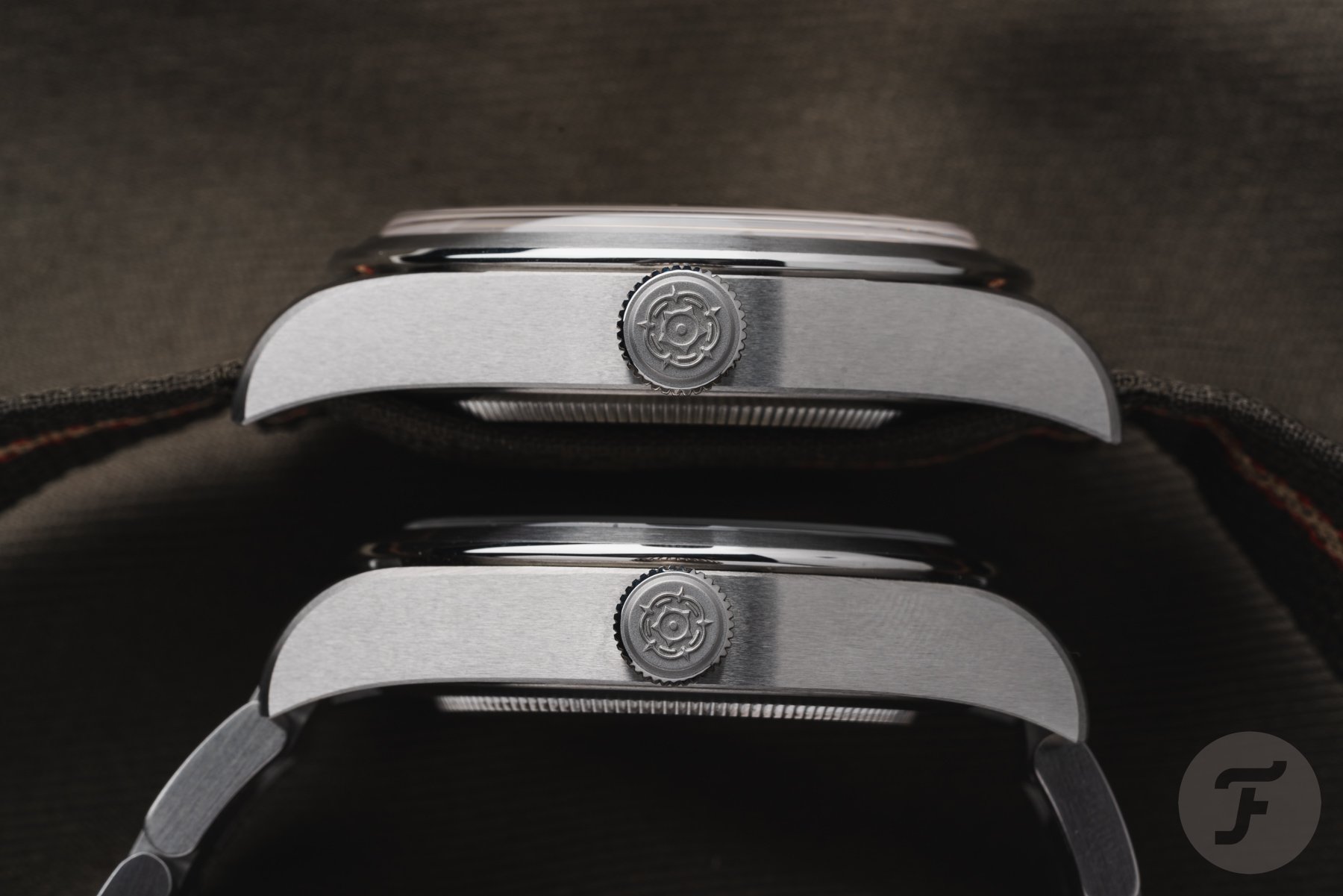
The sturdy Black Bay case
The Tudor Ranger isn’t part of Tudor’s Black Bay collection, but it does have a very similar case design. In comparison, the Ranger’s case is almost fully brushed, except for the bezel’s outer rim, which adds to its adventurous character. The Black Bay case can look a bit slab-sided, especially for thicker models, like the Black Bay Pro. However, on the 12mm-thick Ranger, it works, partially because the case has a sharp bevel on both the top and the bottom. I also love the profile view, with the sharp lug ends that look like devil horns.


Another great feature of Tudor watches is the bracelets, which feel almost as sturdy and luxurious as bracelets from Rolex. The Oyster-style bracelet on the Ranger is no exception, and I like that the case’s brushed finish continues onto it. In addition, the T-fit clasp lets you adjust its size on the go without tools.
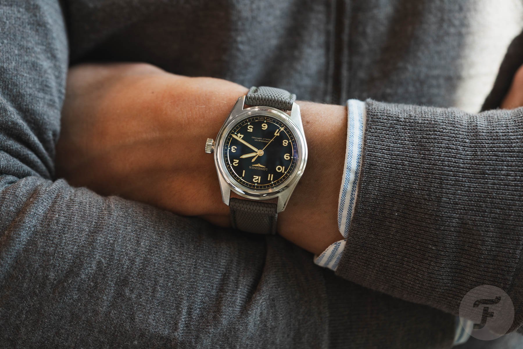
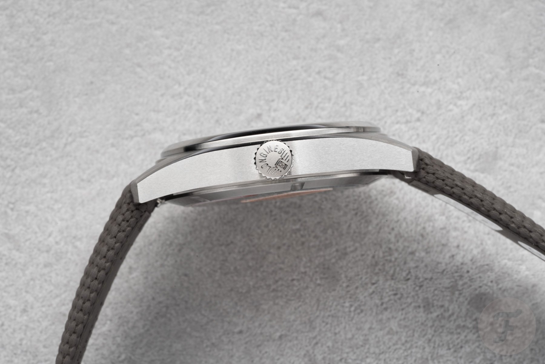
Sure, the Longines Spirit Pilot also offers that comfort, but I don’t love the polished lines on the links. They remind me of Grand Seiko bracelets, which, just like on the Spirit Pilot, don’t match the case very well. And come on, Thomas, doesn’t that ill-fitting end link just give you the creeps? All right, over to you. Let’s hear it for the Longines Spirit Pilot.
Thomas: Longines Spirit Pilot
Thank you, Daan! And good morning, Fratelli! Ah, you set me up there, Daan. Yes, the end links on the Longines Spirit Pilot are an aesthetic weak point. I will get back to that, but let me zoom out before I go into detail. We always get accused of comparing apples to oranges, no matter how closely matched our contestants are. Let’s say that it is a good Fratello tradition. This week, however, I am rather sure we’ll get hit with this feedback. After all, one is a field watch, and the other is a pilot’s watch.
However, it is quite reasonable to find both of these on your friendly neighborhood AD’s table when shopping for a solid everyday sports watch. The “pilot” and “field” labels are, in fact, just labels. Both of these fulfill the sportier GADA role with verve. Add to this the fairly comparable specs, pricing, and, to some extent, even the styling, and we have a fair matchup nonetheless.
Okay, that’s enough justification for our choices. Let’s get into why I think the Longines Spirit Pilot is the one to get.
Longines Spirit Pilot over Tudor Ranger
As you say, Daan, the Longines sits almost €700 below the Tudor. That’s a significant gap at this price point. So, what does the Ranger offer that the Spirit Pilot does not? Well…frankly…nothing. Specs-wise, these two watches are extremely close. You don’t get any significant differences in daily operation or performance from the movements. However, the Spirit Pilot has the Ranger beat in one major respect — finishing.
In my recent review of the Tudor Ranger, I described how it feels a bit crude, with unacceptably sharp edges on several parts. I think it is safe to say that it is Tudor’s least well-finished watch in the current collection. Meanwhile, the Spirit line is Longines’s best series when it comes to surface finishing.
You get much cleaner transitions that are sharp to the eye but not to the touch. Generally, the Longines Spirit’s case features much greater definition and clarity of form. Frankly, it isn’t even close. The Longines is easily the best in class, while the Tudor certainly isn’t.
Comparing the Longines Spirit Pilot’s and Tudor Ranger’s designs
I find it interesting that typography is often considered an “only if you care” element. How could you not care? These are mechanical objects with the sole purpose of marrying beauty and function. Typography isn’t a luxury; it is a key design element. If you botch it up as badly as Tudor did on the Ranger, it deserves a major point deduction. Imagine saying, “The rotor isn’t mounted very well and only barely winds the watch. But hey, that only matters if you care about winding the watch.” Getting the typography right isn’t a nice bonus; it is a prerequisite if you are going to charge any significant amount of money for a watch. After all, poor typography compromises both the watch’s beauty and its function. It is inexcusable laziness. Mediocrity doesn’t cut it in luxury watches.
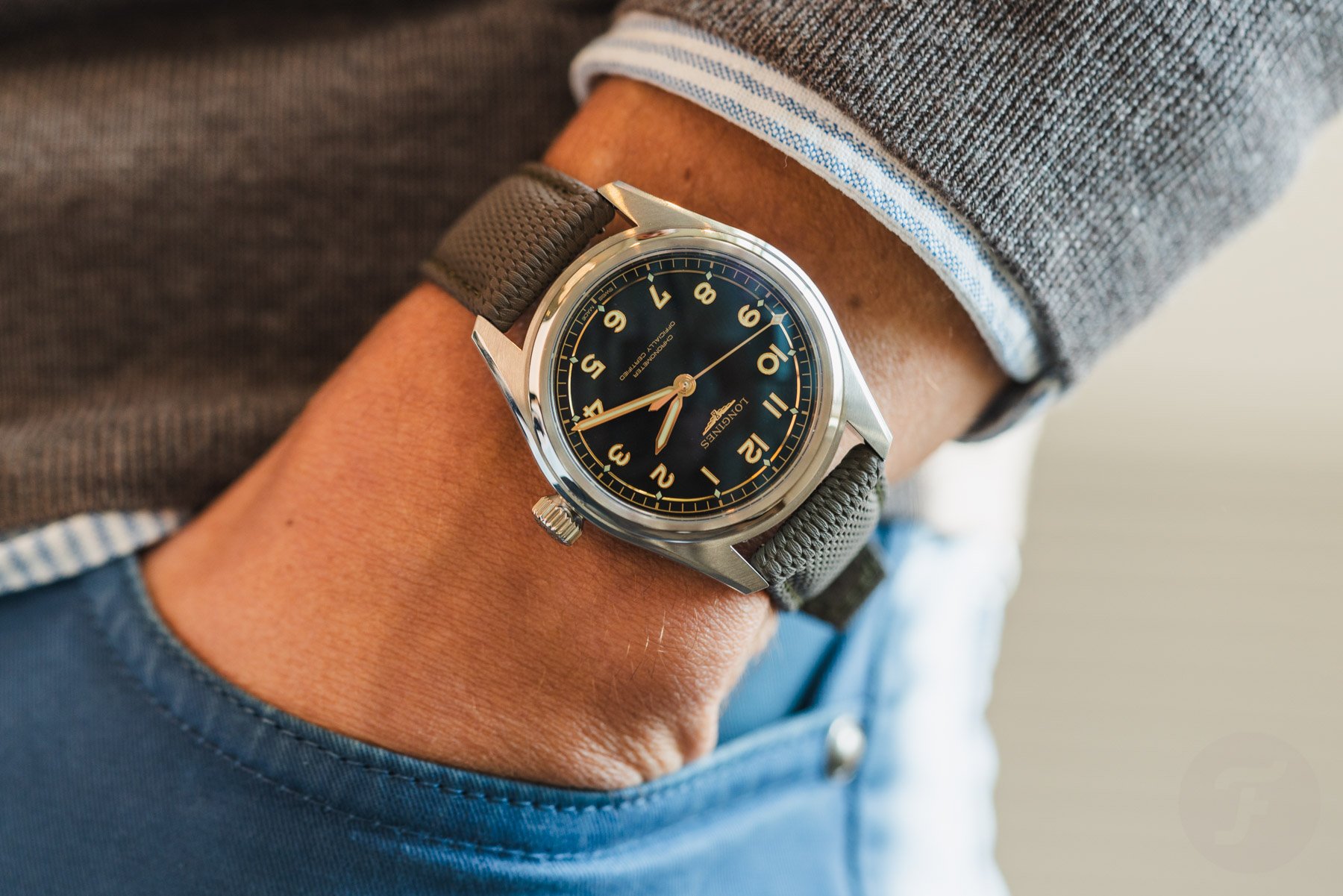
Now, the Longines Spirit Pilot doesn’t exactly count as groundbreaking when it comes to design. However, it gets the basics largely right. The internal proportions make a little bit more sense than the Tudor Ranger’s. The case looks and feels balanced, assertive yet elegant. Similarly, the dial features great visual hierarchy and, again, balance, especially now that Longines has removed those ghastly five stars.
I promised to get back to the end links, Daan, and now I will. In fact, I think the entire bracelet is where the Longines Spirit Pilot goes a bit south. It is nicely constructed and serves its purpose well, but the design language isn’t congruous with the case. You reference Grand Seiko. Interestingly, I often have the same gripe there. Sleek, angular cases married to old-school, rounded bracelets don’t quite work.
Cast your vote!
There you have it — two time-only tool watches designed with versatility and daily use in mind. Even though one is labeled a field watch and the other a pilot’s watch, they perform largely the same role. The differences are mainly limited to look and feel. So, which looks and feels better to you? Cast your vote below, and please share your motivations in the comments section!