#TBT The Ongoing Mystery Of The Round-Typeface Heuer Autavia 2446M

Was the round typeface in the sub-dials of the “2nd Execution” Heuer Autavia 2446M the result of a thoughtful process, a one-off creative anomaly, or a pad-printing-device operator’s neglect? Who knows?
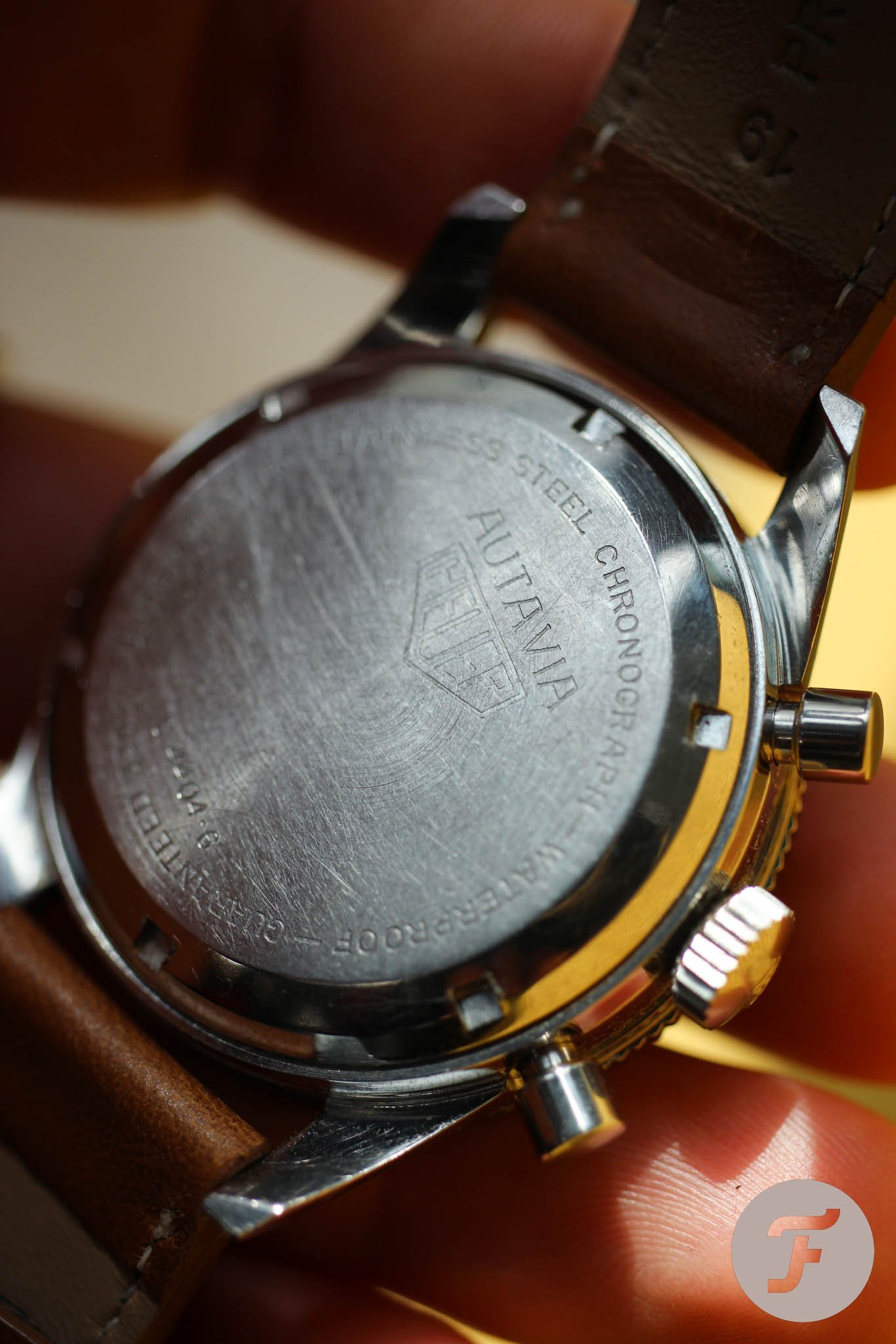
What we know for sure is that we are not looking at some Frankenwatch assembled later from various parts. “Exactly what it should be!” says Jeff Stein, OnTheDash founder and one of the foremost experts on vintage Heuer chronographs, when he inspected the serial number of my Autavia with round numerals. “Serial numbers on the cases are in the 85xxx-to-89xxx range, with only one sample falling outside this range,” he adds.
Three examples from a decade
“Inspired by your work, I have sorted out some files on these watches, and I see that I have photos of approximately eight examples,” says Jeff. Judging by Jeff’s three-decade-long, persistent, and thorough research on these fascinating chronographs, we can rightly call the round-numeral Autavia 2446M a rare find.
The more research collectors put into the study of a particular reference, the more puzzling stories they unearth. It has already been eight years since Mike told us about another great and unique “2nd Execution” Heuer Autavia ref. 2446 variant with lumed hour indexes. You won’t find it surprising that Jeff had a part in that story, will you?
A recap of the basics
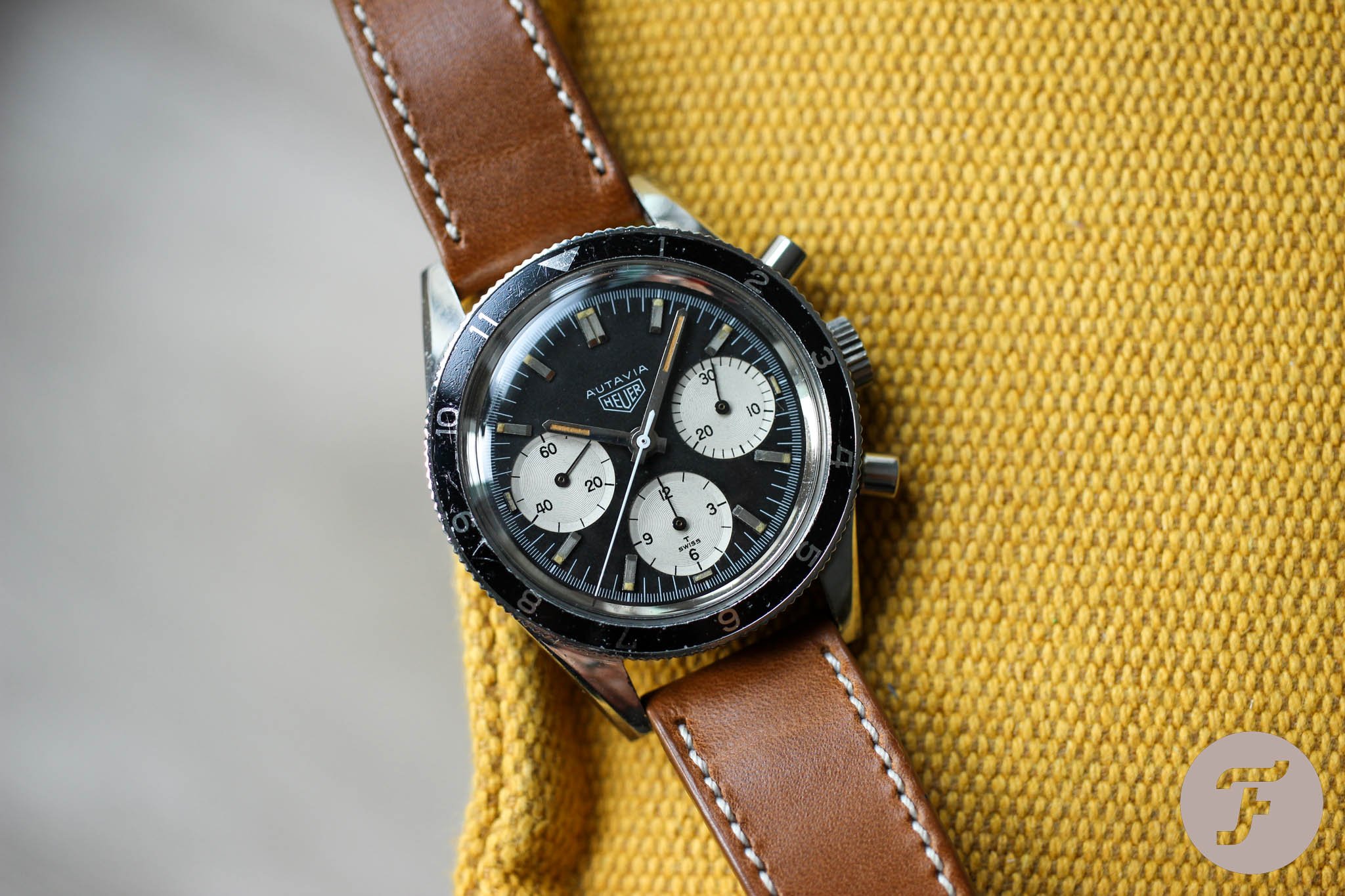
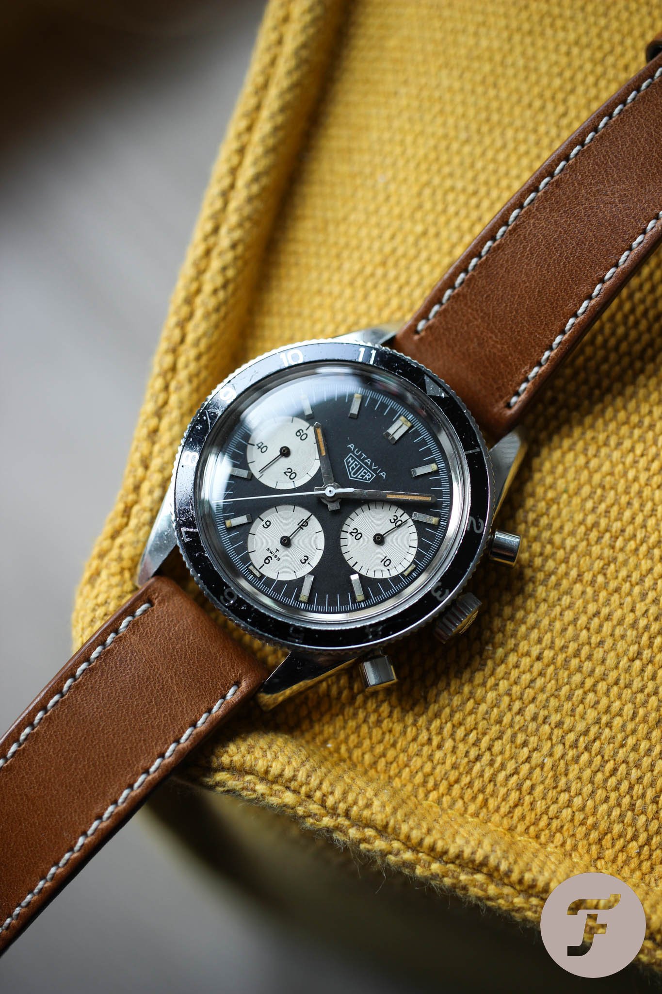
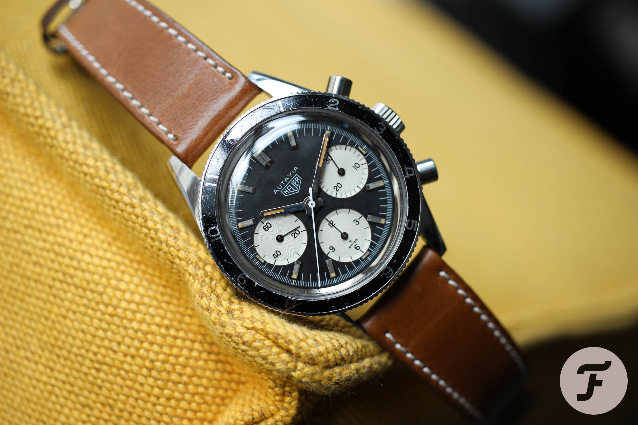
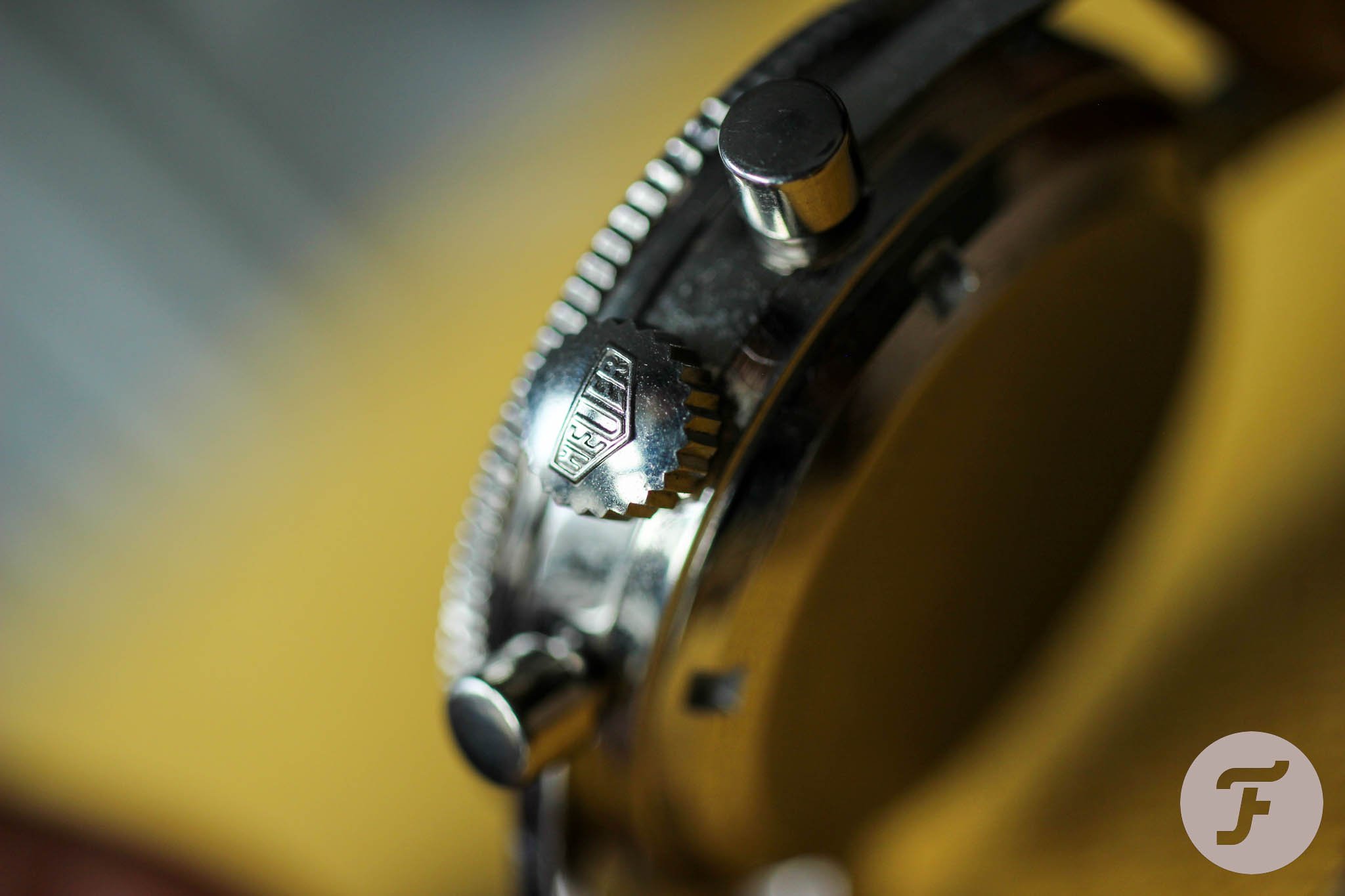
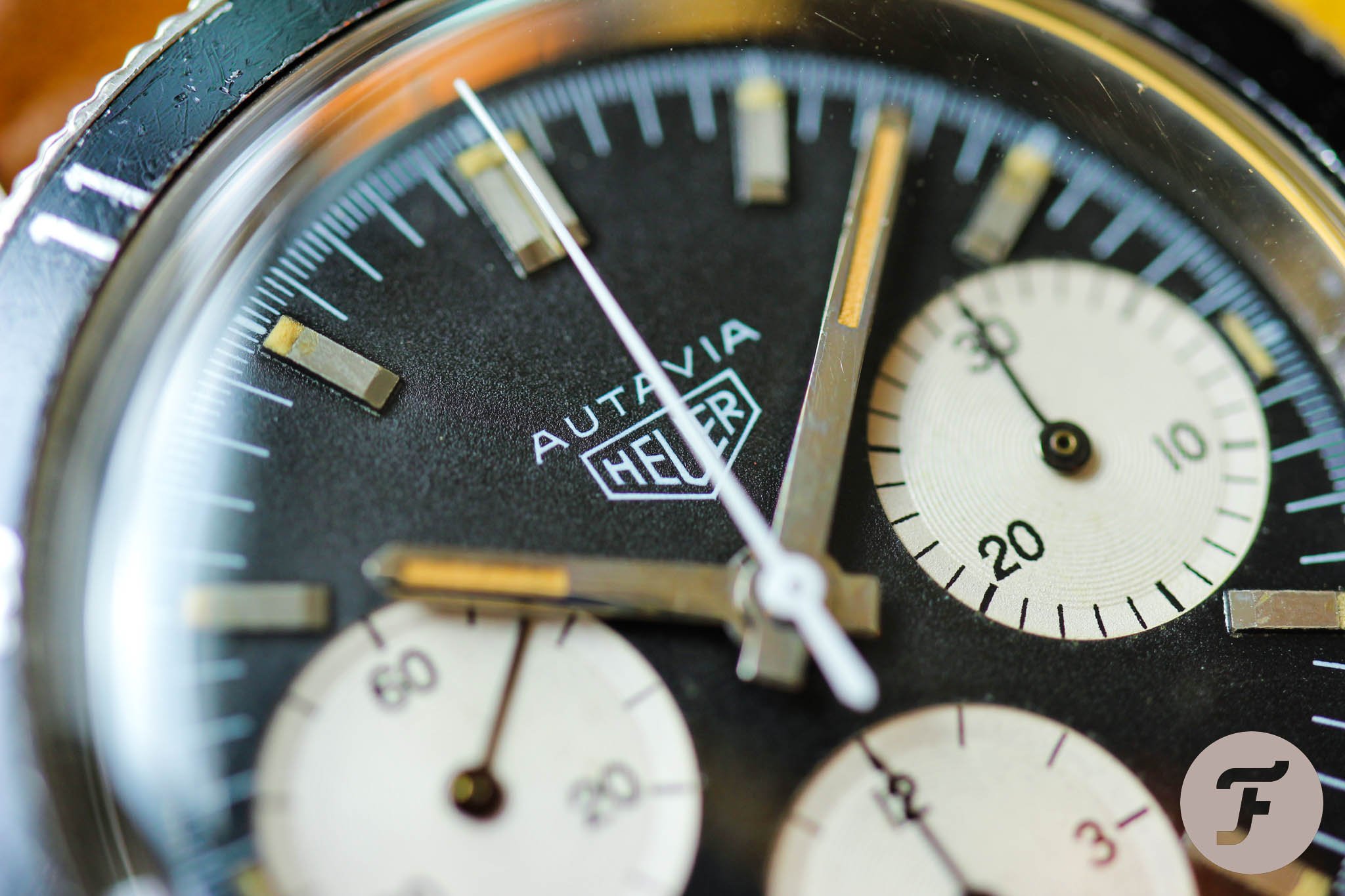
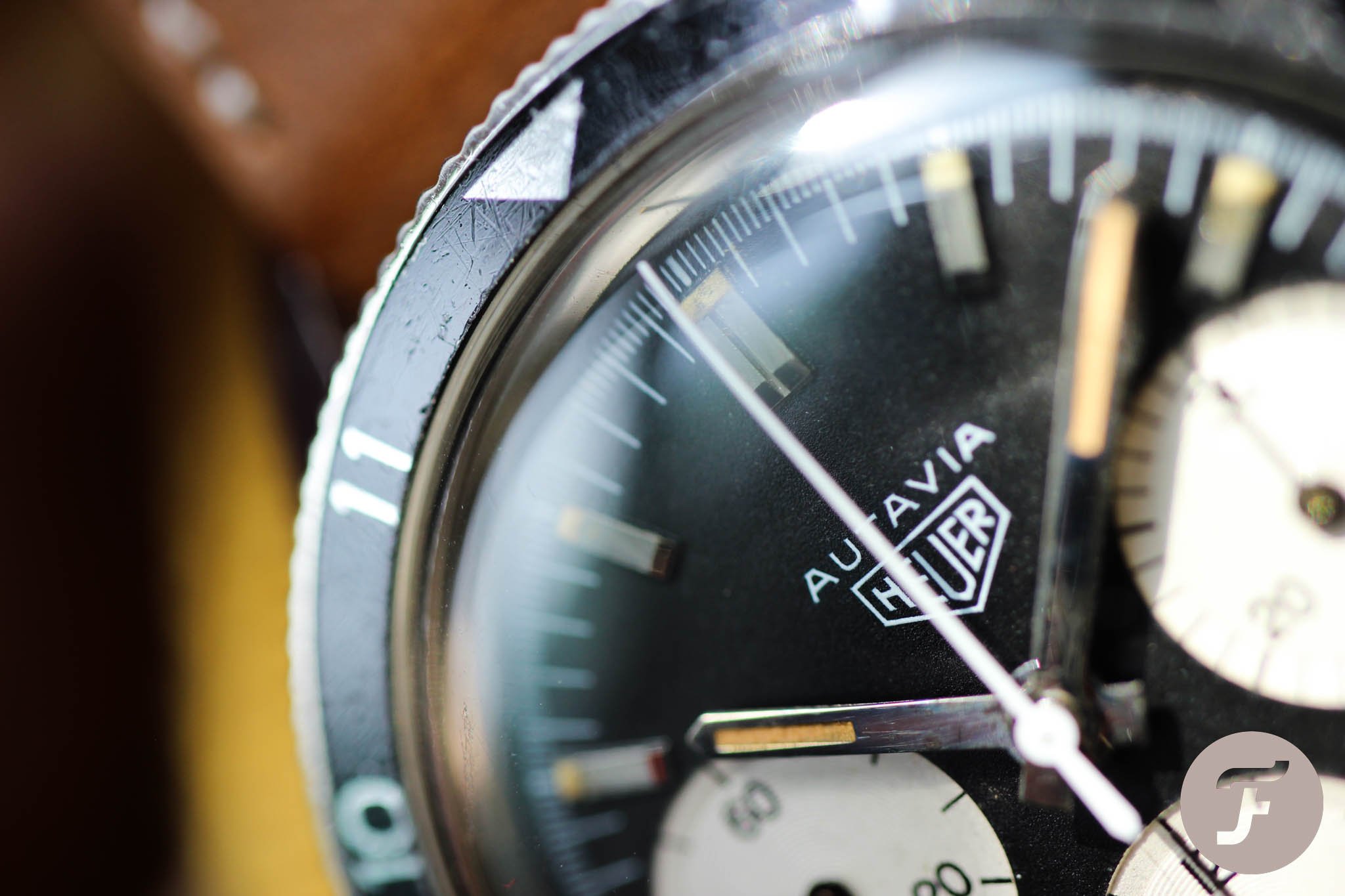
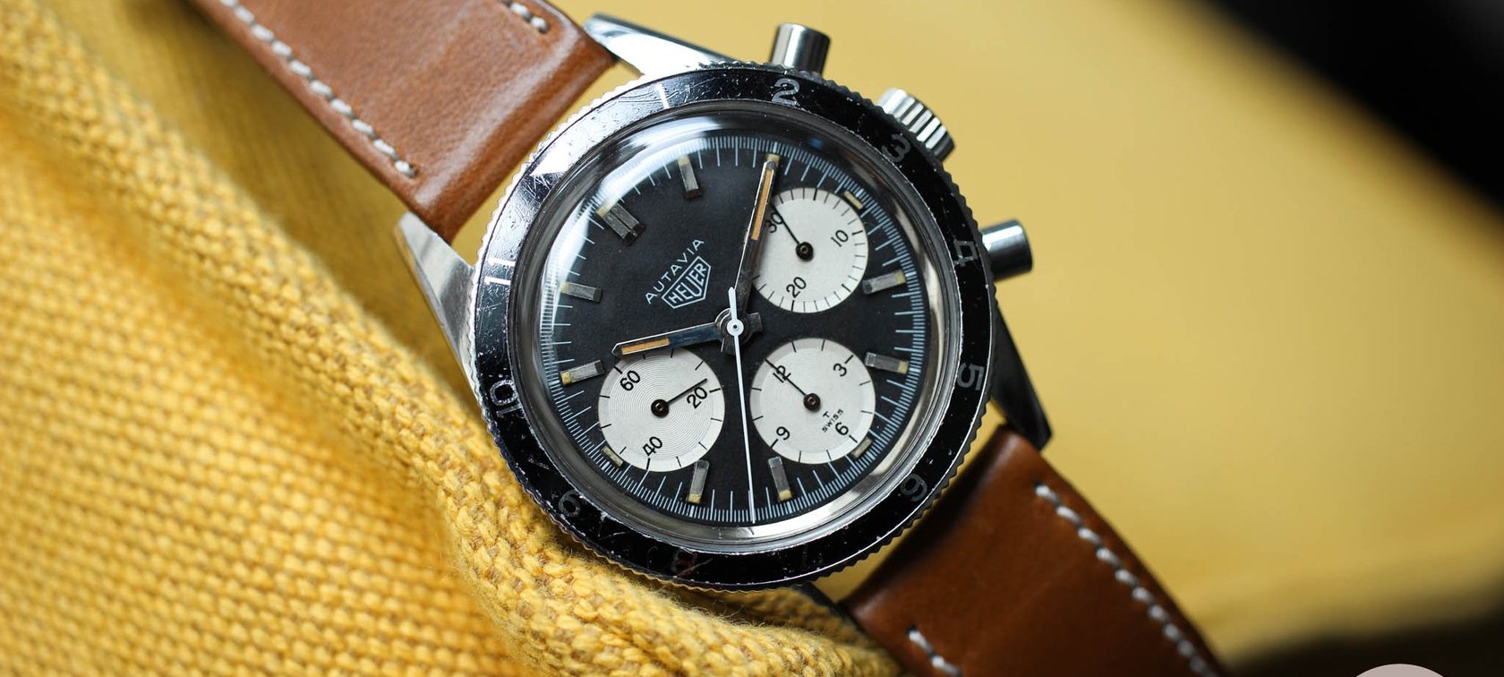
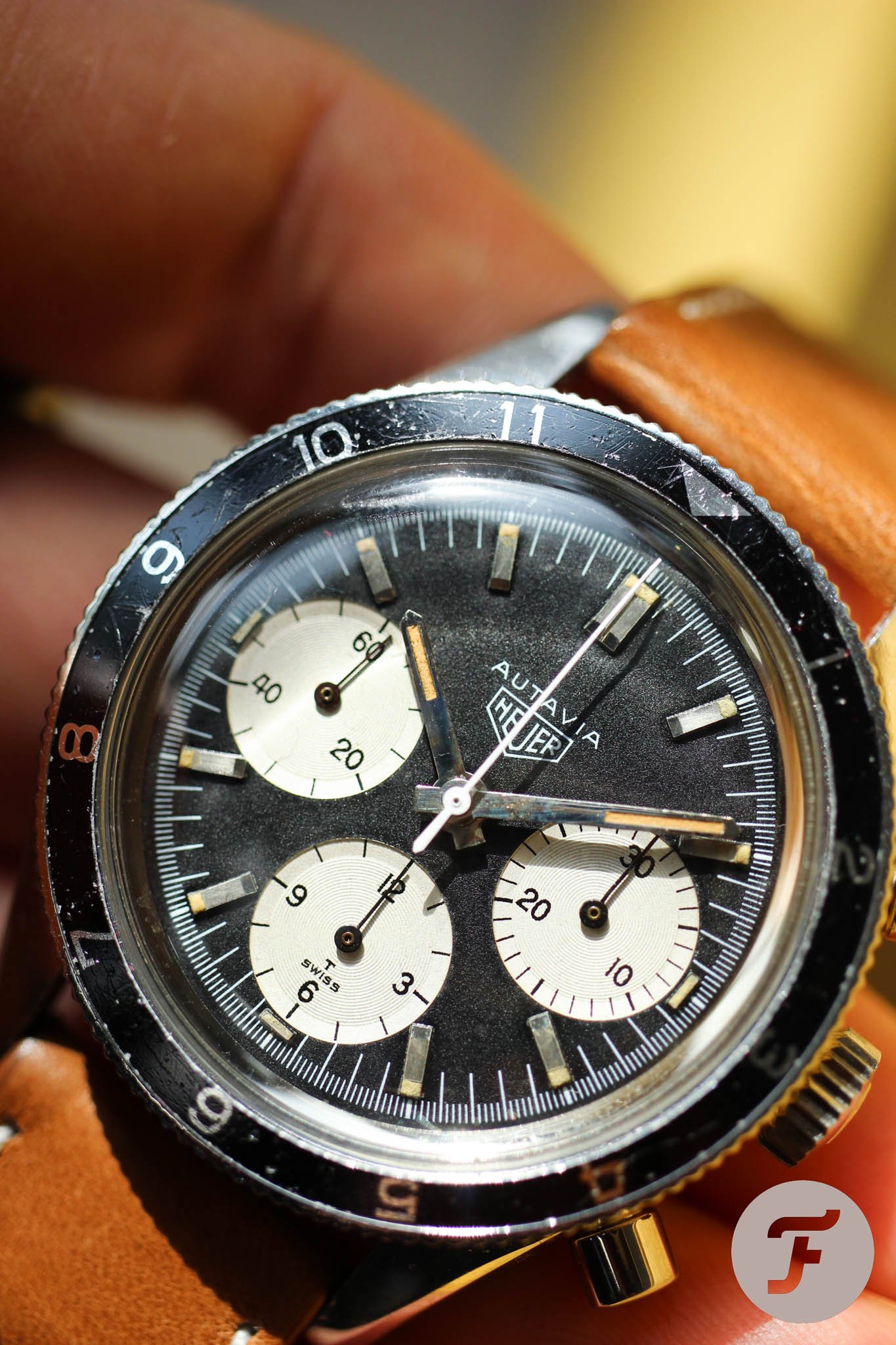
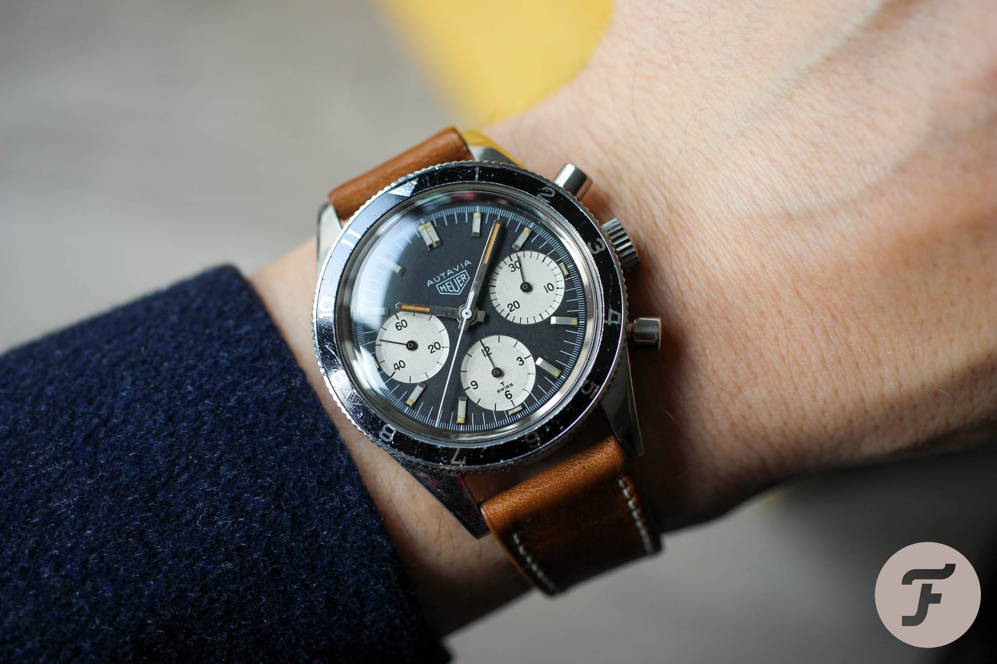
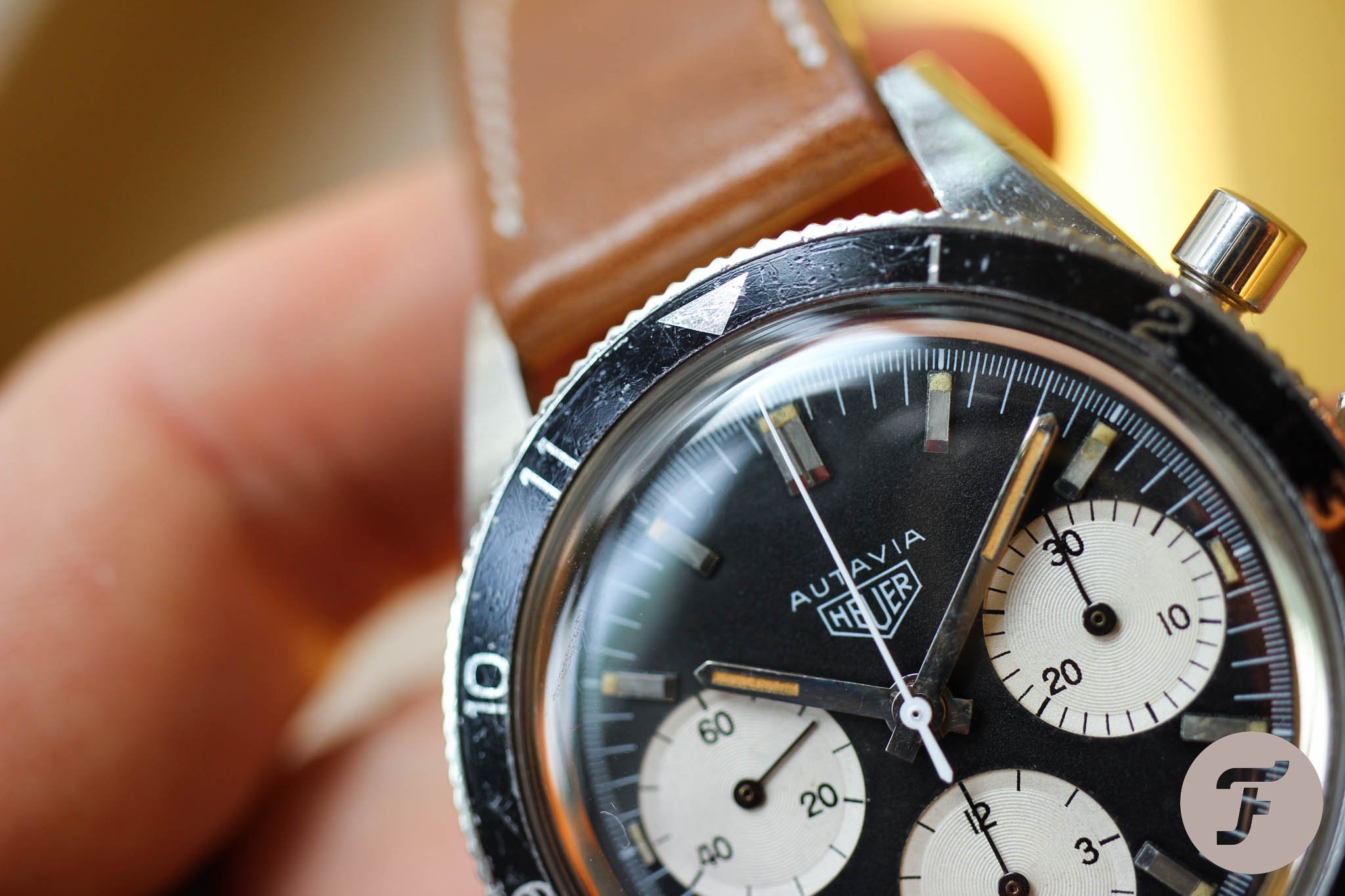
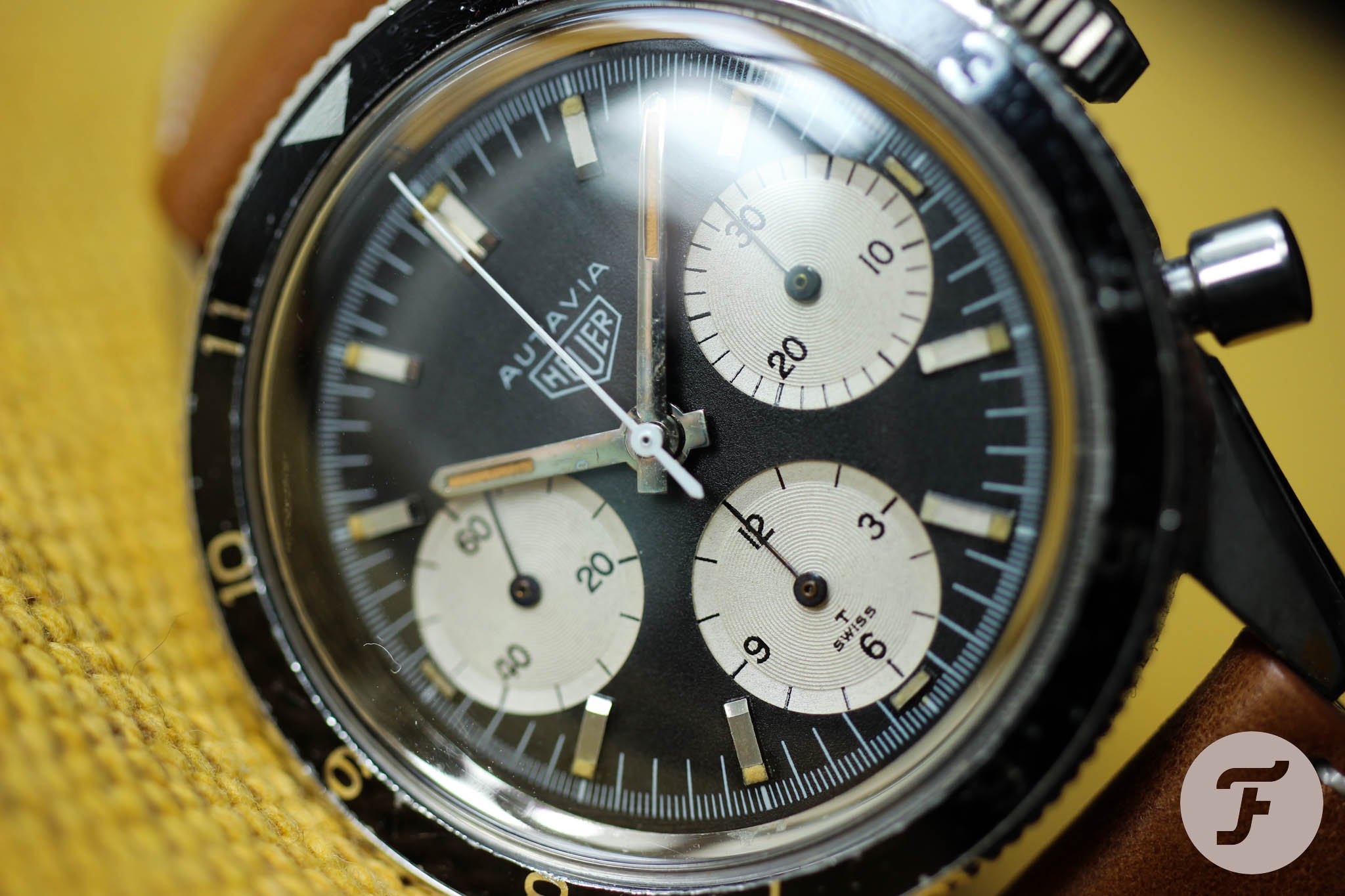
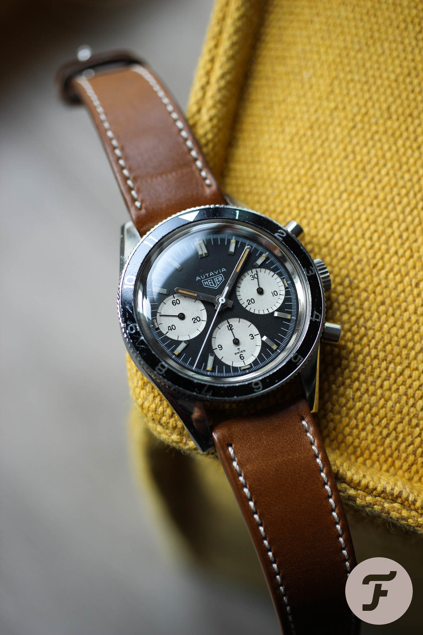
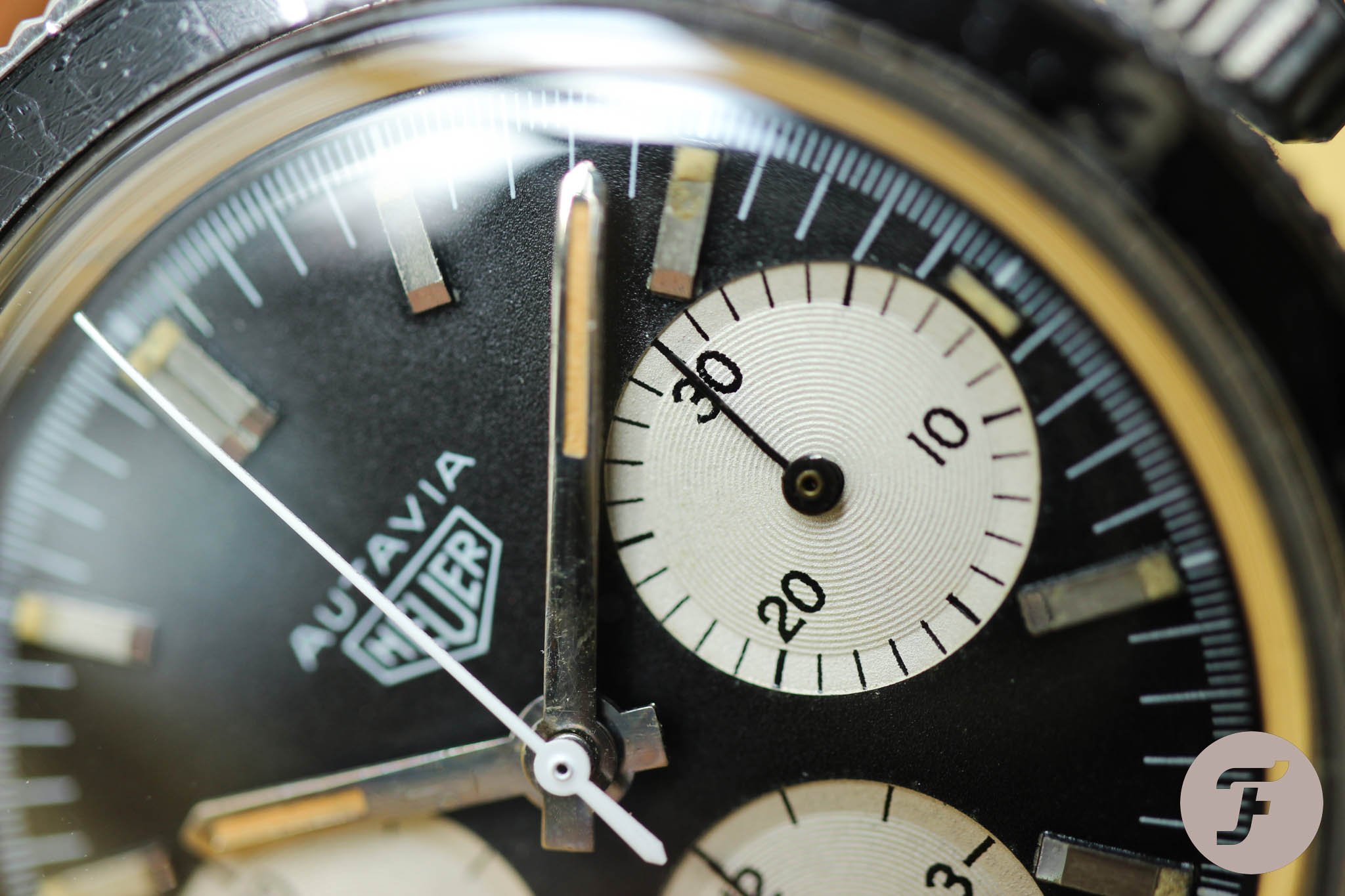
What we have here today is the Heuer Autavia 2446M with the “2nd Execution” screw-back case. This followed the initial Autavias of the early-to-mid-1960s with dagger- or dauphine-shaped hands. The only detail separating mine from Mike’s “standard” 2446M is the unusual typeface in the sub-dials. How did it get there? That’s the question we still strive to find an answer to.
A brief look into catalogs and advertisements
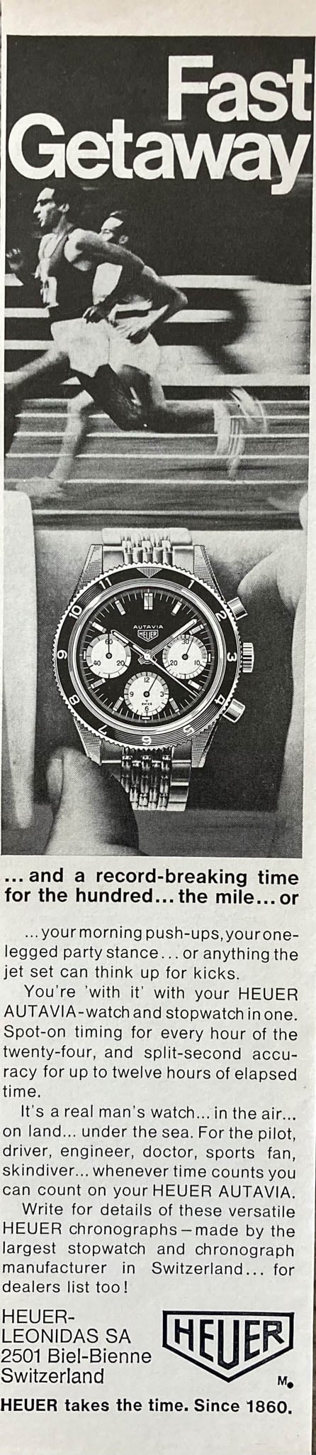
There is little to no information about Autavia 2446 with round numbers. We knew about the original advertising artwork featuring this round-numbered version. It was again Jeff who shared that, according to the book recently published by Rich Crosthwaite and Paul Gavin, this was original artwork produced by an advertising agency for Heuer in 1966.
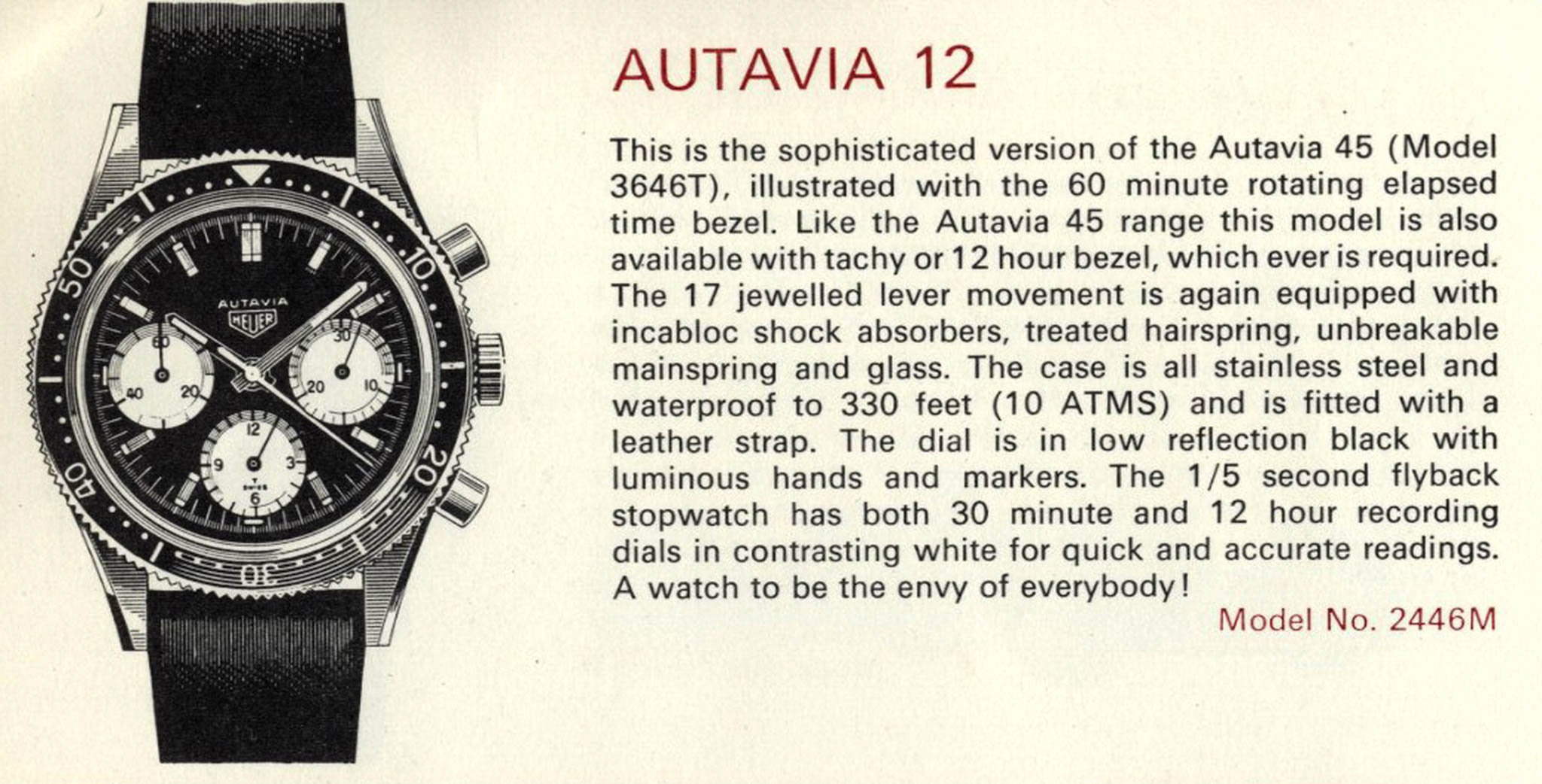
Later on, Jeff sent me another shot. It was a photo from the 1968 Chronosport catalog. It’s from two years later, and in it, we see the round numbers again. “Once Heuer had these illustrations, they seemed to use them for a long while without distinguishing between different executions, generations, etc.” Jeff explains.
This catalog shot also answers my other question — if round-typeface 2446Ms came with bezels other than the 12-hour version. If you check OnTheDash, Jeff already added a few examples. So far, none have a tachymeter bezel, but we shall see once Jeff finishes sorting his archive. “We are approximately evenly split between the Hours bezels and the Minutes bezels, and I would expect that this choice was left to the purchaser of the watch or the retailer,” adds Jeff. From today’s perspective, we could say that the bezel is an “easily” replaceable part. By that, I mean that swapping it is easy. Finding one, on the other hand, is more challenging and can cost you €2K–3K and years of searching…
Brilliant idea
While we were searching for answers, Jeff had the idea to reach out to Björn Altmann, a London-based branding expert and typographer with a keen interest in the typefaces that Heuer used back in the 1960s and ’70s.
Modern Eurostile versus older-style Helvetica
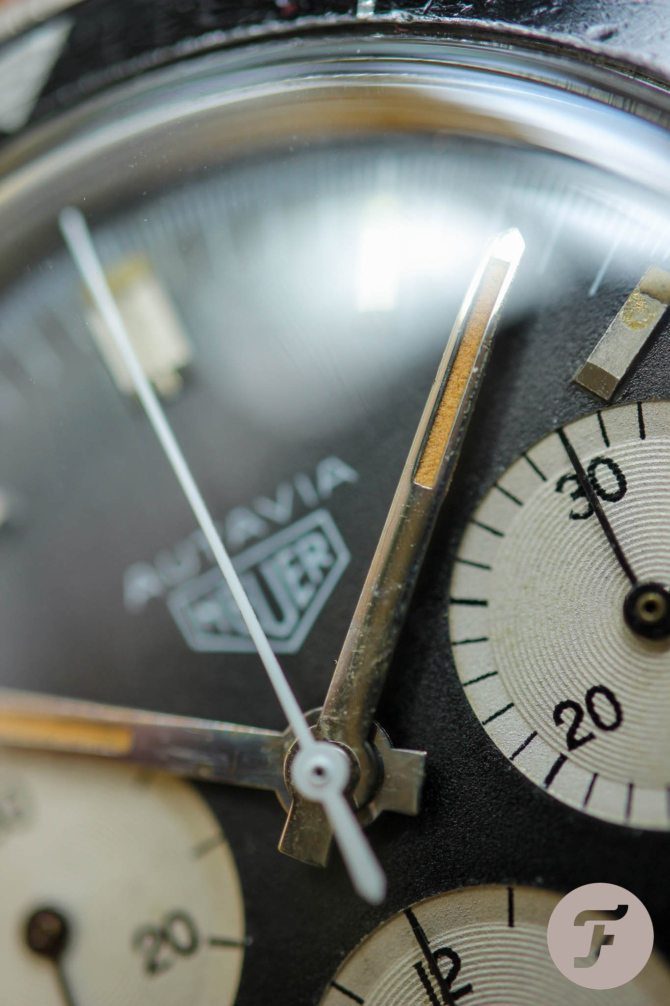
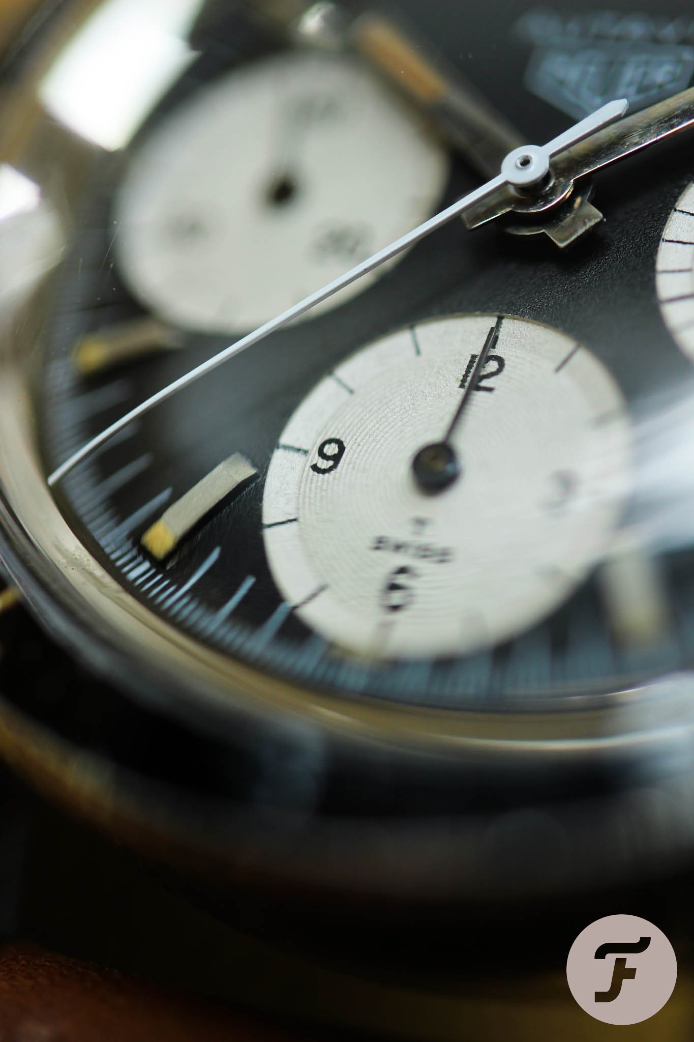
Björn describes the font on standard Heuer Autavia 2446M models as an extended sans serif, in this instance, based on Eurostile (1962). My rare version uses a regular sans serif based on Helvetica (1957), which may have been based on the predecessor Akzidenz-Grotesk, dating back to 1894.
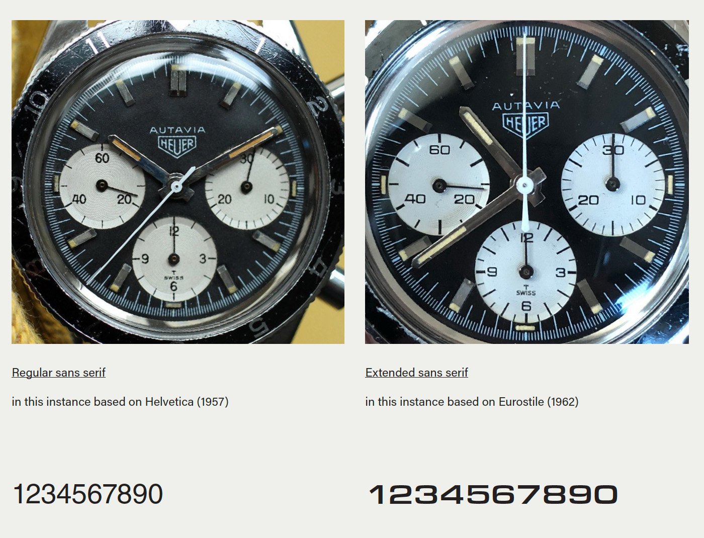
“As Eurostile was brand new in the 1960s and well suited to fill the space on the dial, it was adopted by watch dial designers as it was easier to read at the small sizes typical on a dial,” explains Björn. Aldo Novarese, its creator, wanted to convey modernity and speed at the time, and he definitely succeeded.
If you take the Rolex Explorer as an example, you will find both typefaces there too. Interestingly, Rolex switched to Eurostile much later than Heuer did. The first Eurostile Explorers came to market only in 1989, almost two decades after the first Autavia.
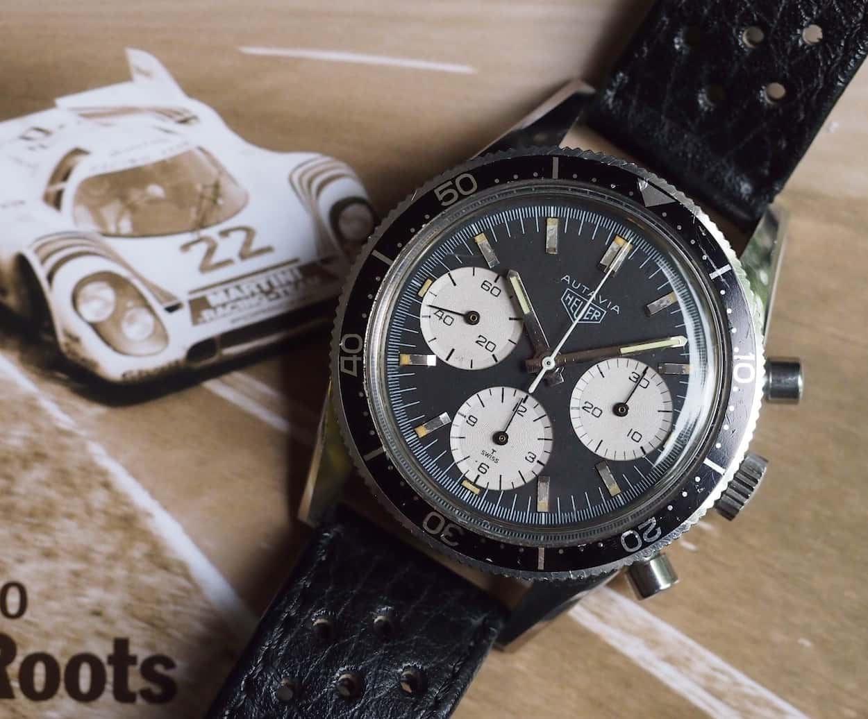
Mike’s “standard” 2446M with the Eurostile typeface
A typeface that is not a typeface
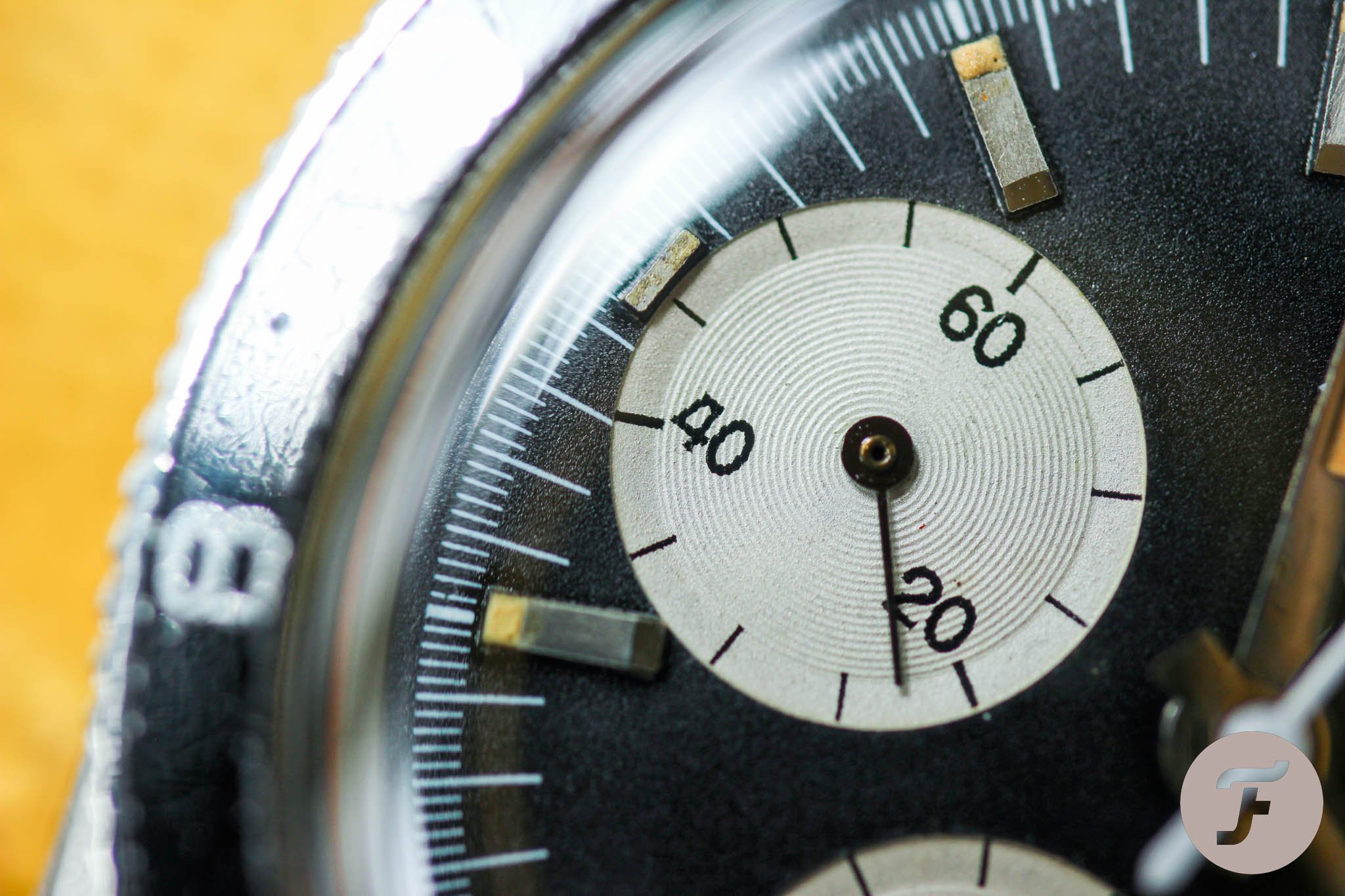
Björn points out that we should keep in mind that dial artists drew these designs by hand. Therefore, the numerals were always merely inspired by an existing typeface and would have been an interpretation of the artist who designed the dial. As a result, we see these variations, inconsistencies, and unique versions of the numbers 4 and 1.
Necessary font modifications
Björn goes on to tell us that dial designers slightly modified fonts for dial-printing purposes. As you can see on the 2446M, “The 4 has a flat top to prevent the ink from filling in the counter, the space inside a letter”. They are not doing that on modern dials, probably because the printing is more precise.
Theories
Jeff offers three possible explanations for how this round typeface got on the 2446M dial: (a) Heuer wanted to see what the “2nd Execution” Autavia case might look like with the rounded typeface on the registers, (b) the dial printer (Singer) wanted to show Heuer a different look, or (c) even that these were printed in error.
Björn chips in with his thoughts too. “I would have thought that dials are batch created, and therefore, there might be 30 (or however big the batch was) of those Autavias out there with these old-style numerals, considering Eurostile is modern style. I think they might have had the pad-printing device still available for the old-style numerals and just used that, although it should have been phased out.”
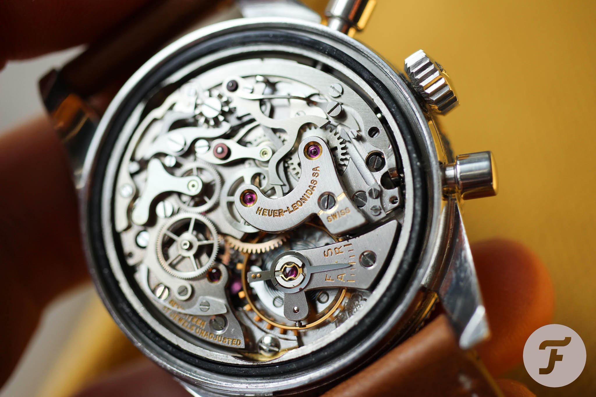
Jeff chips in a different production-volume theory based on his understanding of serial numbers. “Looking at the range of serial numbers that we have seen and the ‘survival rate’ that we generally see for vintage Heuer, it feels as though around 200 to 300 of these watches might have been produced.”
Impact on value
When I asked Jeff what he thinks about the value of the round-number Autavia 2446M, he said it takes us to the category of the “anomalies” among vintage Heuer chronographs and “scarcity for scarcity’s sake.” Instead, he suggests asking two different questions. “Why do we see this anomaly? Which is a better-looking watch?”
Last thoughts
As Jeff concludes, with certainty, “We can say that these dials were not a test or prototype.” For a definite answer, may it ever come, we need to wait and research more, including other references. Until that happens, I will enjoy my old-style round-number Heuer Autavia 2446M. Some find these numerals uglier, cumbersome, or tedious — well, old school. I find them more interesting and not only because it’s my watch. I like old-school stuff.
For me, this has a bit more of a vintage feel, which is even spicier due to the unsolved riddles and limited examples that have resurfaced. This part is really intriguing to me. It’s perfectly clean, and it has beautifully aged lume. Of all the bezel options for the Autavia 2446M, the 12-hour insert was always my favorite. I am happy that it found its way to me. Happy hunting!