Overlooked: The Caseback

The front side of a watch gets lots of attention in general. Often more than the caseback, so I’ve decided to write an article dedicated to casebacks and their designs. Besides some nice and extravagant examples, I will discuss some general facts and my personal way of analyzing and categorizing case backs. So please, sit back and relax.
General introduction and layout
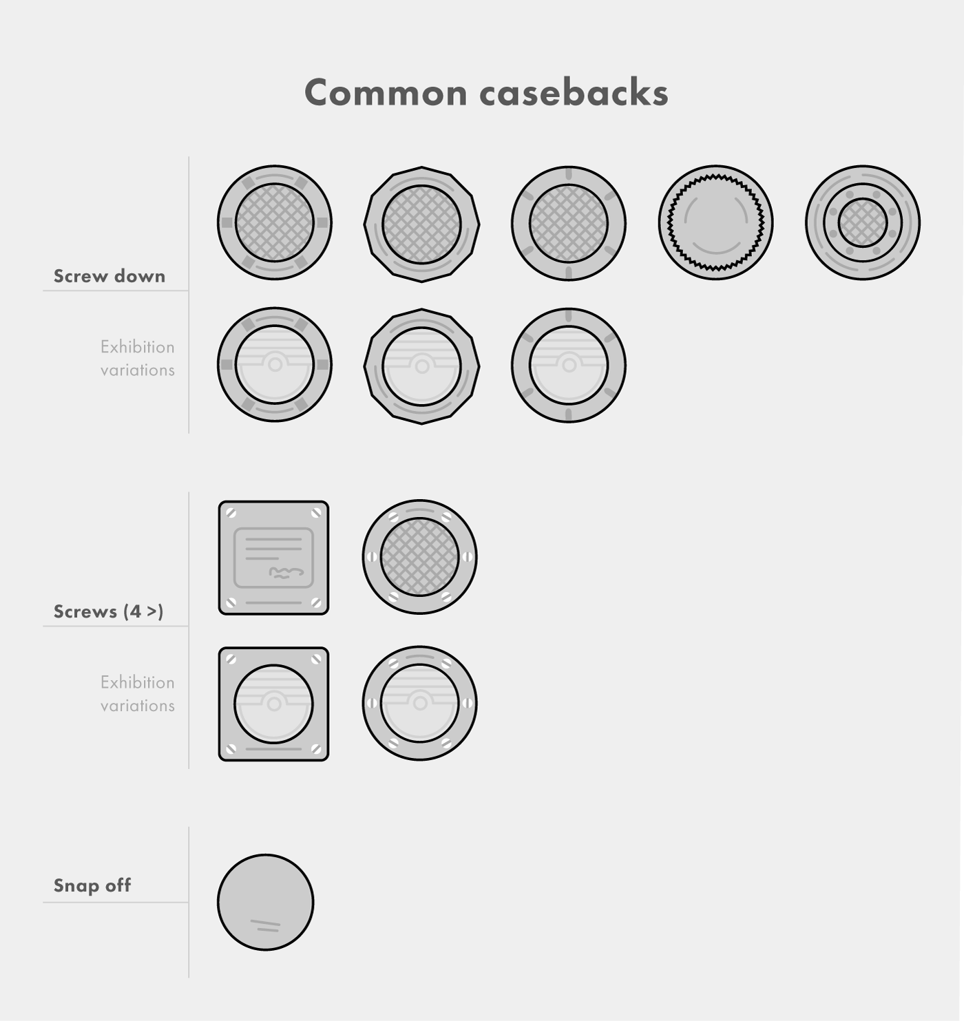
The back of a watch, often referred to as a “caseback”, can reveal several ‘hidden’ parts compared to the front side. Hidden lugs or several parts of the movement for example. The front side of a watch is dedicated to display the time in a distinctive and legible way; it is the top priority. On the back side, generally speaking, this isn’t the case. Here, the brand can focus on other things to create an overall identity besides displaying the movement in some examples. It’s an ideal place to show-off some artwork and place important watch specifications. Although it’s quite an optimal spot, the designer will encounter some caseback specific challenges. For example, caseback-opener cavities, screws, edges and very limited space. Every caseback has its own challenges: snap on case backs, screw on case backs and 4-screw watch backs all have their own limitations. Sometimes there must be some space reserved for necessary elements, logos and marks. Some examples:
- The official EPSA dive-helmet logo to indicate a caseback with implemented patented compressor-technique (although this is sometimes also engraved on the inside of the caseback).
- Common gold jewelry markings (e.g. “18K”).
Thus, the case back is not a complete “carte blanche” for the designer….
Caseback lay-out
Most of the time a case back has the watch properties and other important matters lined up on a circle shaped text path, following the circle shape of the watch back. This is the majority, but there are exceptions. A screwed square shaped case backs for example:
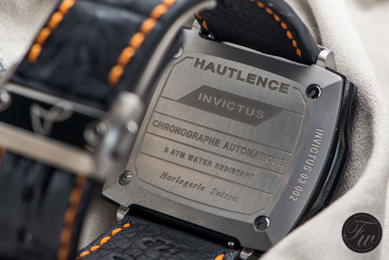
Caseback of the Hautlence BW15
By adding nice custom separators instead of hyphens or pipe symbols it’s even possible to be original on ‘techy lines’:
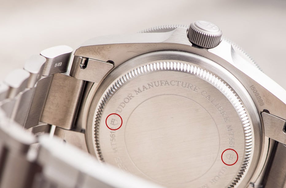
Custom and branded separators on the Tudor Pelagos
Different case back variants and styles
I looked up in the FratelloWatches photo archive and collected some very interesting case backs. From there I decided to create categories:
- Minimalistic case backs
- Crowded or show-off case backs
- Personalized case backs
- Colored case backs
- Case backs with a 3D-effect
- Exhibition case backs
With this in mind I would like to discuss every category and then review some examples. Some watches which we will review in a sec fit in several categories, but that’s ok. They are just displayed in a category to give an example.
Minimalistic case backs
The cleanest caseback there is. No fancy stuff. Only a few necessary elements/lines form the base of this caseback-category. When you are into vintage watches it isn’t hard to spot a ‘minimalistic’ case back. Often only a serial number, material mark or certification number was engraved on the outside. Back then, certain engraving techniques which are now assumed standard were too expensive for mass production or not invented yet. Also, watches served a more practical purpose and many case back examples before 1970 show this to us:
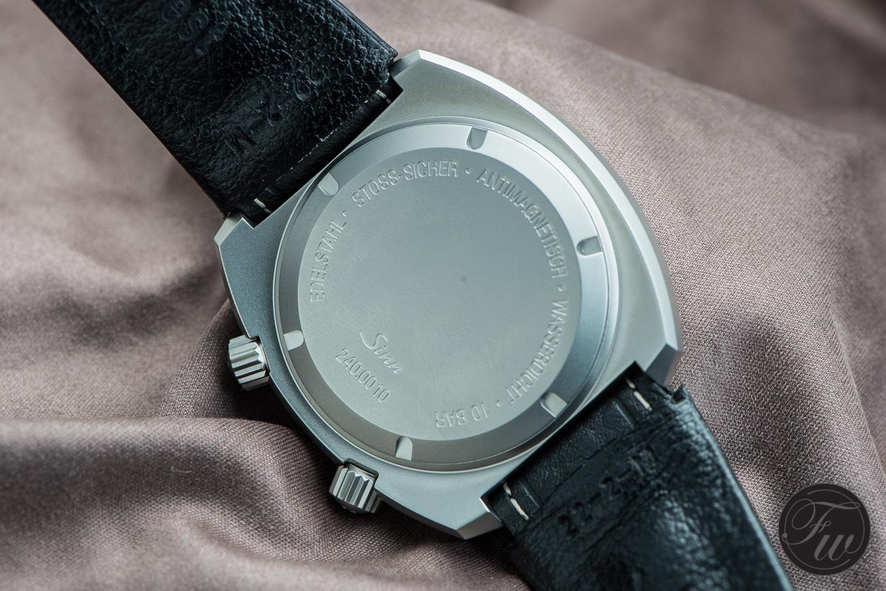
Besides vintage examples modern ones are also quite easy to find. The following Sinn for example. It shows commitment to ‘tool watches’ by keeping things simple and spartan:
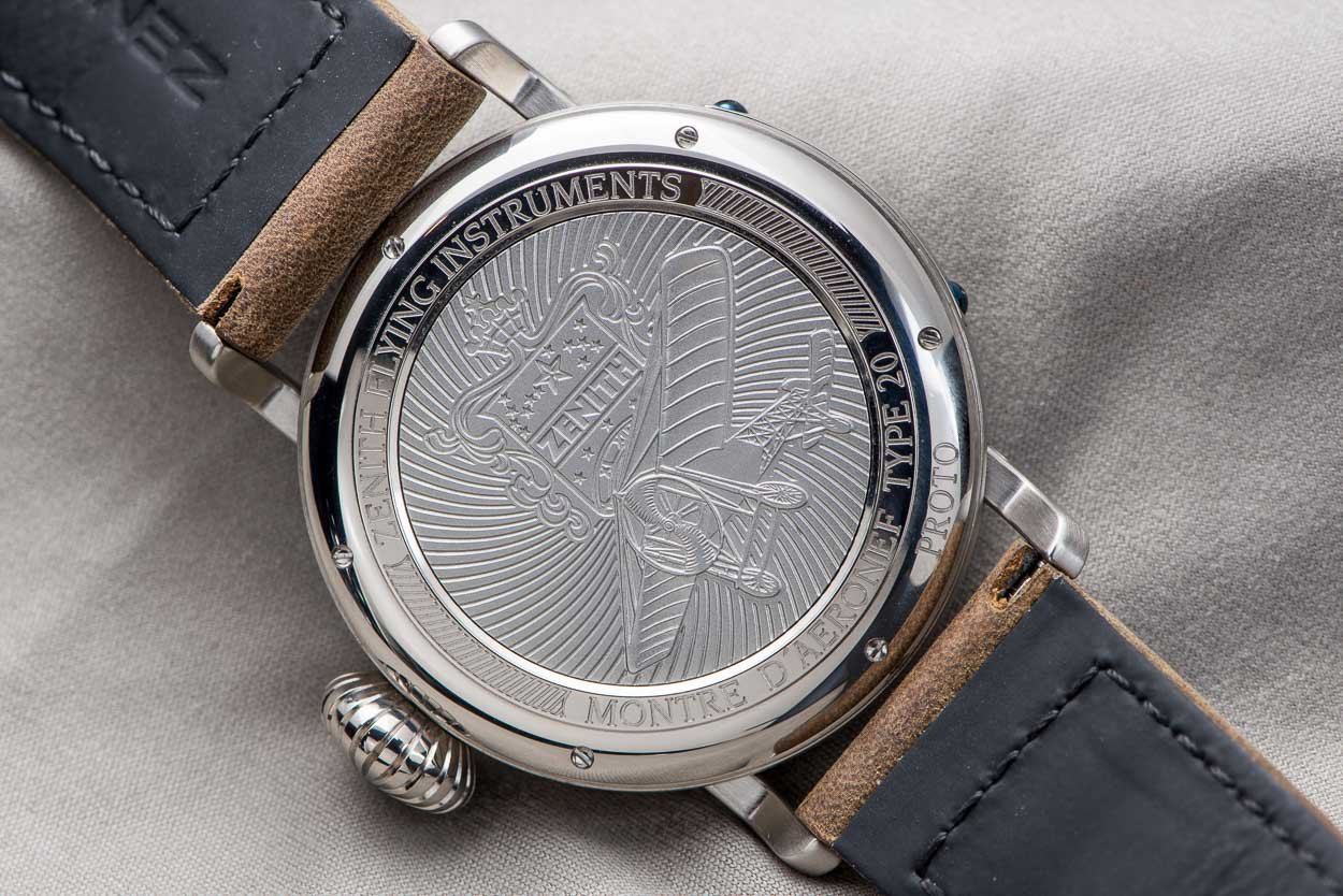
Crowded casebacks
The exact opposite of minimalistic. Almost every micrometer is used. Although this might seem to be an easy category for brands there are a few important points to keep in mind:
- Keep things readable. Do not transform the case back into an advanced puzzle…
- Remain hierarchy on elements.
- Keep balance between elements and space(rs). Otherwise the overall look could become uncomfortably squished.
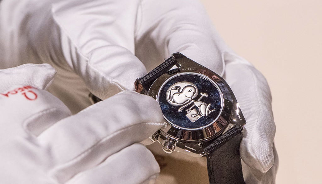
Personalized casebacks
This category does not stand on its own. It goes hand in hand with one of the other categories and is a complementary category. Here is where the true stories are being told. Custom one-of-a-kind (hand) engravings create a more personal touch to the watch. While this caseback often triggers our emotions it also does effect the value in a negative way, unless we speak about a true president’s watch or a famous astronaut’s Moonwatch:
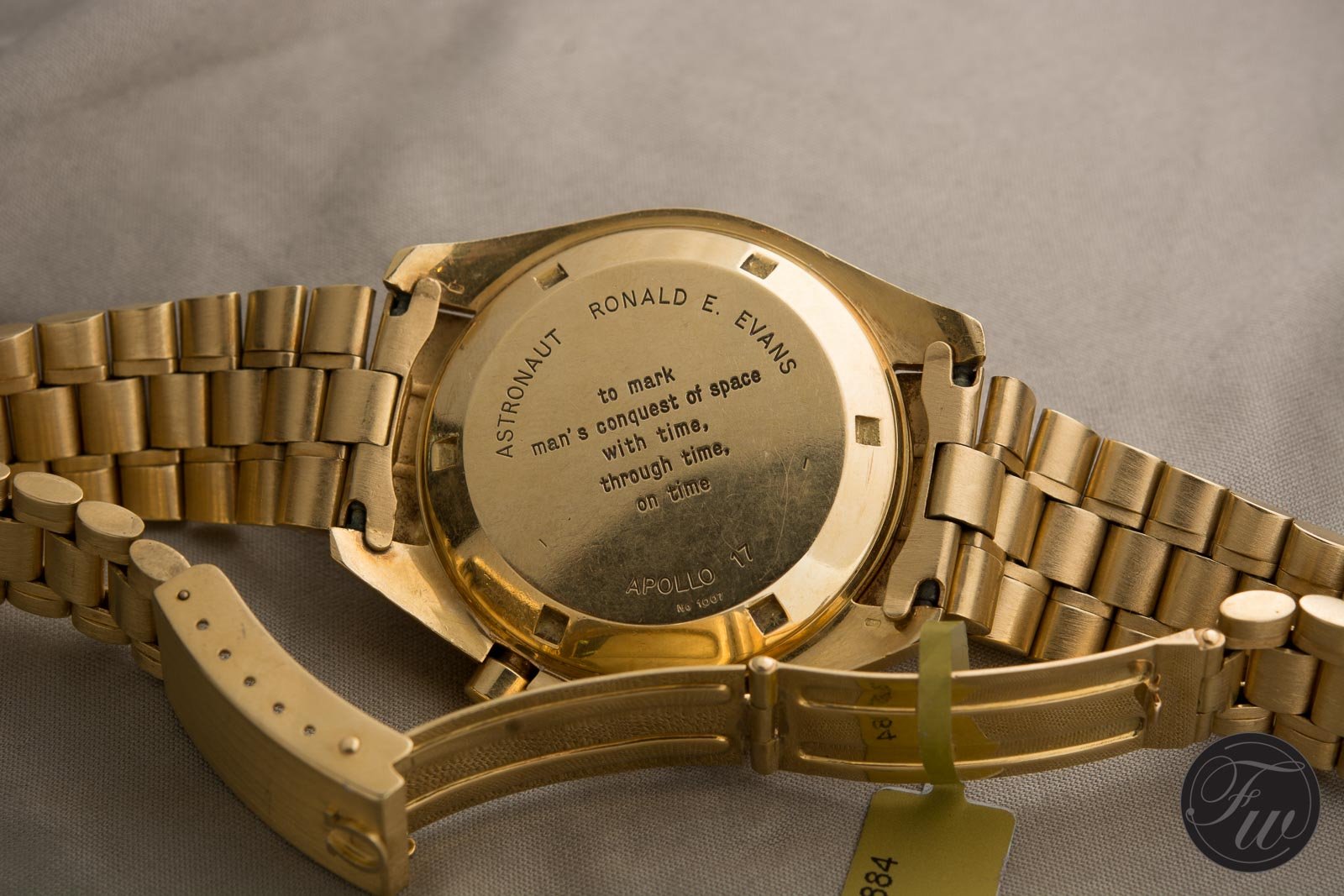
Personalized caseback
Talking about stories. Personalized case back engravings tell a story about us, but casebacks itself also tell a story by the way it looks. The case-back gets beat up, is affected by heavy climates or the engraving fades away. A lot more interesting then those ‘pristine’ casebacks if you ask me.
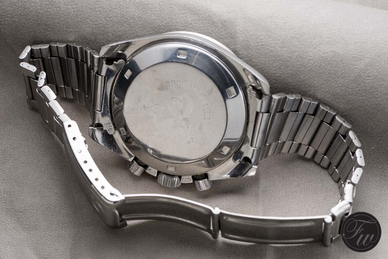
In my opinion a (partly) faded caseback creates character
Colored casebacks
By adding color these watch backs enter another galaxy with more options and expressive possibilities. Sometimes one color can be just enough:
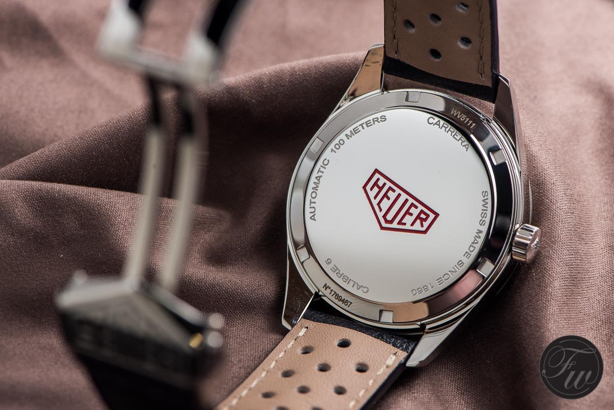
The nice deep red color make the Heuer-logo pop out
Multi-color scenarios are also possible. Overall the primary colors red, blue and yellow are the most popular to maintain optimal contrast. Some great examples:
Casebacks with a 3D effect
With heavenly raised and 3D shaped elements these are the ones with more sculptural ambitions. It looks like they are approaching you and create a great depth to the caseback. You almost could walk around it. The thicker the caseback, the better. This way you’ve got a wider range to make more extreme high-low differences, shadows and natural shapes of elements. With a thicker case you could make a moon more globe shaped for example.
Sometimes it’s difficult to determine whether a caseback is a 3D caseback or ‘just’ a caseback with raised elements. Let me try to visualize that. No rules, just my opinion:
Exihibition casebacks
This one is for the technique lovers. Every caseback in this category has a part where the case material is removed and replaced by a “window” or sapphire crystal. That way the brand can expose his technical skills to us by (partly) displaying the movement to us watch geeks. This is also called an exhibition caseback. Instead of a plain circle window some brands do experiment with different shapes and sizes. Together with a minimal engraved outside the brand can put a focus on the movement. After all, sometimes there is no need for (outer ring) engravings at all:
Odd man out
Just before we wrap up I would like to show some original examples:
Epilogue
We’ve seen quite a lot of flavors. For us watch nerds it is interesting to see and observe the (design) choices of brands. While they are a bit limited by techniques, screws and sapphire crystals there are a lot of options. Let’s be critical on watch backs and ask ourselves a few questions when reviewing a caseback:
- Which caseback category is appropriate for the watch?
- Is the readability good?
- Is the movement interesting enough for an exhibition caseback?
- How much attention is paid to details like separators and such?
- Is the caseback balanced in terms of elements and spacing?
- If there is a history: How does this caseback develops and evolve through time?
- What element does make the caseback distinctive?
- If the watch fits into the category of personalized watches: do I like to wear this “story”? Is it somehow connected to the watch? For example, a Moonwatch worn by an astronaut instead of a birthday engraving by a random father to his son.
Maybe I will write a follow up of this topic someday. A post about a specific model and the case backs or zoom in on a specific category. For now, enough is said and hopefully this forms an easy digestible summary about casebacks. Enjoy your time, move on and do look back now and then…