Lume Wars: Why Green and Blue Dominate the Dark

I don’t know how many others within the Fratello community are big gamers like I am, or rather, was. I spent more hours than I care to remember playing the first Halo during my university years. The poor student that I was, all those hours were spent playing the free demo version of the game. That meant only multiplayer, and no campaign. What’s more, there was just one map. It was called Blood Gulch, and I remember it vividly. Two teams pitted against each other in a battle to capture the flag: red vs. blue. Today, I want to talk about another battle of the colors: green vs. blue. But there’s no futuristic interplanetary warfare going on here. I’m talking about the Lume Wars.
Most of us seem to have a favorite. If you think about your own collection for a moment, you’ll probably find you’ve either consciously or subconsciously leaned into one more than the other. A matter of taste, surely? Perhaps. But there’s also a bit of science behind it. Of course, colored lume exists in all sorts of tones these days, but green and blue remain the most common for a reason.
It’s all about the science of light
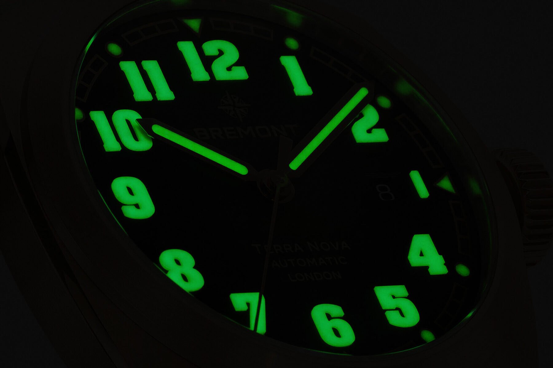
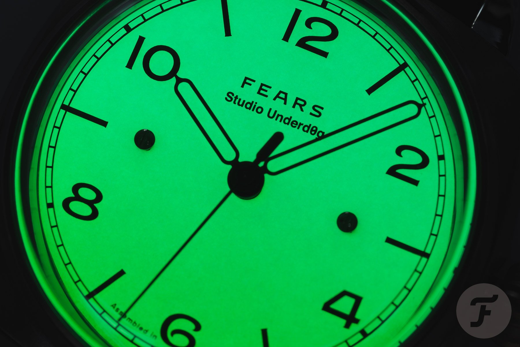
The main difference between green and blue lume comes down to light wavelength. This is measured in nanometers (or nm). To give you an idea, a nanometer is a millionth of a millimeter (which means there’s about 25,400,000 nanometers in a single inch). Green light typically falls in the 520 to 560 nanometer range on the visible light spectrum. Blue light sits a little lower, somewhere between 450 and 495 nanometers. Now here’s the interesting bit. The human eye is most sensitive to green light, particularly in low-light conditions. Our eyes perceive green as brighter and sharper than other colors, even when the actual light output is the same. That’s one reason why green lume looks more intense or “pops” quicker when moving from a bright environment into darkness.
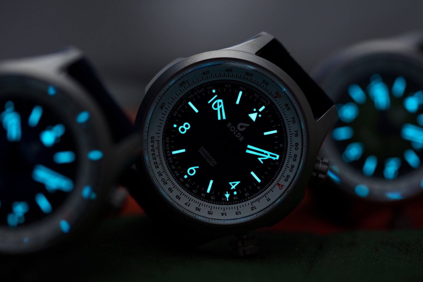
Blue lume might not seem as bright initially, but there’s a trade-off. Blue pigments often offer longer glow durations and are generally more stable over time. So while it may look dimmer to the naked eye, blue lume keeps glowing consistently throughout the night. It’s a bit like the long-game option compared to green lume’s punchier yet shorter glow.
How brands make their lume choices
Most modern lume is based on non-radioactive strontium aluminate, which absorbs UV light and slowly releases it as visible light. The most familiar version is Super-LumiNova, which countless brands across the industry use. There are also proprietary formulas, such as Rolex’s Chromalight or Seiko’s Lumibrite, which are tuned for specific glow duration, brightness, and hue.


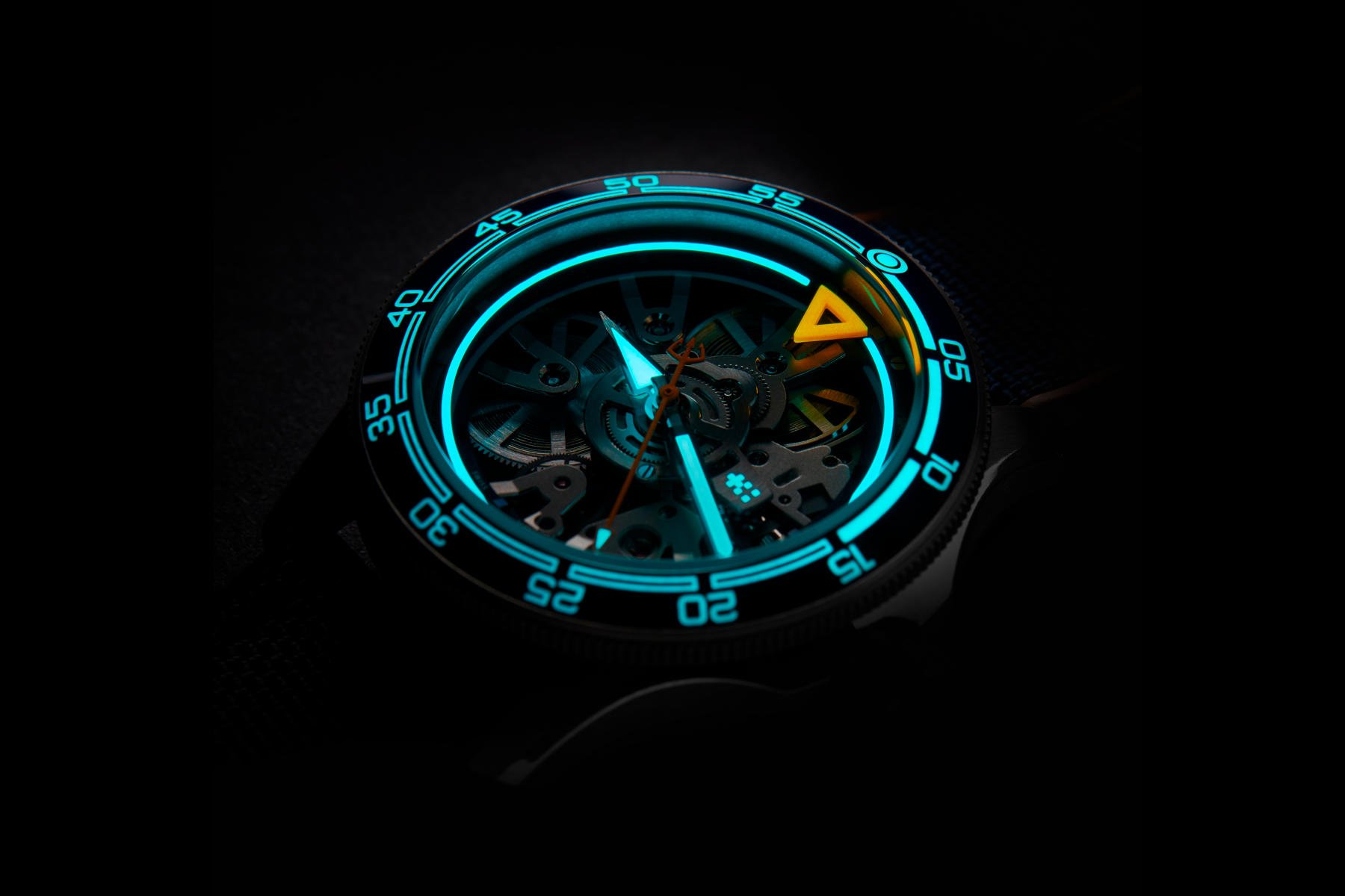
Green and blue are the most effective pigments, which is why they dominate the lume space. Green Super-LumiNova, such as C3, is often seen on more traditional or tool-focused watches. Blue lume, like BGW9, is increasingly used on modern, design-driven pieces or watches that aim for a cleaner nighttime aesthetic.
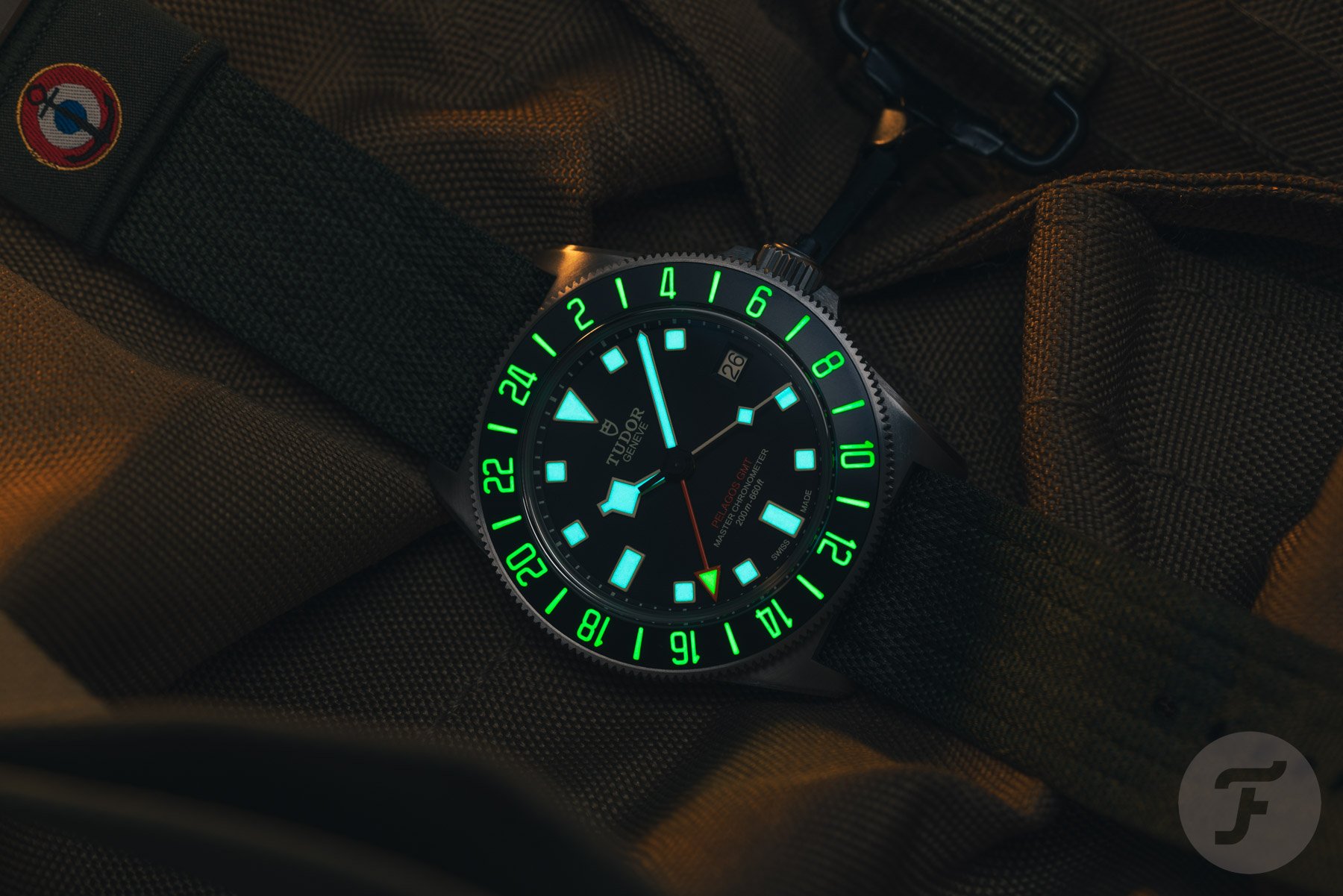
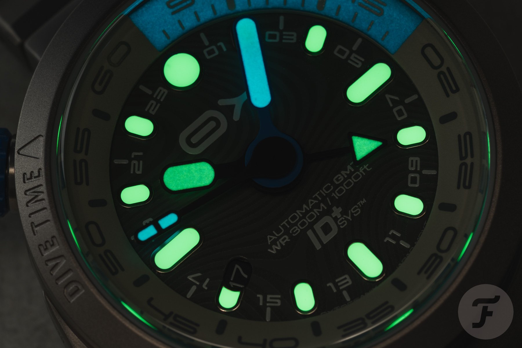
Brands also play with lume color for functional contrast. You might see blue lume on the hour hand and dial markers, and green on the minute hands and bezel pips to help distinguish the timing elements of a dive watch in the dark. Others use different configurations in order to separate complications or different timing elements. In some cases, it’s purely stylistic. Lume can be as much a visual identity as a technical feature.
Function versus feeling
There’s a practical reason why serious dive watches often go for green. Maximum legibility is the name of the game underwater or in pitch-black conditions, and green performs best when the eye is adjusting quickly. It’s also the color we’ve come to associate with traditional lume thanks to the long history of its use on military and vintage watches.
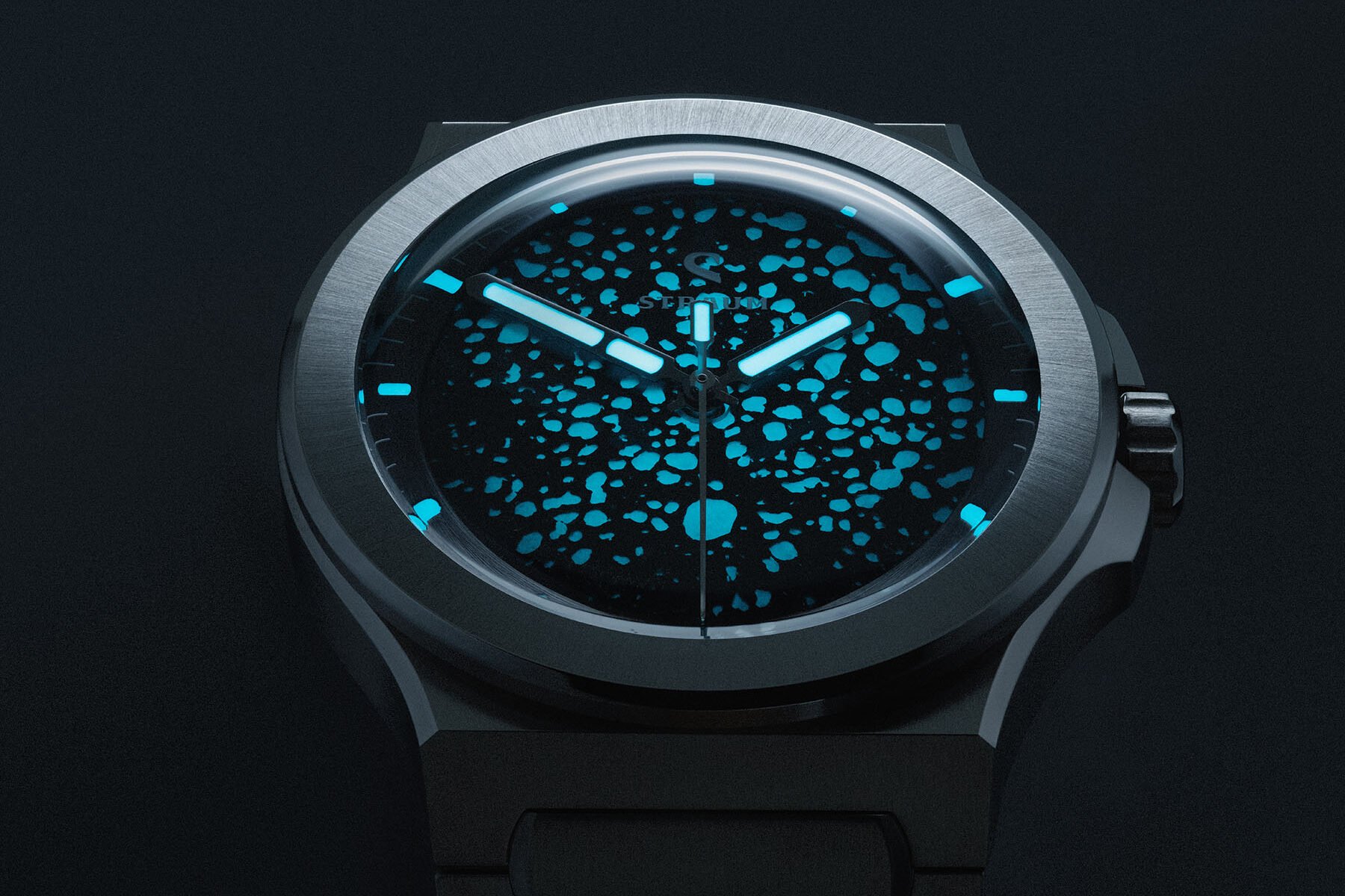
Blue, on the other hand, brings a sense of calm and refinement. It pairs well with different dial colors outside the basic black and white, and suits watches that aren’t necessarily trying to shout their tool watch credentials. Some collectors also find blue lume easier on the eyes, especially in dim ambient lighting, where brightness can become a distraction rather than a benefit.
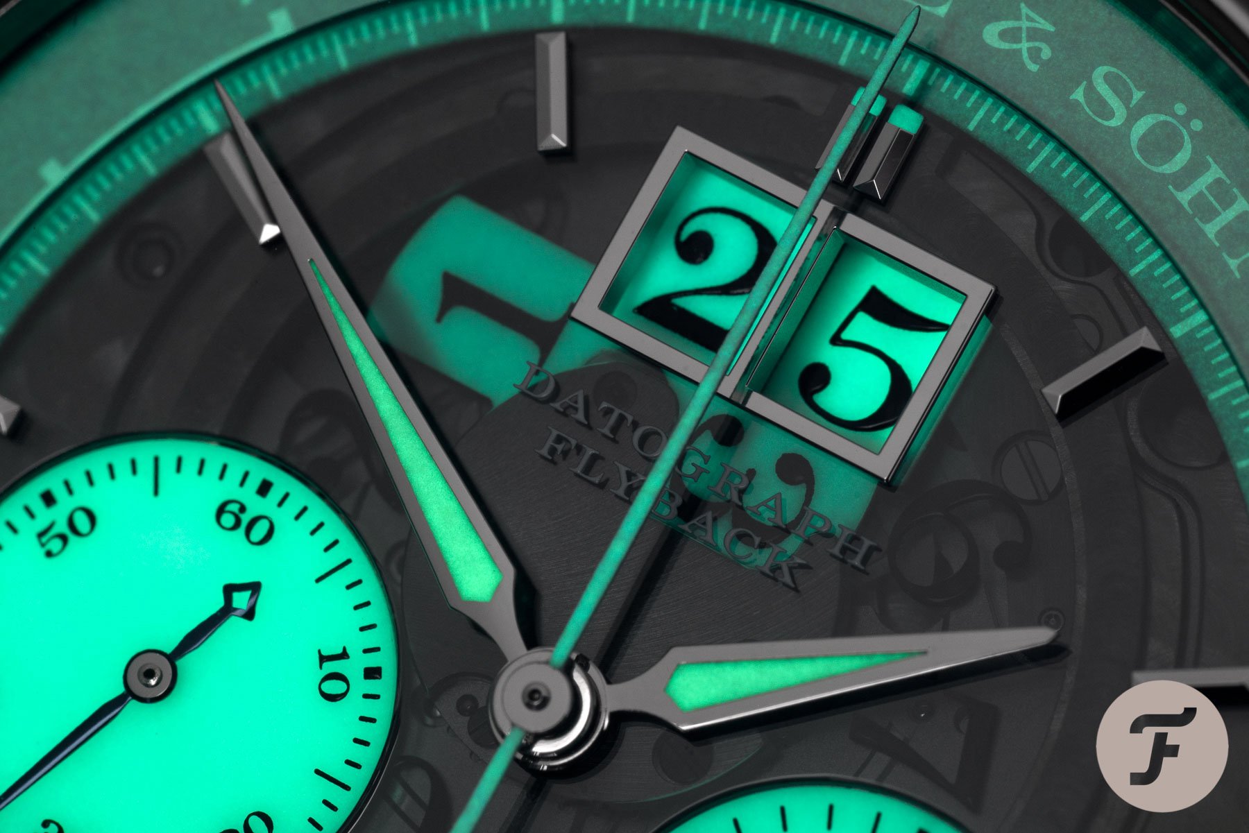
Both colors can be incredibly effective when properly applied, and in many cases, it comes down to design context more than outright performance. A crisp white dial with blue lume can look sleek and understated. A no-nonsense dive watch with big, blocky markers and vivid green lume makes sense. One isn’t better than the other in absolute terms. They simply offer different strengths.
So who wins the Lume Wars?
There’s no definitive answer here. Just like there wasn’t back in my endless multiplayer standoffs in Blood Gulch, I find myself fighting for both teams at different times. Green may give you the advantage in terms of brightness and legibility. Blue might last longer into the night and blend more subtly with modern aesthetics. But now you know that these choices aren’t arbitrary. There’s actual science behind them, and each has its role depending on how and where the watch is intended to be used.
So let’s throw it over to you. Who’s your winning team in the Lume Wars—green or blue? Have you noticed a trend in your own collection, or do you find yourself mixing it up depending on the mood or the watch? Or maybe you’ve gone entirely off the rails with orange, purple, or full-rainbow lume setups. Let me know how you see the lume battle playing out on your wrist.