The Visual Stunners Of 2022 — Our Top 5 Picks From Rolex, Serica, Zenith, And More

When we started talking about this week’s list, I was triggered by several releases that visually stood out to me this year. As some of you will know, my absolute first benchmark to judge a watch is its design. While we see a lot of familiar designs that all move within the same, often retro-inspired parameters, sometimes timepieces stand out immediately because of their looks. It’s why I decided to dedicate this week’s list to exceptional watches that played with the visual status quo of watch design. Let’s find out what these stunners are.
But to stand out visually doesn’t necessarily mean just breaking from the norm by being different. MB&F, URWERK, Trilobe, and HYT are just a few examples of brands that have taken modern watch design to the next level, and they certainly stand out because of that. But with that also comes the freedom to let go of the recognizable elements to create something spectacular and new. While I love all of the mentioned brands for doing so, this list is aimed more at playing with the familiar. The focus today is on watches with recognizable designs that stand out because of the details that make them different. So without further ado, let’s take a look at some of this year’s visual stunners.
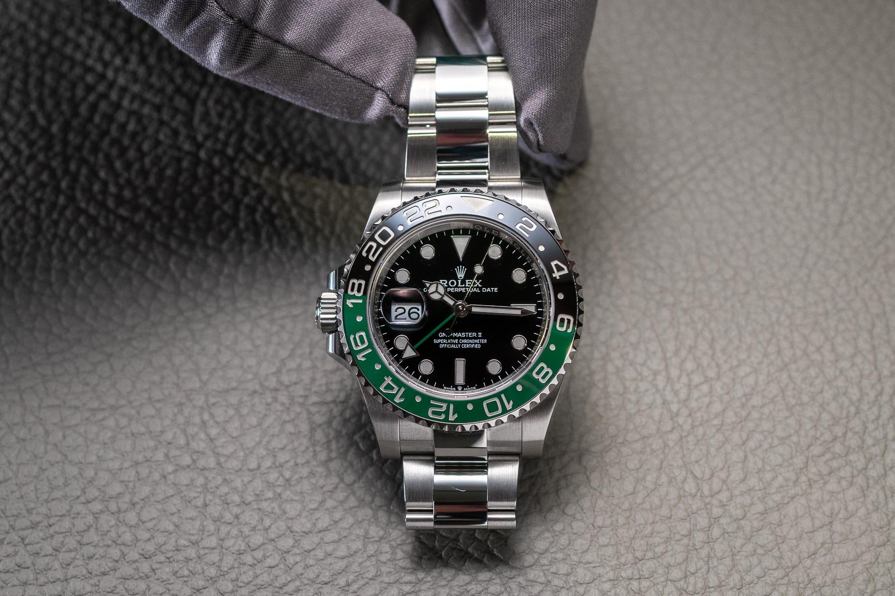
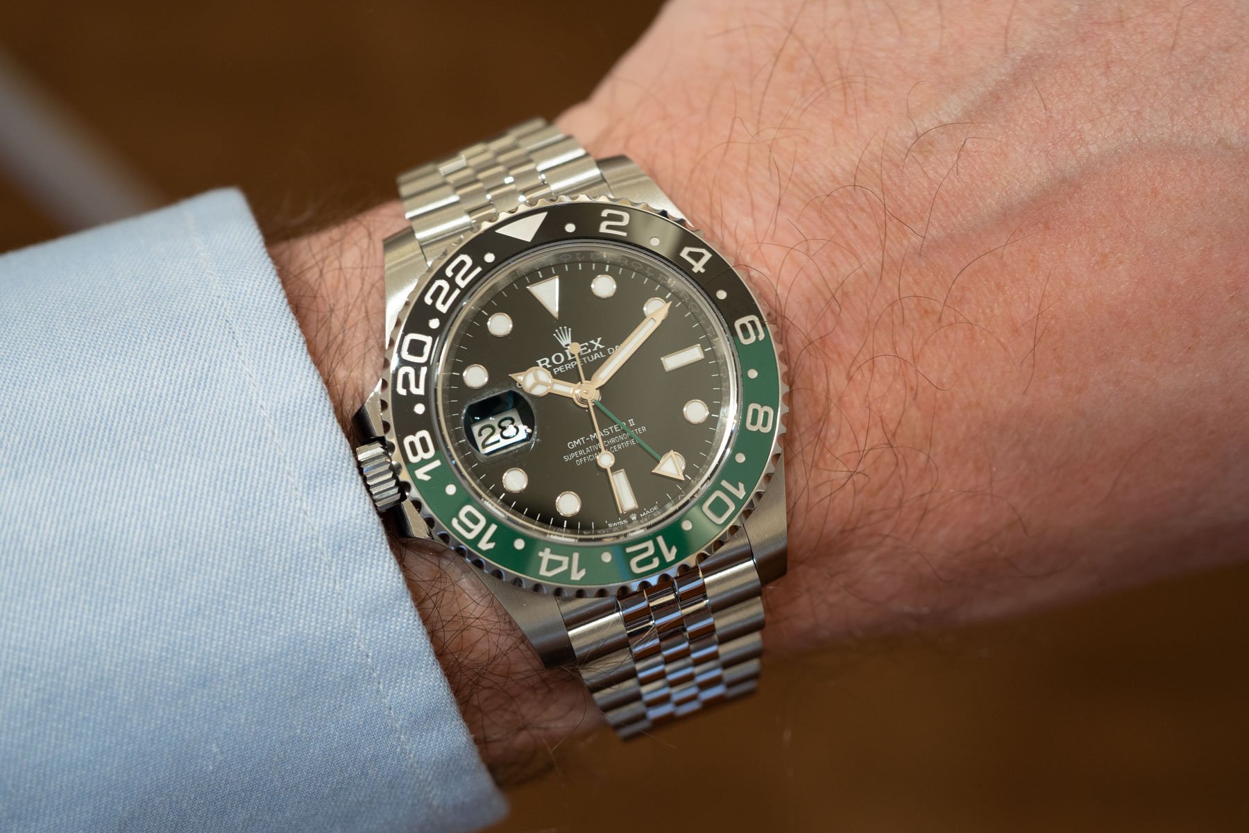
Rolex GMT-Master II ref. 126720VTNR “Destro”
There’s only one watch that could properly kick off this list. When the GMT-Master II “Destro” was first revealed, some people loved it, while others thought Rolex was playing a joke on us. Nevertheless, in what might have been one of the least exciting years for Rolex fans overall, this quirky GMT-Master II certainly got everyone talking. If you are a lefty, you might have enjoyed seeing the brand catering to a group of watch lovers that are often overlooked. And as we could read in the comments section of Robert-Jan’s review, many of you are fans of this watch.
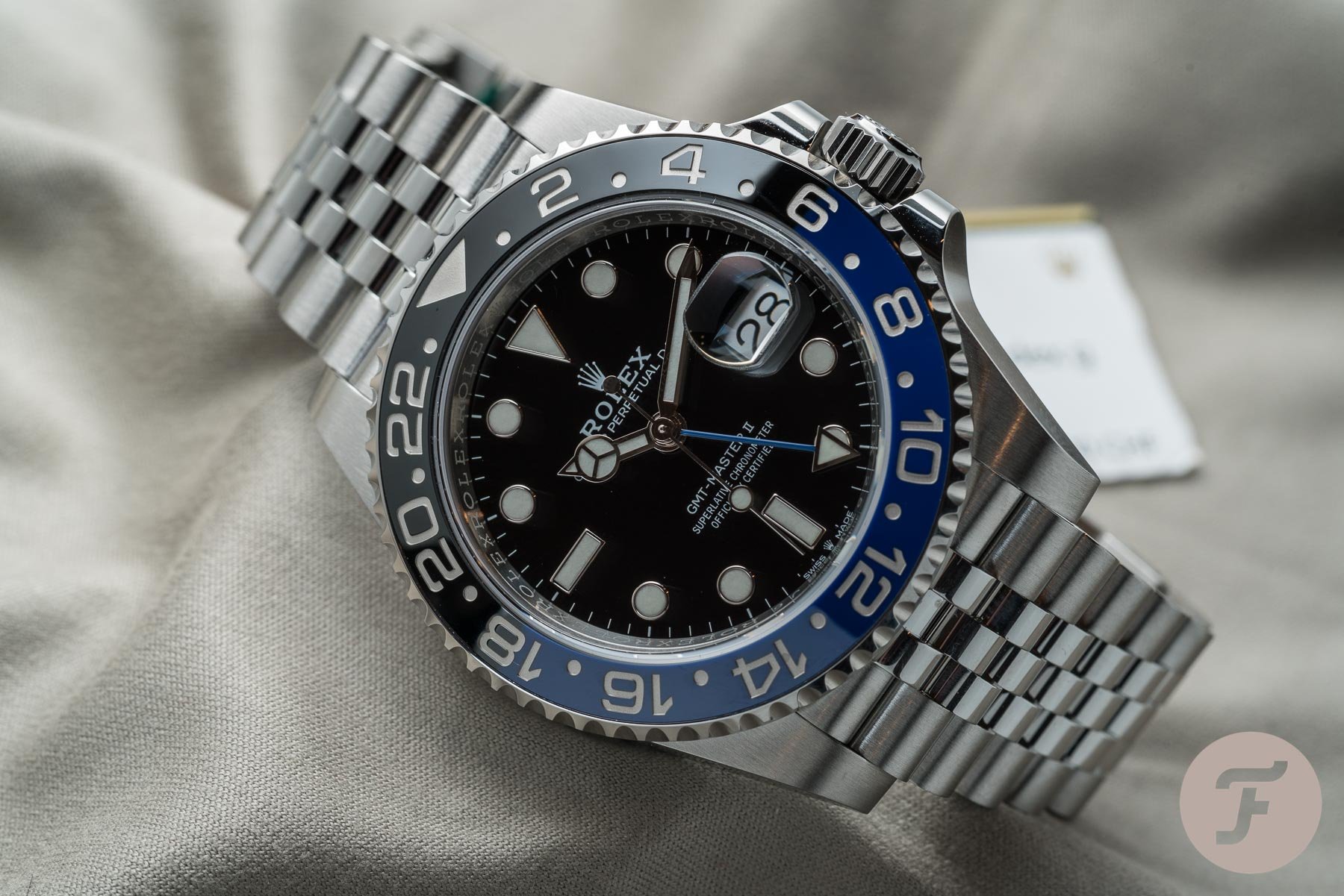
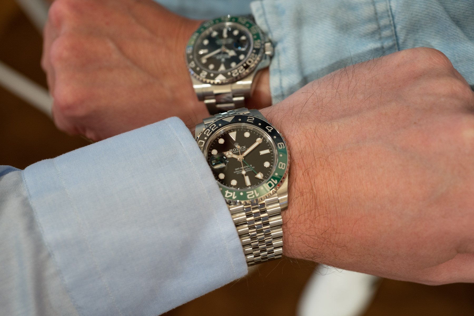
For comparison, the standard GMT-Master 126710BLNR
Obviously, the bezel colors also play a part in how much people like it. If you prefer black and green over the “Batman” and “Pepsi” options in the catalog, you might be tempted to buy the “Sprite” version of the GMT-Master II. But Rolex did more than just introduce a new colorway and place the crown on the left side of the case. As an extra twist, the brand also moved the date window from 3 to 9 o’clock. And that’s where it visually becomes challenging. As Lex explained, the combination of the crown and date window’s placement makes the brain short-circuit. Everything feels familiar, but off at the same time.
Something feels off this time
During my years in the design industry, I quickly learned that people’s brains have difficulty getting used to new designs. A trickier thing, however, is changing an existing design that is familiar and beloved to a large crowd. And that’s exactly what Rolex did. A first glance will tell you something is wrong with the image you see. Once you figure out what is different, it comes down to the question of whether your brain can adapt to the altered image of an icon.
Lex clearly stated that Rolex shouldn’t have introduced this visual experiment. As he said in his article: “The GMT-Master II is an aesthetic construction that inspires a feeling, an experience, and social consciousness. When you mirror the icon and materialize it, the brain just can’t cope.” This raises even more questions. What about the Tudor Pelagos LHD or the “Destro” versions of the Panerai Luminor? They have all become well-respected parts of their respective brands’ portfolios. Therefore, Rolex essentially did nothing revolutionary, not even by its own standards. As Robert-Jan explained in his review, it’s not the first time that Rolex released a GMT-Master like this. Back in 1959, the Geneva brand developed a left-handed version of the GMT-Master ref. 6542.
Will others follow?
Whatever your take on the GMT-Master II “Destro” is, another question is whether Rolex was able to start a revolution. As some of our most loyal Fratelli have stated in the comments, the most interesting thing to find out was if other watch brands would follow. And the first signs of life are there. In a surprise move, Patek Philippe released its 5373P-001 Split-Seconds Monopusher Chronograph with a perpetual calendar in a lefty orientation. It seems hard to believe that it’s a reaction to the GMT-Master II. However, Yema also introduced the Superman 500 Destro Limited Edition dive watch. Could it be that other brands will continue Rolex’s experiment? We’ll have to wait and see, but this version of the GMT-Master II was the visual stand-out of 2022 when it comes to playing with the familiar.
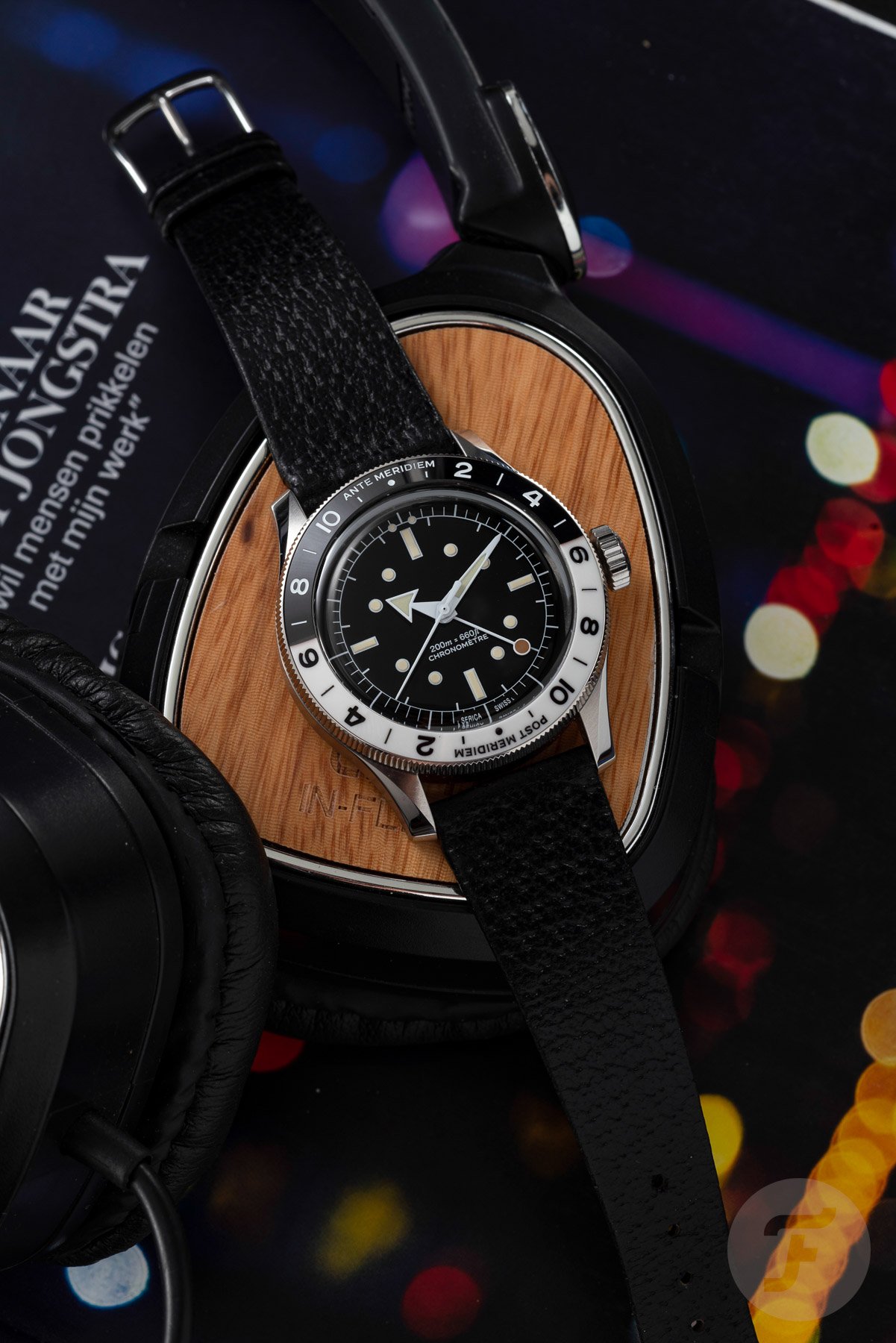
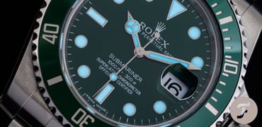
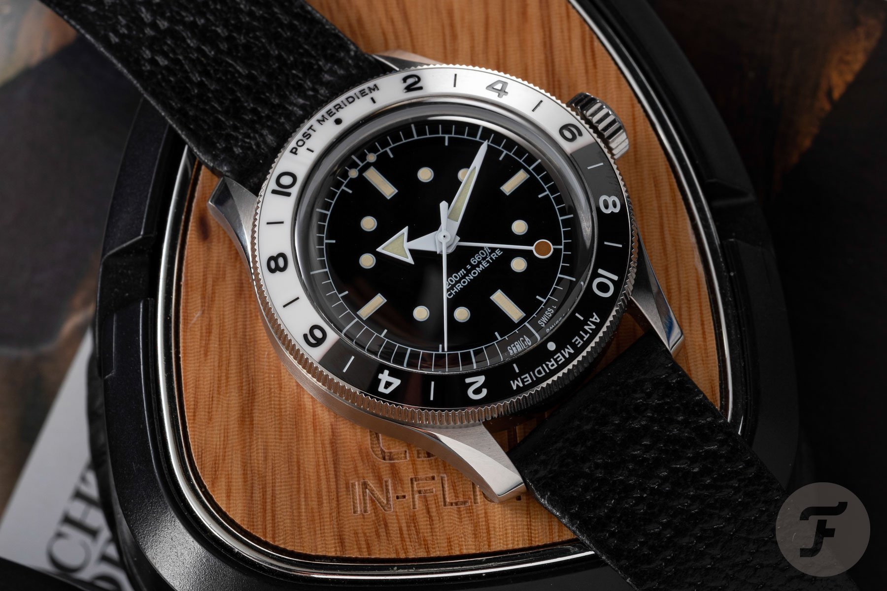
Serica 8315 GMT Chronomètre
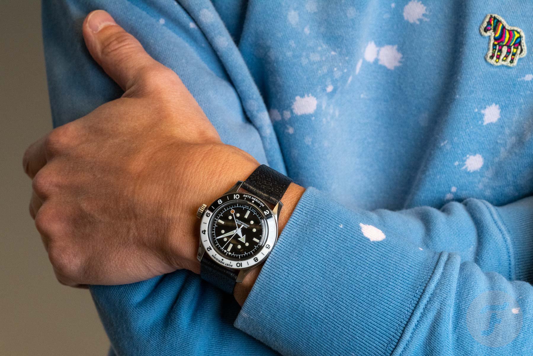
Another release that had people discussing the familiar design elements of a watch was the Serica 8315 GMT Chronomètre. The watch takes traditional aspects of the classic GMT watch and alters them in a way that leads to a quirky and very stylish take on the genre. We have come to know Serica founder Jérôme Burgert as someone with an outspoken view on design. As a result, the brand’s releases have a very clear design signature. While the brand’s first release, the Serica 4512, introduced a great overall aesthetic without a big logo on the dial, the Serica 5303 diver took it one step further.
Serica 5303-3
Besides the small logo at 6 o’clock, the dial layout was a huge talking point. While Burgert’s designs are deeply rooted in watch history, he is certainly not one to copy and paste. With the unusual placement of the hour markers on the dial, the 5303 dive watch introduced a dial design that we do not see often. But it’s something many of us got used to quickly, and the watch has gained a lot of fans. But with the new 8315 GMT, Burgert doubled down on introducing more quirky design solutions for a GMT watch.
New design elements
Next to the familiar elements, the watch introduces a two-tone ceramic bezel executed in black and white with a polished finish. As you would expect, black is for the night, and white is for the daytime hours. But in a remarkable choice, Burgert decided to make the daytime portion longer than the nighttime one. The white daytime part stretches from 5:30 AM to 6:30 PM. As a result, the symmetry of color is lost. It is a trick we also know from Grand Seiko GMT models. But it doesn’t stop there. In the next bold design step, the bezel features two mirrored 12-hour scales dividing it into 24 hours. It’s a departure from the usual 24-hour scale on a GMT bezel.

And to take it even one step further, the bezel specifically mentions “Ante Meridiem” and “Post Meridiem” above its two 12 o’clock markers. As I explained in my introduction article, you could debate the placement of the wording on the bezel. Technically, you could say that both indicators should start at the 12 o’clock markers instead of being centered above them. But in terms of visual balance, this is a better solution. Lastly, the 24-hour lollipop hand is another quirky but very deliberate choice.
The sum of all parts makes it work
By introducing these specific design choices, Burgert shows that he is not here to please everyone. If you have a more conservative approach to watch design, this Serica 8315 might stretch the limits of comfort too far for you. But if you are on board, this new GMT solidifies Serica’s position as a brand that introduces exciting new designs. Whichever side you are on, this new Serica 8315 definitely stood out visually in 2022.
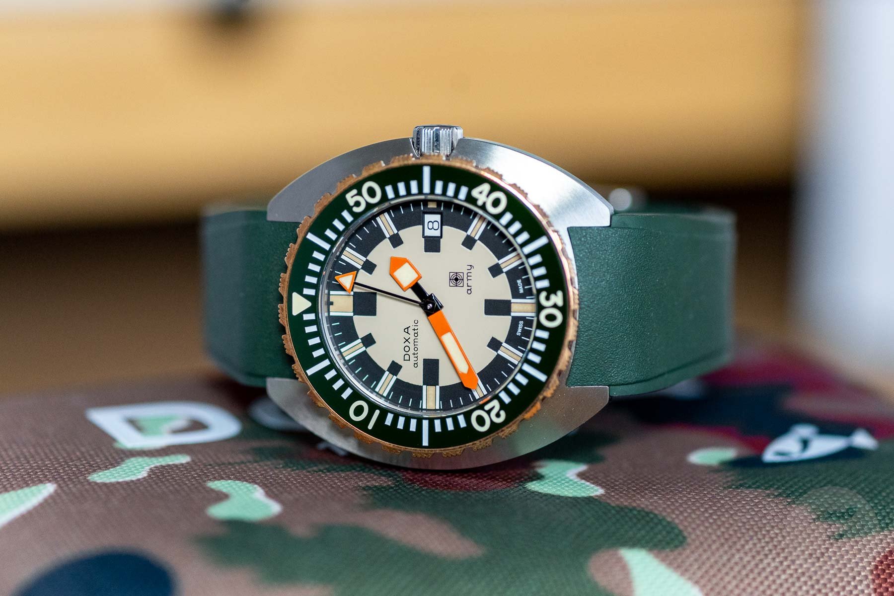
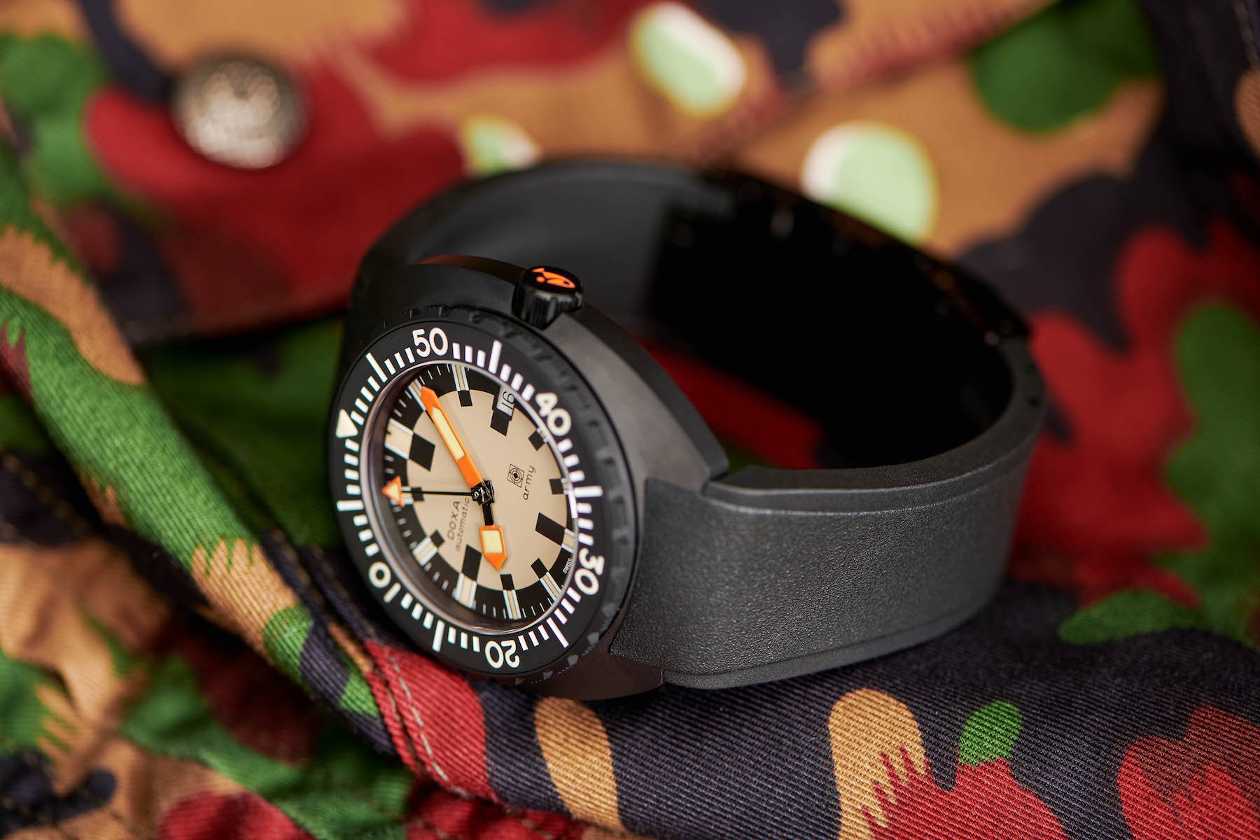
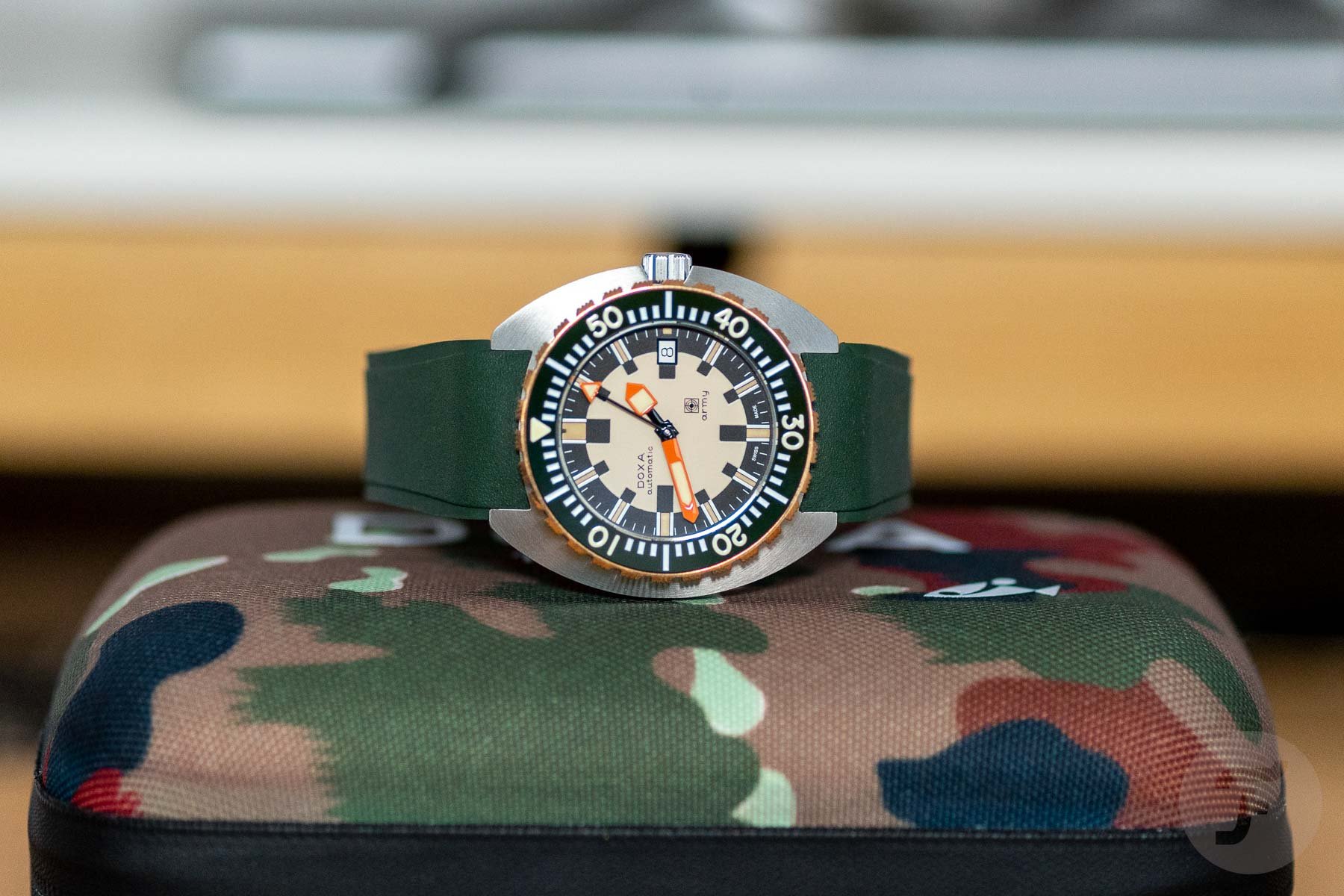
Doxa Army
Another visual standout in 2022 was the series of Doxa Army models. Before the stainless steel models were released, we saw the introduction of a black ceramic limited edition of the brand’s famous Swiss Army diver made in collaboration with Watches of Switzerland. While it was a return of a legend for Doxa fans, this year’s models took the impact of the cult-classic dial design not one but three steps further. As a first step, it was out with the stealthy look of the black ceramic model and in with a bare stainless steel case. And if that’s more than enough for you, that’s one option Doxa offers, either on a bracelet or black rubber strap. It was one of Nacho’s favorite releases of 2022.
The previous ceramic limited edition of the Doxa Army
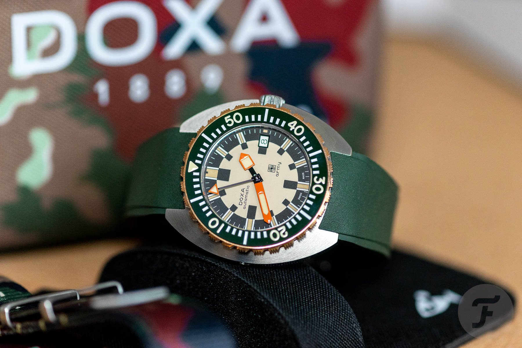
In a second step, Doxa introduced a brilliant dark green color for the bezel and (optional) rubber strap. The combination of dark army green for the bezel insert and black and cream colors for the dial with the contrasting orange hands is an absolute winner. In a third and final step, Doxa decided to equip the watch with a bronze bezel. And that, for me, is the cherry on top. I am generally not a fan of bronze watches, but this bronze bezel is a stroke of genius. Bronze is obviously connected to the world of diving, so it adds to the storytelling aspect of the watch. But the visual impact of the bronze bezel is even more impressive.
There’s a lot going on
Yes, it’s all quite a bit to take in. We have several different colors and bold visual elements. But Doxa managed to make it work perfectly. As Balazs described in his review, “The brand found the right mix between vintage and modern with a sprinkle of boldness.” It begins with the brilliant black and cream-colored dial that is easy to read despite its visual trickery. I love the bold combination of colors that creates brilliant contrast, making the watches immediately stand out in the crowd.
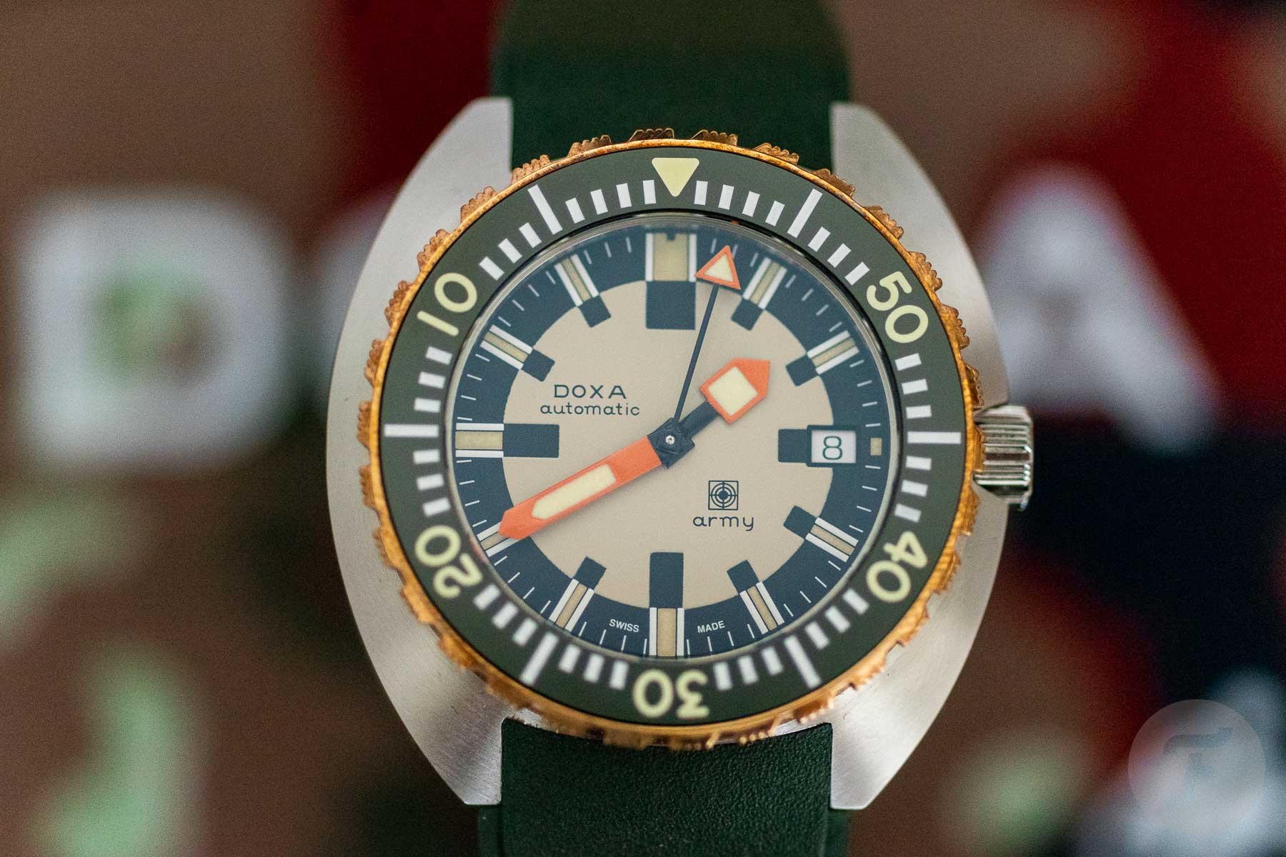
What I particularly love is that nothing about the design is modest. It’s bold and in your face, but it works. The bright orange hands guarantee perfect readability. Not only do they contrast nicely against the dial, but in terms of size, they are also perfectly balanced with the other elements. The numerals on the bezel are also prominent but do not overpower the other elements. We usually see bezels with two scales from Doxa that are much more intricate and detailed, but this striking execution works perfectly for this design.
The crowning glory
And as I said, the bronze bezel adds a spark that makes the Doxa Army stand out in a crowd even more. As Balazs mentioned, some of you may find the bezel too shiny, but over time, the bronze will develop a patina that will help tone it down. I just like this contrasting element in any way it comes. It is the crowning glory of one of this year’s visual standouts.
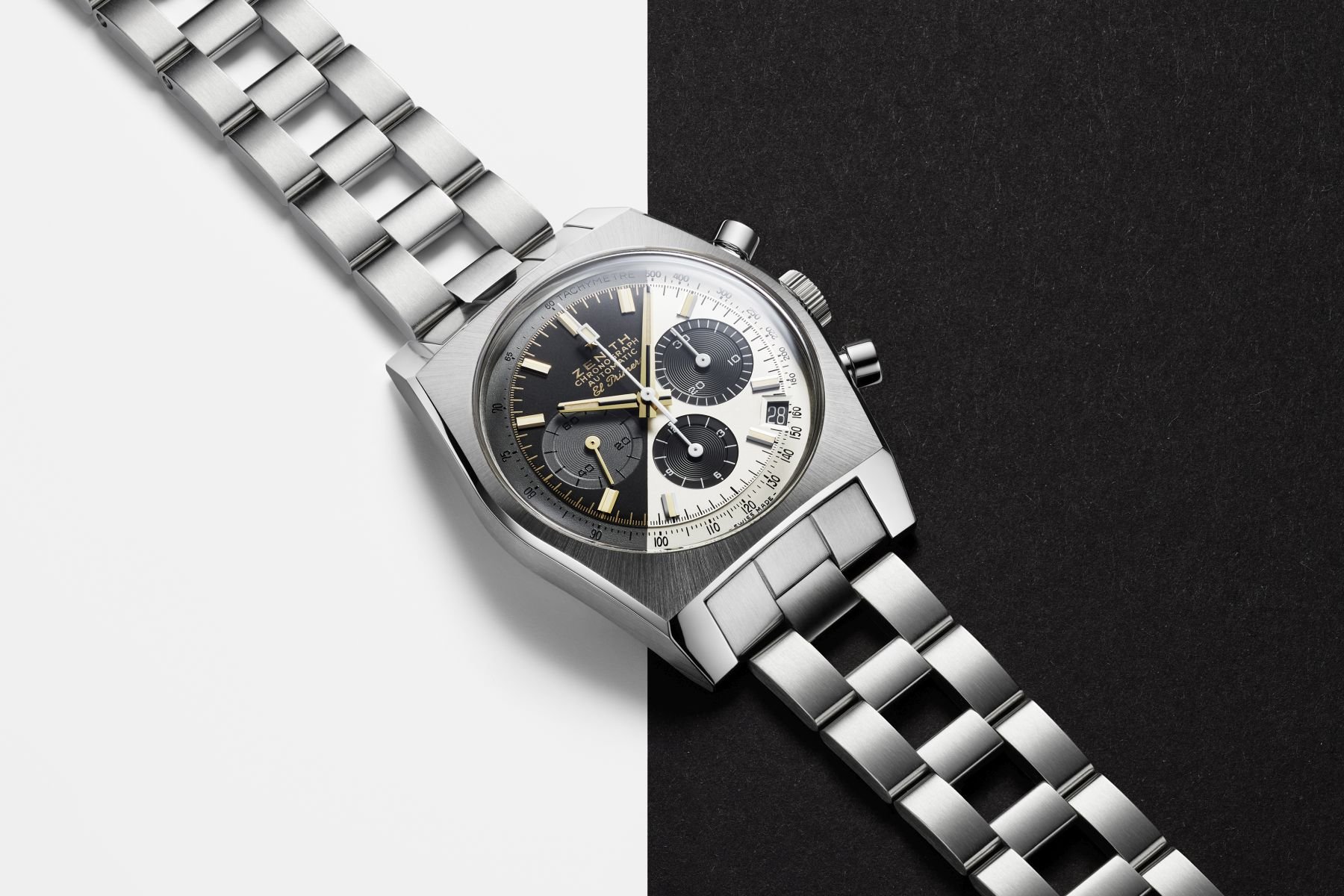
Zenith A384 Revival Lupin The Third – Final Edition
You knew this was coming if you read the article about my favorite watches from 2022. I mean, look at it! Just seeing the dial will tell you everything your heart needs to know. Still, for those who aren’t aware of its background, Zenith’s A384 Revival Lupin The Third – Final Edition combines two dials into one. What seems like a bonkers idea to begin with turns out to be one of this year’s most visually striking releases. I hope that Zenith gives the designer who initiated this a big Christmas bonus because he or she showed that you can make outrageous designs work.
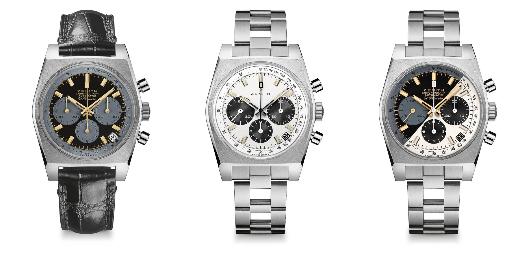
A design story that is almost too simple
The story behind it is pretty straightforward. This A384 Lupin The Third iteration is the third and final edition of a series. The first and second Lupin the Third editions came out in 2021, and the Final Edition combines the dial design of those first two timepieces. Brandon wrote the introduction article on this Final Edition, in which he explained the background of the three watches that were inspired by the Japanese manga and anime series Lupin The Third. The first model features a black dial with gray chronograph registers, a gray tachymeter, and gold hands and indices. The second model — and my favorite as a daily wearer — features a panda dial, just like the regular A384 Revival. However, this special edition comes with a white tachymeter scale instead of a black one. Additionally, it features a black date disc and a black central chronograph seconds hand to set it apart from the regular model.
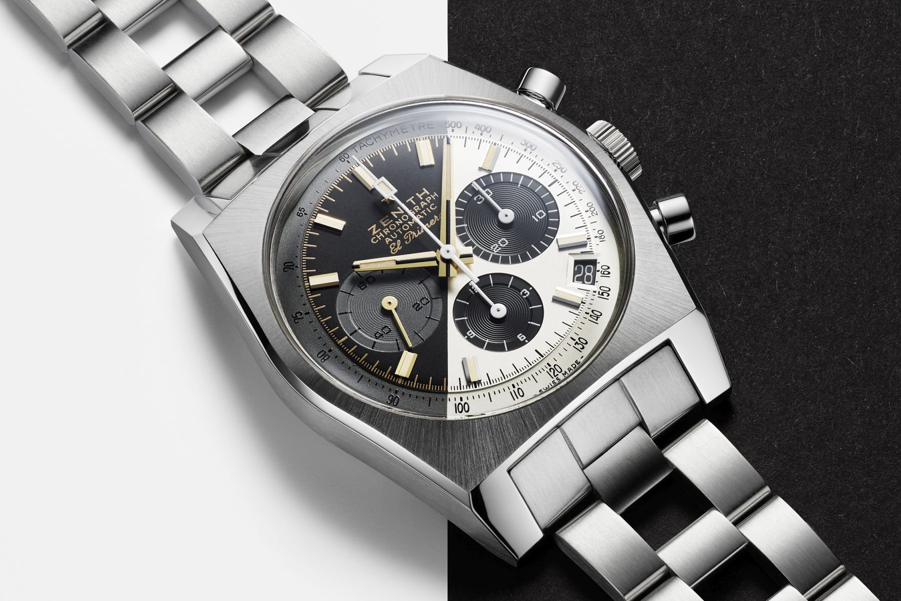
Both of those versions look great, but the combination of the dials turns the world upside down. The diagonally split dial that pairs the aesthetics of both of the Final Edition’s predecessors is brilliant. For me, the visually most surprising release of 2022 proves that bonkers ideas are fun and can work.
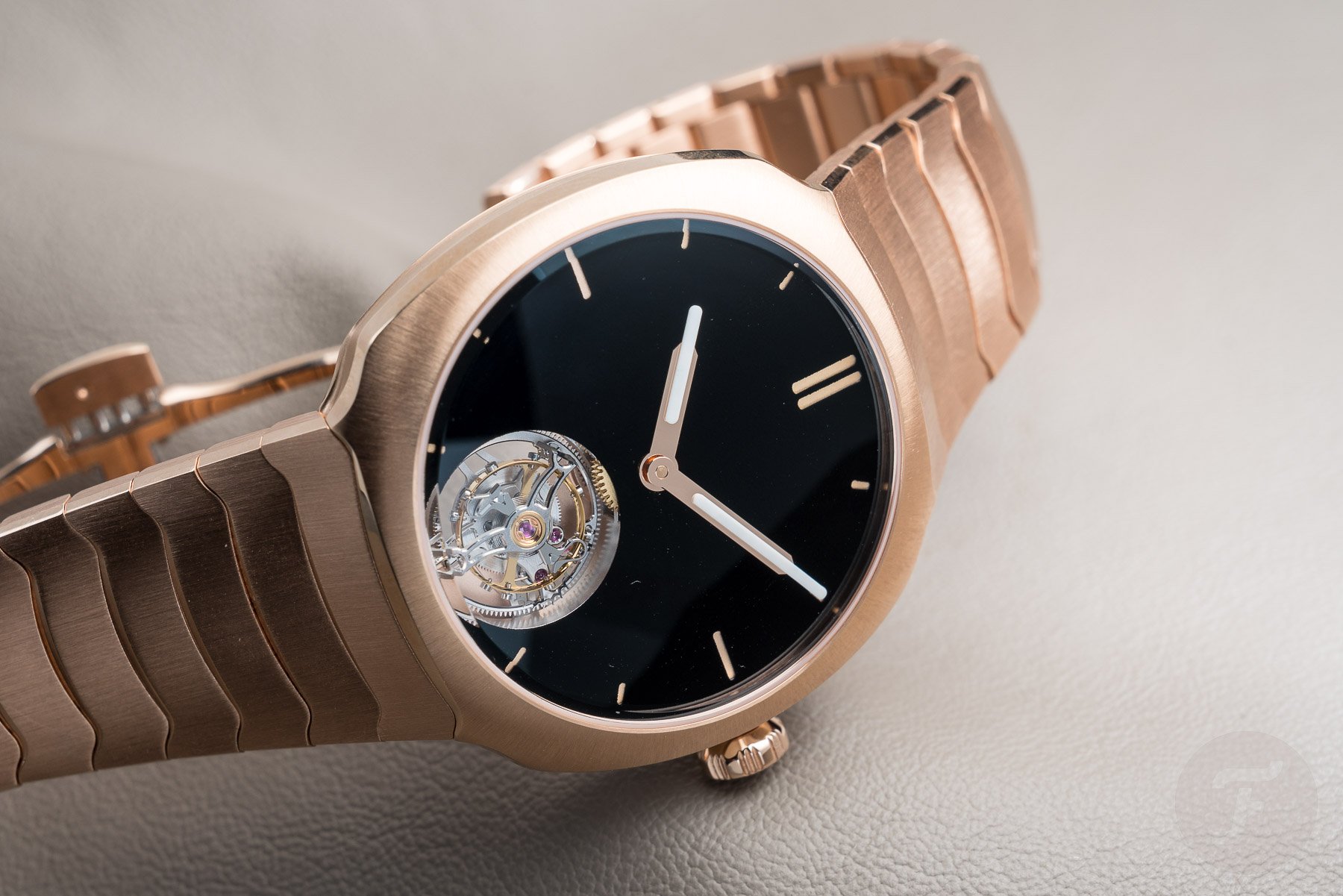
H. Moser & Cie. Streamliner Tourbillon Vantablack
The last watch on this list is a potentially divisive one. I picked this H. Moser & Cie. Streamliner Vantablack Tourbillon partially because of its Vantablack dial. Ever since the brand introduced the material for its dials in 2018, I have developed a slight obsession with it. I like black as a color for a lot of things, so the most intense black used as a dial color immediately drew me in when H. Moser & Cie. started using it. But that alone does not earn this watch a spot on this list. First off, I couldn’t wait to see a Vantablack dial specifically in a Streamliner. Well, here it is! But wait, there is more.
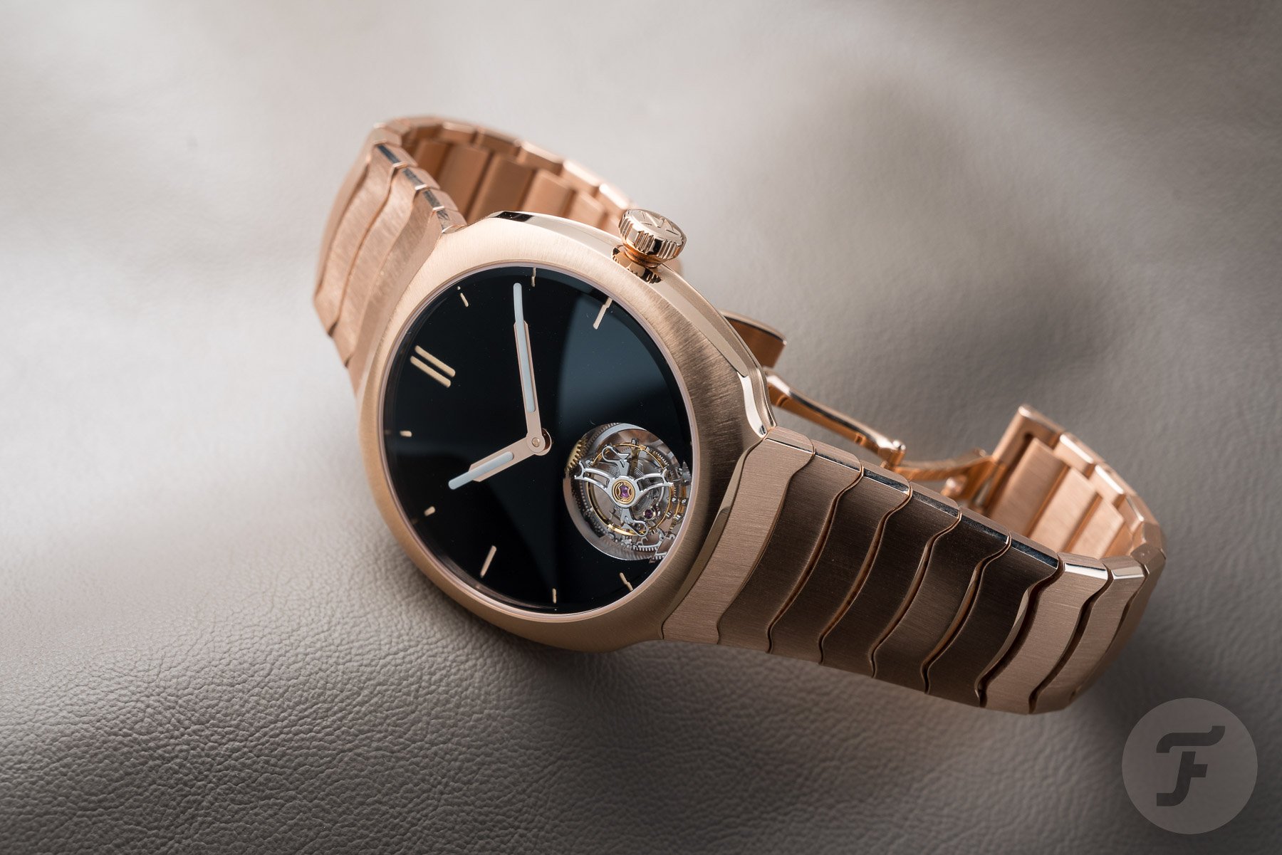
The combination of rose/red gold and black is one of the most striking in the watch world, in my opinion. There is something magical about it that gets me every time. Other examples that come to mind are the equally stunning Girard-Perregaux Laureato 42mm Pink Gold & Onyx and Audemars Piguet Royal Oak “Jumbo” ref. 16202 in rose gold. The combination of colors looks amazing and oozes class and luxury. But with the Streamliner, the black color is taken to the next level. The intense Vantablack creates the perfect canvas for the rose gold execution of the Streamliner to shine.
The “standard” steel H. Moser & Cie. Streamliner Perpetual Calendar
Elements floating in space
While the mentioned Laureato and Royal Oak look familiar in rose gold, the Streamliner in red gold explores new territory for the watch. I am a big fan of the Streamliner, but until now, we hadn’t seen one in precious metal. While I never doubted that the watch would look very good in either yellow gold or the chosen red gold, the result is far better than I had expected. Some of you commented that white metals are the only way to go for the Streamliner, and I wholeheartedly disagree. Sure, I love the stainless steel version seen above, but the red gold Streamliner Tourbillon is stunning in its glorious presence.
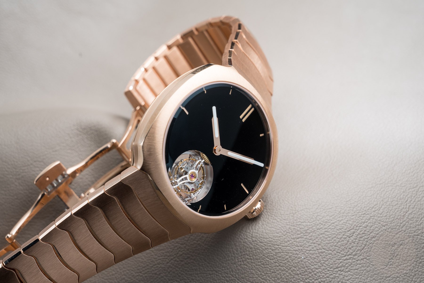
Especially if you pair it with a Vantablack dial that absorbs 99.965% of light, the visual results are breathtaking. The hour markers and the hands seem to float in their pitch-black surroundings. As Thor described in his introduction article, “The effect…is astounding, as if the dial simply is not there, and the details are left floating in space.” That is an effect that we do not often see in the world of watches because we like our dials to be an integral part of the presence of a watch. Even better, we love it to be a defining element. While the Vantablack dial of this red gold Streamliner Tourbillon is exactly that, it takes a completely different approach, and that visual trickery makes it stand out from the crowd immediately. I almost feel bad for saying it, but the watchmaking power play of the tourbillon takes away a big part of the magic. Can we have one without it, please? Thank you!
Final thoughts on the visual stunners of 2022
There you have it — five watches that stood out visually in 2022. Are they all winners? That depends on who you ask. But all five watches play with familiar, comfortable designs in their own way. If you are a regular reader of this series of list articles, you know that it is only the starting point of a bigger discussion. Plenty of other releases could have been on this list of visual stunners that bring a new approach to the designs we know and love. That’s why I am turning the question over to you.
I’m sure you have picks that would be great for this list, so please tell us your favorite visual stunners of 2022 in the comments section!