Play It Classic, Or Make It Loud: Unpacking the Grøne Horologium’s Dual Identity

Grøne introduces the Horologium, a new manual-winding timepiece available in two different versions, “Something Quirky” and “Something Classic.” Both watches come in a 39mm stainless steel case and feature small seconds, a Swiss-made manual-winding movement by La Joux-Perret, a 60-hour power reserve, and 5 ATM of water resistance. Limited to 188 pieces per version, the Horologium continues Grøne’s approach of blending traditional mechanical watchmaking with a more fun, approachable design language. These watches are incredibly rich in finishing details, like Côtes de Genève, sunburst snailing, sandblasted surfaces, heat-blued screws, mirror polishing, and machine-anlage, which make this a serious step forward for Grøne, no matter how “quirky” the release might seem. More on that in a bit.
Grøne is the brainchild of Bart and Tim Grönefeld, the Dutch brothers better known for their high-end independent watches under the Grönefeld name. And allow me to introduce (or reintroduce) you to Grøne’s history: the family’s watchmaking history dates back to 1912, when their grandfather, Johan Grönefeld, laid the foundations of the family workshop in Oldenzaal (check the dial for that). Bart and Tim eventually returned to their hometown and continued that legacy, but Grøne was created with a rather different ambition in mind.
Two Brothers, Two Watches, Two Personalities
The brothers say they wanted to bring mechanical watchmaking to a younger generation and make their designs more accessible. Their website reflects that, through their multiple encounters with young people, they have not abandoned the character and quality associated with their atelier work. That mix of serious watchmaking, Dutch identity, and a slightly irreverent attitude is important to understanding Horologium. Because it’s not meant to be a “cheaper Grönefeld,” more like the brothers experimenting with what their watchmaking can become outside the boring independent luxury bubble. Yes, bubble.
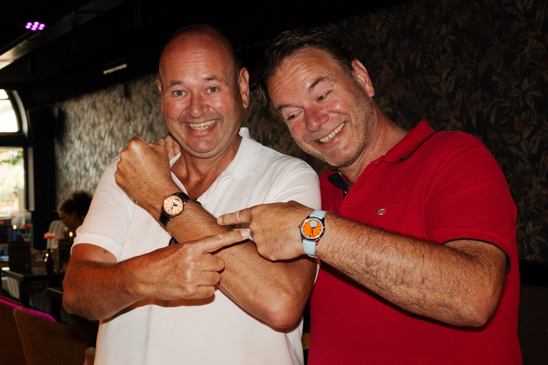
The most interesting thing about the Horologium pieces is that Grøne isn’t presenting the two versions simply as different colors of the same watch. “Something Quirky” and “Something Classic” are meant to represent two different sides of the brothers themselves, continuing an idea that was already present in the “Manueel One” collection. That and “Tim’s One and Bart’s One”, which kept the same basic architecture but gave each brother room to express a different personality through the dial and finishing. With Horologium, Grøne takes that idea and makes the contrast much more obvious. In design elements.
Quirky as can be
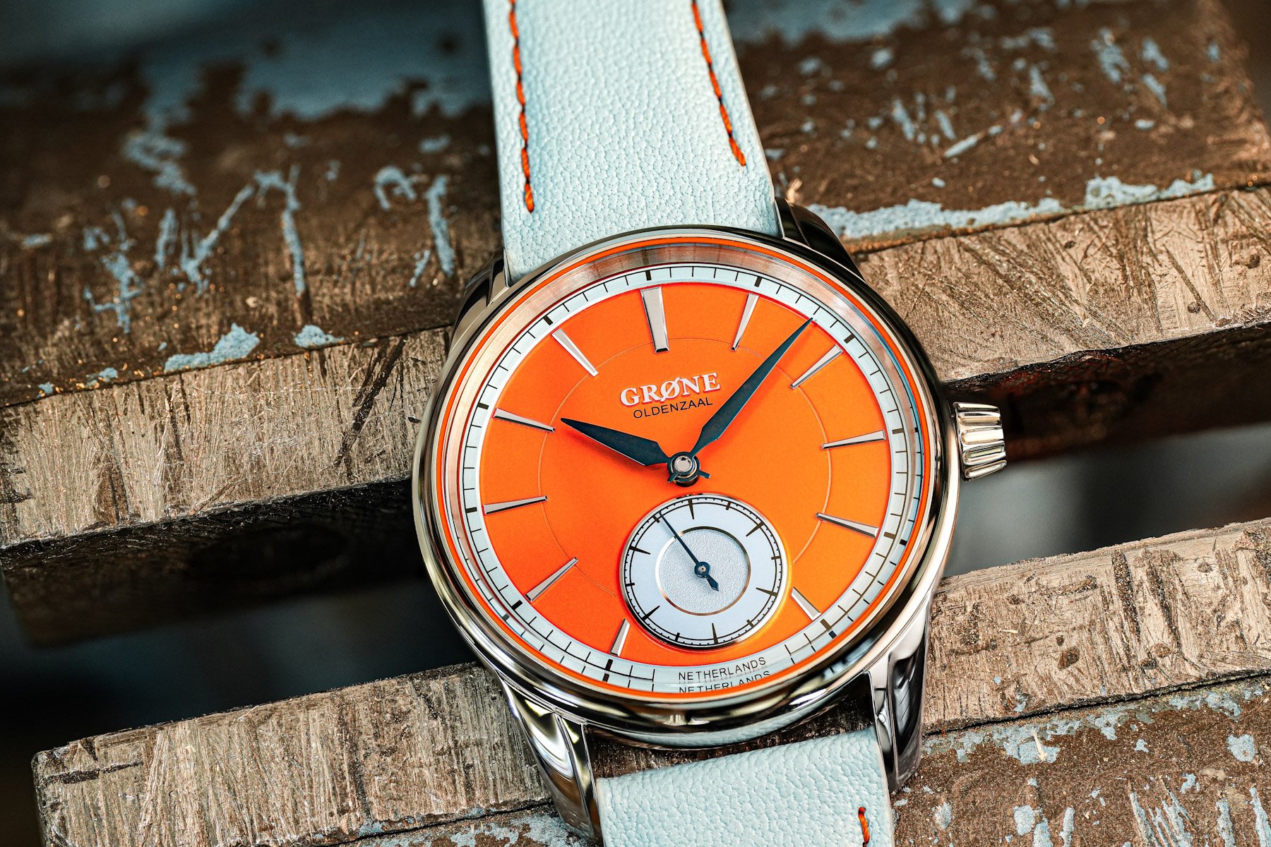
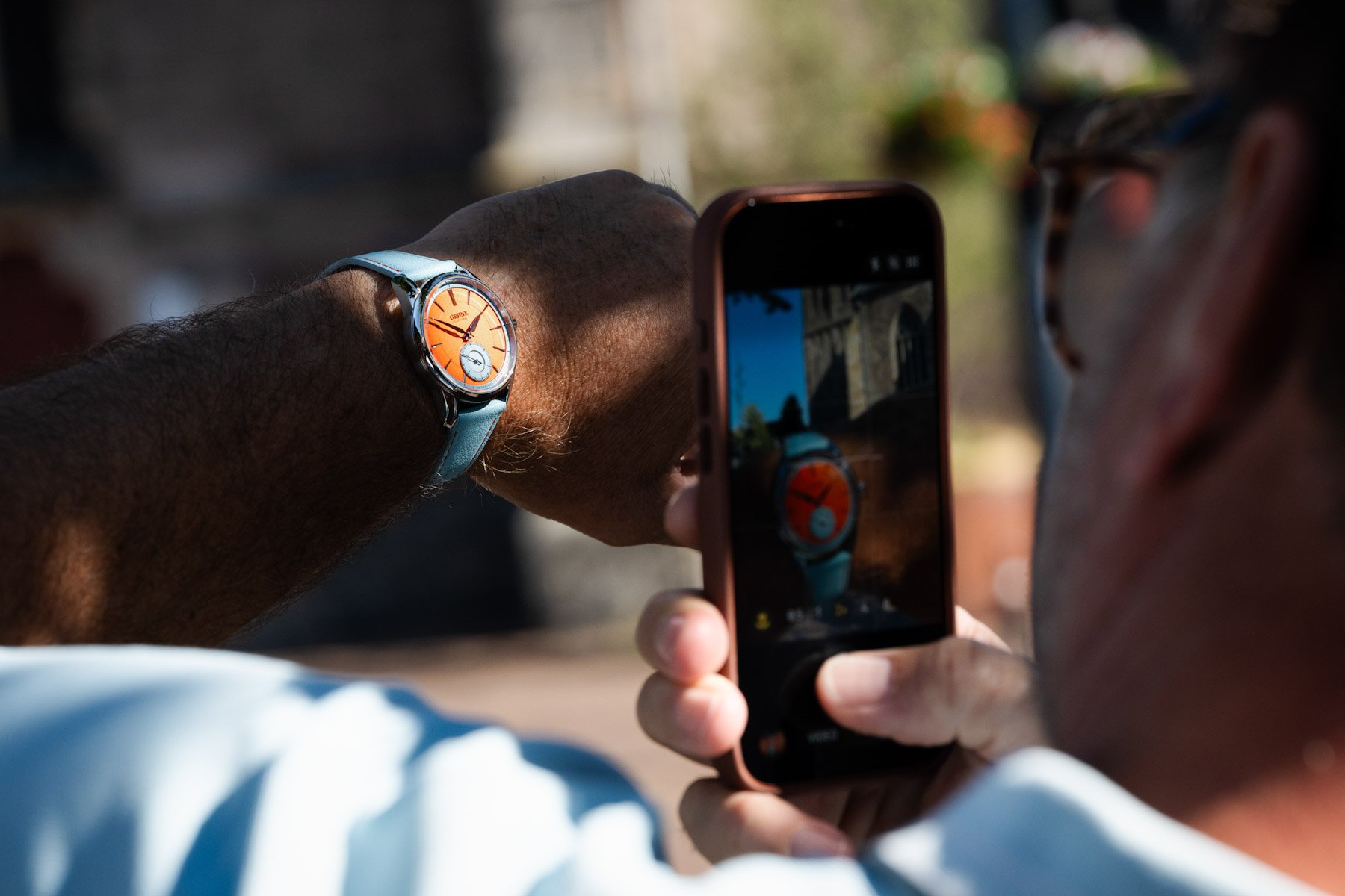
The “Something Quirky” is the one that immediately announces itself, and is kind of the highlight of the collection. The dial combines vivid Dutch orange (which we’ve grown to love through this year’s World Cup) and baby blue, with heat-blued hands and polished diamond-cut hour markers, for a more traditional watchmaking element to a very modern color scheme. There is a lot going on here, but the watch avoids becoming cartoonish or “corny,” as we Gen-Zers say, because the underlying construction remains quite restrained.
The small seconds sit neatly within the dial architecture, while the orange gasket around the sapphire crystal adds another hit of color without turning the case into a novelty object. Grøne also went so far as to find a strap maker who could match the baby-blue details of the dial. That may sound like a minor production detail, but try dipping your finger into watch design, and you’ll see how small decisions like these can genuinely make or break a watch.
Keeping it classic
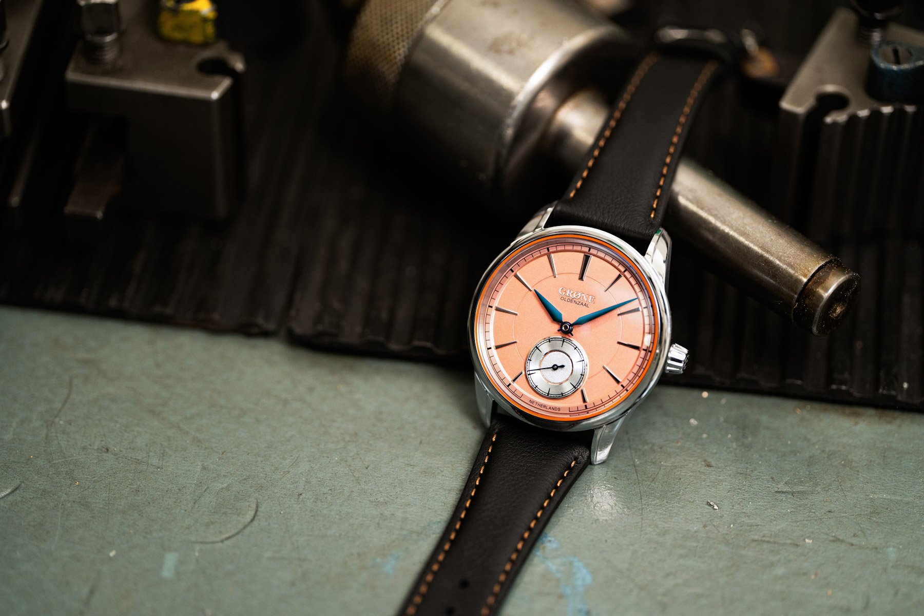
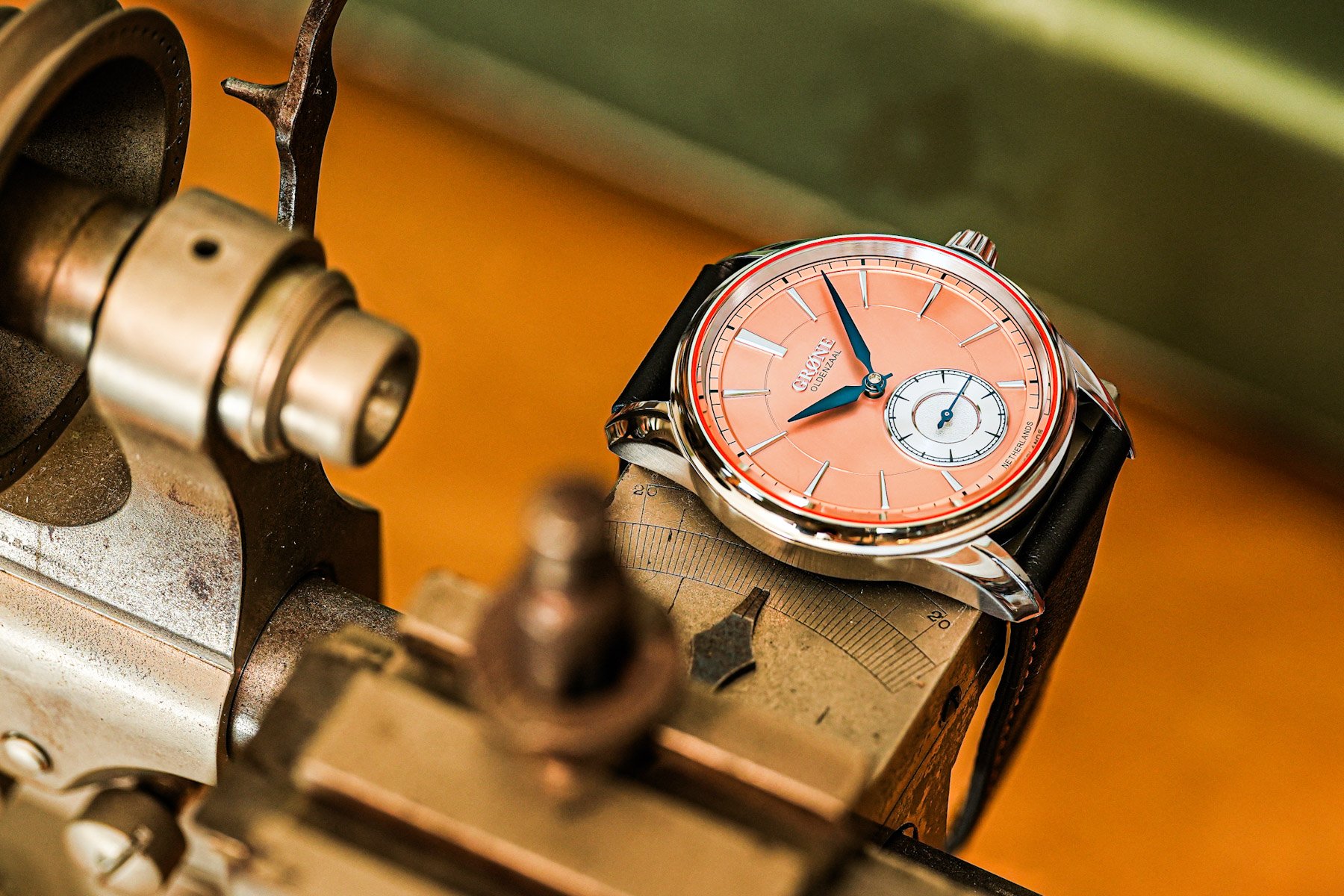
Then there is “Something Classic,” which takes almost the opposite approach. The fun grandpa one. The salmon dial has a much quieter sunray finish, with the small seconds positioned on a raised plateau that gives the conventional three-hander some proper depth. One of my absolute favorite tricks is to bring the dial closer to the wearer. The diamond-cut and polished indices, circular brushing, and flame-blued hands bring it closer to the language you would expect from a traditional independent watch, while still retaining enough of Grøne’s personality to avoid looking plain. The contrast between the two versions is actually quite useful because it shows what Grøne is trying to achieve. The brothers aren’t abandoning traditional watchmaking to appeal to a younger audience. They are taking traditional techniques and allowing them to coexist with a more contemporary visual language.
The Technicality Behind The Colors
Beneath the different dials, the two watches share the same 39mm stainless-steel case and 10mm thickness. The case combines brushed and polished surfaces, with downward-curving lugs intended to help it sit comfortably on the wrist. There is also an orange gasket around the crystal, another detail inherited from the visual language Grøne has been developing. The case itself is an evolution of the brothers’ 1941-inspired design language, already established with the Manueel One and furthered with the Moment Meter. That continuity matters, even when Grøne changes the dial completely; you can still identify the family resemblance from across the different creations.
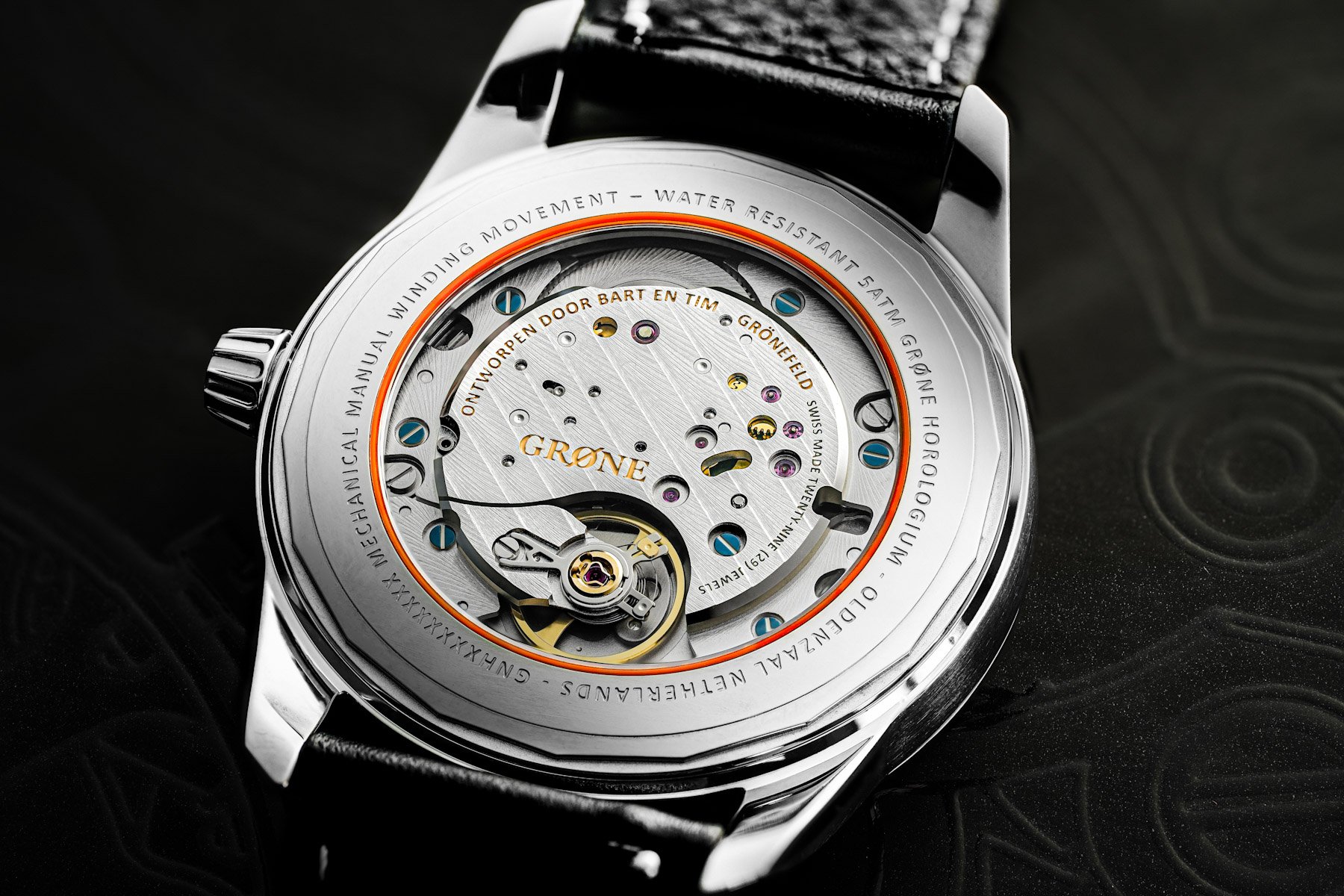
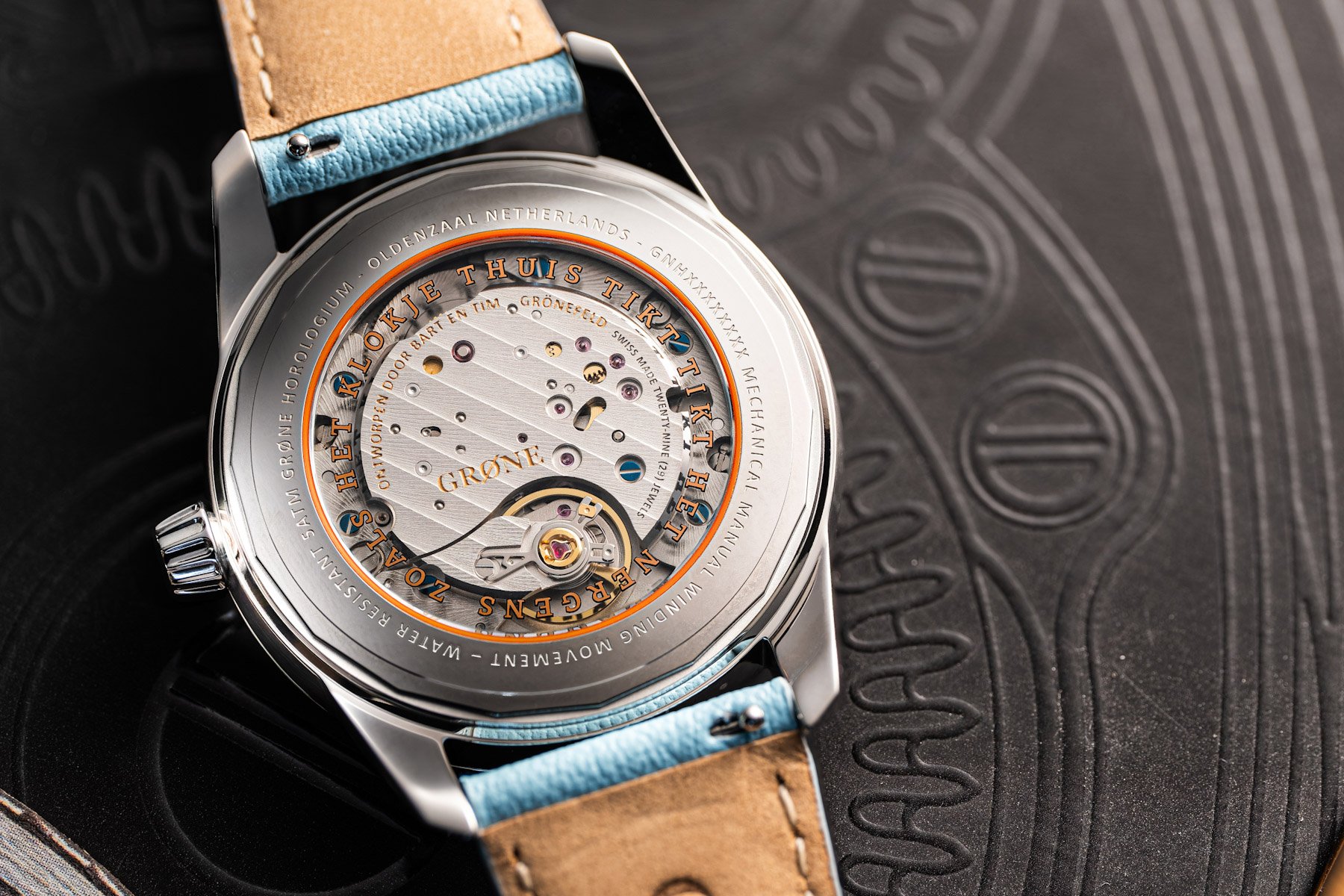
For the first time in a Grøne three-hander, the movement is visible through a sapphire case back, and that changes the emphasis of the watch. Grøne uses a Swiss-made manual-winding movement from La Joux-Perret with a 60-hour power reserve. The bridges are decorated with Côtes de Genève and polished anglage, while heat-blued screws and an engraved bridge add the kind of details you would expect from a brand whose founders spend their days working on much more expensive watches. The movement bridge carries the Grøne Oldenzaal identity and the inscription “Ontworpen door Bart en Tim Grönefeld,” or “Designed by Bart and Tim Grönefeld.”
Final Thoughts
What makes Horologium interesting to me isn’t simply that it costs considerably less than a Grönefeld atelier watch. That would be the least interesting way of looking at it. Grøne is more ambitious than that. Bart and Tim are taking the things that define their work, manual winding, considered case construction, detailed dials, hand finishing, and a very strong sense of place, and trying to put them into a watch that doesn’t require you to already be part of the independent watchmaking world. That positioning is particularly relevant now, when a younger generation of collectors is increasingly interested in small independent brands but doesn’t necessarily have the budget, or the patience, for a €100k-plus watch.
And I think the two versions say something useful about where Grøne is going. “Something Classic” is probably the easiest watch to imagine sitting alongside a traditional independent collection. “Something Quirky” is the more interesting statement because it shows that the brothers aren’t afraid to have some fun with the platform. The orange-and-baby-blue combination is loud, but the watch underneath remains serious. And we’ve seen this with many indies. If you want to find out more about the Horologium, check out the brand’s website.
What do you guys think about the Grøne Horologium collection? Do you prefer the “Something Quirky” or “Something Classic” version? Is this a brand that you guys could resonate with in the long run?