Watches & Pencils #8 – Sandwich Dial In-depth

Today I would like to discuss a ‘tasty’ topic: the sandwich dial. After grasping some (historic) facts I will discuss some recent examples from different brands.
History and Facts
Luminosity to the max
Between 1930 and 1940 the first “sandwich” dials were introduced. Although there are several models with a kind of ‘sandwich’ construction from that time (e.g. the Longines 13ZN Chronograph or IWC cal. 83), the term and construction was mostly introduced by Officine Panerai and presented by one of their primal Radiomir models. Around 1938, Panerai watches were still exclusively developed for the Royal Italian Navy and so they had to be very functional and robust. One request from the navy was to make the watch even luminous. The sandwich dial was Panerai’s answer to that request. Instead of the well known two-layered sandwich dial the first examples were initially made out of three layers. On those dials the upper and bottom dial were connected by a transparent Perspex disc to protect the luminous material (Radium paint at that time). Although this was the first sandwich dial, let’s discuss the two-layered version.
Functional design
Despite being more of a design statement these days, back then sandwich dials were purely functional and pushed the brightness to a next level. By making a dial out of two layers/disks on top of each other the bottom dial could store more luminous material then before. The brightness improved significantly. Also, the highly legible typography on Panerai dials originates from functionial design. The Arabic numerals at the four cardinal points were another request from the Italian Navy. Notice the typical not fully closed ‘6’ or ‘9’ numerals. Again, purely functional: preventing to break the stenciled numerals on the top dial. Number ‘9’ for example. It would not have any outlines if the circle was fully closed.
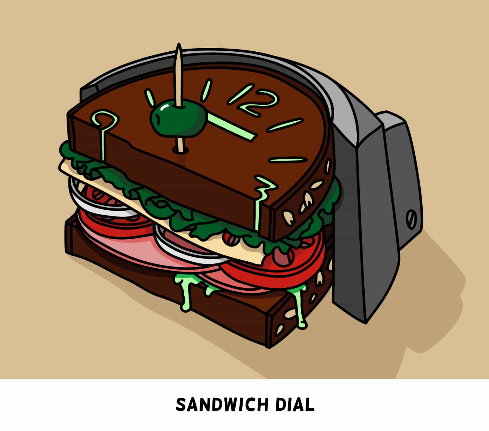
Cartoonish intermezzo
Construction of a sandwich dial and other variations
The bottom dial or disk contains the recessed numerals and indices, the “lume-gutter”. Next, the top dial is put perfectly on top of it and have the slightly smaller perforated numerals and indices, so you can see the lume-filled bottom dial. In the 90’s period of Panerai (mostly pre-Vendome era) dials weren’t made out of two layers anymore and are often mistakenly also being called sandwich dials. Those dials were made out of only one disk and therefore no sandwich dial. If we zoom in on those dials we find models where the dial ‘chambers’ are perfectly filled up or even pop out a little. Sometimes the lume was applied on a printed index on the dial rather then in a recessed cavity. Those dials are also called ‘sausage’ dials and can catch more light then the older sandwich dials. Therefore they are considered to be more bright. Again, from a functional perspective, ‘sausage’ dials are more legible then sandwich dials since the luminous numerals won’t ‘disappear’ in the cavities at more extreme angles. To visualize this, see some of the variations by yourself (simplified side-views):
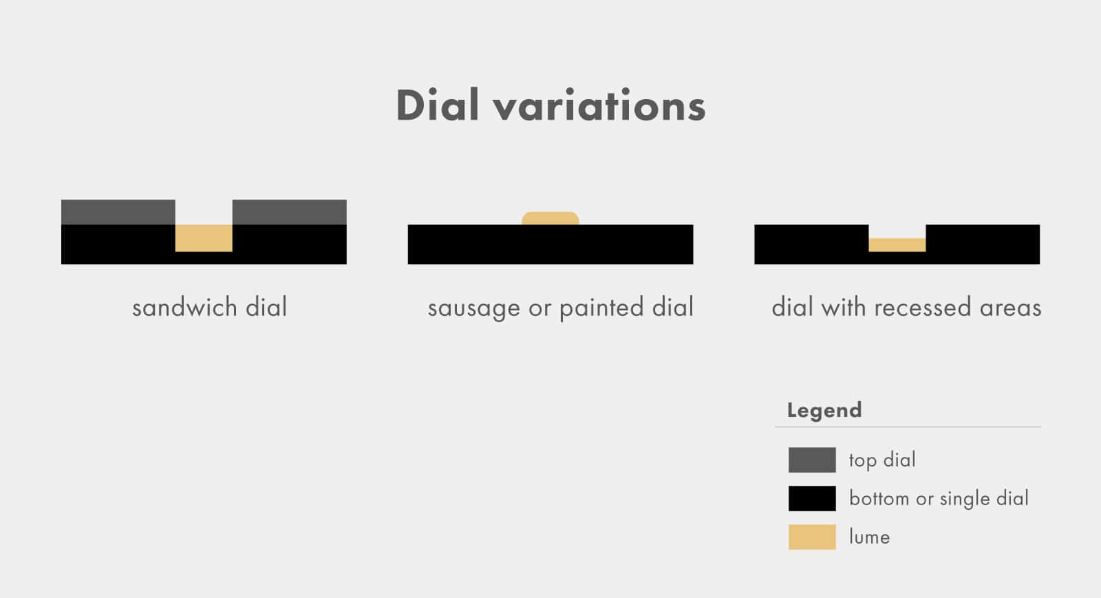 In variation 2 the edges of the luminous material are rounded. Often it looks like a half circle from a bigger distance. Together with the chunky, open and swirly numerals/indices on PAM-dials this is the reason why it is nicknamed ‘sausage dial’ by Paneristi. Also, notice the third variation. This one also creates the nice depth effect as the sandwich dial does, but consists out of a single dial/disk with milled out areas instead of two dials and is therefore not a sandwich dial. Omega used this technique in the recently released Seamaster 300 models, for example the Omega Seamaster 300 Spectre which is recently reviewed by us (especially pay attention to the indicator at 1 o’clock):
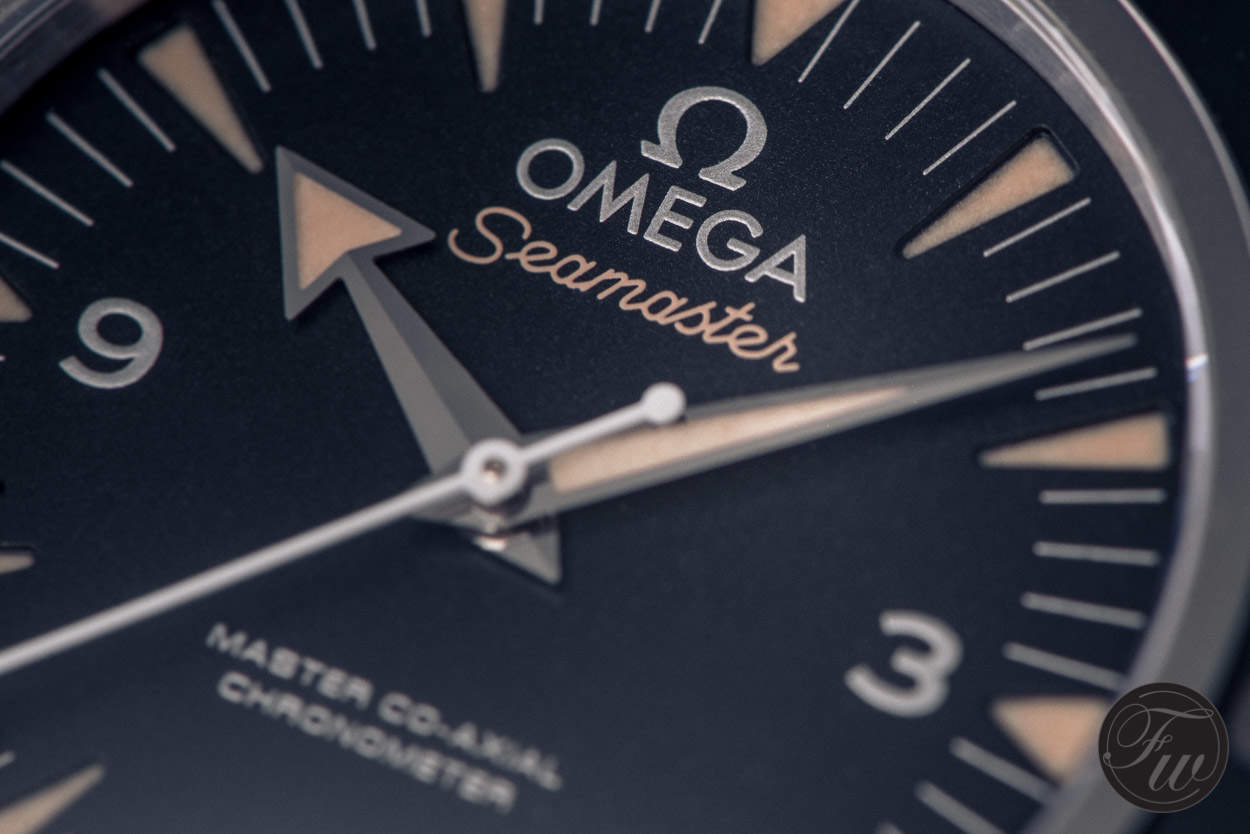
Matt dial of the Omega Seamaster 300 Spectre
Recent examples of sandwich dials
Sandwiches… Still yummy!
Although we often do not need that much luminous material anymore, the sandwich dial has evoluated to an iconic design-element on watch dials and is absolutely timeless. It is one of the core elements on a dial/watch designers toolbelt and I guess that’s one of the reasons why many big and small watchbrands make sandwiches these days and let us taste these nice pieces of art.
Let’s discuss some recent examples. Off course one by the ‘grand-father’:
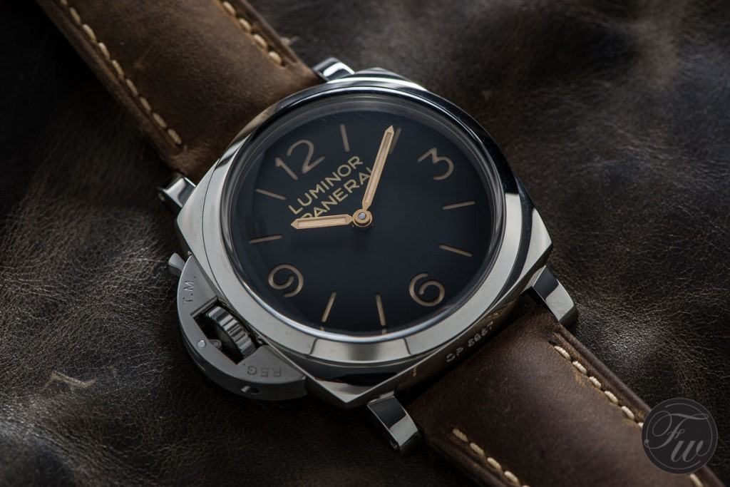 This kingsize example (47mm) of a ‘modern’ Panerai with sandwich dial stays true the Panerai principles: simple, clean, destinctive, big and strong bodied. Also, the domed Plexi glass creates a nice effect together with the sandwich dial. FratelloWatches reviewed this PAM00557 before.
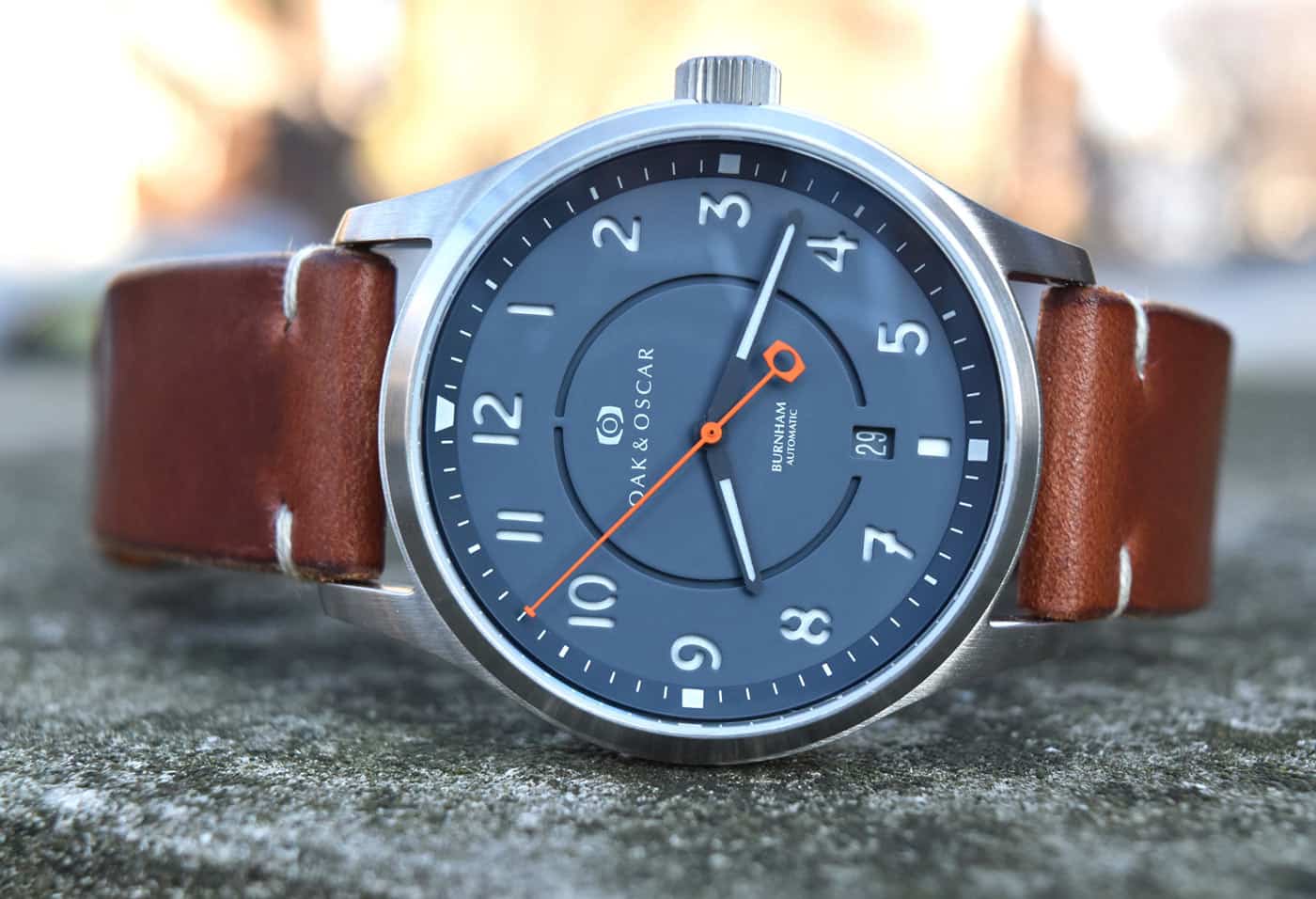
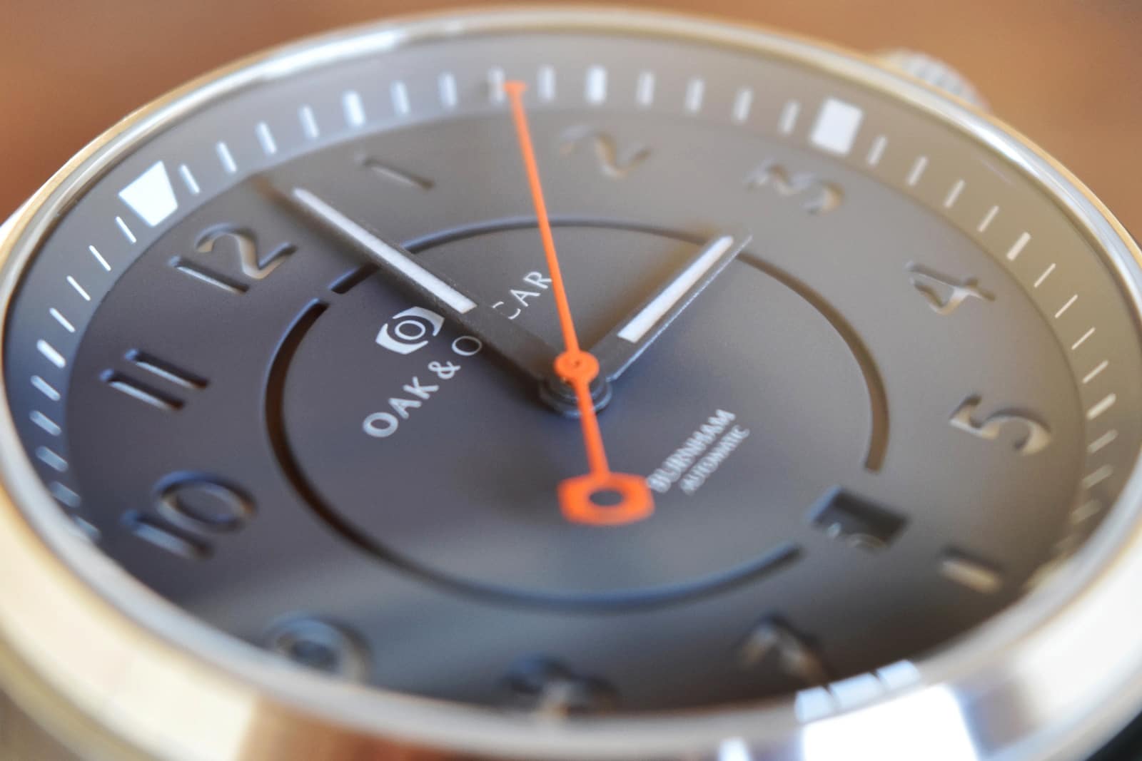
Besides this obvious one other brands also love the sandwich construction. For example, Oak & Oscar did a nice job on the ‘Burnham’ model. I especially like the execution of the ‘7’. It’s not seen very often with the extra hyphen and does give the sandwich dial a very characteristic look. Also note the inner stenciled circle on the dial. This element creates a nice depth and adds another ‘natural’ 12 0’clock marker:
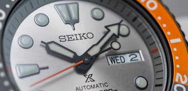
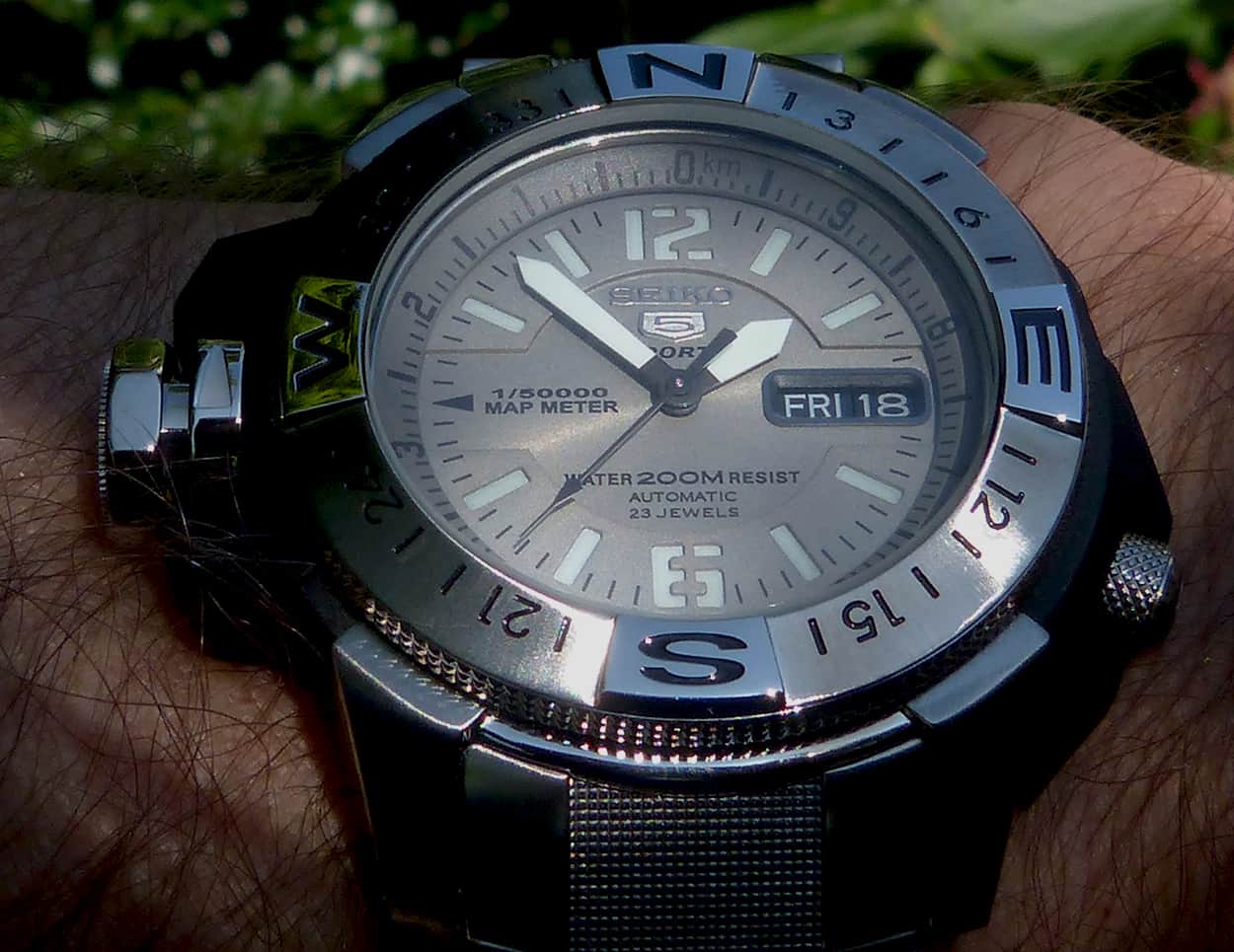
Seiko also features a sandwich dial on the recent Map Meter-model (e.g. SKZ229K1). This special tool-model offers lot’s of geographic functions like a mile marker and rotating compass bezel for example. Although the sandwich-technique is quite old, this dial looks quite modern during the ‘digital’ stenciled sans-serif numerals at the nord and south position:
Enough said… Enjoy your sandwich!