How a Speedmaster and Flightmaster ended up in David Bowie’s album art

On the inside of Lodger, David Bowie’s concept album from 1979, there are images of an Omega Speedmaster Professional and a Flightmaster. We did some research on how these watches ended up inside the Lodger album.
David Bowie’s Lodger, the last of the three ‘Berlin period albums’, is a concept album about a homeless traveler, released in May 1979. It received much less press enthusiasm than predecessors Low and Heroes, even though record label RCA compared it to Sgt. Peppers and despite hit songs, DJ and Boys Keep Swinging. Lodger did not meet the high expectations Bowie had set with his previous work. Nonetheless, the album became gold in The Netherlands and The United Kingdom.
David Bowie’s Lodger Album

Falling
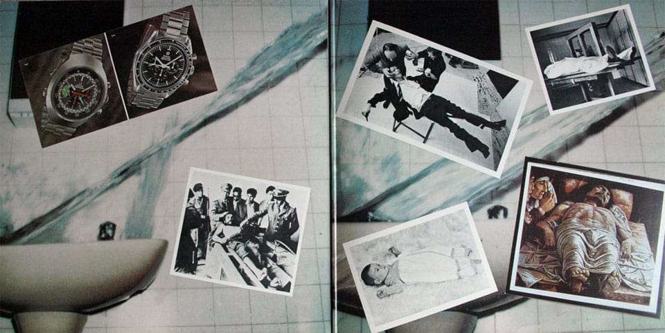
Lodger has a gatefold cover – like a double album you can open it. The outside shows a postcard design featuring a photo of a ‘falling’ David Bowie. The inside shows several pictures of people laying down dead or alive, plus two funky images of wristwatches. All against a background of a pail of water being thrown in a sink. Anyone who takes a first look at the inside of the gatefold will look twice at the watches because they don’t seem to fit the design.
Ground Control to Major Tom?
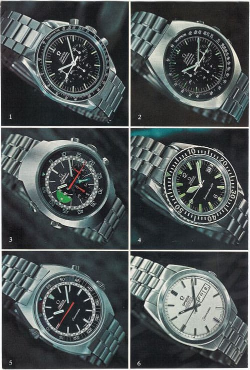
Watch fanatics will take a better look at the watch pictures: two full colors of seemingly free-flying watches.
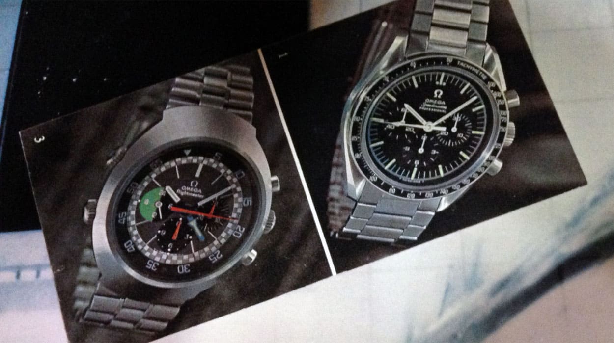
Each picture is numbered. The Omega Speedmaster Professional has a 1 in the corner; the image of the Omega Flightmaster a 3. It is eye candy for watch enthusiasts, showing dials, hands, buttons, bracelets, and materials in full detail. But what are they doing in this record cover art? They belong in a book for watch fanatics, collectors or jewelers, not here in Lodger… Would Bowie like watches? Isn’t he always ahead of time, or even beyond time? Why specifically these two watches? Was the cover art designer an Omega-fan or even better: was David? Is it a wink at space traveling, Ziggy Stardust and Major Tom or – spiritually – a nod at the concept of Heaven, Gods, and astronauts?
Enter Derek Boshier
There must be a reason, a message, a deeper meaning, a higher goal, or at least an explanation for the remarkable presence of these specific timepieces. No way that these two were used here coincidentally. Online research learns enough about the cover art, but nothing specifically about the wristwatches. Bowie never responded but designer Derek Boshier (1937), who designed the cover art, was quick on the draw and happy to tell an exciting story of surprises, creative thinking, and happy accidents.
Surprise
It all started in 1978, when Derek Boshier, 41 at that time, was asked to curate an exhibition that included work by photographer Brian Duffy (1933 – 2010). Derek: “One day, Brian told me he wanted me to meet a friend of his. Somehow, I was convinced that he had me a blind date with a nice lady. So I went to the appointment and was surprised not to meet a lady, but David Bowie. The singer asked me if I’d be interested in collaborating with him and Duffy on the design of his new album cover”.
Falling without falling
Duffy wanted to have a falling Bowie on the cover. Not fallen, but while falling. Duffy constructed a table in the shape of a falling figure, to photograph David from above as if he’s looking down. (Look here for an example: (https://www.paulgormanis.com/?p=5305). An accident eventually made the picture much stronger, Boshier recalls. “David arrived for the shoot with a bandaged right hand. He had burnt it by spilling something hot on it like coffee. The make-up artist – the best in the trade, working for people like Liz Taylor and Michael Jackson – was horrified. It would take him a long time to get the burned hand look uninjured. David, combing his hair, said: “No … let’s leave the bandage”. This coincidence took the image to another level, bandaged hand and comb included!”
Nose job
Another interesting creative feat concerned Bowie’s nose. He wanted to simulate G-Force for the photo, like when the face of a pilot deforms by G-forces while breaking the sound barrier. That’s how David wanted to depict his speed of falling. Boshier: “The cover looks as if a piece of glass is pressed against Bowie’s nose, but the execution was much more complex. The makeup artist had attached fishing lines to David’s face. During the shoot, someone pulled the lines, to get the G-Force look”.
Blurred Polaroid’s and logo
During the process, David decided that he wanted more blurred Polaroid’s instead of the perfect images. He liked the sloppy style of the Polaroid’s that photographers take to check everything before the final shoot. But Bowie wanted a more loose look. “He also wanted the word Lodger in three languages, so I incorporated the French, German and Japanese into a postcard image, with RCA Records London address and invented LODGER logo”, Boshier recalls.
The inside sleeve
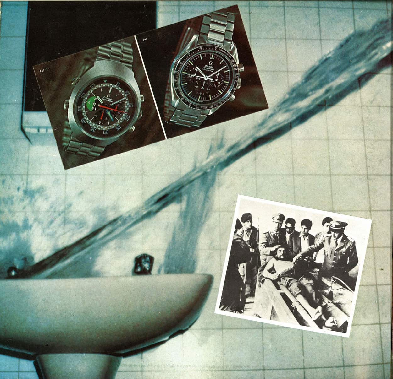
While everyone was busy creating the cover, nobody had said anything about the inside cover. Boshier asked David about it. “You do it, just do what you like”, the singer answered. Boshier already knew his theme: time. Boshier: “I choose all pictures – the famous autopsy picture of Che Guevara, Andrea Mantegna’s painting ‘Death of Christ’, the image of a young child, a body in an autopsy room and of course the watches -because they all have to do with time, live and death, beginning and end, the circle of life”.
Time?
That’s it? Is there nothing more to tell about the watches? It can’t be that Boshier included these remarkable watches coincidentally, only because his theme was time? “There is nothing more to it”, the artist confirms. “Not even a song on the album referring to time. It is a pure coincidence”. No Omega fascination, no space- or flight-related sympathies; Bowie wasn’t a watch collector nor was Boshier. Boshier recalls the reason for those watches was very practical:
“I chose them from a lot of watch pictures because I liked the double watch image and it was a good, clear photograph. It could have been other watches, by any brand. I never even knew they were Omega’s”.

1970 magazine ad
Boshier talks about a double image, but research learns that the pictures come from a 1970’s magazine ad, showing a Speedmaster a Flightmaster and some other contemporary Omega’s. There were different versions of this advertisement, all showing more than two watches, including written information per watch. The latter explains the numbers in the watch pictures: they refer to the accompanying texts.

Coincidence huh?
After his memories on the covert art design, Boshier points at one other incident that has to do with the coincidence factor. “I remember I visited Bowie’s apartment in the Turkish sector. After lunch, David gave me a tour of his home. All rooms were large with high, white ceilings and quite bare – only objects of use. One room was different from the rest. It was full of objects, plush, ornaments, heavy velvet draped curtains, Tiffany lamps, dark colors and a fireplace with oil paintings of Grand Mama with hair in a bun and Grand Papa with a pipe. I thought Bowie had left it the way he found it – as a contrast. Or maybe to make German visitors feel comfortable. How wrong I was … No coincidence with David Bowie. He had choreographed each room including that room like he had always created everything – including the bandaged hand and the comb of the record cover shoot and all his other personas. If David had chosen the watches, he would have had given you a story without coincidence. But he liked what I wanted for his album art, and that is no coincidence, for sure. It stood the test of time.
More information about Derek Boshier can be found here. More details about photographer Brian Duffi here.
*This article appeared first on February 17, 2015, we made some small updates and wanted to give it some attention again.