Sunday Morning Showdown: Rolex Oyster Perpetual Yellow Rolesor Vs. Oyster Perpetual “Jubilee”

It’s Sunday morning, so it’s time for a fresh cup of coffee to accompany a good ol’ watch brawl. This week, we picked two Rolex Oyster Perpetual models to go up against each other. Both were introduced during Watches and Wonders in April and were The Crown’s main releases for this year. The two new Oyster Perpetual models celebrate the 100th anniversary of the Oyster case in two completely different styles. Which of the two do you prefer, the one with the Jubilee dial or the yellow Rolesor version? Let us know by casting your vote and leaving a comment after reading Jorg and Mike’s arguments.
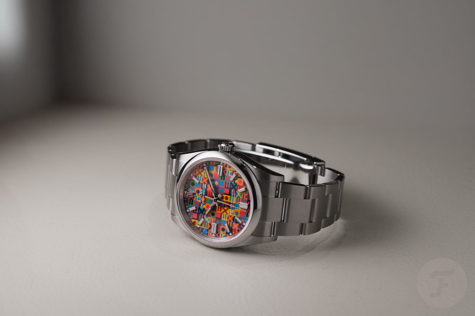
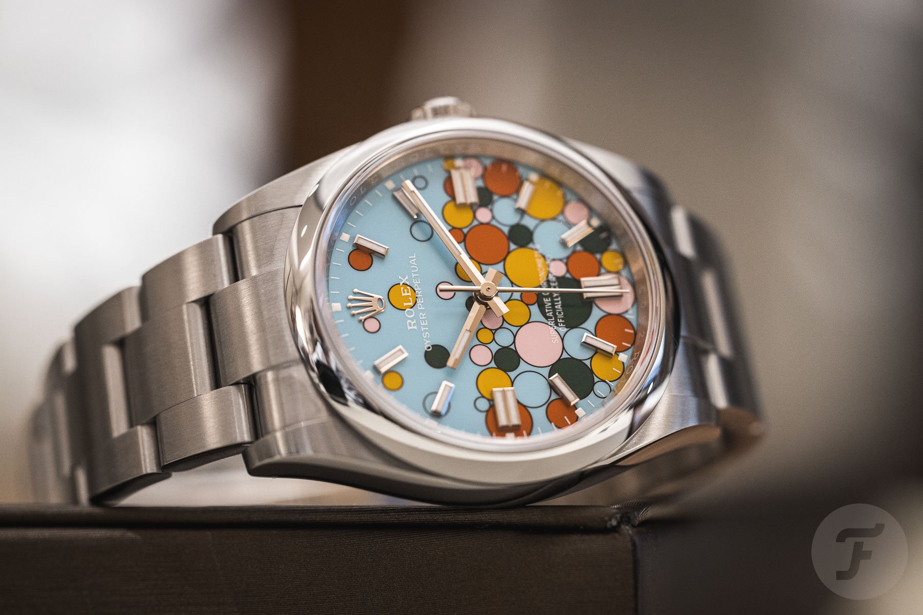
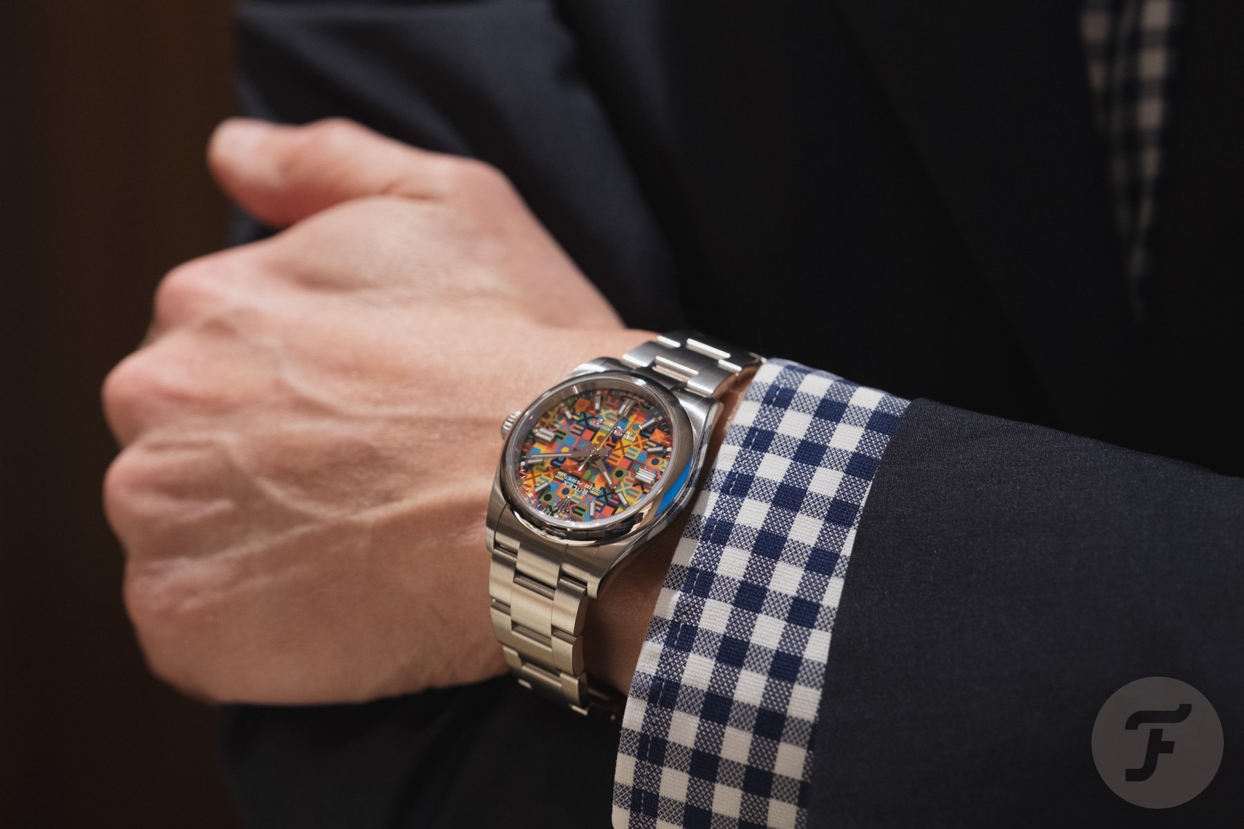
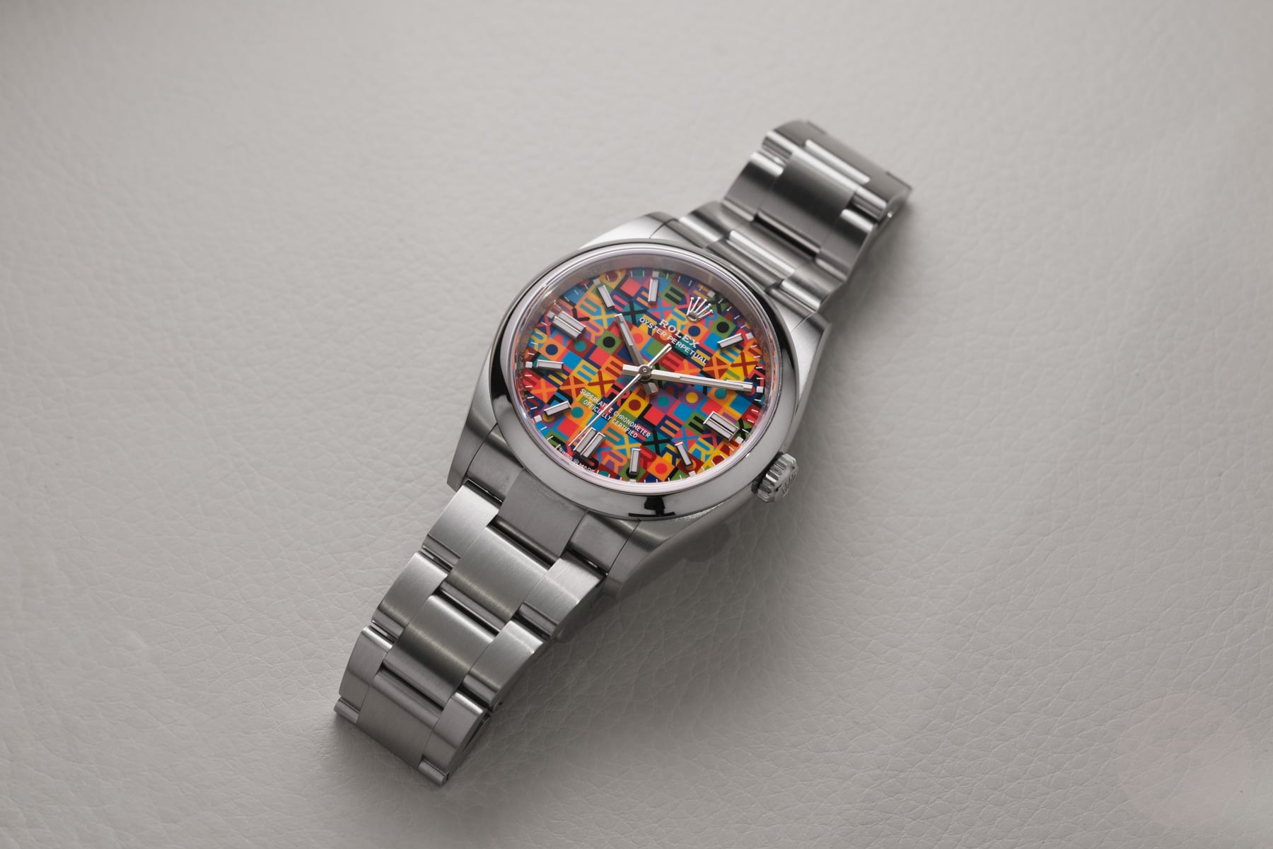
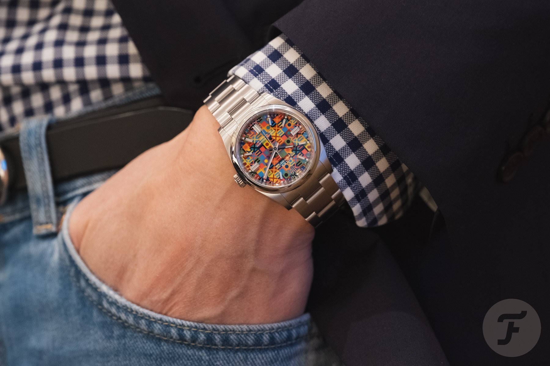
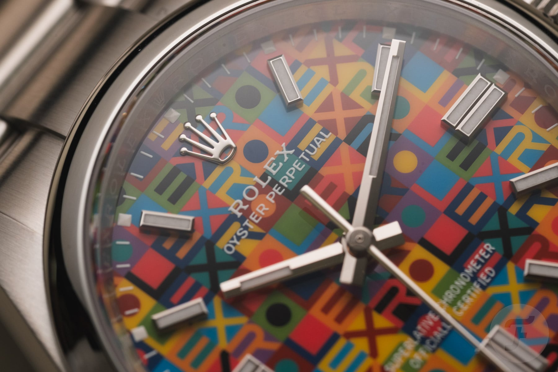
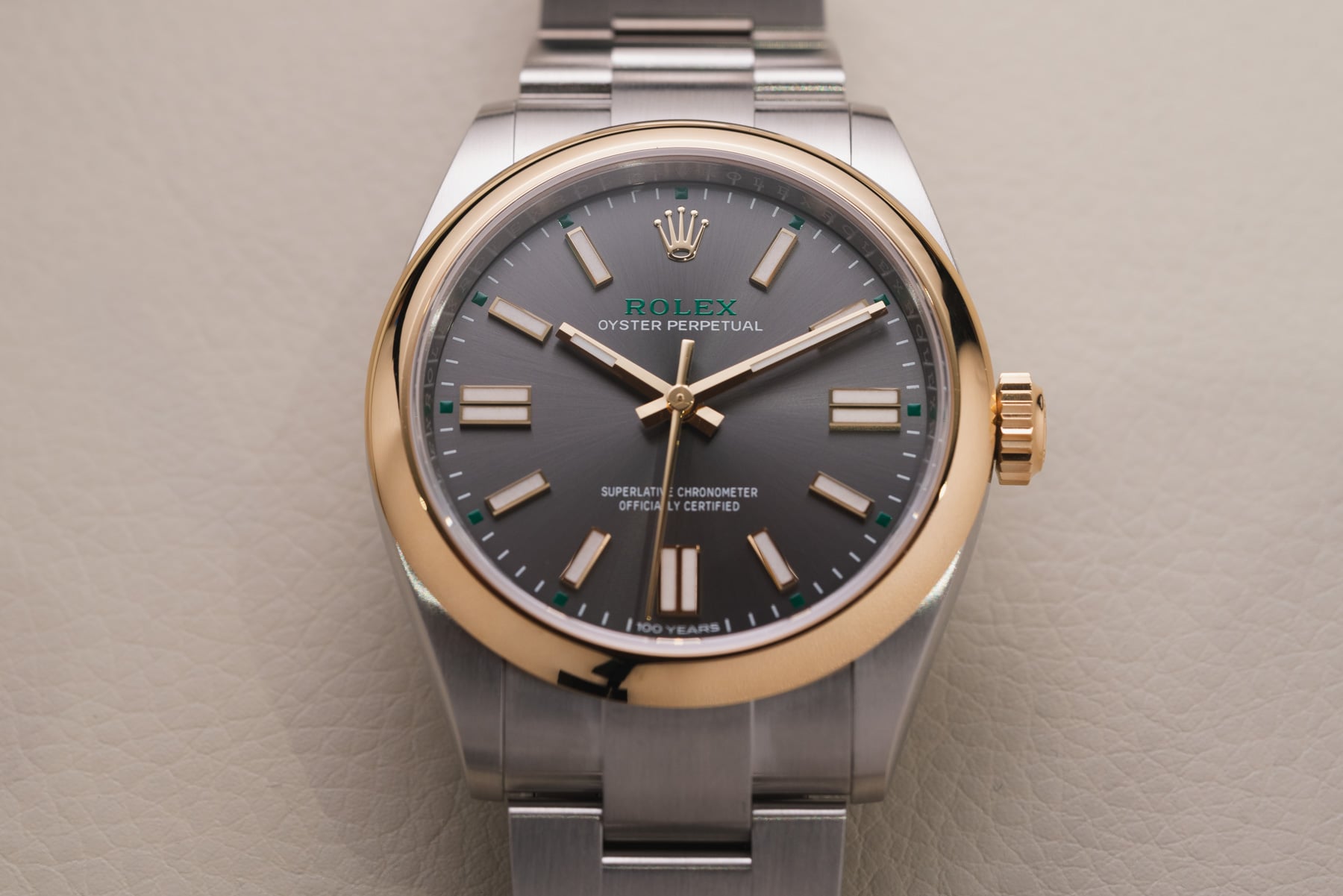
Color is the theme for both of today’s watches. Jorg’s Oyster Perpetual “Jubilee” is a celebration of bright hues, using the Rolex word mark to transform into a repetitive mosaic that creates visual chaos, as Lex explained. The dial pattern was inspired by the classic Jubilee dials that Rolex introduced in 1985 to celebrate 40 years of the Rolex Datejust. This steel Oyster Perpetual retails for €6,550. It goes up against Mike’s contender, the Oyster Perpetual in yellow Rolesor, which uses color differently. The combination of stainless steel and yellow gold is unusual in the Oyster Perpetual lineup. It also features some nice 100th-anniversary details to mark the Oyster case’s centennial. This watch comes in at €8,250, so it is slightly more expensive. But the big question is which of the two you would pick. Let’s find out!
Last week, on Sunday Morning Showdown…
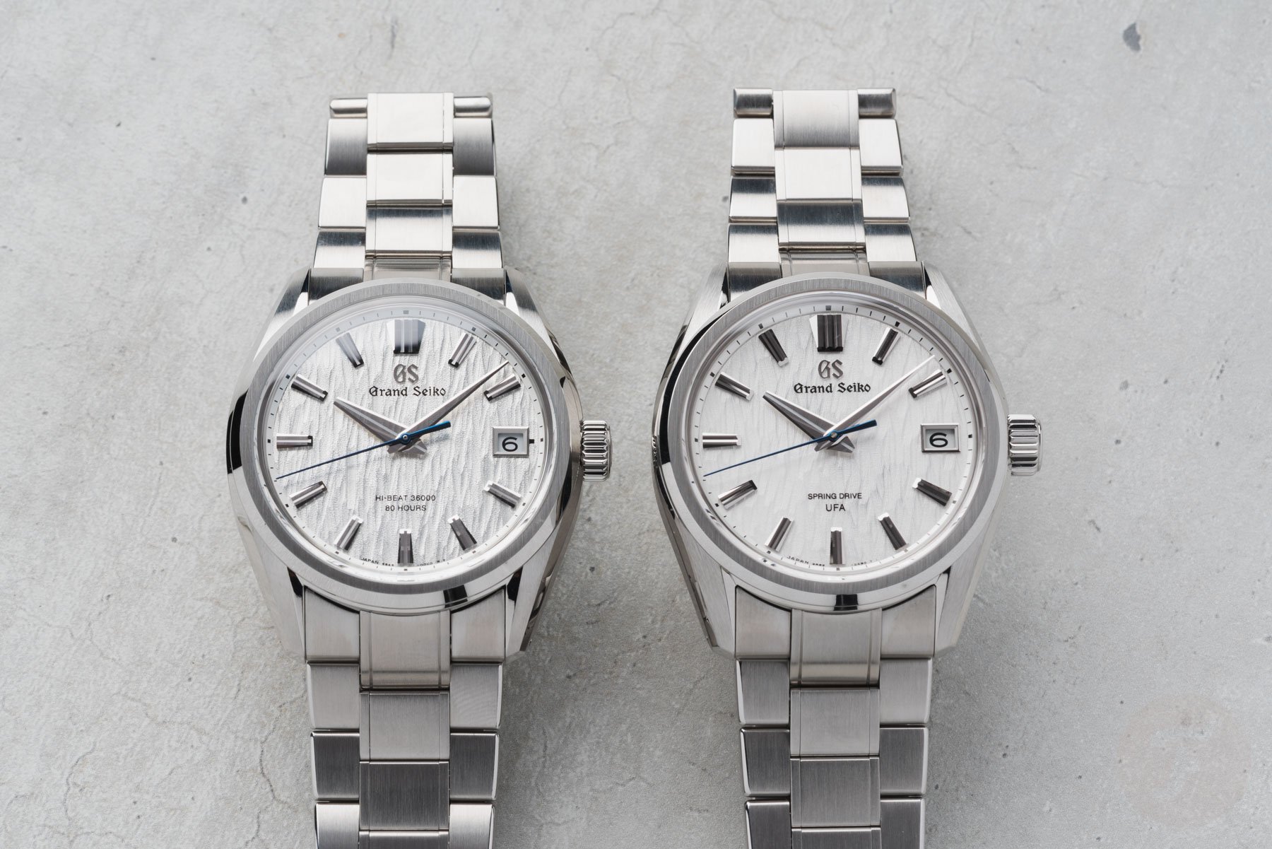
Before we let Jorg and Mike go at it, let’s quickly look back at last week’s Sunday Morning Showdown. In the context of the latest Grand Seiko Evolution 9 models, you voted the Spring Drive U.F.A. caliber 9RB2 as the clear winner over the Hi-Beat 9SA5. The results were clear, with Spring Drive taking 70% of the votes versus 30% for mechanical Hi-Beat movements. As is often the case, the comments section showed that opinions were split, but in the end, the numbers don’t lie. Will it be another clear victory today? Over to Mike and Jorg.
Jorg: Rolex Oyster Perpetual “Jubilee”
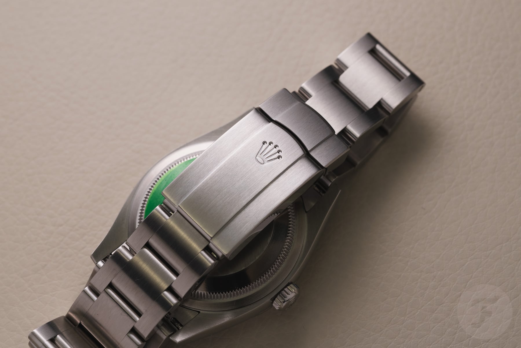
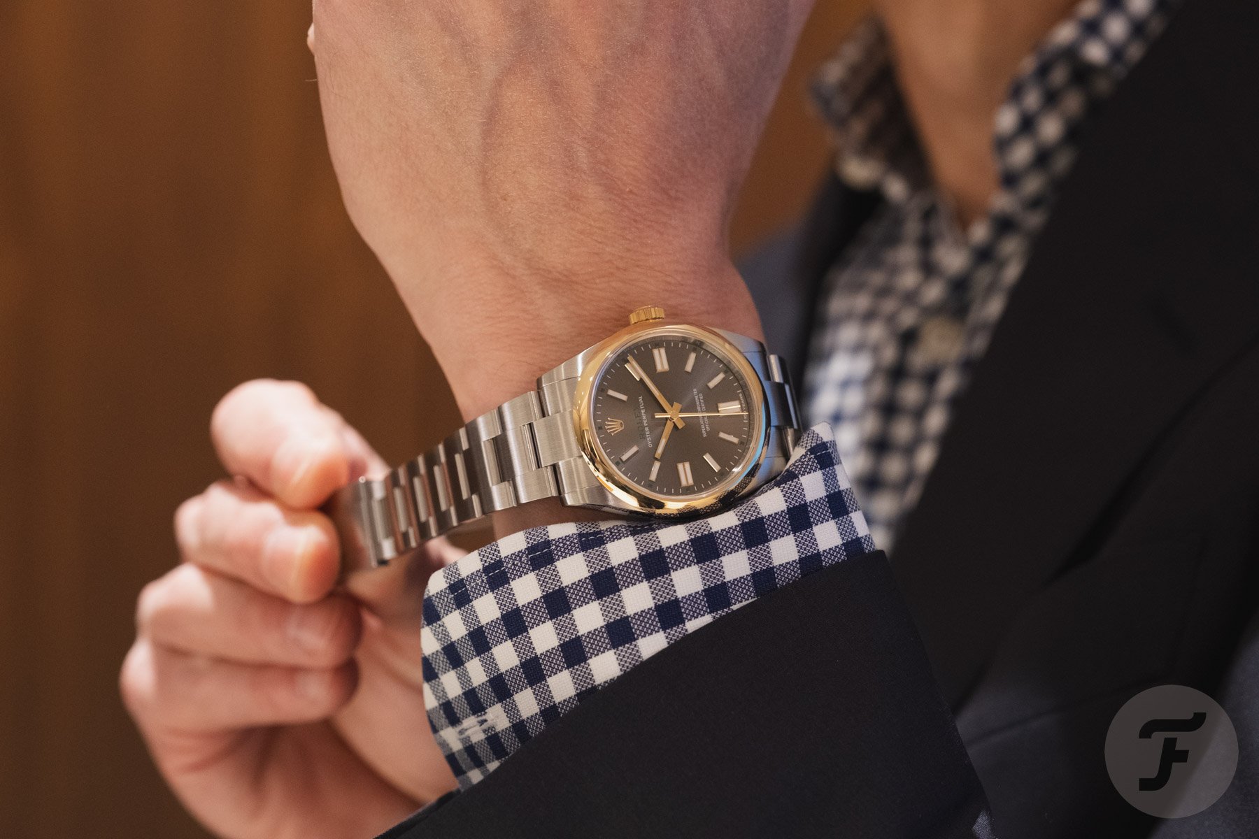
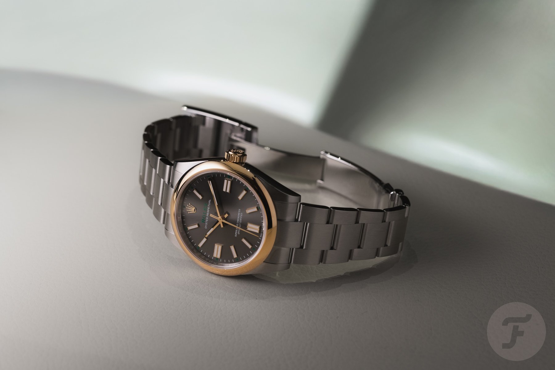
Today’s matchup will not come down to technical differences or dimensions. The Oyster Perpetual 36 “Jubilee” (ref. 126000-0016) and the Oyster Perpetual 36 in yellow Rolesor (ref. 126003) are practically the same watch. The deciding factors will be the use of color, materials, and, to some readers, the price. That makes our cases fairly simple, Mike. Let’s quickly go over the details of both watches to get an idea. Both feature a 36mm case with an 11.6mm profile and a 43.1mm lug-to-lug. The obvious external differences are the yellow gold bezel and crown on Mike’s OP. Finishing the look of both watches is the modern Oyster bracelet.
Inside the case of both watches, you will find the Rolex caliber 3230. This automatic movement has a time-only display and offers a 70-hour power reserve. The caliber carries the Superlative Chronometer certification, which was updated this year with even stricter performance criteria. The new certification guarantees precision, power reserve, waterproofing, and self-winding efficiency in accordance with Rolex’s internal standards. It makes these two 100th-anniversary models great daily wearers with a completely different aesthetic.
The colorful dials are truly special
That’s also where things get interesting. As I wrote earlier this week, I am a fan of Rolex’s recent series of colorful dials. They offer a playful, fun break from the usual Rolex fare. In particular, the Celebration and Jubilee dials that the Genevan brand created for the Oyster Perpetual stand out to me. But I am also aware that many Fratello readers do not see the fun in these dials. The strong opinions shared in the comments below that article showed many reasons people would not want such a playful Oyster Perpetual. Among them, readers mentioned the unobtainability, the stigma as a watch for flippers, and the ever-enduring question of whether a luxury brand like Rolex should be making watches like these.
While I love these dials, I initially had my doubts. But that wasn’t because of the reasons above. Colorful dials like these can appear to lack the depth of a typical Rolex dial. The Celebration dial was inspired by a set of bubbles, using the original colorful dial options Rolex used for the current-generation Oyster Perpetual introduced in 2020. The story of the new Jubilee dial goes back a bit further. It is based on the original Jubilee dials introduced in 1985, when Rolex celebrated the 40th anniversary of the Datejust.
A playful version of the Jubilee dials from the 1980s
While these dials could be considered a playful break from the norm, some were pretty extravagant, with a debatable show-off factor. Especially the gold Jubilee dials can still raise an eyebrow or two. With this year’s colorful reinterpretation, the designers created a repetitive mosaic that focuses more on art and color than on extravagance. That’s exactly what I love about this dial. Lex referenced the work of Italian conceptual artist Alighiero Boetti, a member of the Arte Povera movement, in his review. Boetti made artworks in the 1960s and 70s that looked very similar to this Rolex dial, using typography patterns in bright colors.
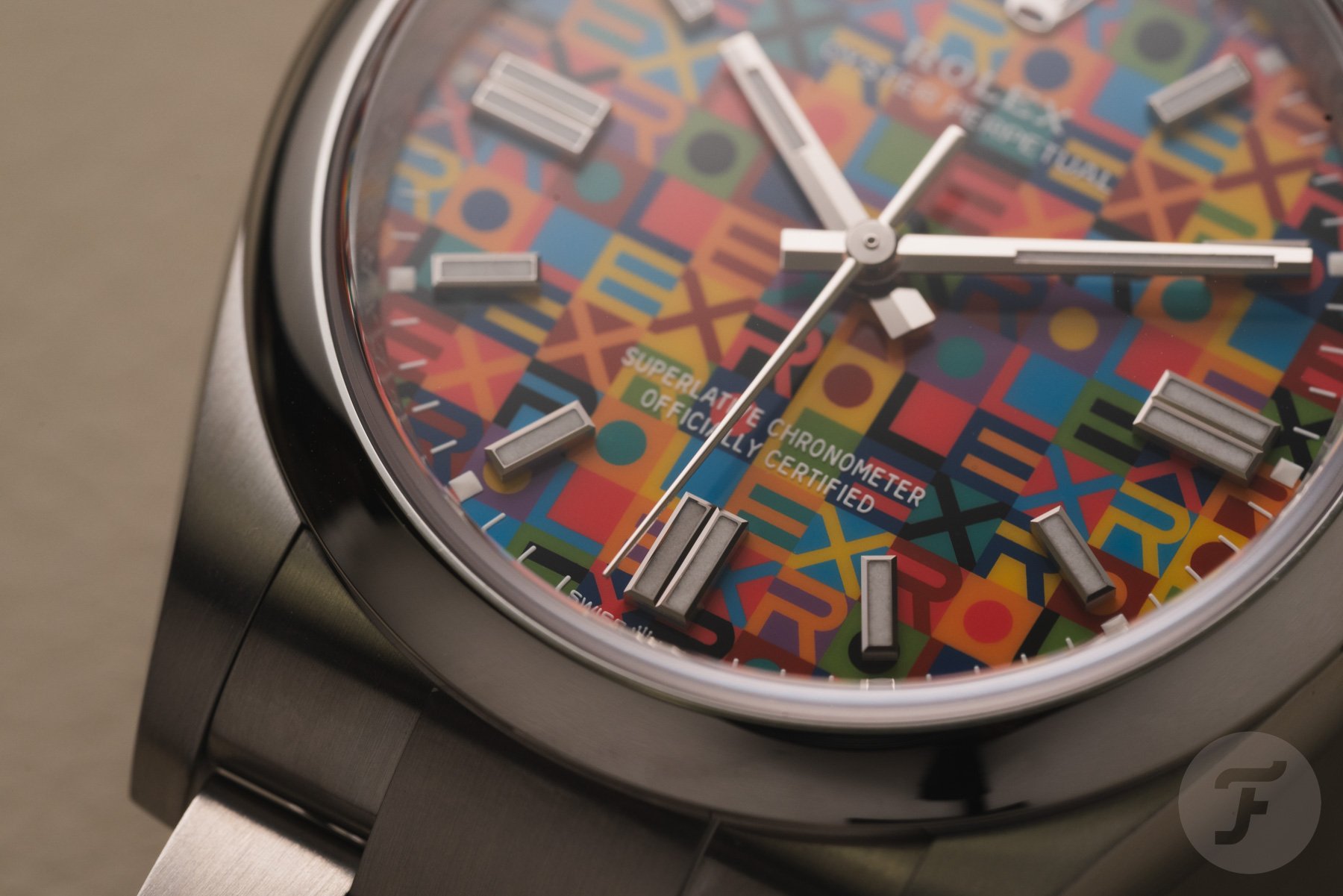
But this typographical wordplay touches on many more art styles and forms, making it much more than just a play on the ’80s Jubilee dials. I immediately grabbed a few books that I have covering typography, old jazz posters, and other art. That’s the kind of inspiration I love to come from a watch dial. Though I was immediately intrigued by this colorful pattern, I had my doubts about the execution. That was until I put the watch on my wrist. I should know better by now, as Rolex always ensures that playful dials have the same depth and detail as its more serious options. As a result, I found it hard to take the watch off my wrist when we visited the Rolex offices in Brussels. That’s where something clicked.
I want a loud statement reminding me of the 100th anniversary
During that same meeting, I also had a chance to try out the 100th-anniversary two-tone Oyster Perpetual that debuted at the same time. While I think it’s a charming bicolor play on the OP, it didn’t have the same wow factor as the Jubilee dial. And when it comes to these special pieces, I prefer a wow factor every time.
The use of yellow gold and stainless steel is special for an Oyster Perpetual, but it’s certainly not remarkable within the Rolex catalog overall. On top of that, the little 100th-anniversary details are subtle. While some might prefer them over the loud statement of the Jubilee dial, they lose my attention quickly. By contrast, every time I look at the wildly colorful Jubilee dial, I’m reminded of how special the watch is. That is exactly why I prefer this watch as the statement to celebrate 100 years of the Rolex Oyster case.
Mike: Rolex Oyster Perpetual in yellow Rolesor
This week, I have the challenging job of defending the Oyster Perpetual in yellow Rolesor. I think it’s a tough position because the “Jubilee” model is so different, fresh (in Rolex terms), and colorful. My combatant, on the other hand, is the more traditional release. Then again, that’s what may make it so appealing to less flash-driven fans.
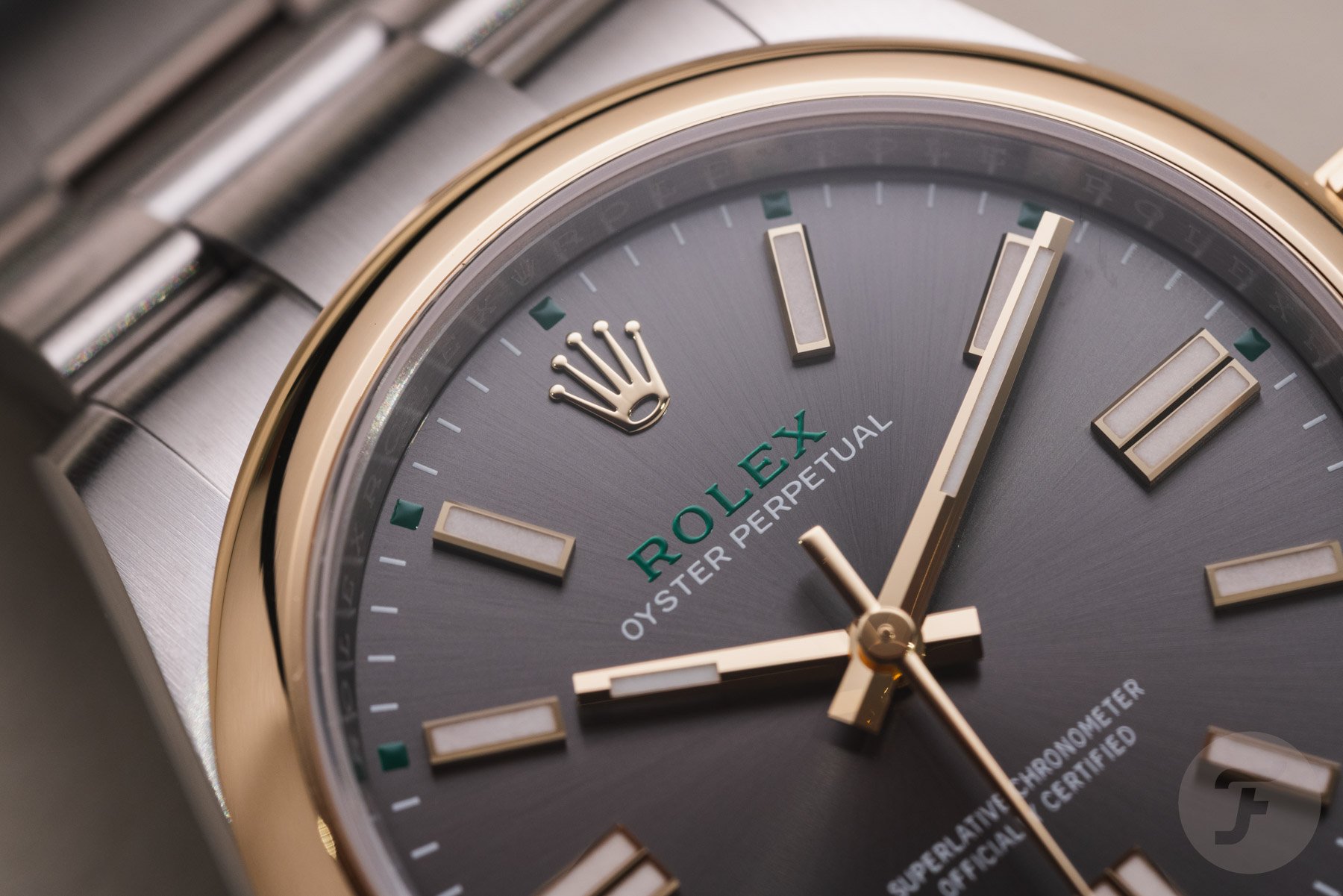
Per the norm, Rolex uses green to express an anniversary. On these watches, available in either 36mm or 41mm cases, the color is kept to a minimum. It’s only used for the brand name and the square-shaped hour markers on the outer minute track. Aside from this, the pieces have slate-gray sunburst pattern dials with white printing. All of the lume-filled indexes and hands are crafted from yellow gold. From a dial perspective, the minute track is the only giveaway that this is a special model. A smallish “100 Years” script is included, which is decently subtle.
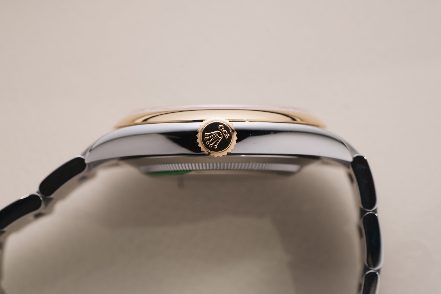
Yellow gold comes into play on the smooth bezel and screw-down crown. The latter contains a “100” script in addition to the famous coronet symbol. Again, I don’t mind this as much as my buddy Lex, as it could be taken as the brand’s “Triplock” designation from a quick glance. Of course, this is the only other signifier of the anniversary, although the watch conveniently has a 100m water resistance rating.
A relatively under-the-radar release, which is good!
While Rolex produces some zany off-catalog models requiring royalty-type bank balances or striker-like behavior on a football pitch, the brand is generally fairly discreet. That’s why it’s not so surprising that this Oyster Perpetual plays it fairly cool. Would I like to see yellow gold center links? You bet I would because I think a smooth gold bezel with matching links is one of the most underrated and rarest looks on a vintage Datejust. However, we need to keep in mind that this is not a Datejust, and the Oyster Perpetual is supposed to represent Rolex in its most elemental form. So, the flourish of gold starts to make sense, whereas overdoing it wouldn’t. That said, I can understand if some folks feel like the watch is incomplete or has suffered an incorrect bracelet swap.
Choosing loud or proud
At the end of the day, this choice comes down to how you like to party. If a crazy, all-night rager from a rooftop is more your style, then the Oyster Perpetual “Jubilee” is likely your companion. If a more buttoned-up dinner and cocktails are on the evening’s agenda, then the Rolesor version feels more fitting. Mechanically, both are identical, but the Rolesor adds cost to the equation, with the 36mm model priced at €8,250 and the 41mm version listed at €9,400. Naturally, and unfortunately, everything discussed here today is nearly impossible to buy at an authorized dealer and trades for a hefty premium on the secondary market. Still, let’s take these at face value and cast a vote for the watch you like best. As always, let us know why you voted the way you did in the comments section. Thanks for playing!