Does Tudor Have A “Design Tease” Issue?

There is a specific feeling that comes from handling a new Tudor, one I have felt often enough now to trust it. It is the sense of a genuinely good design arriving at 90% finished, then stopping just short of the final step that would have made it unambiguously excellent. Of course, that doesn’t make it a bad watch. Pretty much everything Tudor makes is bulletproof, and we can all agree that the brand has recently focused on providing high-quality Swiss watches at reasonable prices. Often, though, one design choice seems to signal that the folks at Tudor talked themselves out of their best idea at the last moment. It could be an overly thick case, strangely colored luminescent markers, an unusual dial color… The list goes on.
I would argue that the pattern shows up often enough across Tudor’s catalog that it stops looking like coincidence. Oddly, the Black Bay Pro, the new yellow-dial 39mm Black Bay Chrono, and the Ranger all share strong designs followed by smaller decisions that quietly undercut them. Now, these decisions might seem strange to me but make perfect design sense to you. Either way, I’m looking forward to reading your views on this in the comments section. Now, without further ado, let’s explore this notion further.
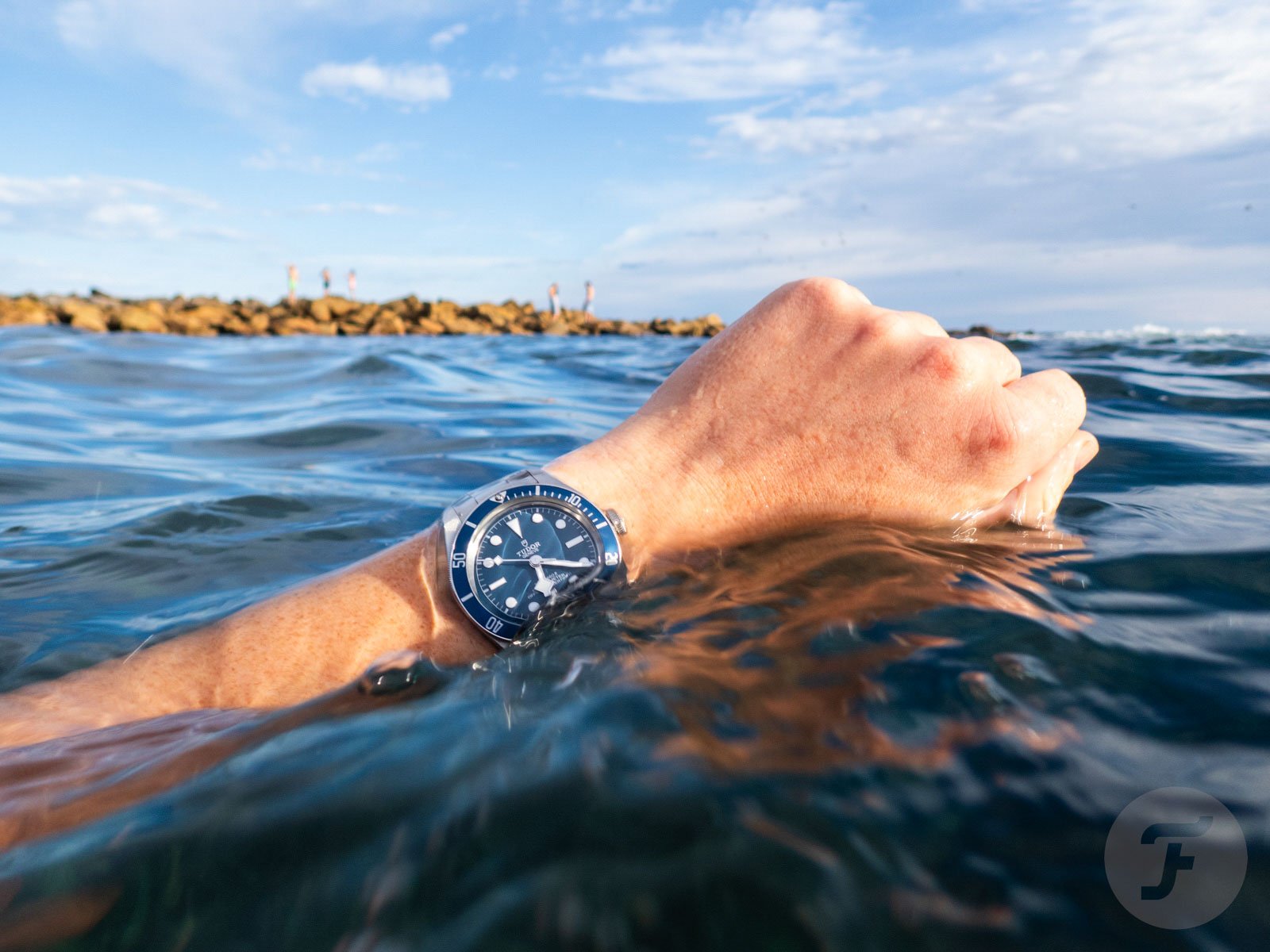
I say this as a fan of Tudor watches
None of the watches mentioned in this article are bad, and in my humble opinion, some are among the best things Tudor currently makes. That is precisely why this pattern is worth examining rather than dismissing as ordinary inconsistency. It’s worth digging into whether this is deliberate restraint or something closer to a house habit.
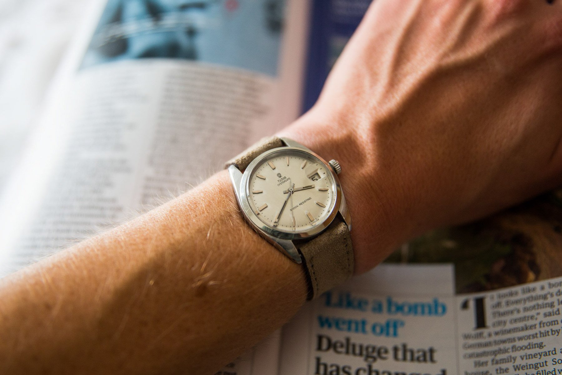
I say this as someone who owns a modern and a vintage Tudor watch (a navy Tudor Black Bay 58 and an Oysterdate, respectively). I consider myself a fan of the brand, and this article is not a dig at Tudor or Rolex. But it is touching on a phenomenon many enthusiasts seem to have identified, so I know I’m not alone.
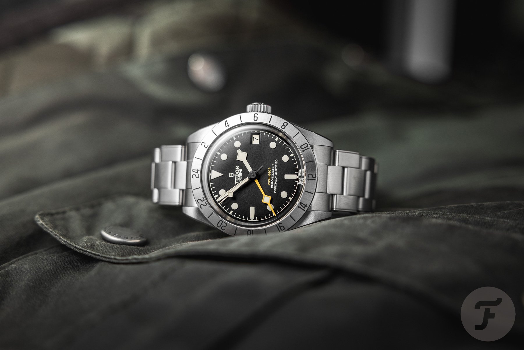
The Black Bay Pro’s very specific inspiration
The Black Bay Pro is a clear example, and to Tudor’s credit, nobody at the brand has ever pretended otherwise. Its fixed 24-hour bezel, handset, and black dial sit unmistakably close to the vintage Rolex Explorer II ref. 1655, the watch widely — though inaccurately — nicknamed the “Steve McQueen.” This link is so direct that watch press covered the resemblance as the headline story rather than a footnote when the Pro debuted in 2022.
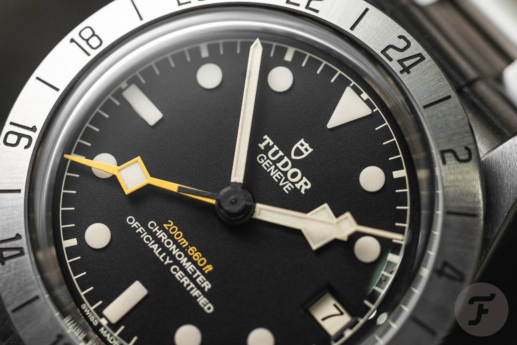
There is nothing wrong with drawing on history, and Tudor has every right to reference a watch from a time when the brand’s catalog overlapped with Rolex’s far more than it does today. But the Black Bay Pro does not quite commit to being itself in the way that, say, the Black Bay 58 does. It reads as a very good homage rather than a design with a distinct center of gravity. That distinction matters more the longer you spend with the watch, particularly once the initial thrill of the resemblance wears off.
The bigger issue
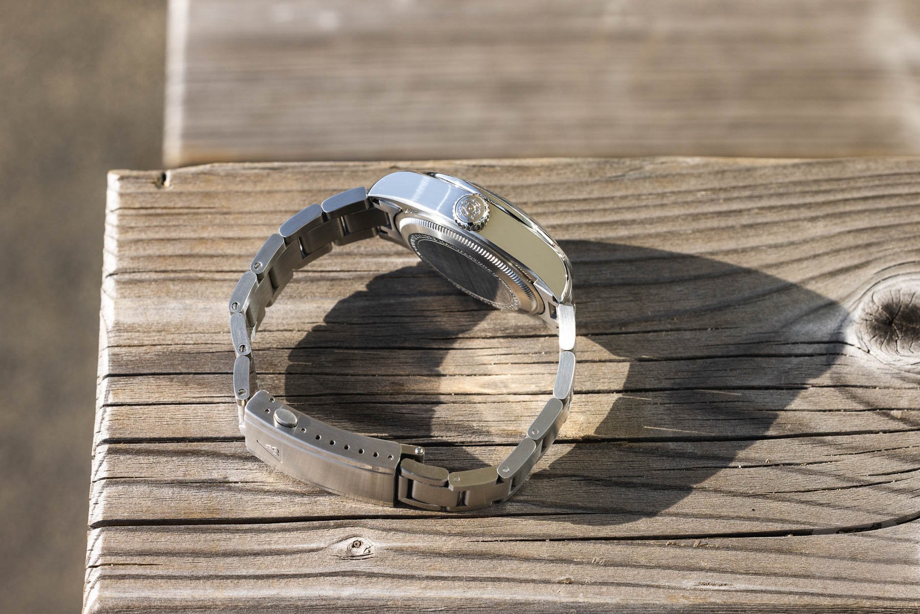
While some still bemoan the Rolex resemblance, in my eyes, the real problem is not the Black Bay Pro’s aesthetic. After all, it is still a beautiful tool watch. Rather, it’s that Tudor released a watch that is too thick and too top-heavy for a 39mm case. With the release of the relatively slim Black Bay 58 GMT, we see that Tudor can release a slimmer watch with a GMT caliber inside.
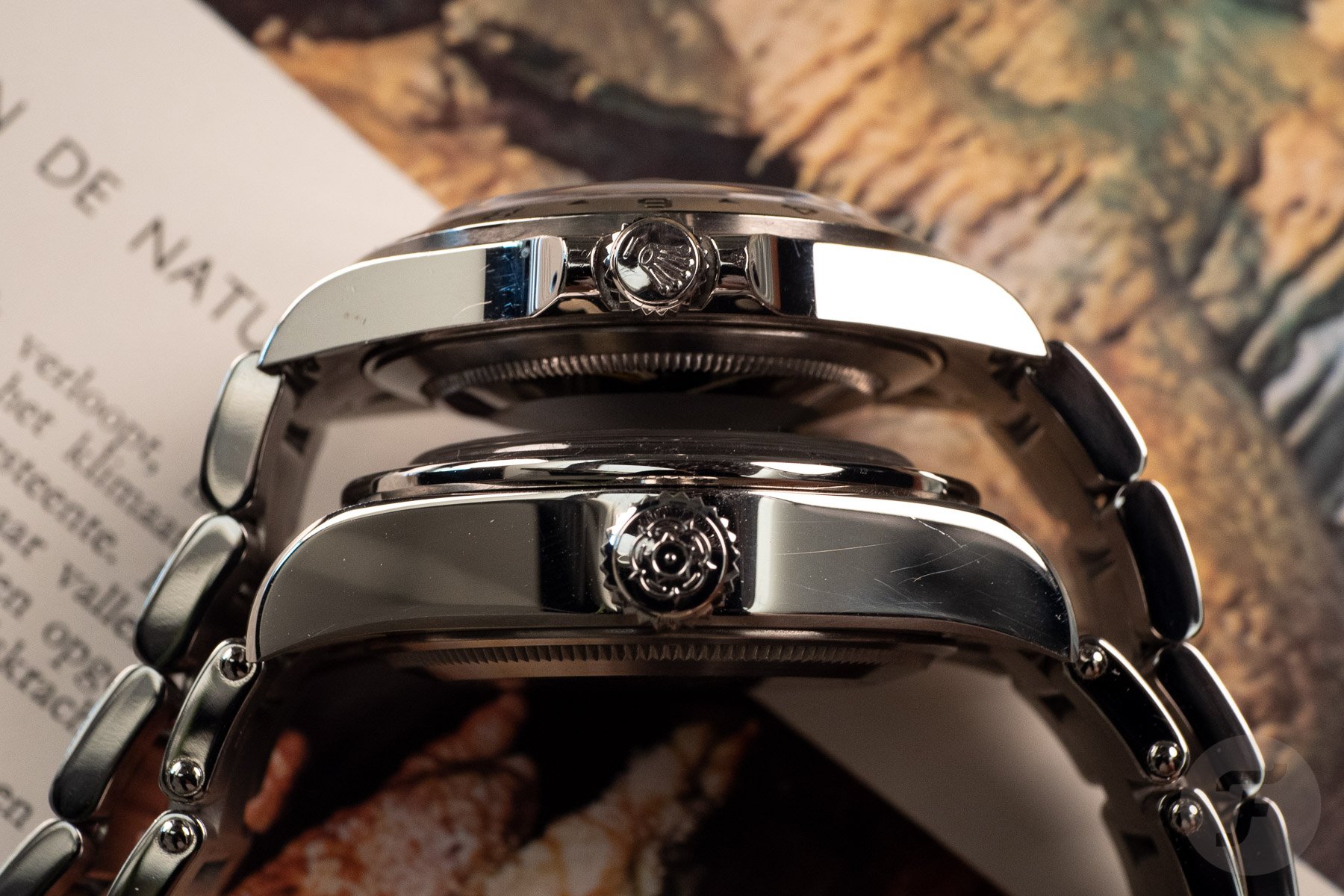
The Black Bay Pro is quite a chunk compared to the Rolex Explorer II 16570
For me, then, the Black Bay Pro is one of the clearest examples of Tudor designing a wonderful watch but then making one design decision that leaves me scratching my head.
The Black Bay Chrono 39’s yellow-only debut
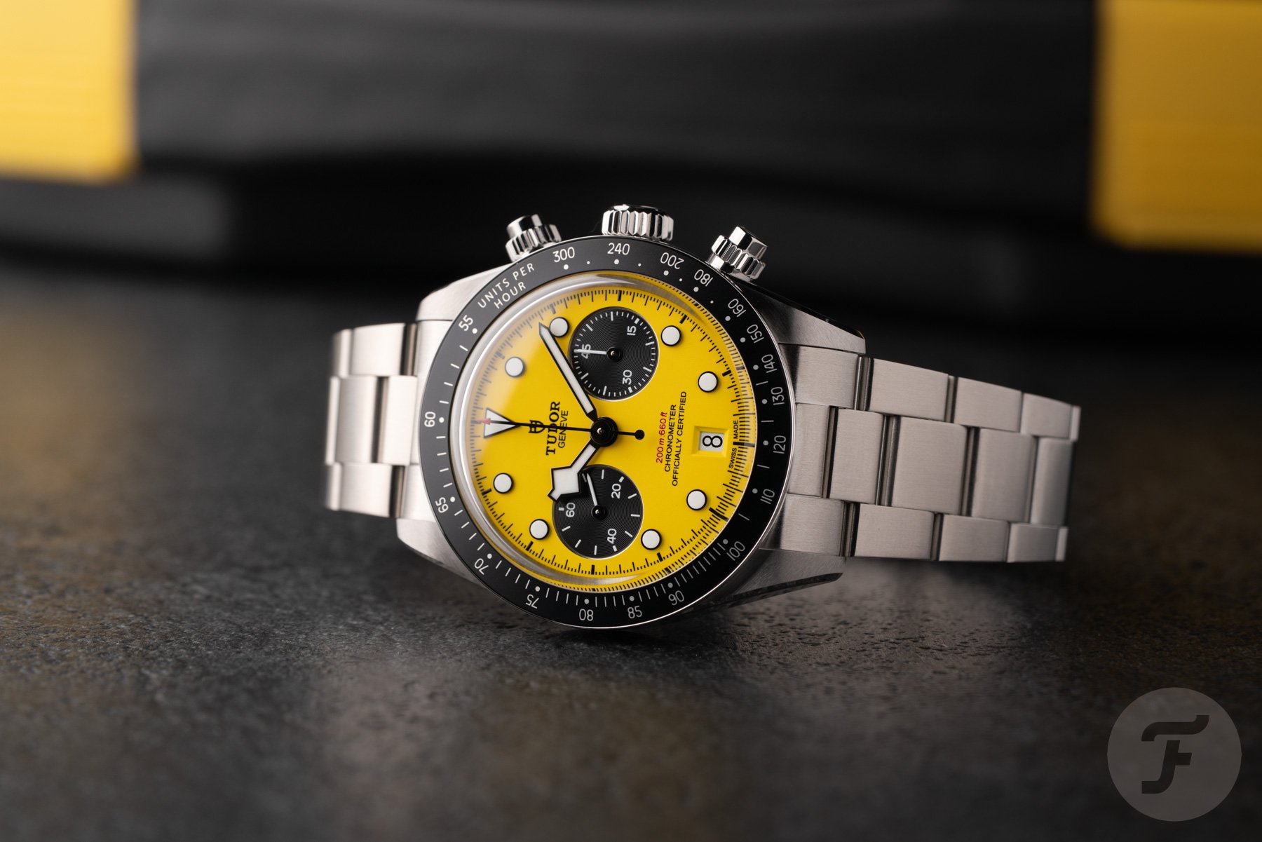
Tudor’s new 39mm Black Bay Chrono is, numbers-wise, a genuinely excellent update. It has a slimmer case than the 41mm original, a column-wheel chronograph movement, and a size that finally makes a Tudor chronograph wearable for people who found the older case too large. Every ingredient for an instant classic is there. Then comes the dial… Rather than launching the new case size with a clean black or panda-style option, Tudor launched the first — and, so far, only — version in bright yellow, nicknamed it “Bumblebee” internally, and positioned it within the deliberately playful “Daring Watches” color family alongside pink and light blue siblings with the larger case.
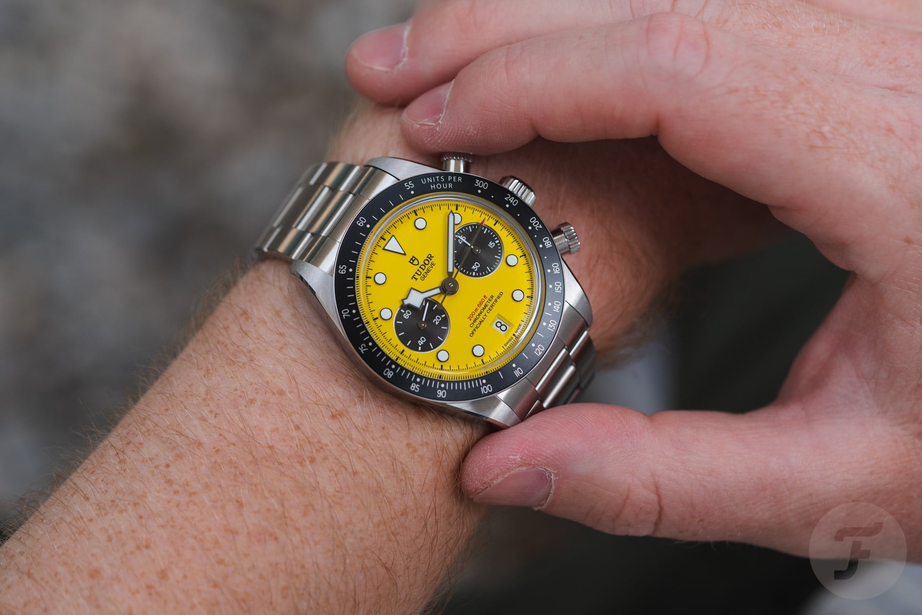
Sure, it’s a fun watch, and plenty of people will love it exactly as it is. But it also means the single most universally wearable dial configuration, the one that would have let the new case size sell itself on proportions alone without needing a bold color to generate attention, was not the one Tudor chose to lead with. Time will tell if Tudor opts to bring out more “standard” colors for this smaller chronograph. Given the work that likely went into designing the smaller case, that would make commercial sense. Let’s wait and see, but as it stands, it is frustrating that the closest attempt to a proper remake of the Oysterdate chronograph series has a dial color that only some will appreciate.
The Ranger’s oddly tinted lume
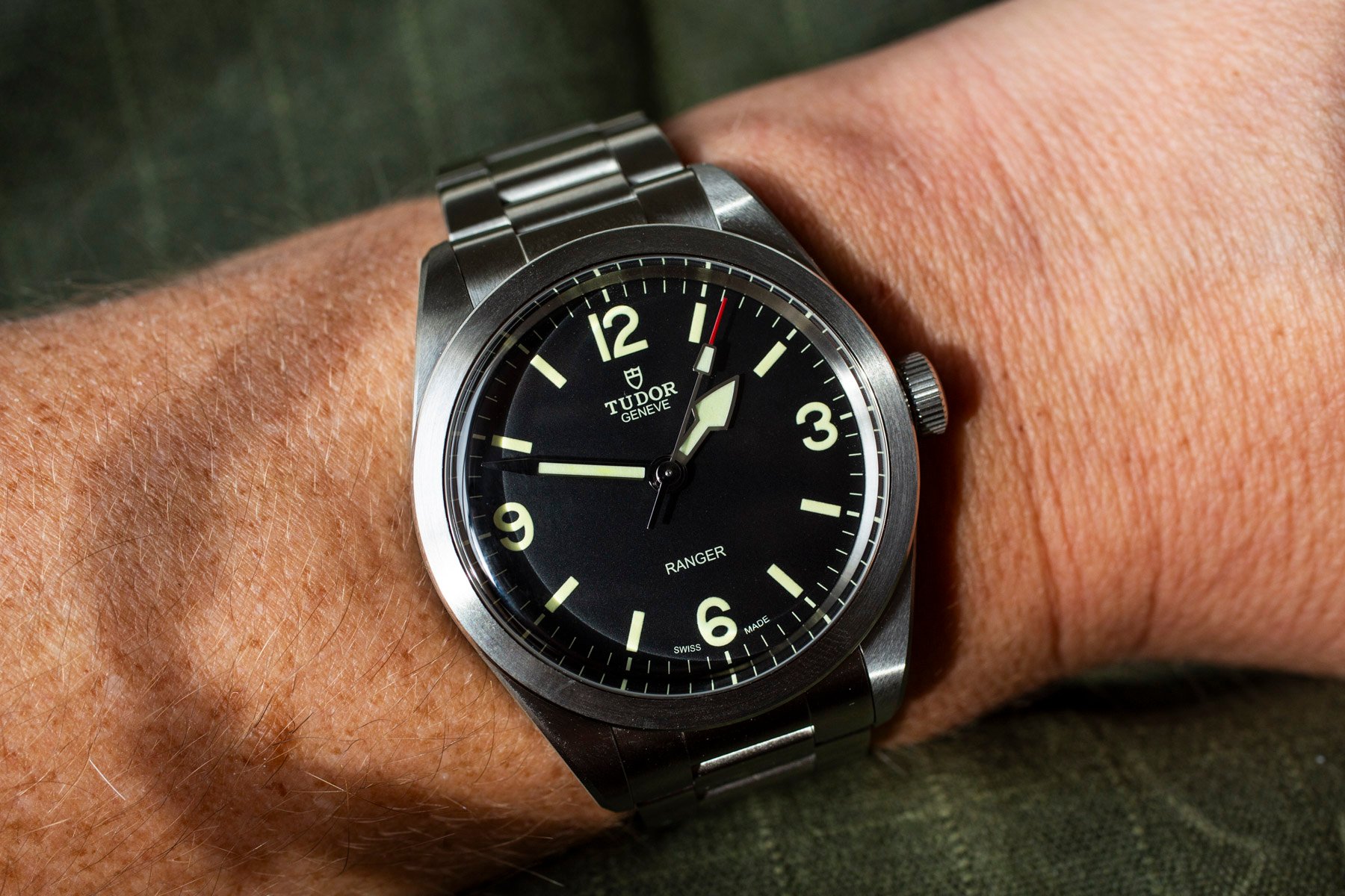
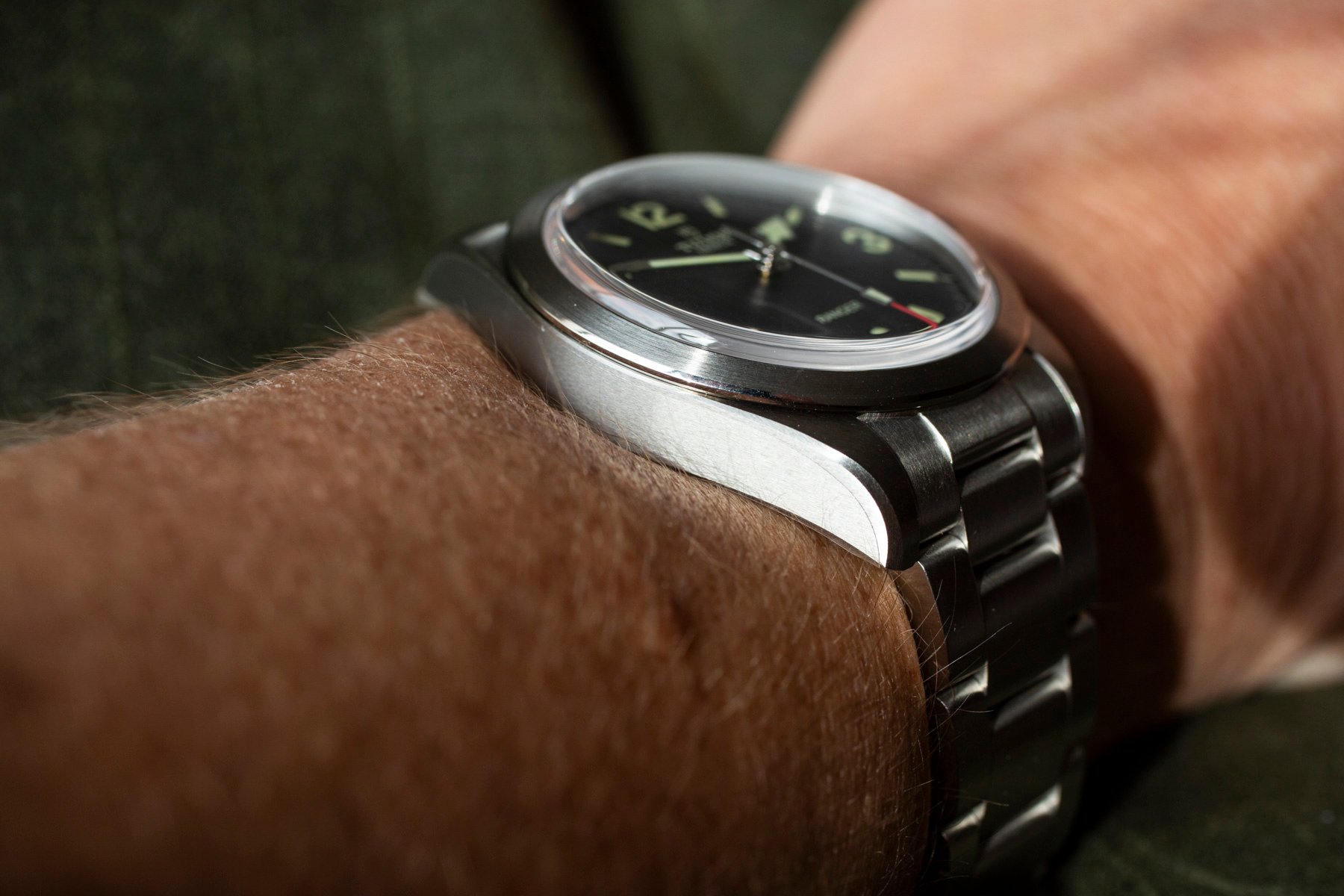
The current 39mm Ranger tells a smaller version of the same story. The case, dial layout, and overall proportions are genuinely well judged, close enough to the brand’s military-watch history to feel authentic rather than costume-like. This is also true of the 36mm version, which, I would argue, is the perfect size for the Ranger. Then, you look at the lume, and the accent color on the hour markers reads as an odd, institutional green rather than the warm, creamy tone the earlier Heritage Ranger used to good effect.
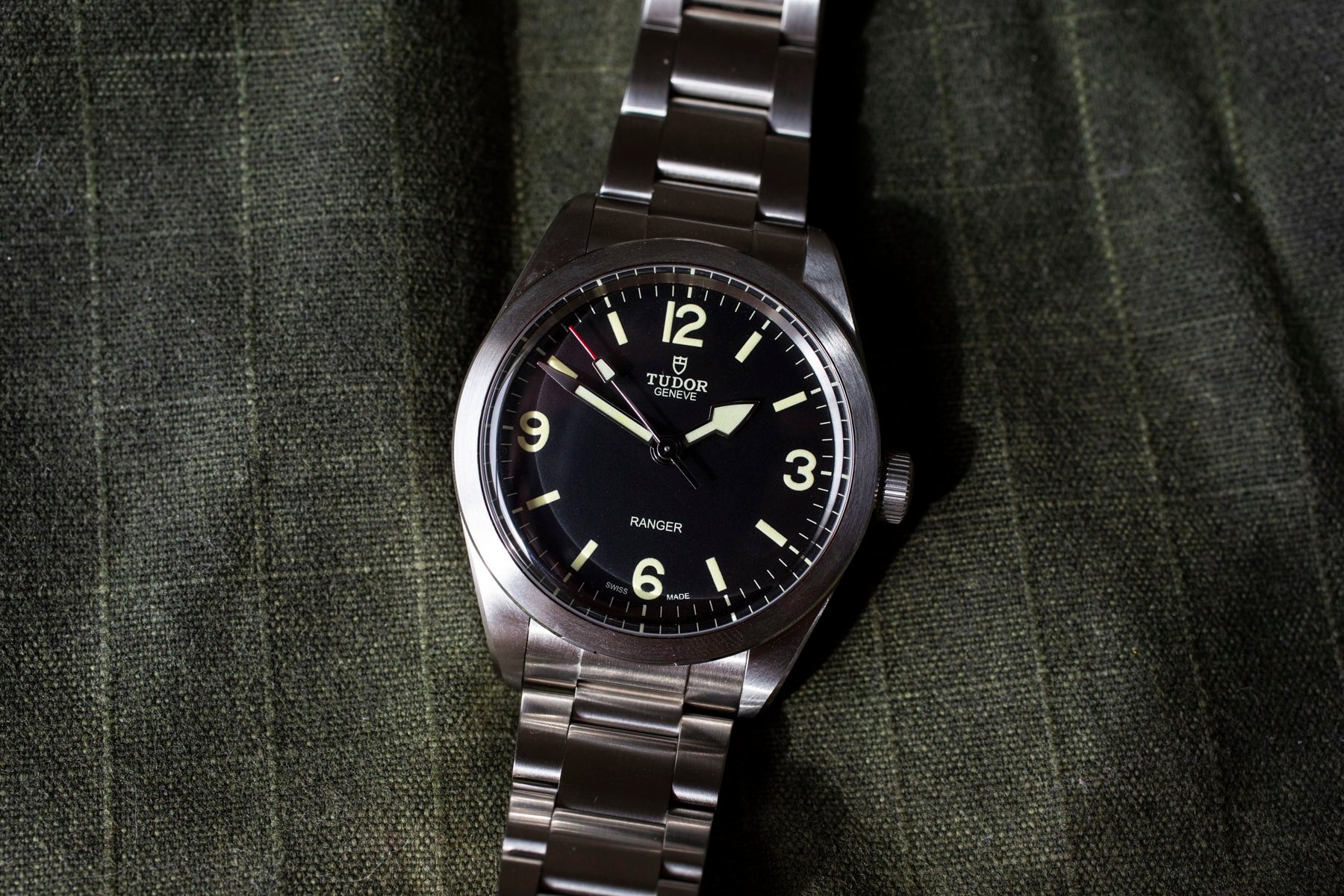
It is a small detail, and plenty of owners genuinely don’t mind, only noticing after someone else points it out. But enthusiast forums and reviewers have flagged it consistently since the watch launched, precisely because it is the one element standing between a very good watch and an obviously great one. A slightly different lume tint would have cost Tudor nothing in engineering terms and would have removed the Ranger’s single most common criticism entirely, without touching the case, movement, or price that make the watch appealing in the first place.
Is this about not competing with Rolex?
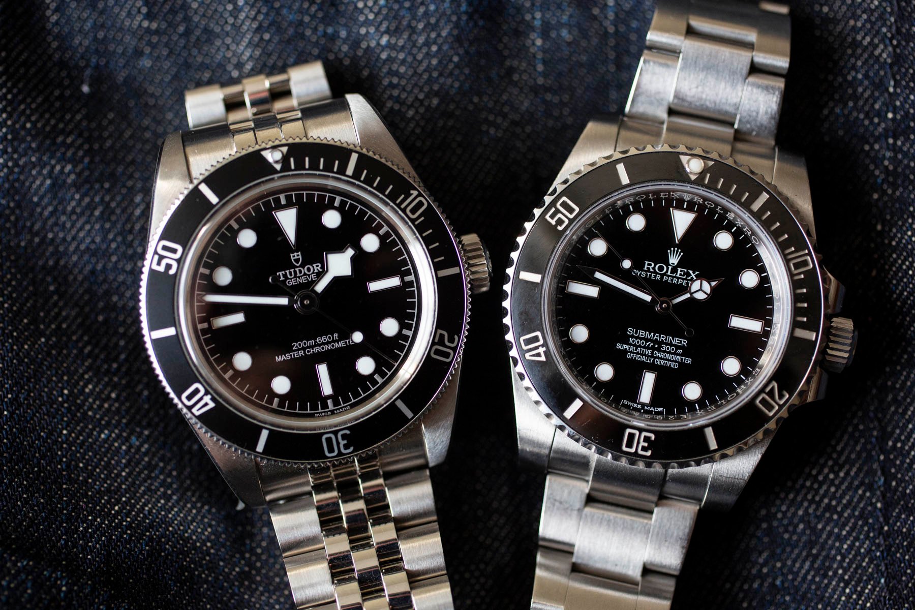
The uncharitable read is that Tudor, as Rolex’s sister company, has an institutional interest in never quite outshining the more prestigious brand. Some think that a small, seemingly avoidable flaw in an otherwise excellent design is the easiest way to keep a watch just below “genuinely better than the equivalent Rolex” territory. It is a tidy theory, and the pattern across several models does make it tempting. The more charitable read is that these are simply independent creative decisions made by different design teams across different product cycles, but they just happen to land in similar places because Tudor’s broader brand identity has always leaned toward playful, slightly unresolved details rather than austere perfection. The company built its reputation on being the interesting, slightly rougher alternative to Rolex’s polish, and a design that never quite settles fits that identity, whether intentional or not.
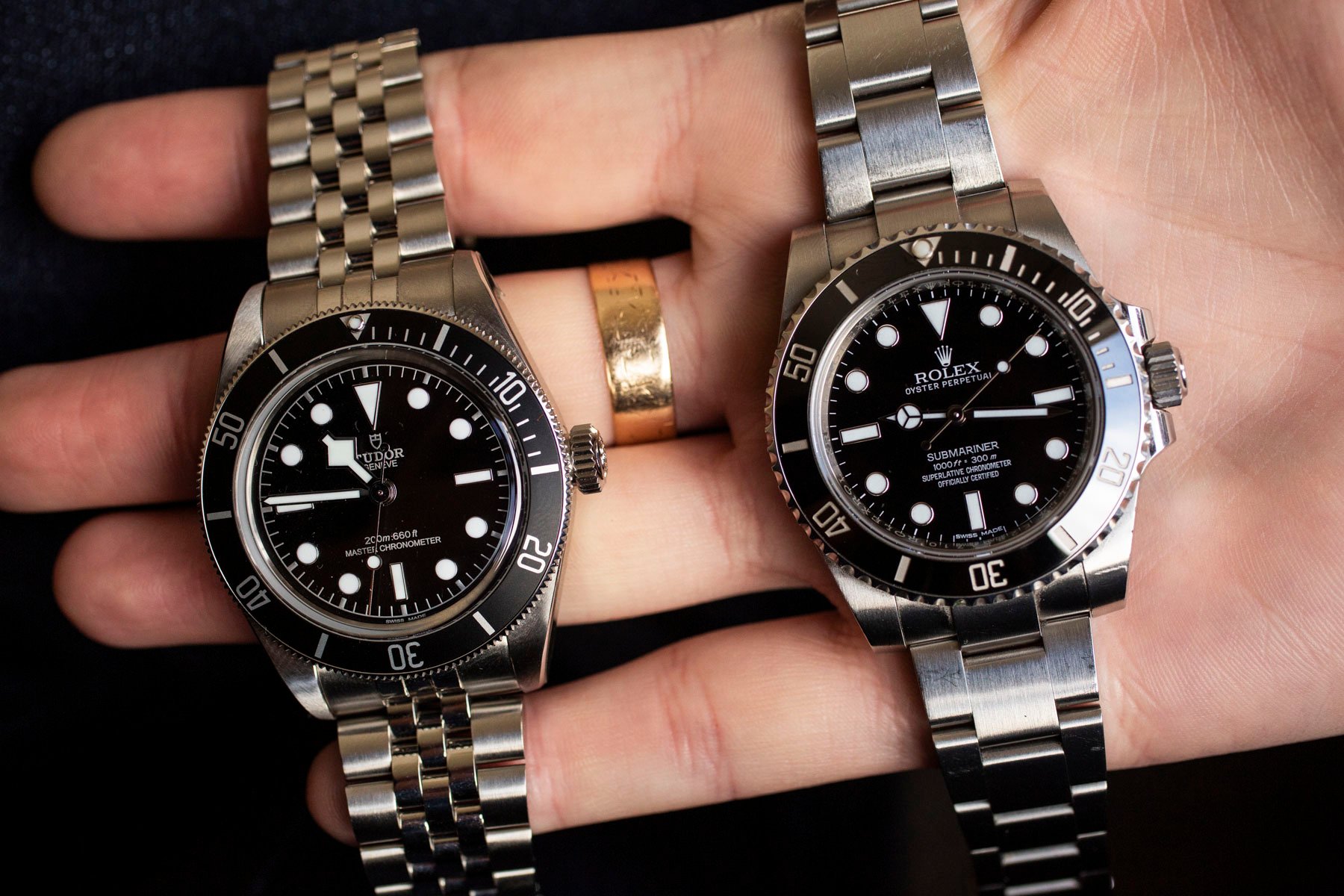
I lean toward a mix of both explanations, without fully committing to either. Tudor’s pricing, positioning, and market share all benefit from staying visibly distinct from Rolex rather than competing head-on, and it would be naive to assume that commercial reality has zero influence on design-sign-off meetings. But it would be equally naive to assume every quirky lume tint or bold colorway is a calculated act of self-sabotage rather than a genuine, albeit debatable, creative choice made on Tudor’s terms alone.
Concluding thoughts
Whatever the actual reason, the “design tease” pattern is real enough to name, even if we can’t definitively identify the cause. Tudor keeps designing almost-excellent watches but then making one small decision that keeps the results just short of definitive. Sometimes, it’s unwieldy proportions. Other times, it is a dial-color choice, and other times still, it is a lume tint nobody asked for. Whether that is strategy or simply house style, it is worth keeping in mind for upcoming Tudor releases, even if only to see whether the pattern eventually breaks or simply becomes part of what people expect.
Do you think the brand deliberately undercuts its designs to avoid outshining Rolex, or is this just Tudor being Tudor? Or maybe I am the one off the mark here… In any case, let me know in the comments!