The Chronoswiss Neo Digiteur Pastel Code Puts A Softer Spin On A Peculiar Watch

The way we tell time matters, and not just because we don’t want to miss the train. The way we read time is also an experience. Digital time is just a series of numbers, while an analog timekeeper sweeps through time, showing you where it has been and where it is going. Call me a hopeless romantic, but when hands tell time, they do so poetically. But this article is about a digital watch, so let’s not dwell too much on the poetry of time. Now, I must have a point when it comes to handless watches because the new Chronoswiss Neo Digiteur Pastel Code puts a softer spin on a peculiar watch.
The first Chronoswiss with a digital time indication debuted in 2005. The Chronoswiss Digiteur MSA (Montre Sans Aiguilles) was a modern homage to the jump-hour watches of the 1920s and ’30s. The original Digiteur utilized the tonneau-shaped, modified, and refined caliber 130 from Fabrique d’Ebauches de Fleurier (FEF), the movement-blank specialist founded by Jules Jéquier and David-Louis Petitpierre in the Swiss town of Fleurier, Val-de-Travers, in 1882. Last year, the brand founded by the late Gerd-Rüdiger Lang presented two new, updated versions — the Neo Digiteur Sand and Granit. The original Digiteur variants were all made of precious metals. The reinvented model, however, debuted in stainless steel and with confidence thanks to its stronger, sharper-than-ever shapes and updated movement. Now there’s the Neo Digiteur Pastel Code trio, which offers a softer perspective on digital time.
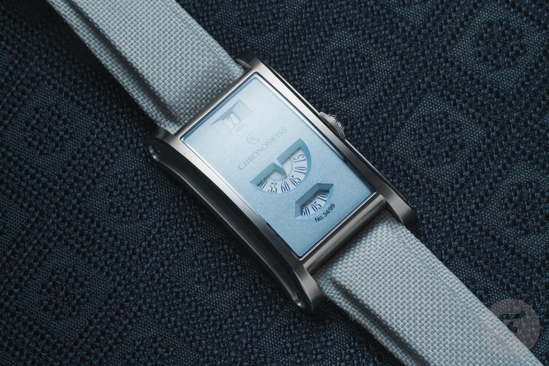
Introducing the Chronoswiss Neo Digiteur Pastel Code in three soft colors
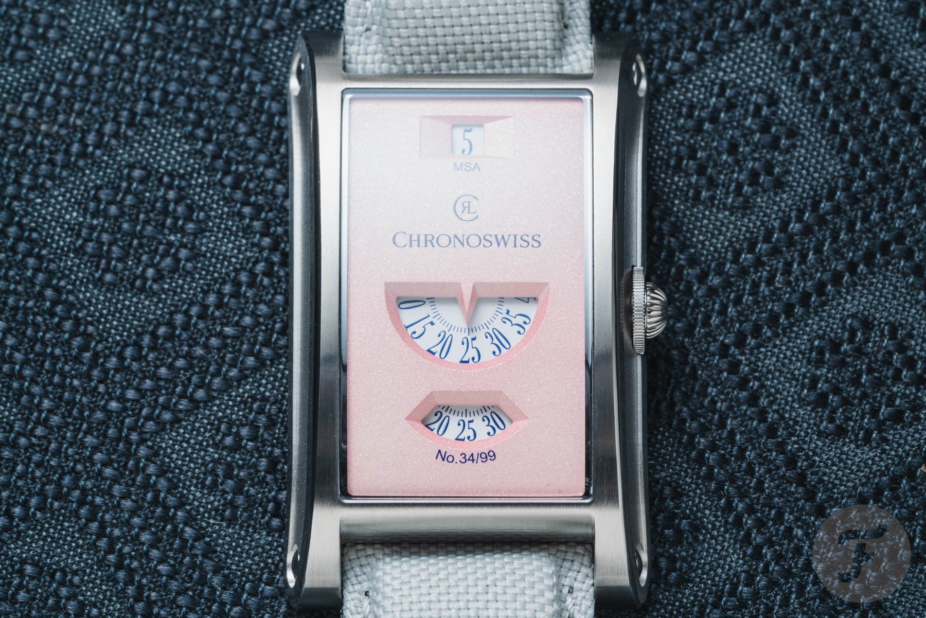
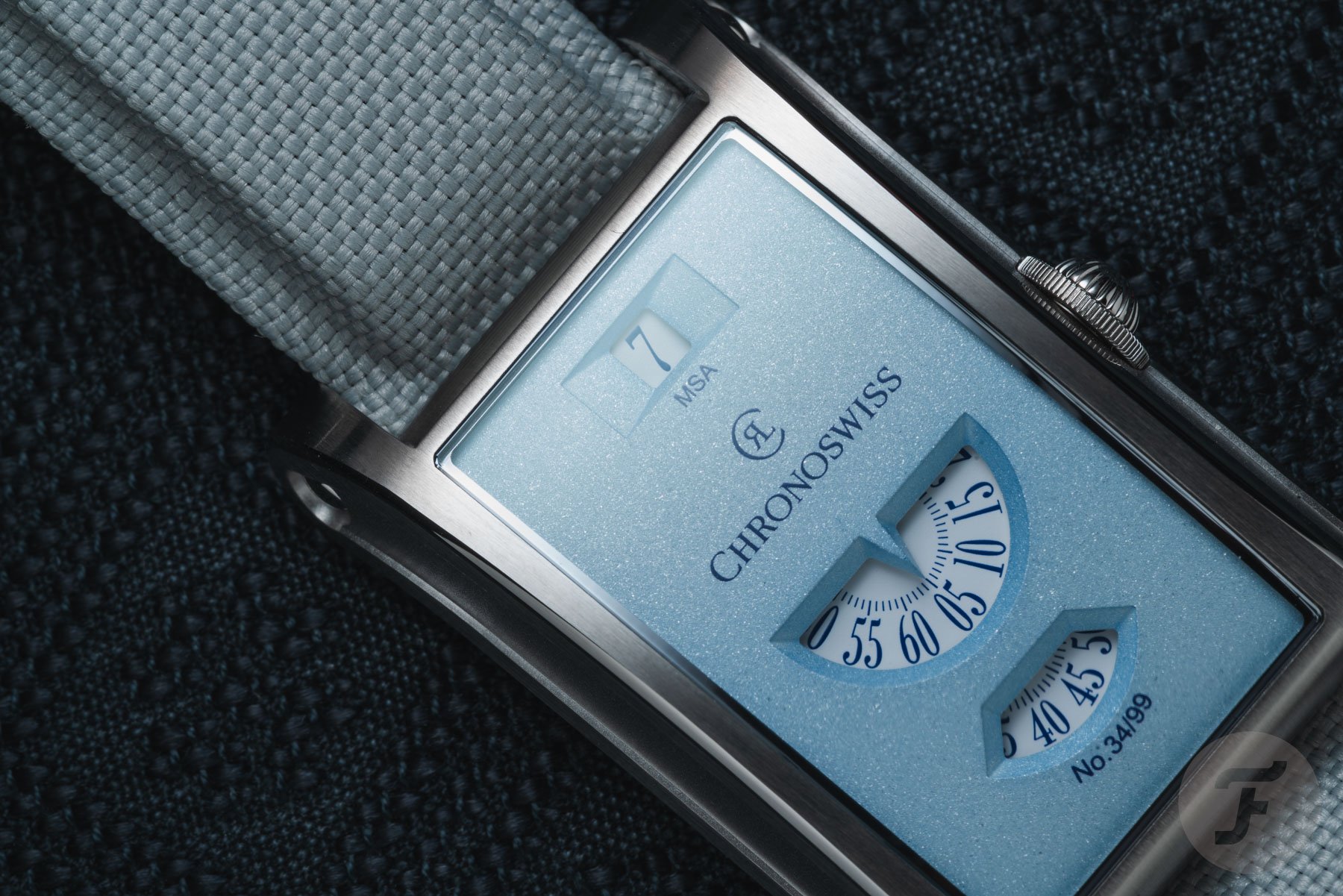
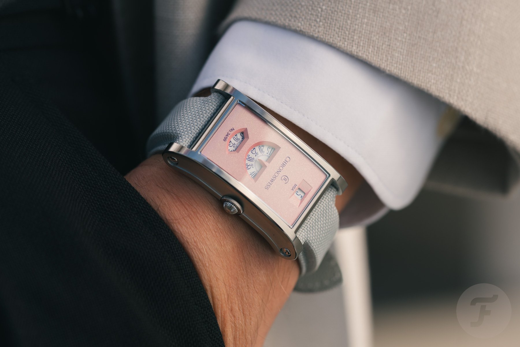
Maybe someone at Chronoswiss thinks I’m right when I say digital time can come across as very harsh — it’s one reason we wear analog watches in a digital world. To soften digital time, put the numbers in pastel surroundings. The Pastel Code collection is a trio of Neo Digiteurs coming in Rose, Mint, and Sky, with each version limited to 99 pieces. The colors may be considerably softer than what we usually associate with the Lucerne-based brand, but the underlying concept remains as peculiar as ever. The hours jump at 12 o’clock, while the trailing minutes are displayed centrally and the seconds run through a horizontal window at 6 o’clock. You could say that it’s a regulator presented in digital form.
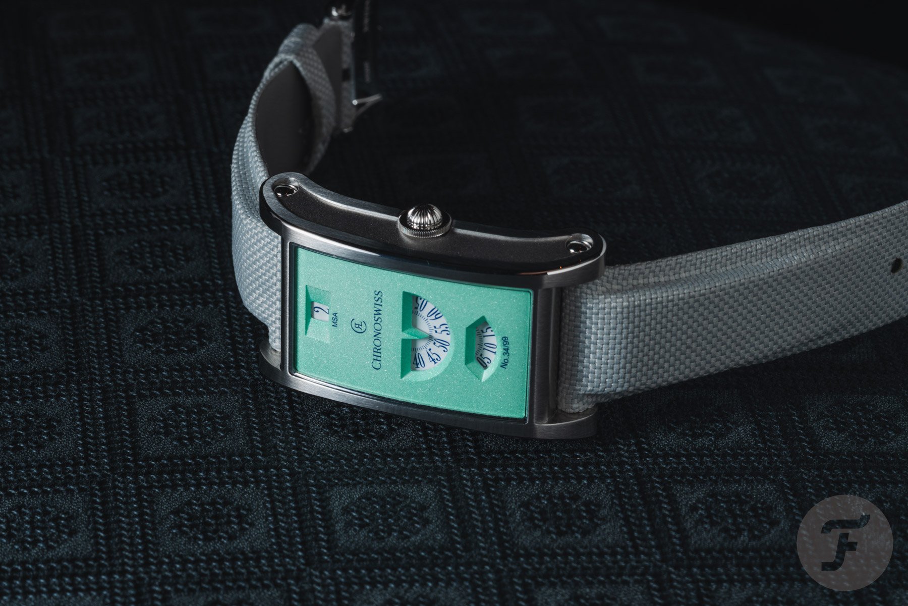
The Pastel Code editions now take the Neo Digiteur in a different visual direction. Rose (a light pink), Mint (a pale green), and Sky (a soft blue) are certainly not the first colors that spring to mind when thinking about a watch with a handless digital display and a rather assertive rectangular case. And that, presumably, is precisely the point. A montre sans aiguilles is already an exotic timepiece. With a pastel-colored cover, it becomes a unicorn of sorts.
Colors of the Renaissance
Though pastels are way older than watches, they’re not as old as you might think. Their roots trace back to Renaissance Italy, where artists in the late 15th century began experimenting with dry pigments bound into sticks. It was a practical way to put color on paper without wet paint, and it quickly found a place in the artist’s toolkit. By the early 16th century, Leonardo da Vinci had written about dry drawing materials, including chalk and charcoal, which he used for preliminary studies and sketches. Pastel was not yet the highly developed medium we know today, but the basic idea was already there.
Michelangelo and Raphael were among the Renaissance masters who used colored chalks primarily for preparatory drawings. These chalks allowed the artists to work out compositions, poses, and details before committing them to the final piece. In other words, pastel started life less as a medium for showing off and more as a remarkably useful tool for figuring things out. The Neo Digiteur Pastel Code watches are no studies of things to come, though; they are very much the finished products.
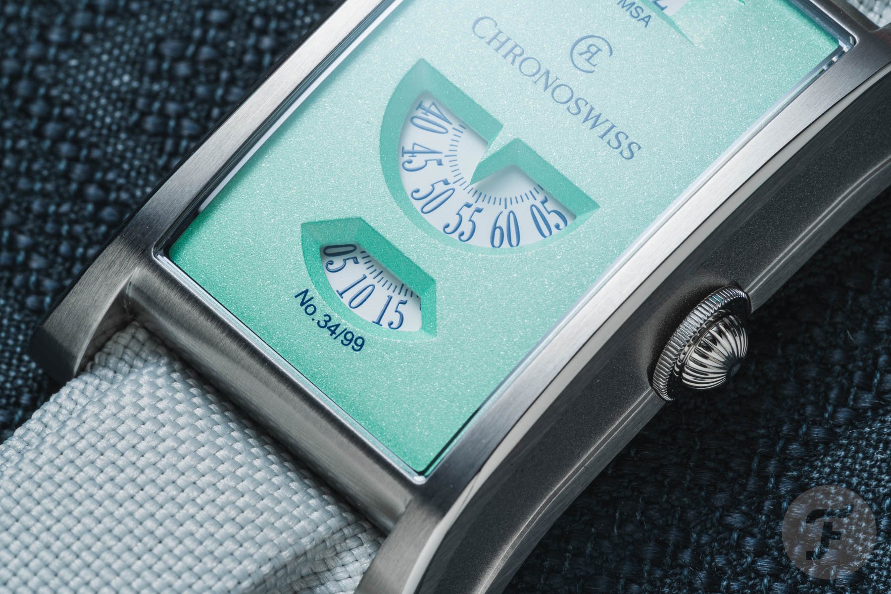
Lacquer with depth
You might think hard and soft don’t mix, but digital time in pastel attire works very well. The contrast between the pastel dials and the Neo Digiteur’s technical display does give them a rather unusual character. The dial, or cover surface, receives a sandblasted finish before being treated with lacquer, creating a matte appearance with some visual depth. The result is less about flashy decoration and more about letting the color and unusual display architecture do the talking. Rose is the warmest of the three, Mint adds a fresh green tone, and Sky is the most restrained.

New colors, familiar shapes
The 30 × 48 × 9.7mm case remains one of the Neo Digiteur’s defining features. It is made of stainless steel and follows the barrel-shaped, rectangular architecture of the previous two models. The case has pronounced lines and polished edges, while a horizontally sandblasted section along the side adds some contrast. It is a sculptural design that never attempts to disappear on the wrist.
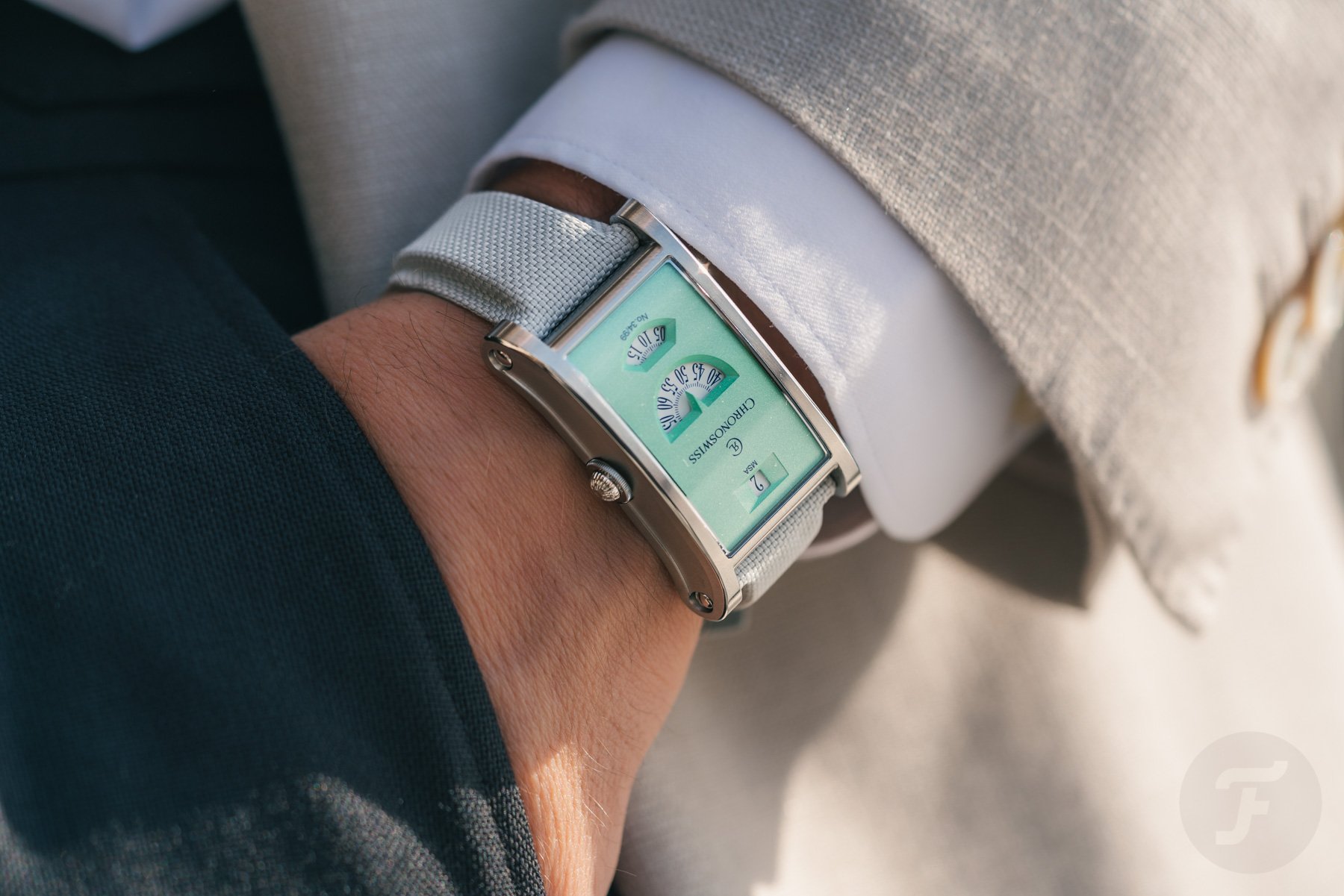
The crown follows the familiar Chronoswiss onion-crown theme, albeit in a more contemporary form. It has been flattened on the underside to improve ergonomics and better integrate with the case’s shape. A watch like the Neo Digiteur does not like to be hidden when worn. Well, no matter which of the three new watches you choose, it will look and feel very present on the wrist.


Any Neo Digiteur variant has an assertive look and a distinct profile. However, the sculptural qualities do not compromise comfort. The size and curvature of the case work on the wrist — on my 18cm wrist, anyway.
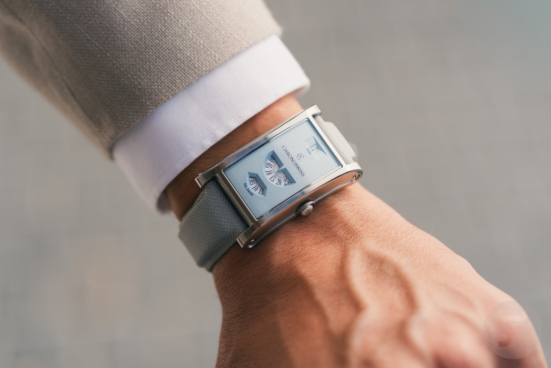
The mechanism behind the numbers
Inside the three Pastel Code editions beats the hand-wound caliber C.85757. The name refers to the original Chronoswiss postal code from 1983. The 3Hz movement offers a 48-hour power reserve and incorporates a proprietary Chronoswiss module that produces the unusual display. That module manages the necessary energy for the jump-hour mechanism while also driving the continuously moving minute and second displays. The result is a watch that separates the three time indications into distinct mechanical displays while remaining entirely analog beneath the surface.
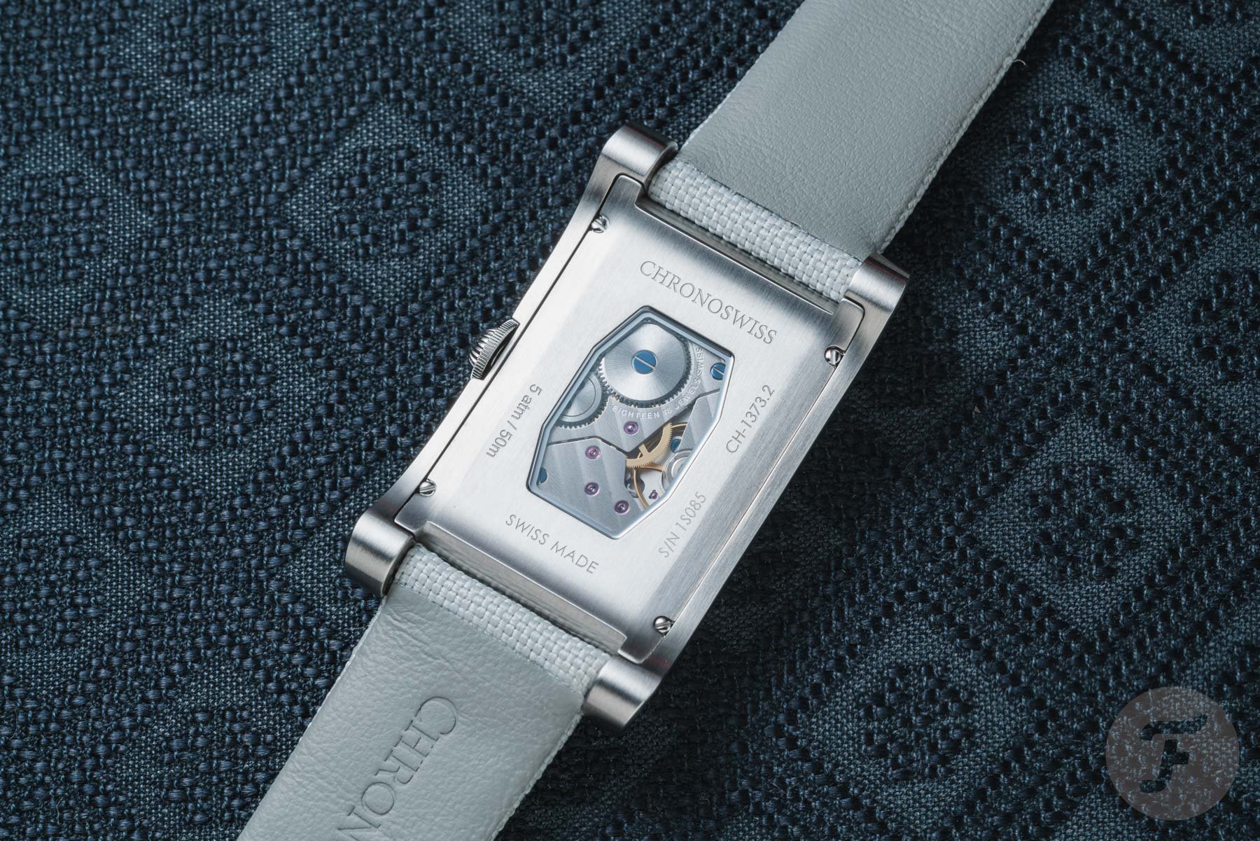
The movement is visible through a small, tonneau-shaped sapphire crystal in the case back. Unlike the first Neo Digiteur models, the Pastel Code editions do not feature hand-guilloché decoration. Instead, the movement is finished with Côtes de Genève, shifting the focus somewhat from traditional decorative watchmaking to a cleaner, more contemporary presentation. The shape of the sapphire window also nods to the Fleurier movements used in the original Digiteur from 2005.
Not retro, just different
Chronoswiss didn’t treat the Neo Digiteur as a nostalgia exercise. Instead, the brand put some color on the watch’s face. The colors are retro in an artistic, historical way. Yet, they also come across as very contemporary; they look like a modern watch-love story. There’s also something slightly frivolous about a very technical digital watch dressed in pastel. The color initially makes it appear a little less serious, but when you get to know the watch, its horological depth reveals itself. The new pastel-tinted Neo Digiteurs are unconventional. But that is precisely what Chronoswiss has been all about since the brand’s very beginning in 1983. With the Pastel Code editions, Chronoswiss has taken one of its most original concepts and then made it even more original by adding unexpected colors. Rose, Mint, and Sky may soften the appearance, but underneath, this remains the same uncompromising mechanical oddity.
Each Chronoswiss Neo Digiteur Pastel Code version is limited to 99 pieces and retails for €12,700 / US$13,900 / £12,200 / CHF 11,500.
What do you think of a digital display in pastel surroundings? Please let me know in the comments section below.
This is a partnership post. Learn more.