Sunday Morning Showdown: Blancpain Fifty Fathoms Bathyscaphe 70th Anniversary Vs. Blancpain Fifty Fathoms Automatique 38

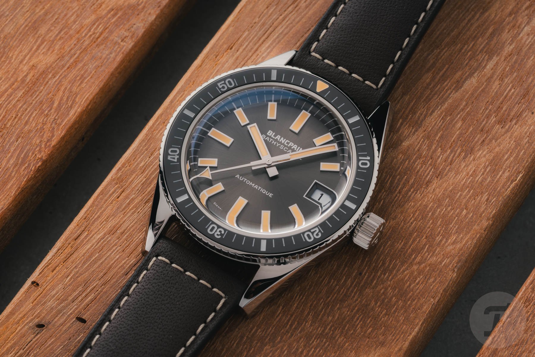
Good morning, and welcome to another Sunday Morning Showdown. Blancpain surprised us this week with a vintage reissue of its 1968 Bathyscaphe. The 37.4mm case of the new Fifty Fathoms Bathyscaphe 70th Anniversary features a sunburst dial and faux patina, while there’s a ceramic bezel insert and a modern automatic movement inside. Of course, Blancpain also still offers its Fifty Fathoms Automatique in a 38mm size. As these watches share roughly the same dimensions and house the same movement, we thought it would be a good idea to put them head-to-head. Let’s see whether you, dear Fratelli, would go for a vintage-inspired or thoroughly modern Blancpain.
Both the Blancpain Fifty Fathoms Bathyscaphe 70th Anniversary and the Fifty Fathoms Automatique cost about €18,000, so money is not a factor here. Daan will defend the new vintage reissue, and Jorg will do the same for the more modern-looking Fifty Fathoms. But first, let’s take a look at what happened last week.
Previously, on Sunday Morning Showdown…
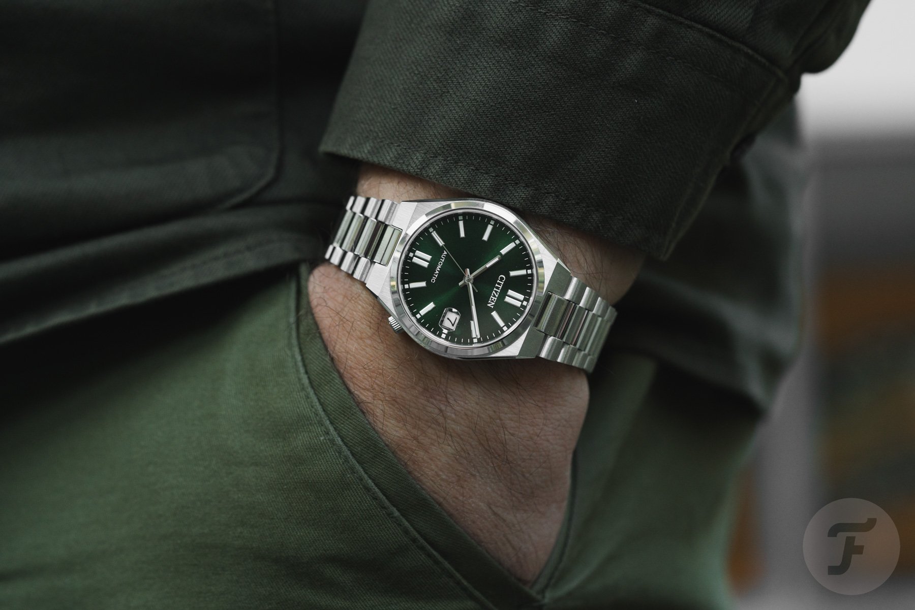
Last week, it was Casio’s third attempt at beating the Citizen Tsuyosa series. We had already put the Casio EFK-100 and EFK-110 up against the popular Tsuyosa, and Casio’s automatic watches didn’t win either time. We thought the new Casio EFK-200 could have a good chance, though, as it features great proportions and a more original design than the Tsuyosa. Plus, it’s still as affordable as before. Many of you agreed with those arguments. However, the Citizen Tsuyosa still has many followers thanks to its great build quality and clean design. In the end, Casio came very close, but the Tsuyosa took the win with 51% of the votes versus 49% for the EFK-200. But the results showed that both these watches are great, worry-free, affordable daily beaters. Let’s see if this week’s battle will be as close.
Daan: Blancpain Fifty Fathoms Bathyscaphe 70th Anniversary
Good morning, everyone, and Jorg, of course. This is an interesting one. I actually used to own the modern 38mm Blancpain Fifty Fathoms Bathyscaphe. I traded that watch for a Breguet Classique 5907, and I’ve never regretted it. However, I still think the modern 38mm Bathyscaphe is a great little diver. Its gray sunburst dial is one of the best I’ve ever seen. The indexes are refined and very well finished, just like the sharp and nimble 38mm brushed case. It was also a real strap monster.
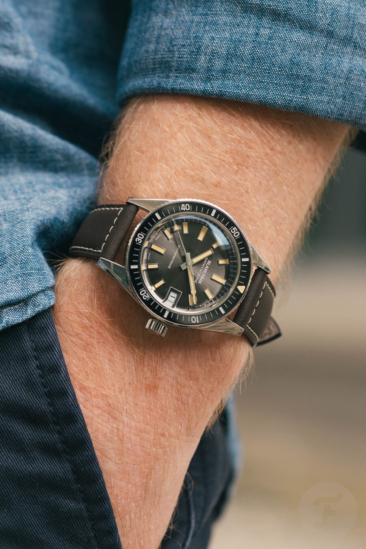
It’s funny because the Blancpain Fifty Fathoms Bathyscaphe 70th Anniversary introduced this week shares several features with the Bathyscaphe I used to own. The 37.4mm case is now fully polished, but it’s still very sharp and nimble. I also suspect that Blancpain uses almost the same gray sunburst dial on the 70th Anniversary model. Both watches also feature the same Blancpain 1150 automatic movement with an ample 100-hour power reserve. So, when I had to pick a side in today’s showdown, it was quite easy to go with the new Bathyscaphe 70th Anniversary.
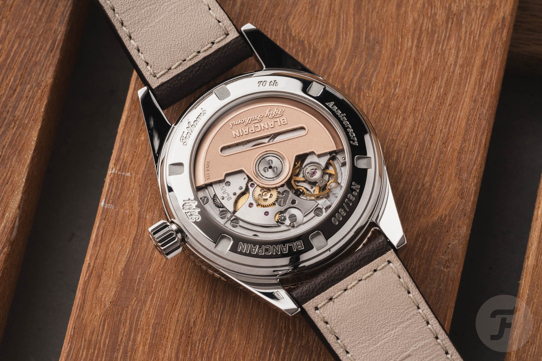
A vintage reissue done well
When I first saw the latest Blancpain Fifty Fathoms Bathyscaphe, it immediately reminded me of Seiko’s SJE093, a reissue of its famous 62MAS diver from 1965. There had already been quite a few iterations/reissues of that legendary diver, but this was the first one that hit the nail right on the head. It had the same vintage proportions and great looks, along with a few logical modernizations, like the bezel insert and the movement. With the new Fifty Fathoms Bathyscaphe 70th Anniversary, Blancpain achieved what Seiko did a few years ago.

The new Fifty Fathoms Bathyscaphe 70th Anniversary looks almost identical to the vintage 1968 Bathyscaphe. It’s also similarly sized and updated with modern materials and a contemporary movement. Brands can do so many things wrong when they release vintage reissues. They often try to make them bigger and better than the originals, which usually results in complete misses. But in the case of the Seiko SJE093 and now the Blancpain Fifty Fathoms Bathyscaphe 70th Anniversary, they did it almost just the way I would.
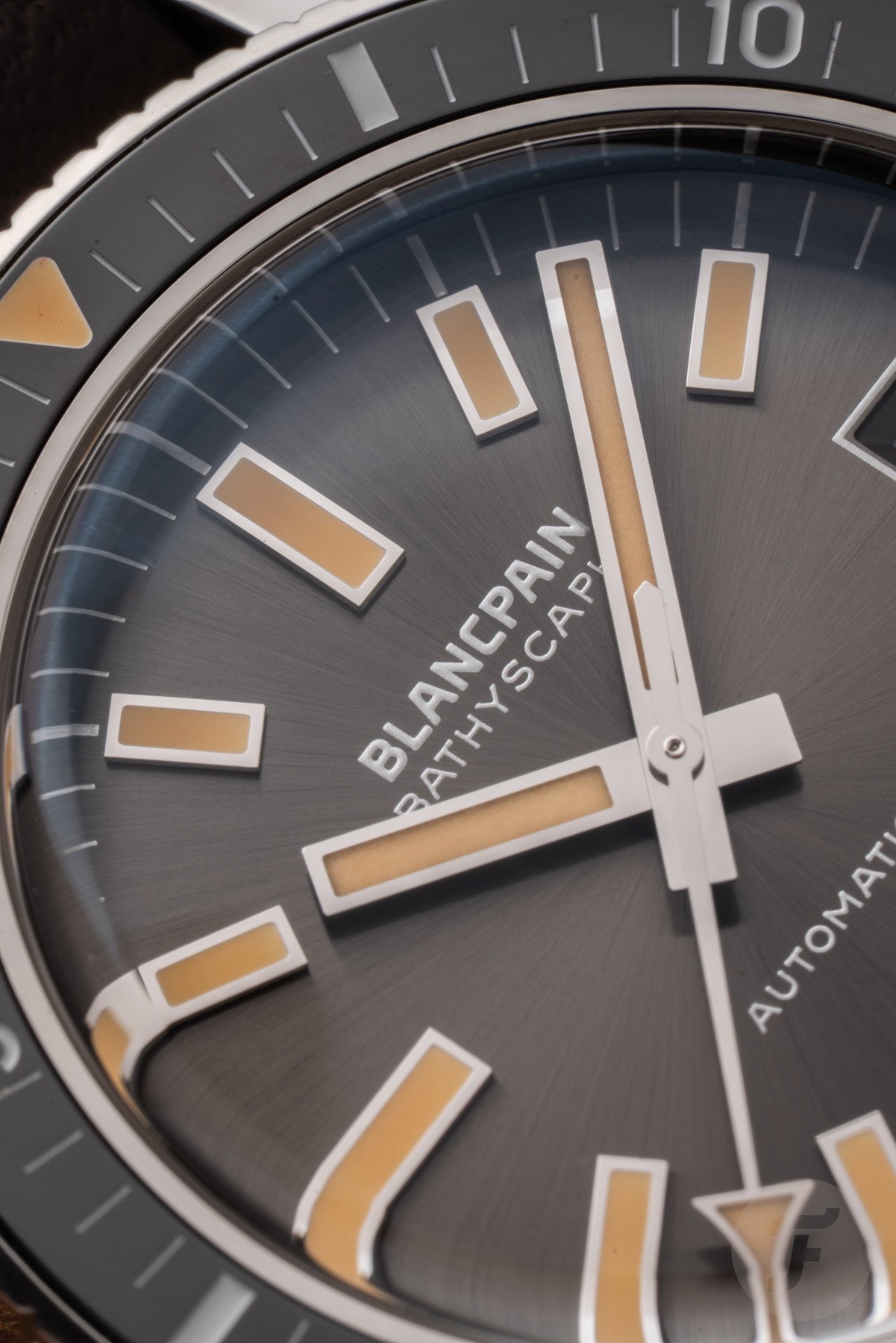
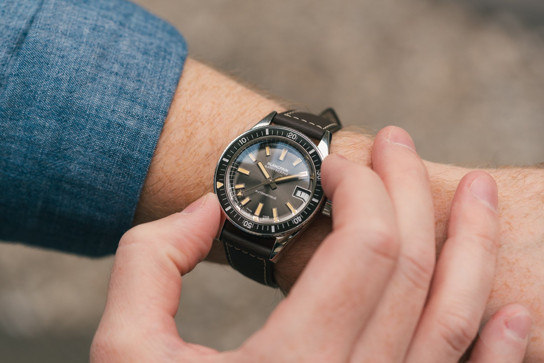
All right, maybe I wouldn’t have made the lume that pumpkinny orange. Oh, and at least for me, I’d definitely put it on something other than the bland brown leather strap. Other than that, though, if the Bathyscaphe from 1968 were still made today, I think it would look exactly like this.
An inflated Fifty Fathoms
So, yes, I really like the new Bathyscaphe 70th Anniversary. But what do I think of the more modern 38mm Fifty Fathoms Automatique? Well, actually, I’m not really a fan. I do like the fat Arabic numerals on the dial and bezel, but I don’t get the elegant font used for the “Fifty Fathoms” printing on the dial. I also don’t like the incognito 4:30 date window, just like on the Bathyscaphe I used to own. Finally, and most importantly, the modern Fifty Fathoms looks as if it took a deep breath and never exhaled. The domed bezel insert and rounded case remind me of how Dizzy Gillespie’s cheeks used to look as he played his trumpet.
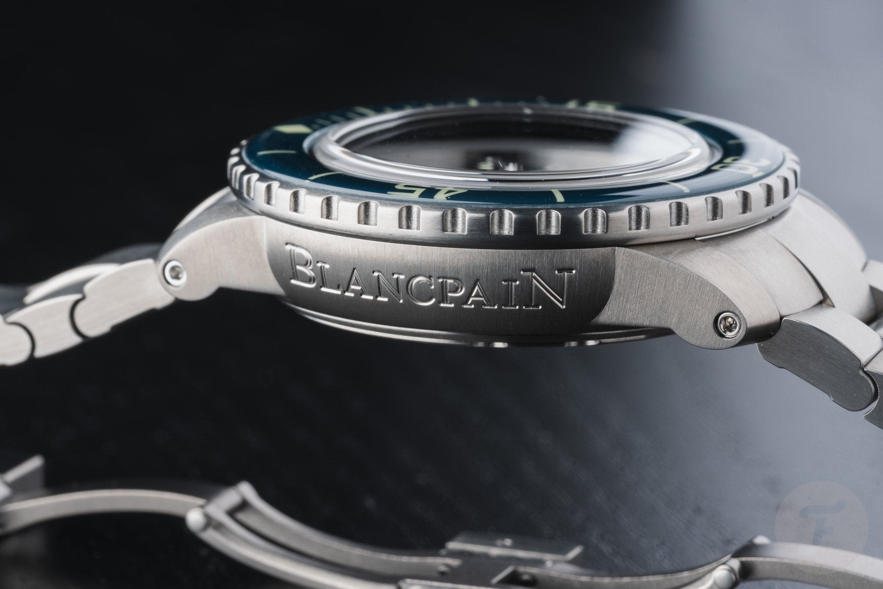
Funnily enough, I actually like the look of Swatch’s Bioceramic Scuba Fifty Fathoms models, as the inflated shape matches the colorful theme. However, I really dislike it on the steel and titanium versions of Blancpain’s Fifty Fathoms Automatique. Don’t even get me started on the Blancpain branding on the side of the case… Who on earth came up with that idea? Overall, considering how subtle the new Blancpain Fifty Fathoms Bathyscaphe 70th Anniversary is, the Fifty Fathoms Automatique looks much more inconsistent to me. But, Jorg, I’m very happy to hear why you think the more modern Fifty Fathoms Automatique should win today.
Jorg: Blancpain Fifty Fathoms Automatique 38
Thanks, Daan! It’s funny that you compare the Fifty Fathoms Bathyscaphe 70th Anniversary to a reissue of the famous Seiko 62MAS from 1965. But I want to add to that comparison from a historical perspective. Some watch fans seem to think this Blancpain Bathyscaphe takes after the Seiko 62MAS. However, it’s important to note that Blancpain introduced its first Bathyscaphe skin diver in 1956, a respectable nine years before Seiko released the 62MAS. It creates a rather different context for the reissue of the 1968 Bathyscaphe, which resembles the 62MAS and its modern iterations.
I think Blancpain deserves more historical credit than some people give it. The situation is understandable, though, because Seiko simply did a better job telling the story of its rich history in dive watches than Blancpain did for the Bathyscaphe. Especially in the world of skin divers, telling that story can make a huge difference.
But this same crowded genre also leads to my first and main gripe with the Bathyscaphe 70th Anniversary. I expressed it in my hands-on review as well. Despite Blancpain having been one of the first brands to introduce a skin diver, the overall aesthetic doesn’t surprise anyone much, nor is it really ownable. Consequently, “my” Blancpain Fifty Fathoms Automatique 38 is much more distinct. If you remove the logo from the dial, you will always know it’s a Fifty Fathoms, and with the Bathyscaphe, that’s simply not the case.
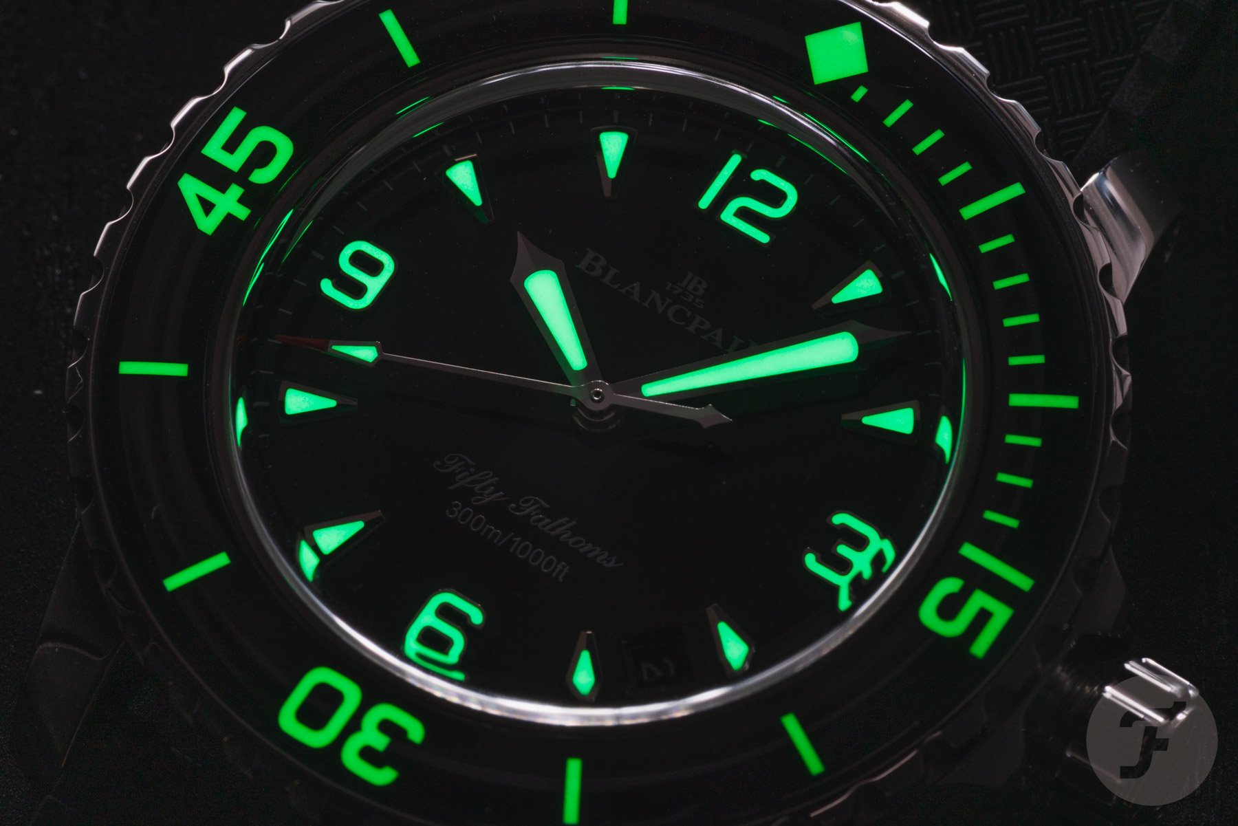
A design from 1953 that feels as relevant as ever
As a design fan, I like that kind of ownability because it creates an identity. Within the crowded world of watches, that is super important. And it’s fascinating to see that the design from the fifties remains as relevant as ever. I think the best compliment you can give is that the Fifty Fathoms is more modern than the Bathyscaphe. It essentially admits that the Fifty Fathoms’ design has stood the test of time tremendously well. Granted, it has evolved from the original, which is more than seven decades old. But the main features persist — the black dial with the large numerals at 3, 6, 9, and 12 o’clock, the curved bezel with its signature Arabic numerals, and the characteristic curvature of the crystal.
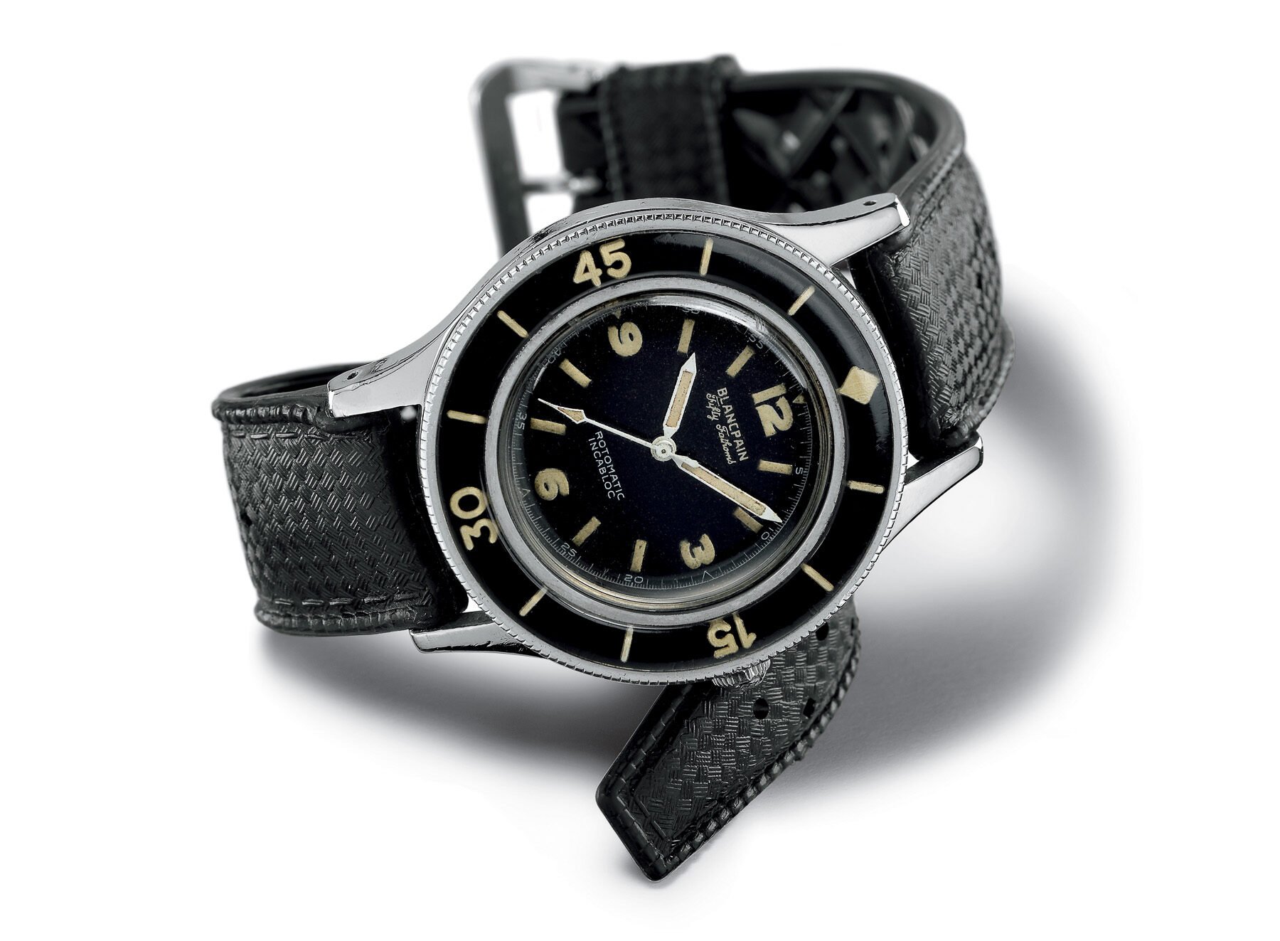
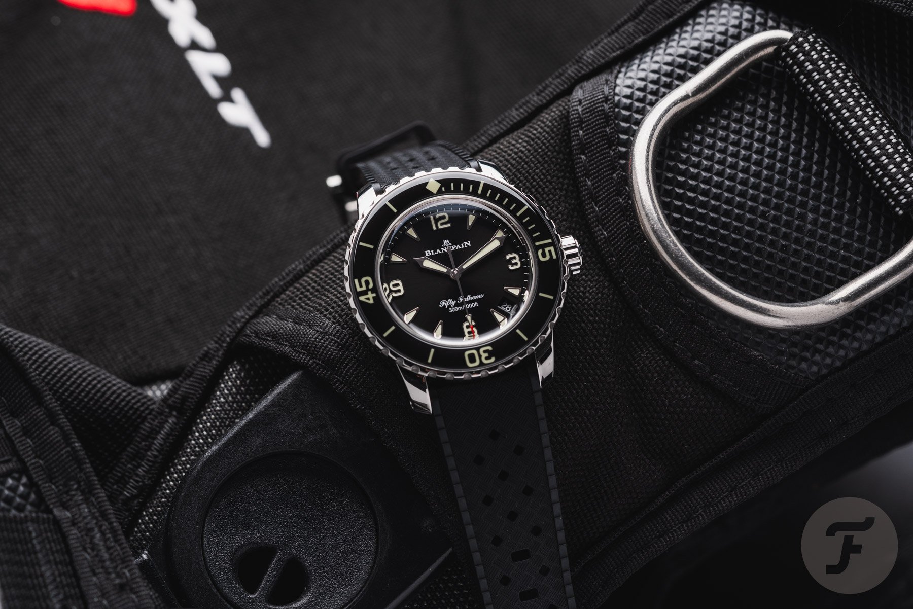
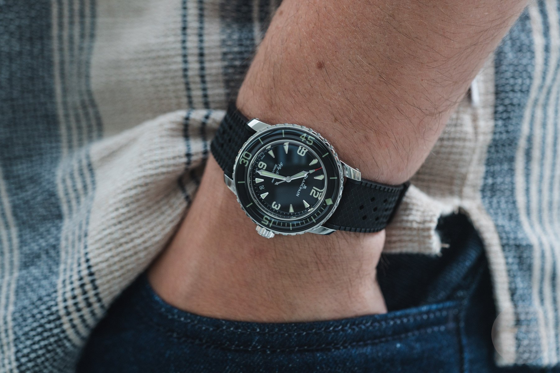
That brings me to the issues you have with the current 38mm version introduced last year, Daan. You are right that Blancpain has added even more curves to the design. The original Fifty Fathoms didn’t have a curved case. I do like those curves, though, because they not only add to the design signature but also ensure the watches sit really nicely on the wrist. I was lucky enough to try both your Bathyscaphe and my 38mm Fifty Fathoms, and the latter is the superior daily wearer. Blancpain has modernized the watch’s design while retaining the traditional traits that make the Fifty Fathoms a well-respected classic. The Bathyscaphe is a far more straightforward reissue that doesn’t use modern ergonomics to impress as a daily wearer these days.
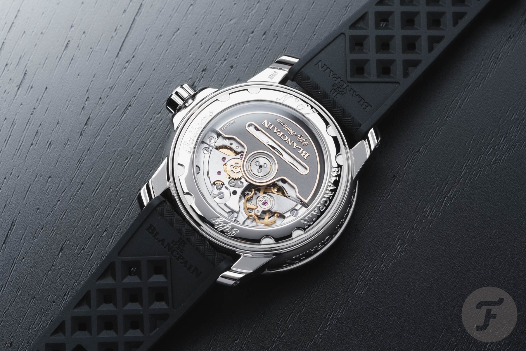
The modern sign-off of a professional dive watch
As for your critique of the Blancpain name on the side of the case, I agree…partly. First, the main difference between the Bathyscaphe and the Fifty Fathoms is that the latter is a series of diving tools for professionals. As such, the Blancpain name on the case is a great sign-off, reassuring you that you’re wearing a tool watch from one of the leading watch brands in diving. I actually like that reassurance.
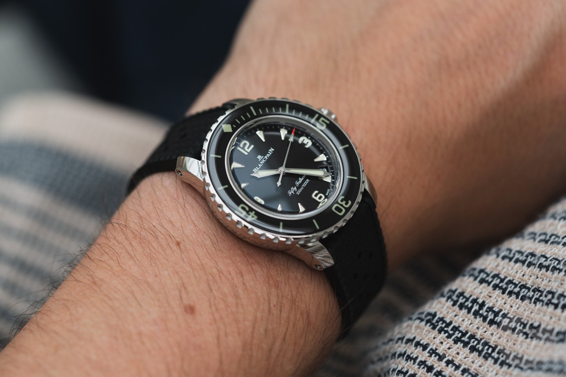
On top of that, practically, you will hardly see that big engraving when you are wearing the Fifty Fathoms. It’s on the left side of the case, which is often covered by a sleeve or cuff. I’ve worn several Fifty Fathoms models over the years and have always thought the same thing you brought up. The immediate impression is that the logo looks too big and prominent, but in reality, it’s hardly noticeable on the wrist. That’s partly due to the curvature you dislike so much. I’m on the opposite end and think it’s cleverly designed.
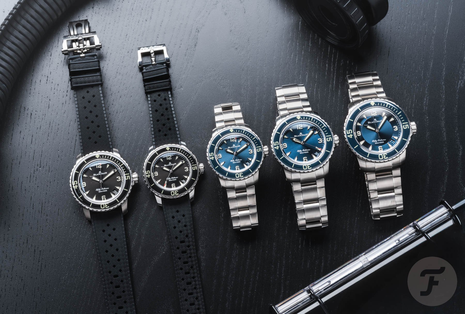
In the end, it’s the choice between the brand’s icon and another limited edition
One thing I fully agree with is your critique of the date placement. I also prefer a date at 3, like on the Bathyscaphe. Overall, I don’t mind a date at 4:30, but only if it looks like it “wants” to be there. Here, it looks like an afterthought rather than a welcome part of the design. That brings me to my last point — the “Fifty Fathoms” script on the bottom half of the dial. The graceful script is a nice link to the original Fifty Fathoms, which had a similar-style name underneath the vintage logo the brand used in the ’50s and now uses on your reissue. While I am not the biggest fan of the “Fifty Fathoms” font, it tells a story.
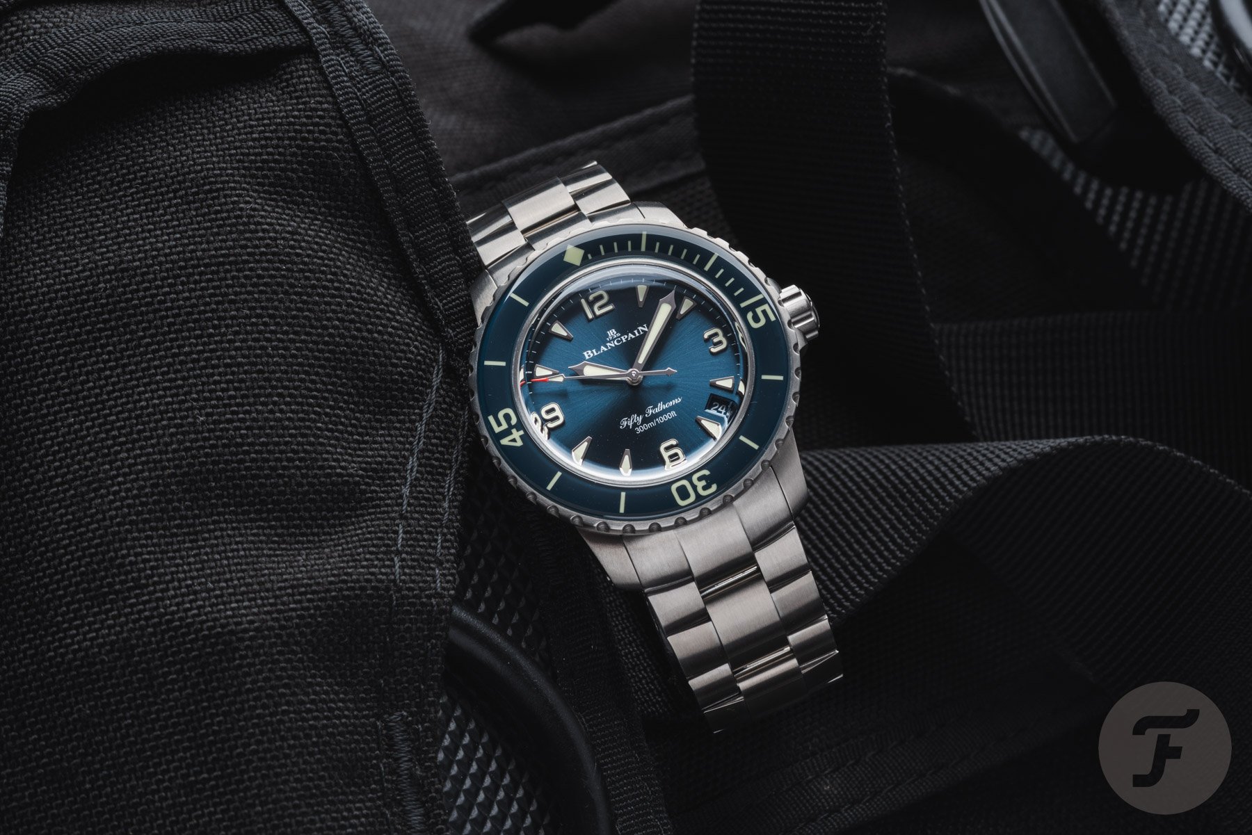
That story is, in the end, the biggest difference between the two watches in today’s match-up. The 38mm Fifty Fathoms is the smallest take on Blancpain’s modern version of its iconic dive icon. After many fan complaints, the brand has finally updated its Fifty Fathoms lineup to honor the rich history of the first professional dive watch.
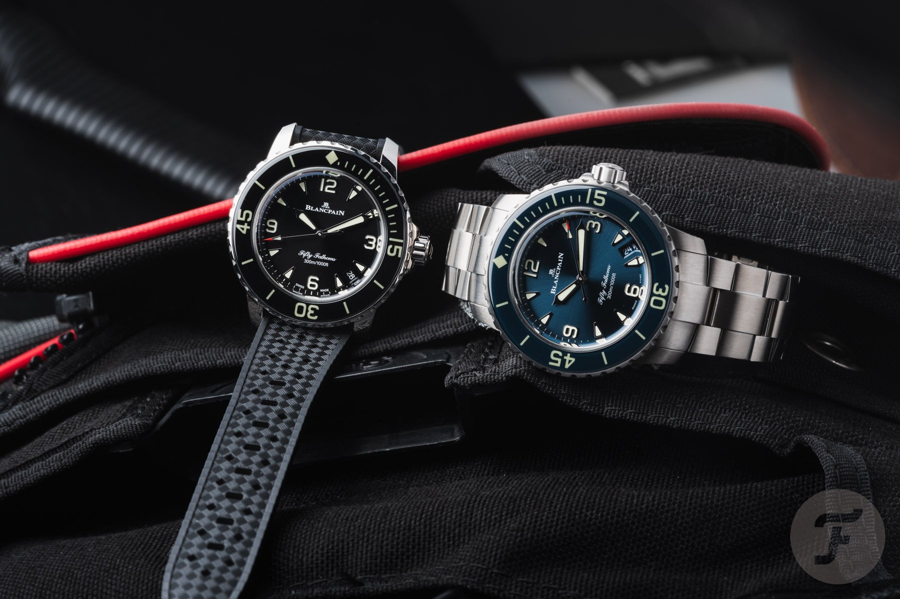
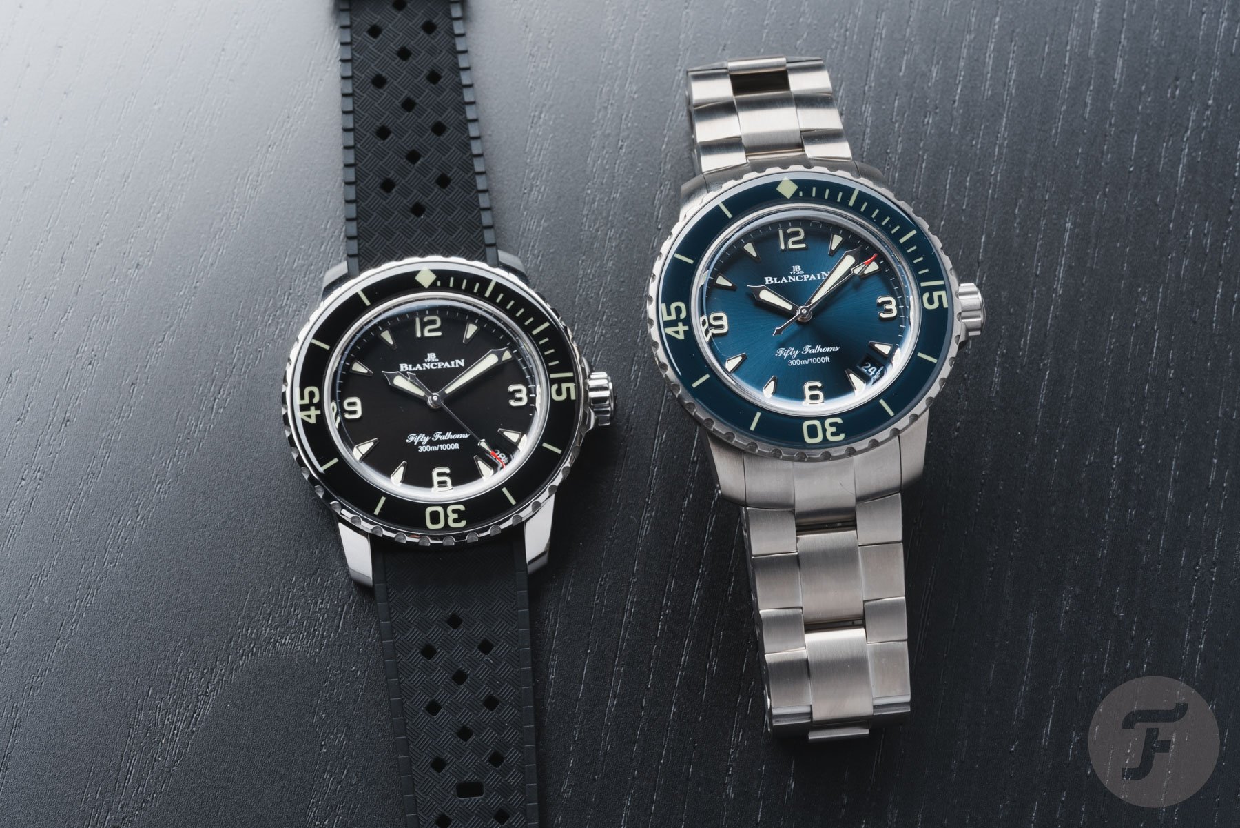
The steel model in black and the titanium model in blue
On top of that, the series has been modernized in a way that keeps the current Fifty Fathoms a great professional dive watch in 2026. This combination of heritage and contemporary execution makes the Fifty Fathoms a modern icon. At the same time, the 70th Anniversary version of the Bathyscaphe is a really nice reissue, but it lacks the story, presence, and progress. All this makes the 38mm Fifty Fathoms an easy pick in this week’s battle.
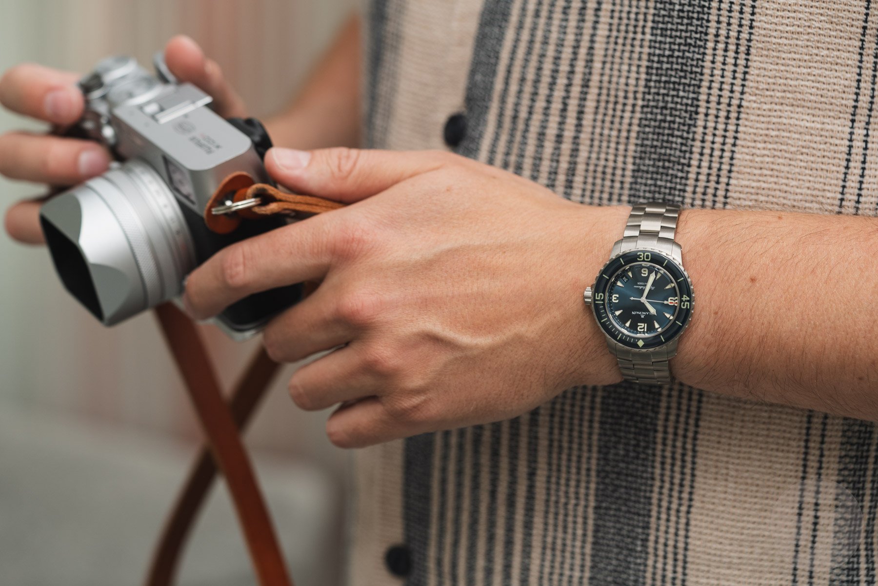
Time to cast your vote
There you have it — another Sunday Morning Showdown. Which of these Blancpain divers would you choose? Would you go for the modern Fifty Fathoms or the vintage-inspired Bathyscaphe 70th Anniversary? It’s time to cast your vote below. Also, don’t forget to tell us why you voted the way you did in the comments below!