Introducing: The Laurent Ferrier Classic Moon — The Brand’s First Lunar Flirtation

My theoretical-wrist-grail taste has evolved, as has the watch-collecting community. In the face of unavailability and client-selective ADs, independent choices have come to the fore. And despite the shaky world markets, plenty of potential buyers are looking for alternatives outside the big-brand catalogs.
Debuting back in 2010 with distinctively minimal luxury and the world’s best-looking spear hands, Laurent Ferrier has emerged as The Alternative for many. The Classic model with slender Roman numerals on its dial won the GPHG’s Best Men’s category at the brand’s debut. Now we revisit this timeless style with a complicated twist. The Classic Moon promises a deep blue brand first with a stellar outlook.
The Laurent Ferrier Classic Moon
Last autumn, I attended Geneva Watch Days to try on the racing vibe that suffused the Sport Auto 40, a fresh Nautilus alternative. In the short two years since its debut, the Sport range has become the understated choice in the increasingly hot market for integrated-bracelet sports watches. But this time, Laurent Ferrier shows the brand’s broad range in two distinct interpretations of its debut vision of a moonphase complication.
The two versions utilize the brand’s smooth Classic case design, which delicately straddles the line between dressy classicism and a sportier aesthetic. Each curve of this case is frustratingly balanced in its radius and proportion, making it hard to fault. The 40mm diameter, 12.9mm thickness, and trademark ball-shaped crown still make it a style chameleon. Underlining this are the steel and 5N red gold versions of the Classic Moon, which have taken on two distinct personalities.
The allure of the Moon
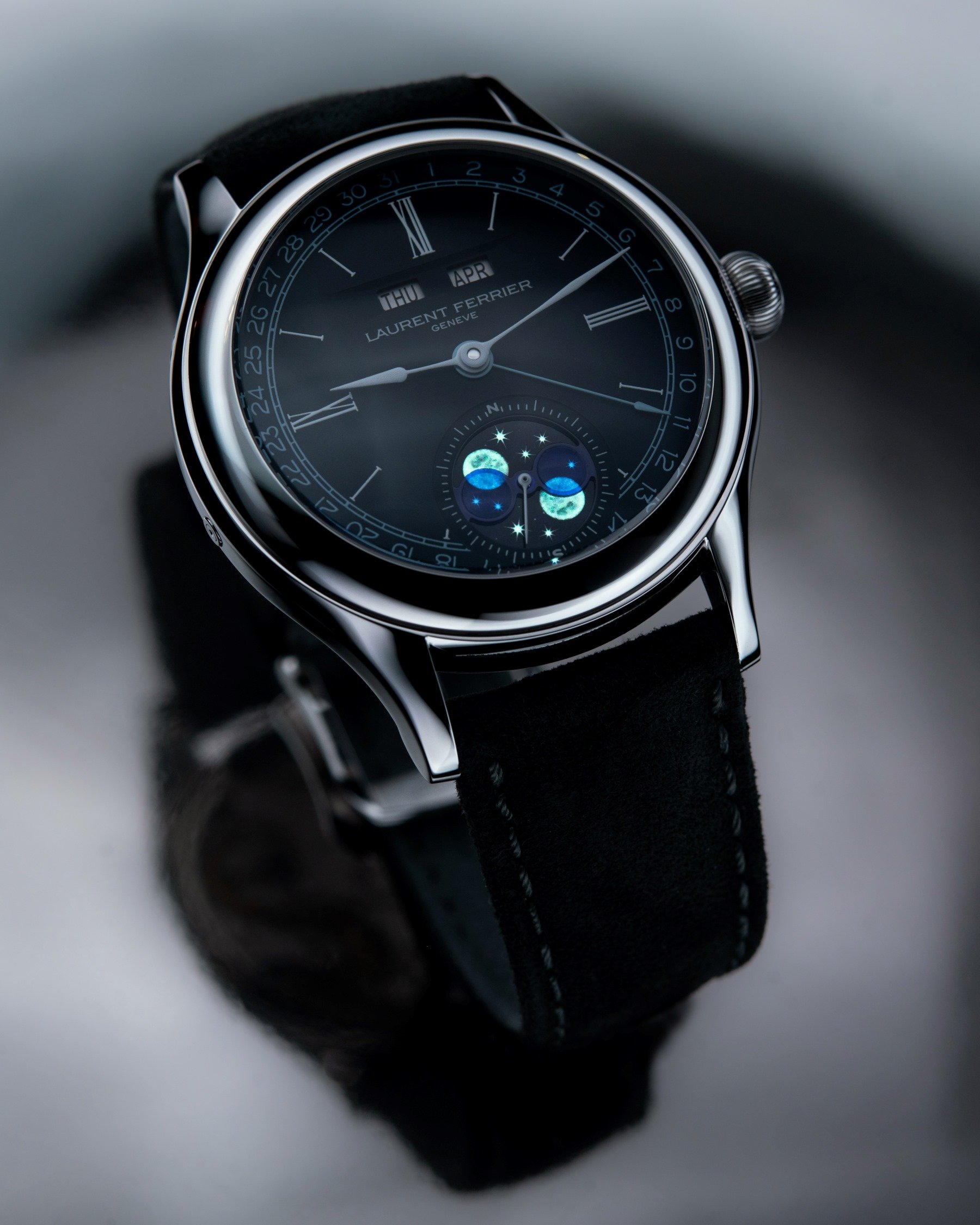
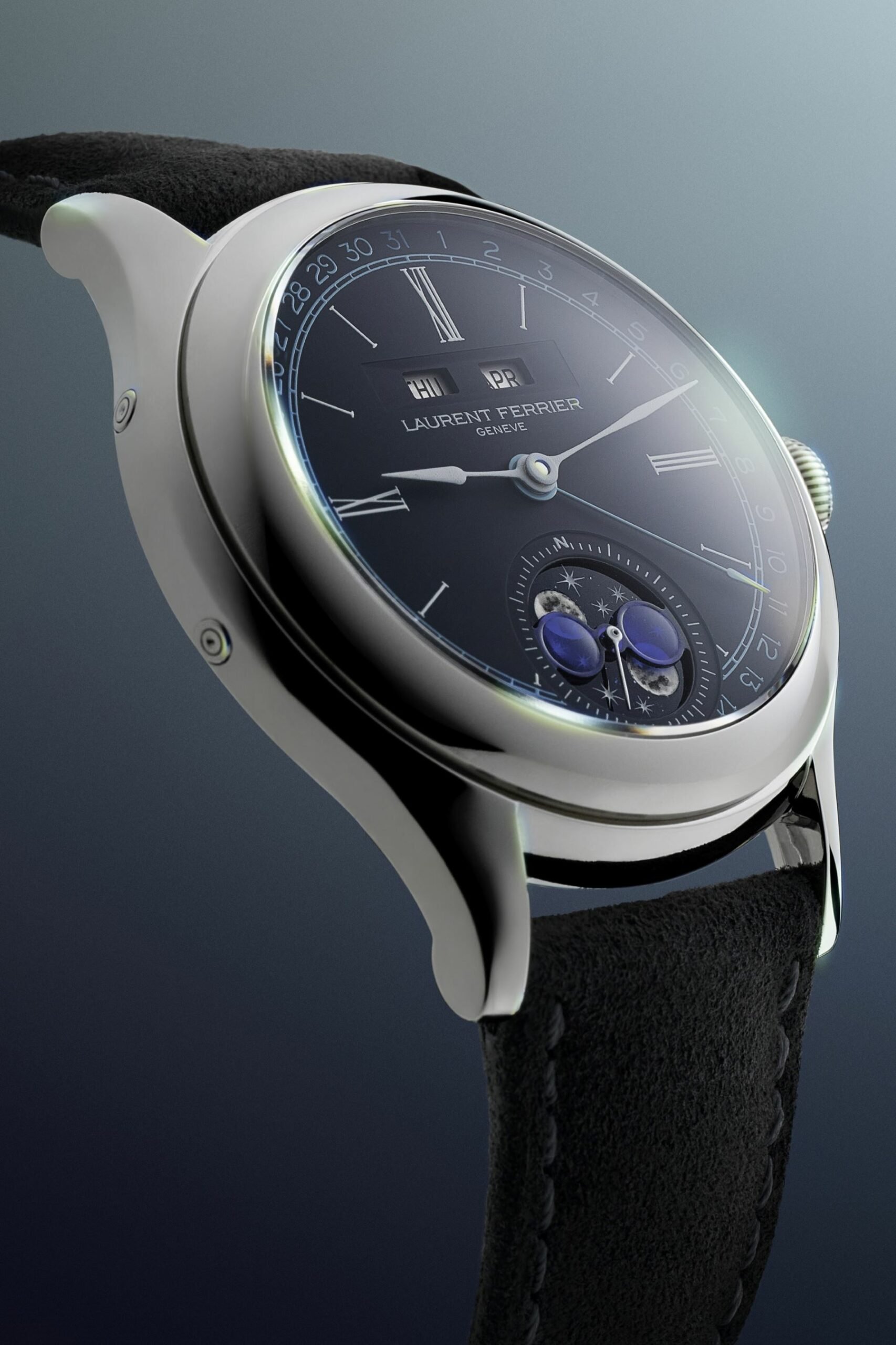
For those in the know, the big picture will bring to mind the triple-calendar complication of the École Annual Calendar, a hidden gem within the brand’s portfolio. That series has a distinct case design that sets it apart from the Sport and Classic pieces from Ferrier’s imaginative design team, and it was the only one with a triple-calendar function until this duo entered the stage. Thankfully, though, the new complication makes no compromise on legibility, and the wide-angle window just under the slim Roman numerals at 12 is delightful. Twin windows sit deeply within a wide aperture, its angled side leading the eyes to a crisp font of day and month. This balances out the big news at 6 o’clock. It is a brand first — a handcrafted double-moonphase display with much to unpack.
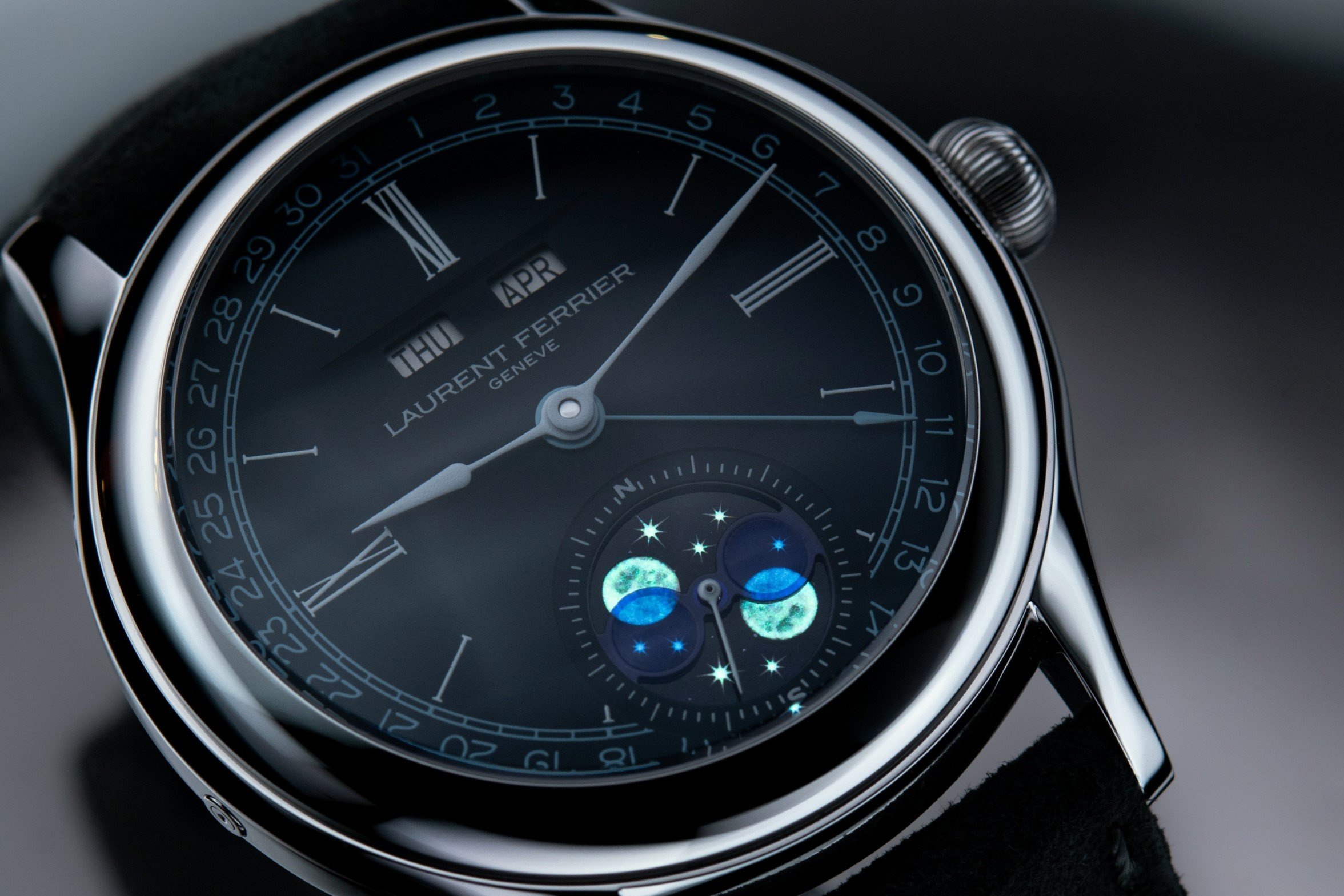
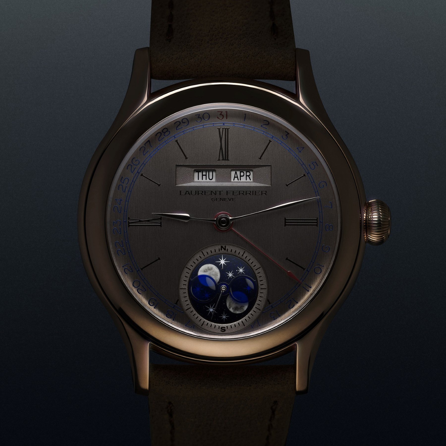
The center of the display is identical within both versions of the watch, offering a tonal elegance for the gray-blue version. By contrast, within the vertically brushed dial of the red gold reference, the dark blue aventurine moonphase disc sparkles. This disc is the starting point and an artist’s canvas. On its glass surface, an artisan has engraved the shapes of the Northern and Southern Hemisphere moons and stars. The celestial bodies then receive a carefully applied filling of white paint, detailing the surface of the real Moon. The next stage involves lume applications and firing at high temperatures. Then, as a final flourish, the artist individually engraves the lunar craters. Yes, the moonphase complication alone requires more hours of work than assembling a single watch from many brands. And therein lies its appeal, whether or not you use the complication to determine the ocean’s tides.
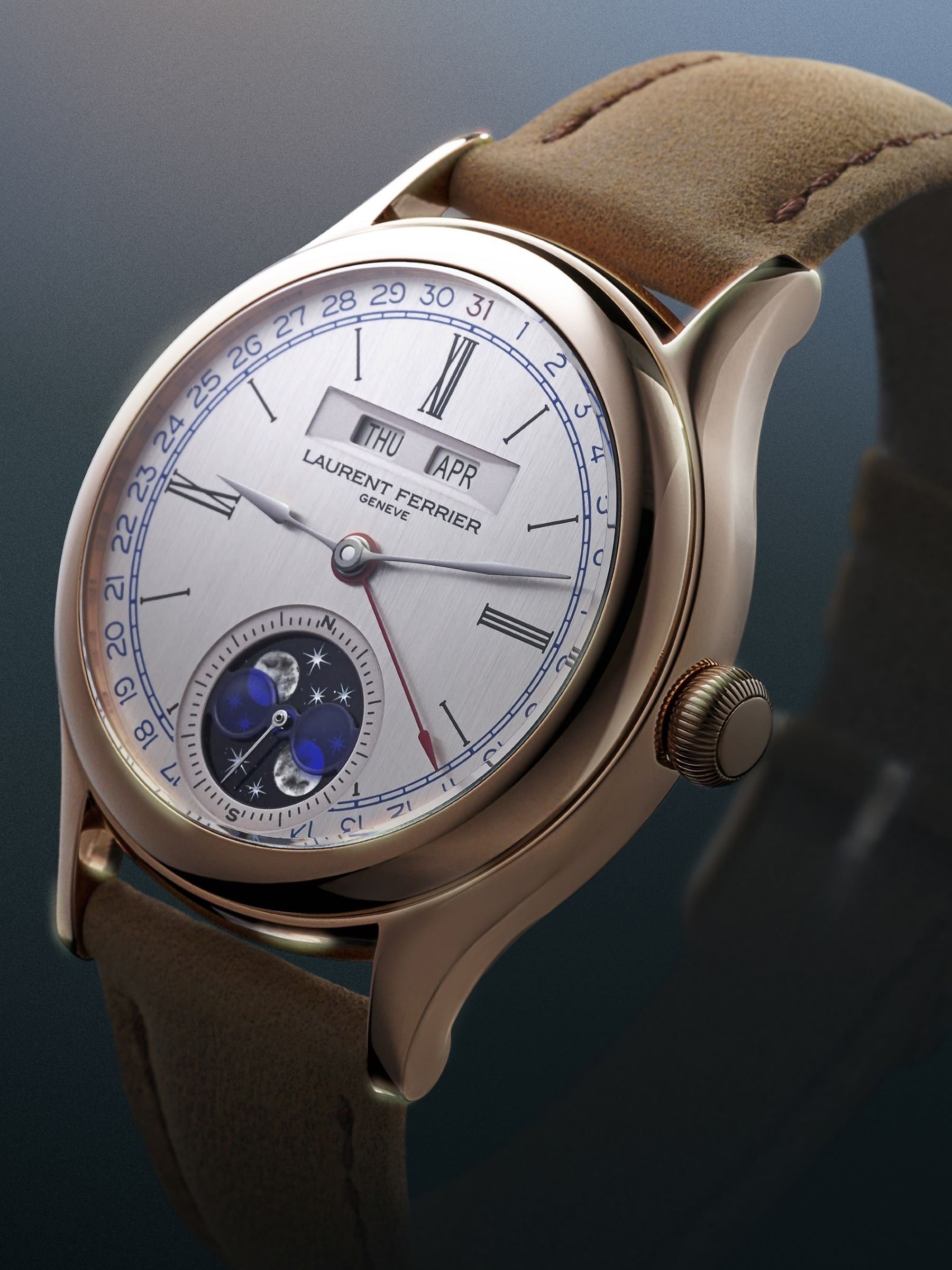
Two distinct personalities for the Laurent Ferrier Classic Moon
A figure-eight-like shape with translucent enamel appliqués covers the display. This frames and reveals the waxing and waning moons. Even with their identical designs, the two versions of the Laurent Ferrier Classic Moon have their distinct personalities. We all know how much a dial color, textures, and details can do to change the personality of a single watch. Laurent Ferrier shows this in exemplary fashion, with the gray-blue opaline dial framed by polished steel, exuding an elegant urban vibe. A soft Alcantara-lined strap makes for a casual contrast to the strong monochrome and white lacquer details. And the deep blues of the lunar work of art at 6 o’clock is the piéce de rèsistance. Then, with its impossibly slender Roman numerals on a silver dial, the red gold version’s delicate balance leans more toward classicism.
With the luster of red gold comes a different, warmer personality. This is courtesy of tonal contrasts and a warm, vertically brushed silver dial surface. A tan calf strap with a gold pin buckle matches the warm colors of this reference. The moonphase display pops visibly at 6 o’clock, while the classic dial has even more in store. There is a crisp blue in the date numerals encircling the dial. Looking closer, we see a bright spark of red in the date pointer quietly echoing the 31st numeral at 12, one of many Easter eggs.
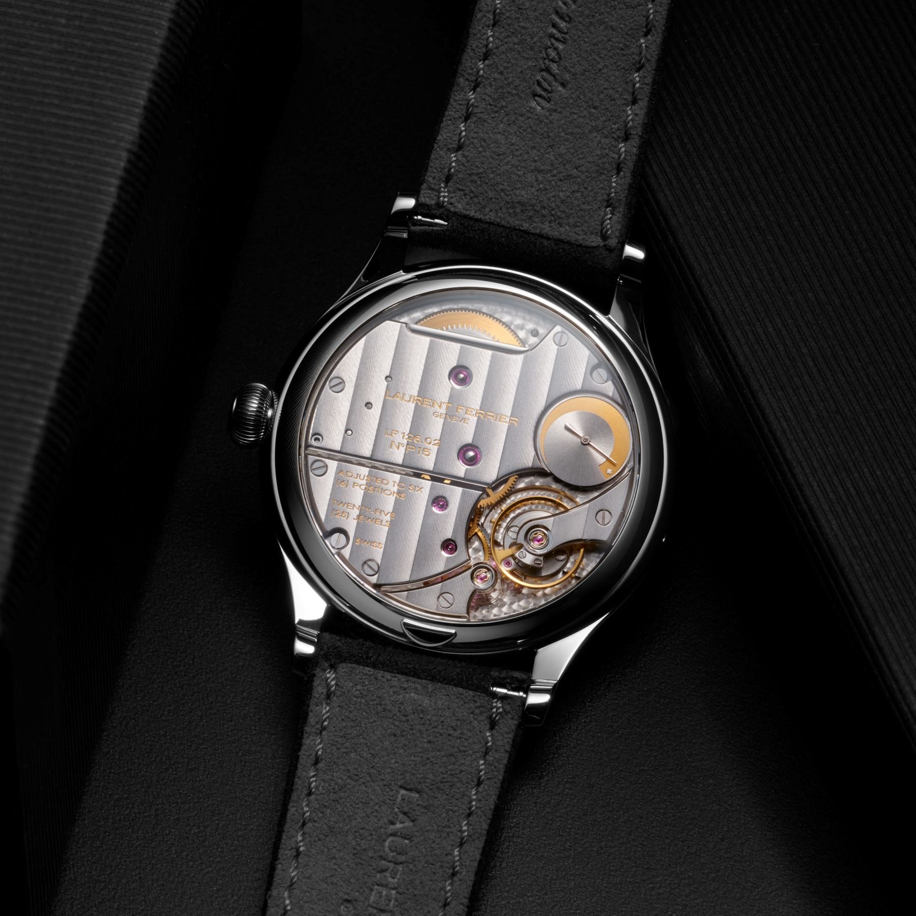
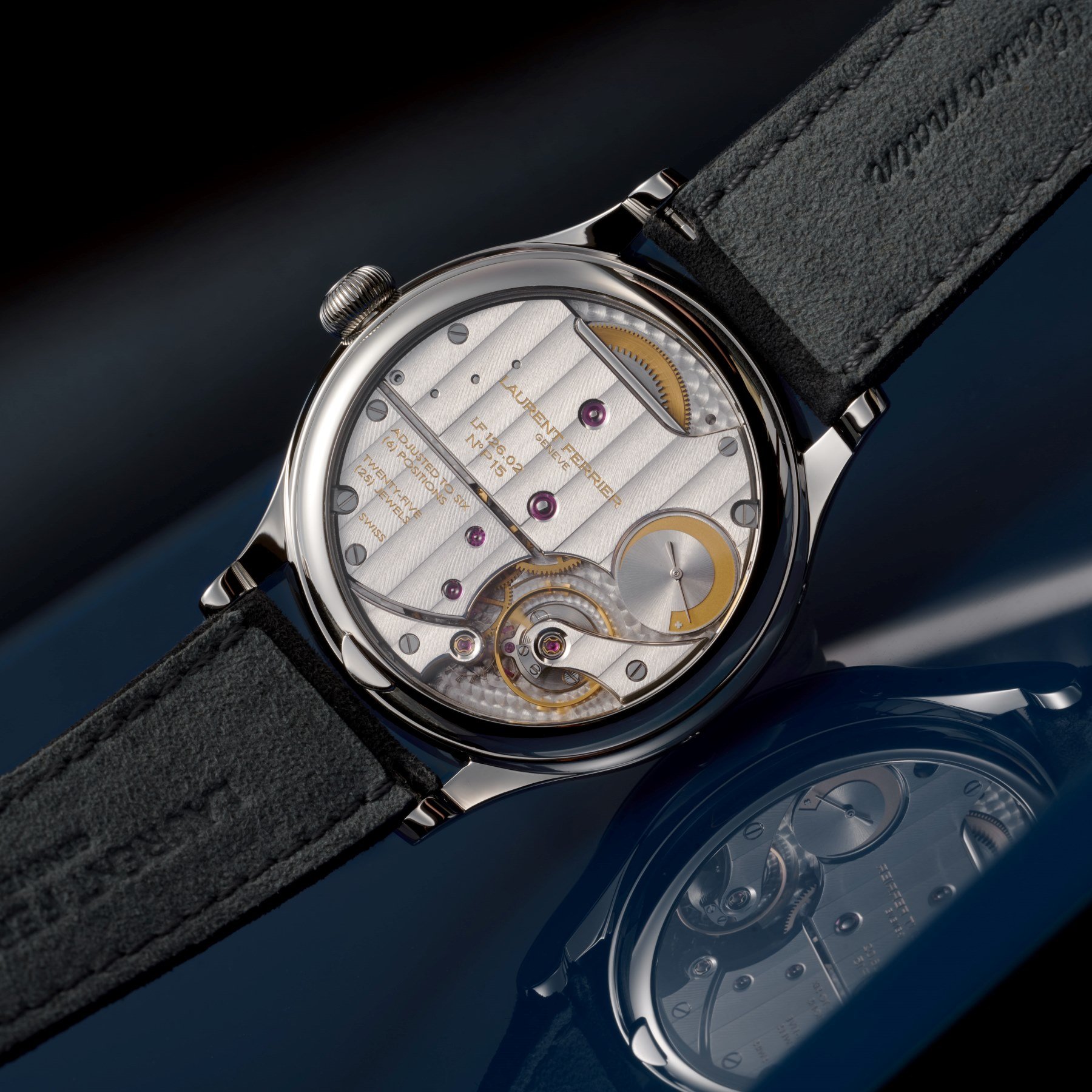
The LF126.02 movement
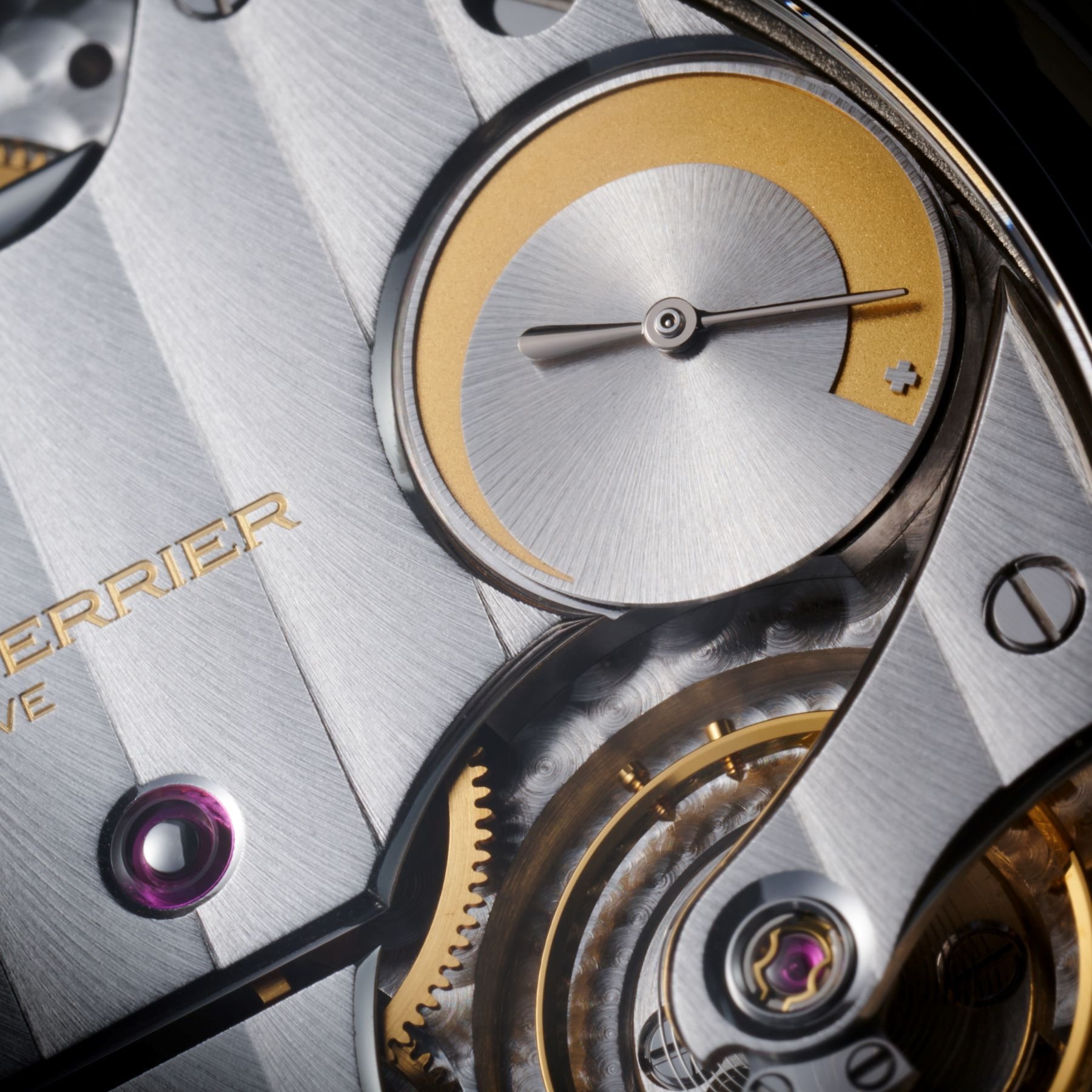
The new caliber is visible through the sapphire window on the back. As mentioned, it is inspired by the Ècole’s annual calendar complication but improved with a substantial 80-hour reserve. This is visible in a power reserve indicator crescent on the back of the caliber. The calendar complication will automatically distinguish months with 30 and 31 days. Manual adjustment is only necessary once a year on March 1st. You will find a corrector recessed on the left side of the case to adjust the day display.
The moonphase display is adjusted with a second corrector at 10 o’clock. Other adjustments can be made easily using the trademark crown. The inspiration comes from the LF126.01 movement, but the new LF126.02 is redesigned. It has been improved through 30 new parts, and more than 20 components were revised and optimized. The Laurent Ferrier Classic Moon is an important addition to the range, and I am impressed. The classic roots are here but with modern touches like the distinct lume. With its two charming personalities, this is one of the strongest duos debuting this year. The watches are available to order from Laurent Ferrier for CHF 70,000 in steel or CHF 80,000 for the 5N red gold version, both excluding taxes.
How about you, my Watches and Wonders-barraged Fratelli? Could this be the quiet lunar chic you’ve been looking for? Let me know in the comments.